
HbD News: NY Islanders’ Stadium Series Uniforms Announced
John Tavares, working on his Blue Steel.
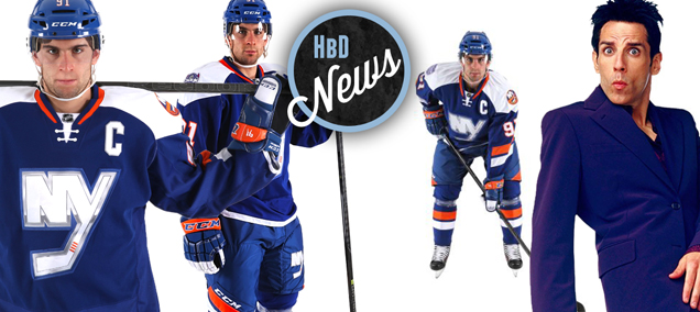
Last night, the NY Islanders announced the jerseys they’ll be wearing for the upcoming Stadium Series match against the NY Rangers on January 29th, 2014. The best news is that it’s not covered in fake glimmers and sheen-like chrome like their logos are. You can read the full release (and watch a short video with more views of the uniforms) here.
As I mentioned in the post about the chrome, the Islanders went in a different direction with the logo for this one, eliminating all of the elements on their current logo except for the NY/hockey stick element, creating a much more simple and striking logo to use on these one-game jerseys. And it works well when seeing it on these jerseys, but I’m not entirely sure if I would give a complete thumbs-up at this point. Sometimes, it takes time for these things to play out and see how they work. Or maybe it’s just that stupid chrome effect that’s throwing me off and keeping me from full embracing it. I’m not at hockey-hug level with it yet.
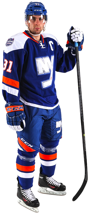 But there’s a lot to like about these jerseys. In the same way that the new Minnesota Wild road jerseys seem to bridge the gap between traditional and forward-thinking jersey design, these Islanders jerseys take a step forward in seeing where jersey design could go. But there’s something that tells me that I’d prefer to see these as a road whites design.
The big reason for that is the chunky white shoulder yokes. Don’t get me wrong, I really like the shape of them actually. Coming to a point on the shoulders (instead of being rounded- or squared-off) is something more interesting and innovative and fits very nicely with the diagonal lines being used elsewhere on the uniform. But the bright white yokes on a navy blue jersey creates an incredibly start contrast, constantly drawing the eye to the jersey’s shoulders. It’s balanced somewhat by the brightness of the NY logo, and it would have been even more balanced if the chrome elements and light grey outline has been removed altogether.
I like how the orange is dialled down in the jerseys as well. Using complementary colours like orange and blue only works if one if clearly given prominence over the other, which allows the other colour to truly compliment it instead of competing. With the orange left to striping in the collar and sleeves on the jersey (and pants/socks in the full uniform), it allows for the colours to work together smoothly.
Other somewhat unique approaches with the jerseys are the sleeve stripes not wrapping around the full arm, instead resting just on top of the arms with the jersey being completely solid blue underneath. Part of the reason it works is because the stripes are slanted on an angle, so wrapping it fully around would cause problems. A fix for that could be mimicking the point that the shoulder yoke comes to perhaps.
But (and that’s a big but) holy crap, did they angle the numbers on the sleeves as well? From what I can see from the video, that’s the case, and that’s very disappointing. I don’t understand why they would choose to that unless they italicized the letter to make the vertical lines stand up straight (similar to the “by” in the Hockey By Design logo). Without the italics though, it’s a cheap gimmick that just looks awkward. If they were trying to introduce more movement and dynamism in the jersey, the numbers (or at least in this way) are not the best place to do that. I’d love to know the reasoning for it, because it really does look stupid.
Otherwise, there the multicoloured gloves. They draw way too much unnecessary attention to themselves with the white fingers (again, too heavy contrast). The only reason you should want to draw people’s attention to your gloves is if you’re Michael Jackson and it’s fully sequinned. I’ll stay away from OJ Simpson references though. But for some reason, whenever I see the gloves, I just think of skeleton gloves.
And then there’s the striping on the bottom of the jersey, being just a single white line. I’m not crazy about it, as it’s a little too simple, and wonder how an orange line included in there might work.
They also went with the white nameplate with blue letters on the back, which I’m worried might become a new trend in jerseys. The Flyers first did it for their Winter Classic jerseys and it worked well with their design, because it’s an extremely simple design and their orange colour is not as contrasty as the Islanders’ navy blue. Here, like the gloves, it’s more of a distraction than a positive look.
But overall, it’s a good looking uniform and does what third jerseys, or one-off uniforms, are meant to do: play around a little bit, see what works in jersey and uniform design to continuously push the conversation forward in an innovative way. Oh, and for the teams/league to make more money, of course.
Now, is it still too late to get rid of the chrome on the logo, which doesn’t fit with the design of the jersey at all?
Did I miss anything? Agree/disagree? Let me know your thoughts below.


I was at the Islanders, Capitals game the other night and they showed these uni’s on the big screen. I personally think they are just awful and the chrome logo just doesn’t belong on a uniform (that pretty much will go for any of the chrome logos). It would have been a nice touch to at least outline the logo with orange, just like the numbers, instead of a blue that’s slightly lighter than the actual sweater. I agree 100% on the shoulders, that shape is very unique and I would like to see that used on future uniforms for any team. I don’t even want to bring up how much I cant stand the numbers being slanted… I definitely agree about bringing in orange to the bottom as another stripe. Good read! I cant wait to see how decent/bad my team’s (Rangers) uni’s will look.
As it turns out, it looks like the worst part of these jerseys (the slanted numbers) are going to be on all the Stadium Series jerseys. Sigh.
[…] numbers appears to be an NHL-demanded design element, as it first appeared inexplicably on the Islanders’ Stadium Series jerseys. And it’s also on both these jerseys. Is it worse than Nike’s fake laces on the […]
[…] More: HbD News: NY Islanders’ Stadium Series Uniforms Announced • More: Worst to First Jerseys: New York […]
[…] More: HbD News: NY Islanders’ Stadium Series Uniforms Announced• More: Worst to First Jerseys: New York […]