HbD News: Stadium Series, All Chromed-Up
 Earlier, the NHL released the logos that are going to be used for the upcoming Stadium Series games in January and March in games involving Los Angeles, Anaheim, NY Rangers, NY Islanders, New Jersey, Chicago and Pittsburgh…and they are almost nothing more than beveled, embossed, plastic-wrapped and chromed-up versions of the usual logos. The Devils and Kings are using older logos, and the NY Islanders are using a modified logo based on their current one.
From the NHL:
The Chrome logo designs are unique to the 2014 Coors Light NHL Stadium Series™ and inspired from the chrome details on the NHL shield, bringing a dynamic and modern perspective to conventional team identities.
I’m not sure how cheap Photoshop filters and overlaid stock textures get defined as “dynamic and modern”. Pretty sure over-filtered cheap designs died with the ’90s and that dynamism implies movement and excitement rather than something being cast in heavy steel, but hey, who am I to argue with the lack of thought or originality put forward by the designers for the Stadium Series. If Coors Light didn’t force some influence with this, all the NHL’s designers should be fired. Otherwise, I’m fine blaming Coors Light, one of the shittiest of all the beers. All that aside, there are a couple tasty bits of design stuff happening here. Two teams – New Jersey and NY Islanders – are using altered logos.
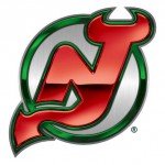
 The New Jerseys Devils will be bringing back their classic Christmas colours (which makes it disappointing the game wouldn’t be a month earlier, on December 26 instead of January 26) for the first time since dumping them in 1992. It will be the first alternate logo (and presumably jersey) that the Devils will have ever created in their existence. They have been the epitome of status quo since 1992, so it will be exciting to see what they come up with for the Stadium Series game.
As for the green and red logo, it’s not as great as the red and black one. The green never made much sense as an inclusion into the jersey and the complimentary colour scheme only works when one colour is clearly dominant over the other. In the logo, this is the case because of the dominance of the red, but the jerseys they used to wear, not so much. Plus, red and black makes a lot more sense when your team is called the Devils. Again, it will be interesting to see what their jersey looks like though, which I’m assuming will be reminiscent of the original jerseys.
 As for the Islanders, they’ve dropped everything from their logo except for the “NY”, the hockey stick and the four orange stripes representing their four Stanley Cups. It actually reminds me of something that I read a little while ago:
What works for the [NY Islanders logo] is the bold simplicity of it. Like the large “NY” dominating the upper-half of the logo with the tail of the “Y” becoming a hockey stick. The difference of the thickness between the “NY” letters and the hockey stick gives it a very specific styling and makes it instantly recognizable. You could remove everything else from the logo and you would know what team it is. Distinctiveness and simplicity makes for great logos. But the thickness of the “NY” is important too in that it gives a solid strength to the entire logo. The human eye is naturally attracted to the place with the highest contrast, and the white “NY” on the blue background ensures that this is main focus of the logo. It works well.
Oh yeah, that was me, 2 years ago, for the Islanders’ BTLNHL Countdown post. GUYS, GUYS! I CALLED IT! THE ISLANDERS READ MY BLOG! Or, maybe they just saw the potential and power of simplification where their logo was concerned. I much prefer the former though.
I’m interested to see how this is going to work on a jersey though. It’s impactful, but it may be a little too static to use as an actual logo on a jersey, lacking a lot of movement and dynamism. As a third jeresey/alternate logo though, it could work nicely, but it really heavily depends on what the jersey looks like.
Also in the press release, the jerseys that all the teams will be wearing for the Stadium Series games will be announced over the coming weeks. I’m looking forward to them continuing this chromed theme and forcing the players to wear actual suits of armour during the games. That would be so…unique. But remember, unique isn’t always good.


[…] 29th, 2014. The best news is that it’s not covered in fake glimmers and sheen-like chrome like their logos are. You can read the full release (and watch a short video with more views of the uniforms) […]
[…] the Stadium Series jerseys are pretty underwhelming, and we’ve talked exhaustively about the shitty chromed-up logos, and the slanted numbers on the sleeves, so while this countdown will certainly take these things […]
[…] team, but is pretty bland and seems to have some fake chroming on it, which is just as bad as the Stadium Series chromed-up logos. The elements are there for a great jersey, but some of those elements are just over-thought and […]
[…] HbD News: Stadium Series, All Chromed-Up HbD News: Rangers and Blackhawks Stadium Series Jerseys Announced HbD News: New Canada Olympic Jerseys Announced BTLNHL #7: Chicago Blackhawks HbD Masks #1: Tim Thomas […]
[…] No matter what you think of some of the more negative features of the Stadium Series jerseys (chromed-up logos! slanted numbers! wallet-stuffing cash grabs!), the Penguins version of the jerseys are the best […]
[…] Full Breakdown: New York Islanders Debut Their Third Jersey Full Breakdown: HbD News: NY Islanders’ Stadium Series Uniforms Announced Related Reading: HbD News: Stadium Series, All Chromed-Up […]
[…] Related Reading: HbD News: Stadium Series, All Chromed-Up […]
[…] And really, there’s just not enough purple and gold in the world of hockey. Compared to the black-and-white colour scheme that the Kings adopted after this era, these jerseys were distinctive and unique in hockey design and still would be today. And they add so much colour to the clean sheet of white ice. I hope we see some rendition of these jerseys for the Stadium Series game, but please not all chromed-up like the logos. […]
[…] Reading: HbD News: Stadium Series, All Chromed-Up Related Reading: BTLNHL #21: Ottawa […]
[…] • More: 2020 Stadium Series Jersey Countdown• More: HbD News: Stadium Series, All Chromed-Up […]
[…] • More: HbD News: Rangers and Blackhawks Stadium Series Jerseys• More: HbD News: Stadium Series, All Chromed-Up […]