BTLNHL #20: New York Islanders
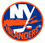 After a brief pause to talk with Terry Smith and to talk about Winter Classic jerseys, BTLNHL continues at #20 with the New York Islanders. I’m not going to lie and say it was easy to place all these teams in order for this countdown and it’s impossible to separate personal prejudices when doing something like this. I bring this up because this is arguably the first team in the countdown that has a storied history and legacy. Sure, Tampa Bay, Colorado and Anaheim have all won the Cup, but the Islanders had a dynasty, winning 4 straight Stanley Cups from 1980-84. And a logo always seems to look better when it’s attached to a person raising the Stanley Cup, especially multiple times.
Would the Islanders be ranked lower had they not been a dynasty in the ’80s? Perhaps. Am I overcompensating that thought by ranking them too low now? Maybe. Would the Avalanche been ranked higher than #29 had they won more than 2 Cups when they were a dominant team in the ’90s and ’00s? Probably not. That logo sucks.
After a brief stint in the processed fish production industry, the Islanders have gone back to their original logo, one that’s dipped like a DQ cone in legacy. And good on them. It was the proper move after that horrible foray into ’90s horrible logo and jersey design. But it’s still not a logo that deserves to be in the top 2/3 of the league.
My biggest pet peeve about the logo is the “I” in “Islanders”. It’s unfortunate that the “I” overlaps with the map of Long Island, but is there any other way around this, rather than just cut-out the overlapping part to make it the same blue as the background? Sure there is, and it took me 5 minutes. To me, the “I” as it is just seems lazy.
The use of a map of Long Island in general is something unusual for a sports logo. It’s currently the only team in the four main professional leagues in North America to use a map in their logo, although there were a couple in the past, like the Golden State Warriors and the New Jersey Nets in the NBA. As recently as last year, Tampa Bay used a map of Florida in their alternative logo, but these are generally places where the map of the state/area are somewhat iconic in themselves. Florida is easily recognizable. Does anyone outside of the Eastern Seaboard know what Long Island actually looks like? It looks more like the beginnings of a Rorshach test.
But that begs the question, does it matter? Your fans are going to be predominantly the people living on Long Island, especially considering both the Rangers and Devils are so close to the team, but off the island. So maybe it doesn’t matter in the end, but it’s still a topic of interest for logo design. And it seems like a strange inclusion here. I can’t decide whether I like it or not. But I guess the other options may be limiting when your team name is the Islanders, which might otherwise lead to stuff like sea captains being used. Yikes!
What works for the logo is the bold simplicity of it. Like the large “NY” dominating the upper-half of the logo with the tail of the “Y” becoming a hockey stick. The difference of the thickness between the “NY” letters and the hockey stick gives it a very specific styling and makes it instantly recognizable. You could remove everything else from the logo and you would know what team it is. Distinctiveness and simplicity makes for great logos. But the thickness of the “NY” is important too in that it gives a solid strength to the entire logo. The human eye is naturally attracted to the place with the highest contrast, and the white “NY” on the blue background ensures that this is main focus of the logo. It works well.
The “Islanders” text, is a little bit too MS Word Text Art, but there’s no effects like gradients and bevelling on it, so it’s mostly non-offensive. Again, simplicity here makes it work better. And the fact that it’s orange on blue, so not as much contrast, ensures it’s not the focus of the logo. But the text is also not even, coming up higher on the left than the right and slightly of centre (see here), which is strange if you’re going to create text that wraps the bottom of a circle like that. Which brings us back to that “I” again. The human eye is also naturally attracted to pattern (remember Magic Eye?), and that “I” overlap creates a kind of pattern and it draws attention when it’s something that really shouldn’t. And because of the unbalanced text, makes it sense even less necessary.
Just two more things, one good, one bad.
Like a movie fan hoping for a happy ending, let’s go with the bad news first. Knowing why the human eye is attracted to contrast, why would anyone put the “®” on the logo in white, and so large? It is, by far, the least important element in the logo. Like small print on any document, it has to be there for legal purposes, so why draw any attraction to it at all? Bizarre. Better.
And the happy ending? It’s the only difference between the original and current logo. Fresh from the Sunday morning newspaper, it’s like a game of spotting the difference. It’s very subtle but acknowledges the great history of the Islanders. There’s four stripes on the hockey stick instead of three, honouring the four Stanley Cups the franchise has won. Brilliant.
I guess if the Islanders win another Cup, they’ll add another stripe to the stick, but given their recent GM/management history, I don’t think we’ll need to worry about that for a few years.
But, unlike their standings in the last few seasons, the Islanders are ahead of 1/3 of the league with their logo, coming in at #20.
The BTLNTL Countdown Posts
BTLNHL Finals: Boston Bruins v Detroit Red Wings
BTLNHL #3: Philadelphia Flyers
BTLNHL #4: St. Louis Blues
BTLNHL #5: Montreal Canadiens
BTLNHL #6: Pittsburgh Penguins
BTLNHL #7: Chicago Blackhawks
BTLNHL #8: Toronto Maple Leafs
BTLNHL #9: Phoenix Coyotes
BTLNHL #10: Vancouver Canucks
BTLNHL #11: Edmonton Oilers
BTLNHL #12: New York Rangers
BTLNHL #13: Calgary Flames
BTLNHL #14: Buffalo Sabres
BTLNHL #15: Winnipeg Jets
BTLNHL #16: Minnesota Wild
BTLNHL #17: New Jersey Devils
BTLNHL #18: Nashville Predators
BTLNHL #19: Carolina Hurricanes
BTLNHL #20: New York Islanders
BTLNHL #21: Ottawa Senators
BTLNHL #22: Tampa Bay Lightning
BTLNHL #23: Columbus Blue Jackets
BTLNHL #24: Washington Capitals
BTLNHL #25: San Jose Sharks
BTLNHL #26: Florida Panthers
BTLNHL #27: Dallas Stars
BTLNHL #28: Los Angeles Kings
BTLNHL #29: Colorado Avalanche
BTLNHL #30: Anaheim Ducks







I know this falls outside your 4 major professional leagues, however, I just wanted to make a point on how you can include a geographical map in a logo, and it works:
The logo for the new St. John’s IceCaps of the AHL
https://upload.wikimedia.org/wikipedia/en/2/23/SJIceCaps.png
In the iceberg at the top of the logo is an imprint of the province of Newfoundland and Labrador in such a way where its not intrusive, and looks very nice.
Anyways, loving this series, I look forward to each new article. Thanks!
Very nice example! Subtle, but obvious when you notice it. Thanks for sharing!
While I agree that the blue in the “I” when it overlaps the island is jarring, I think your work-around causes more problems than it solves. You point out that it’s odd to incorporate maps into logos, but if you do you need to commit to certain assumptions about maps. Here, the convention that North is up. It looks like you rotated the island between 5-10 degrees clockwise, so North is at about 1:15 – 1:30. Do that to England, or Italy, or Japan, or Texas. Doesn’t look right at all and the eye is attracted to that. You’ve created something jarring because it looks just a little bit off from what people are used to.
Maybe have the “I” be all orange but with a tiny but visible blue border when it crosses the island to break up the colors?
I had thought about that, but I didn’t see the 5º the map turned as a huge deal since it’s still a very recognizable shape for those that live there. I wouldn’t stress too much about a slight tilt myself.
The other option, which I mentioned, is to work on the text itself so that it doesn’t overlap. Maybe a combo of the two would work best?
@Ross. Meh. rotate it out of the way and it can be a trivia fact for the local fans. I’m wondering why HBD didn’t put up a logo that combined all his/(her?) suggestions, but then that might be doing work they could get paid for.
My predictions for the rest of the list:
19. Carolina
18. Nashville
17. Phoenix
16. Minnesota
15. Edmonton
14. NY Rangers
13. Vancouver
12. Calgary
11. Philadelphia
10. Winnipeg
09. St. Louis
08. Pittsburgh
07. New Jersey
06. Chicago
05. Toronto
04. Boston
03. Montreal
02. Buffalo
01. Detroit
You got two exactly right. Which two, I’ll never say.
Just as an interesting point you failed to mention, the point of the I overlapping the map is that the tip of it points to the exact location on Long Island of Uniondale, where the Islanders play. It’s still a bit jarring, but at least there’s a reason behind it, and as clever touches go it could be worse.
Didn’t realize that! It’s certainly a nice touch, but a bit too subtle and the execution makes it more jarring for my liking.
The main problem I got with rotating the island is not that it’s not geographically correct. It’s that when you rotate it, you kill off the symmetry between NY and the island. In the original one, the island basically underlines NY which makes the logo look better. While your quick fix solves the I vs Island problem, I find the result is less appealing because of that.
Just for fun, I took 5 minutes to put a blue outline around the I to make it all orange (and fix the (R) as I worked with the original logo, it does indeed look terrible), without changing the position on the island:
http://dl.dropbox.com/u/23900268/islanders_v2.gif
Besides that, I pretty much agree with the rest of the post, keep up the good work. =)
Cool, definitely like that better, but it accentuates how off-center and uneven the “Islanders” text is, since the outline visually brings it up even further. Fixing that up would definitely upgrade the logo.
Thanks for taking the time to make that!
I agree with the issue with the text, so remaking the text would be the best thing. Like you said, the text is really uneven. the two S have different widths, the diagonal line in the N is way too thick compared to the other lines (like S & R). Which I can’t unsee anymore now…
I quite disagree about the overlapping I. First, because of the colors, I really think it is a minor element. My eye goes to the middle of the logo, and I hardly notice the slightly weird blue/orange reversal in the corner.
Given that, your alteration creates a lot more problems than it solves. With the island angled, larger (and more uneven) blue negative spaces open up right in the middle of the logo. It may be that I’m just used to the balance between white, blue, and orange as my eye moves down the middle of the logo, but the altered version does not look right at all.
I see your point about the negative spaces. Just keep in mind that I spent 5 minutes changing it just to show that there are workarounds, or other things you can do to prevent something like that. Not saying it’s perfect. But the overlapping “I” still bugs me, especially considering the off-kilter nature of the text.
Keep making alternate logos, as you can see, this installment has by far the most postings; it’s due to the ‘fixing’ of the logo which is a great addition past articles didn’t have.
[…] is old, but is a fun discussion of the Isles logo. (He discusses all 30 team […]
It so happens that, even as an devout Islander fan almost since the beginning, I discovered not long after they stranded the fisherman crest that there was a very good solution to any problems with the Islanders wordmark, which I soon realized, even if it seemed very sacrilegious to do so, was always their logo’s weakest element and perhaps a bit redundant (for I saw LI as being READILY recognizable) – get rid of it entirely and make it even MORE of a rebus. In order to hew with the retained uniform’s wave design motif (which I liked very much) I replaced the name with a multi-color wave accent. In so doing there was also an immediate improvement in this logo’s dynamism; the puck now seemed to skip off that wave as if having been actually shot…..the revised crest looked fanTAStic, aside from the less impressive results of trying to incorporate the silver and teal into its rings but, while Islanders management liked it a lot as well, they were still gun-shy after what happened with the fisherman and essentially said without saying, ‘thanks but NO thanks’…..am going to attempt to have it scanned – maybe as soon as today – so people can see for themselves…..
If you’d like to post the image, I certainly won’t stop you. It would be interesting to see.
…..cool – and THANKS! Did get it scanned – how do I upload it here? Going to post it on Flickr if I can, or is there another method you’d recommend?
If it’s on Flickr, just post the link to it. That would probably be easiest.
…..let me at least do THIS much:
http://www.flickr.com/photos/61449963@N07/7178470411/in/photostream
Sorry, can’t see it. It’s marked as “private”.
What’s Going down i am new to this, I stumbled upon this I have found It altsbuoely useful and it has helped me out loads. I hope to give a contribution & assist different users like its aided me. Great job.
The “I” overlapping the map points to just about the exact location of the Nassau Coliseum.
[…] is old, but is a fun discussion of the Isles logo. (He discusses all 30 team […]
Thanks! Another commenter mentioned that as well, and obviously, I didn’t know that when I first wrote the post. Makes more sense that way for sure.
…..as I don’t appear to have the option of directly replying to Admin’s response, try copying and pasting this instead:
…..well, for whatever reason THAT didn’t work either, but I’ve changed the settings on Flickr – should be able to see it now (?)
http://www.flickr.com/photos/61449963@N07/7178470411/in/photostream
I quite like that. I think that it could be refined a bit and made more simplistic, but taking the “Islanders” right out of there doesn’t hurt the design at all, and it’s a good base to start from. Nice job!
Thanks! If there was any way to get just the outline from it and you could send it to my email or post to a hosting site, would try to experiment with just the 3-color motif – have some ideas but not sure how they’ll resolve…..
Why bother agonizing over the registered trademark symbol in the logo? That part isn’t on the jersey, which is what matters most. I own multiple jerseys from different teams. NONE of them have the (R) symbol on them, because it doesn’t matter on the ice.
[…] Wild BTLNHL #17: New Jersey Devils BTLNHL #18: Nashville Predators BTLNHL #19: Carolina Hurricanes BTLNHL #20: New York Islanders BTLNHL #21: Ottawa Senators BTLNHL #22: Tampa Bay Lightning BTLNHL #23: Columbus Blue Jackets […]
[…] Wild BTLNHL #17: New Jersey Devils BTLNHL #18: Nashville Predators BTLNHL #19: Carolina Hurricanes BTLNHL #20: New York Islanders BTLNHL #21: Ottawa Senators BTLNHL #22: Tampa Bay Lightning BTLNHL #23: Columbus Blue Jackets […]
[…] and finding the balance for these ones without making it look like Christmas is difficult), the Islanders and the NBA’s NY Knicks (both the blue and orange are competing with each […]
[…] Wild BTLNHL #17: New Jersey Devils BTLNHL #18: Nashville Predators BTLNHL #19: Carolina Hurricanes BTLNHL #20: New York Islanders BTLNHL #21: Ottawa Senators BTLNHL #22: Tampa Bay Lightning BTLNHL #23: Columbus Blue Jackets […]
I think the “ny” is confusing. When I was younger I thought it was a M with a stick and wondered why is there an M in their logo?
[…] not winning another one anytime soon, so we’re safe to keep this logo going.” The Islanders do a similar thing, but the integration is much simpler and subtle and not as integral to the overall design. This […]
[…] Wild BTLNHL #17: New Jersey Devils BTLNHL #18: Nashville Predators BTLNHL #19: Carolina Hurricanes BTLNHL #20: New York Islanders BTLNHL #21: Ottawa Senators BTLNHL #22: Tampa Bay Lightning BTLNHL #23: Columbus Blue Jackets […]
[…] yeah, that was me, 2 years ago, for the Islanders’ BTLNHL Countdown post. GUYS, GUYS! I CALLED IT! THE ISLANDERS READ MY BLOG! Or, maybe they just saw the potential and […]
see the I has been discussed. As far as the map, familiararity is not required. The map is ILLUSTRATING THEIR NICKNAME. Most emblems illustrate nicknames. SO CHECK. A diagonal spelling of RANGERS? Not so much.
[…] So, how do you take something static and solid like an igloo and give it more movement and dynamism, to the point where it can represent a professional hockey team? Well, you add an angled hockey stick. I’m not usually one for incorporating hockey elements into logos (see the Avalanche’s puck, or the Sharks’ hockey stick) as it’s way too obvious of a choice and, as such, usually signifies a lack of creativity and for a hockey-crazed area like Quebec City, it’s completely unnecessary. Unless that hockey stick serves a very specific and necessary purpose (see the Penguins’ hockey sticks/skates and the Islanders’ hockey stick). […]
[…] logo featuring the Highliner fisherman. The weak competition means that this logo is still only ranked 20th in the BTLNHL Countdown. But their overall design and branding has improved since they went back to […]
[…] this into the BTLNHL Countdown, and it would be placed 20th, just ahead of the Islanders, and right behind the […]
[…] Wild BTLNHL #17: New Jersey Devils BTLNHL #18: Nashville Predators BTLNHL #19: Carolina Hurricanes BTLNHL #20: New York Islanders BTLNHL #21: Ottawa Senators BTLNHL #22: Tampa Bay Lightning BTLNHL #23: Columbus Blue Jackets […]
[…] #7: Chicago Blackhawks Related Reading: The Best Winter Classic Jerseys (2015) Related Reading: BTLNHL #16: Minnesota Wild Related Reading: HbD News: New Wild and […]
[…] not winning another one anytime soon, so we’re safe to keep this logo going.” The Islanders do a similar thing, but the integration is much simpler and subtle and not as integral to the overall design. This […]
[…] More: BTLNHL #20: New York Islanders • More: Worst to First Jerseys: New York […]
Least favourite for me. None of the elements fit graphically, although the colours are OK. With no iconic element, it’s messy and forgettable.
[…] More: BTLNHL #20: New York Islanders• More: Worst to First Jerseys: New York […]
[…] More: BTLNHL #20: New York Islanders• More: Worst to First Jerseys: New York […]
[…] not winning another one anytime soon, so we’re safe to keep this logo going.” The Islanders do a similar thing, but the integration is much simpler and subtle and not as integral to the overall design. This […]
[…] More: BTLNHL #20: New York Islanders• More: Worst to First Jerseys: New York […]
[…] More: BTLNHL #20: New York Islanders• More: Worst to First Jerseys: New York […]
[…] More: BTLNHL #20: New York Islanders• More: Worst to First Jerseys: New York […]
[…] More: BTLNHL #20: New York Islanders• More: Worst to First Jerseys: New York […]
[…] More: BTLNHL #20: New York Islanders• More: Worst to First Jerseys: New York […]
[…] More: BTLNHL #20: New York Islanders• More: Worst to First Jerseys: New York […]
[…] More: BTLNHL #20: New York Islanders• More: Worst to First Jerseys: New York […]
[…] More: BTLNHL #20: New York Islanders• More: Worst to First Jerseys: New York […]