
NHL Playoffs 2020: Cup Finals Countdown and Prediction
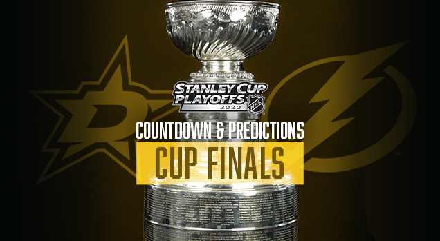
Finally, we pulled off a .500 round in the Conference Finals for our branding-specific predictions, with Tampa Bay advancing! That brings us to…*checks notes*…6-for-22. Urrrrrrm. Well, maybe our Cup Finals prediction will help us get to at least 7-for-23.
Plus, it’s the Cup Finals, so let’s rank all 23 of the match-ups from the entire playoffs! Why not? There’s so much time in-between games now, you’ve got lots of time to through long ranking lists like this. And aside from a few duds, there were a huge amount of really nice jersey match-ups in the bubble.
• More: NHL Playoffs 2020: Round 3 Countdown and Predictions
• More: NHL Playoffs 2020: Round 2 Countdown and Predictions
• More: NHL Playoffs 2020: Round 1 Countdown and Predictions
• More: NHL Playoffs 2020: Qualifying Round Countdown and Predictions
As a quick recap, here’s how this works. We’ll compare the overall branding of each series and see how they match-up. This includes the logos, alternate logos, jerseys, historical logos and jerseys, general legacy and everything else that builds a team’s brand.
But on top of that, the match-ups are going to be ranked according to which will be the best to watch from an aesthetic standpoint. Some jerseys work better together than others, and you’ll see why. After 8 post-seasons (not including 2020), we’re 62-for-120, or 51.7%.
Okay, like last time, let’s start with the worst jersey match-up from the entire 2020 Playoffs…
It seems weird to have such an iconic jersey like the Blackhawks ranked at the bottom, but it’s just not a great aesthetic matchup against an Oilers jerseys that’s too navy of a blue and too peachy of an orange. The red of the ‘Hawks and the orange of the Oilers visually compete with each other too much. On top of that, both road jerseys are kinda monochromatic and bland. Yup, I’ll say it again, the Blackhawks road jersey are overrated. They’re nice, no question, but there’s better ones out there. Their home jersey though? *chef’s kiss emoji*
• More: BTLNHL #11: Edmonton Oilers
• More: Worst to First Jerseys: Edmonton Oilers
• More: BTLNHL #7: Chicago Blackhawks
• More: Worst to First Jerseys: Chicago Blackhawks
• More: 2020 Winter Classic Jersey Countdown
Brand-Based Prediction: Blackhawks ✓
Next, I’m going with Tampa Bay and Columbus. Why? Well, there’s a lot of blue, so it’s a little bland in terms of any sort of contrast between the two teams. And the Jackets’ navy blue – looking almost like black on the TV – doesn’t help things out at all. Sure, there’s some red to break things up, but it’s also the contrasting styles of Tampa’s classic minimalist approach and Columbus’ more ’90s-inspired modern approach that clash here. Not a bad match-up at all, but not a great one.
• More: BTLNHL #22: Tampa Bay Lightning
• More: Worst to First Jerseys: Tampa Bay Lightning
• More: BTLNHL #23: Columbus Blue Jackets
• More: Worst to First Jerseys: Columbus Blue Jackets
Brand-Based Prediction: Lightning ✓
See above. It’s essentially the exact same match-up. But the Leafs had the jerseys first, so we’ll give them the edge here.
• More: BTLNHL #8: Toronto Maple Leafs
• More: Worst to First Jerseys: Toronto Maple Leafs
• More: BTLNHL #23: Columbus Blue Jackets
• More: Worst to First Jerseys: Columbus Blue Jackets
Brand-Based Prediction: Maple Leafs

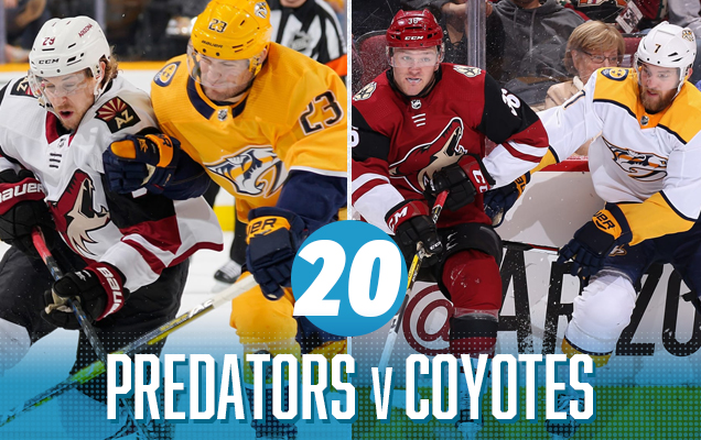
It’s probably the most unique and modern visual match-up of the playoffs, with the golden Predators against the burgundy Coyotes. Their modern jersey designs complement each other – both featuring chunkier blocks of colour paired with thin stripes – but neither jersey is particularly well-designed. The gold and burgundy is a bit aggressive visually as well, grating on the eye. Especially with those gold helmets. Still can’t get used to them.
• More: BTLNHL #18: Nashville Predators
• More: Worst to First Jerseys: Nashville Predators
• More: BTLNHL #9: Arizona Coyotes
• More: Worst to First Jerseys: Arizona Coyotes
Brand-Based Prediction: Predators
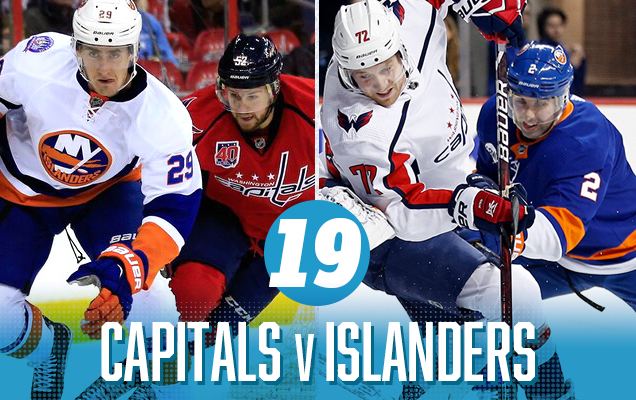
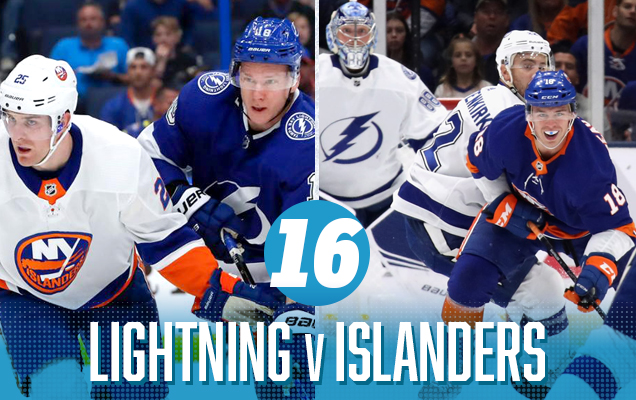
Again, not a bad matchup. It’s a classic red-vs-blue clash. But what hurts this matchup is – similar to the Bolts/Leafs-Jackets – a distinct diversion of jersey styles. The Caps use a much more modern aesthetic with thin stripes, navy blue, and minimal chunks of colour, while the Islanders have reverted (thankfully) to their classic royal blue and orange colours with large, chunky stripes and bold colours.
• More: BTLNHL #24: Washington Capitals
• More: Worst to First Jerseys: Washington Capitals
• More: BTLNHL #20: New York Islanders
• More: Worst to First Jerseys: New York Islanders
Brand-Based Prediction: Capitals
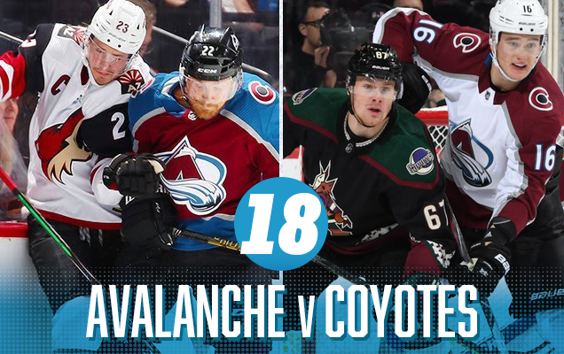
I don’t know if we’ve ever had a burgundy-vs-burgundy matchup in the playoffs ever before…and we still don’t. The Coyotes went with their Kachina-inspired black jerseys for their “home” games this playoff season, but we’ve still got a more unique and modern jersey matchup going on here. Unfortunately, there’s not a lot of colour variation here aside from the Avs bringing in some blue in their home jerseys. Otherwise, it’s black/white/burgundy, and that’s about it.
• More: BTLNHL #29: Colorado Avalanche
• More: Worst to First Jerseys: Colorado Avalanche
• More: BTLNHL #9: Arizona Coyotes
• More: Worst to First Jerseys: Arizona Coyotes
Brand-Based Prediction: Avalanche ✓

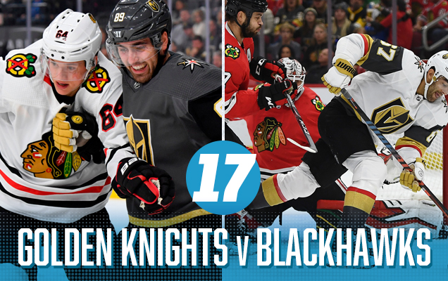
This is an instance where one of the matchups (the games “in” Chicago) are pretty great, while the other (the games “in” Vegas) are not pretty great. The matchup of Vegas’ grey/black home jerseys against Chicago’s mostly mono-chromatic road jerseys make for a relatively bland visual aesthetic. But the Blackhawks excellent home reds against a Vegas road jersey that has pops of gold and red throughout is pretty great visual. Sorry, still don’t like those white gloves though…and there definitely a competing clash of jersey styles.
• More: HbD Breakdown: Vegas Golden Knights Jerseys
• More: HbD Breakdown: Vegas Golden Knights (Logo and Alternate Logo)
• More: BTLNHL #7: Chicago Blackhawks
• More: Worst to First Jerseys: Chicago Blackhawks
• More: 2020 Winter Classic Jersey Countdown
Brand-Based Prediction: Blackhawks
Two sets of classically-designed jerseys with simple solid striping and liberal use of colours, what’s not to like? But there’s a lot of blue here, with only a bit of orange to break it up, so it comes across as a little bit basic. Don’t get me wrong, these are still two good jersey sets, but slap them together over a 7-game series and, well, there’s not much diversity to it.
• More: BTLNHL #22: Tampa Bay Lightning
• More: Worst to First Jerseys: Tampa Bay Lightning
• More: BTLNHL #20: New York Islanders
• More: Worst to First Jerseys: New York Islanders
Brand-Based Prediction: Lightning ✓
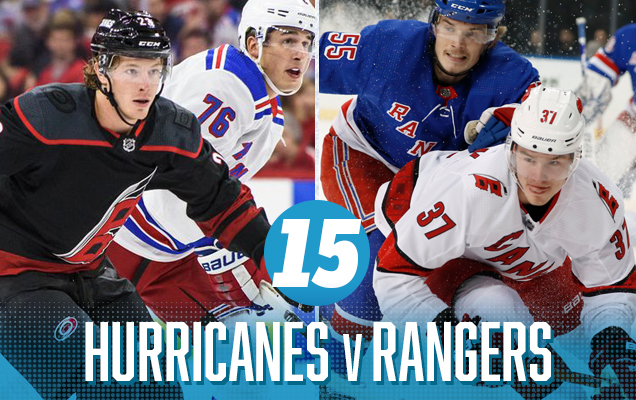
Get rid of the games in Carolina when Carolina is wearing their home jerseys, and this could be one of the best matchups of the year – and also one of the most unique with two jerseys that don’t feature a logo on the chest. While Carolina’s is most modernly-designed, the connection of the red between the Rangers and the ‘Canes jerseys makes for a visually striking matchup. It’s Carolina’s third jerseys (that they’ll be wearing for these playoffs) that drag the match-up down, make for a relatively monochromatic white-vs-black jersey matchup, although the Rangers do their best to add a good amount of colour.
• More: BTLNHL #19: Carolina Hurricanes
• More: Worst to First Jerseys: Carolina Hurricanes
• More: BTLNHL #12: New York Rangers
• More: Worst to First Jerseys: New York Rangers
Prediction: Rangers

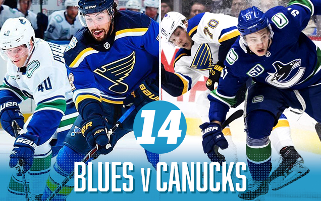
Similar to the previous matchups on this list, there’s a lot of blue here. But, these are two shades of royal blue, ensuring there’s always a burst of colour on the ice no matter who the “home” team is. Add in some burst of yellow from St Louis and green from Vancouver – as well as relatively similar jersey styles – and you’ve got a pretty good visual matchup. It’s just very blue.
• More: BTLNHL #4: St. Louis Blues
• More: Worst to First Jerseys: St. Louis Blues
• More: BTLNHL #10: Vancouver Canucks
• More: Worst to First Jerseys: Vancouver Canucks
Brand-Based Prediction: Blues
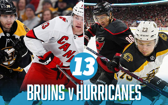
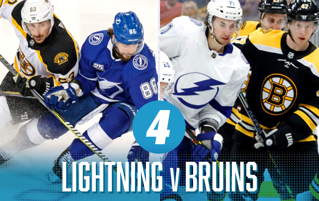
It’s not often that two black jerseys climb too high on a ranking like this, but this is more about setting a clean, contrasting canvas for the red-vs-yellow element to really pop. The Bruins have one of the best black jerseys ever, with tons of colour and contrast to give them strong visuals, and Carolina’s road whites are clean and allow the red to really come out. The games “in” Carolina are definitely the weaker of the two jersey matchups, keeping it from climbing any higher on this list.
• More: BTLNHL Finals: Boston Bruins v Detroit Red Wings
• More: Worst to First Jerseys: Boston Bruins
• More: BTLNHL #19: Carolina Hurricanes
• More: Worst to First Jerseys: Carolina Hurricanes
Brand-Based Prediction: Bruins ✓
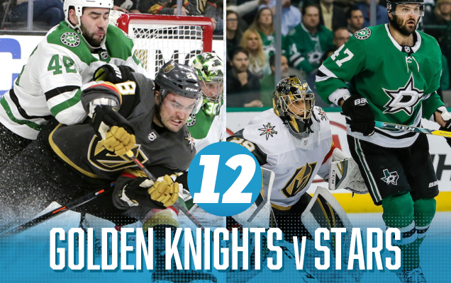
The Golden Knights don’t have a great jersey set, but for them to look good, they need to match-up against a team the brings a lot of colour to offset the mostly grey Vegas jerseys – and preferably nothing that clashes with gold. Enter Dallas. The Stars bring tons of green which set off the gold quite well. Not as nicely as Vancouver’s blue (foreshadowing!), but it still works. The styles of the jersey contrast a little bit, but there’s some diversity and visual interest happening here to get it up the list, so it gets the nod here.
• More: HbD Breakdown: Vegas Golden Knights Jerseys
• More: HbD Breakdown: Vegas Golden Knights (Logo and Alternate Logo)
• More: HbD News: New Dallas Stars Logo Leaked
• More: Worst to First Jerseys: Dallas Stars
Brand-Based Prediction: Golden Knights

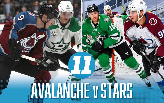
Red and green are complementary colours, which means that one works as an excellent accent against the other. But when placed beside each other in relatively equal amounts, it’s an aggressive onslaught for the eyes…in the best possible way. And while red and green makes you think of something usually not associated with the month of August, it’s less aggressive here because of Avs using burgundy instead of a traditional red. But the different styles of jerseys hurt the match-up just a touch, enough to barely keep it down here, at the beginning of a bunch of excellent jersey match-ups.
• More: BTLNHL #29: Colorado Avalanche
• More: Worst to First Jerseys: Colorado Avalanche
• More: HbD News: New Dallas Stars Logo Leaked
• More: Worst to First Jerseys: Dallas Stars
Brand-Based Prediction: Avalanche
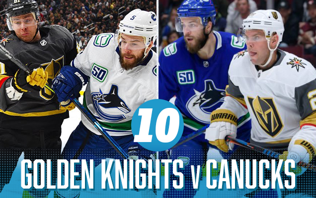
I’ll say it again. he Golden Knights don’t have a great jersey set, but for them to look good, they need to match-up against a team the brings a lot of colour to offset the mostly grey Vegas jerseys – and preferably nothing that clashes with gold. Enter Vancouver. Tons of blue and green with the blue really setting off the gold quite well. The styles of the jerseys are relatively similar too, but there’s just a bit too much going on here, with the green and red added in, to rank it any higher than this.
• More: HbD Breakdown: Vegas Golden Knights Jerseys
• More: HbD Breakdown: Vegas Golden Knights (Logo and Alternate Logo)
• More: BTLNHL #10: Vancouver Canucks
• More: Worst to First Jerseys: Vancouver Canucks
Brand-Based Prediction: Canucks
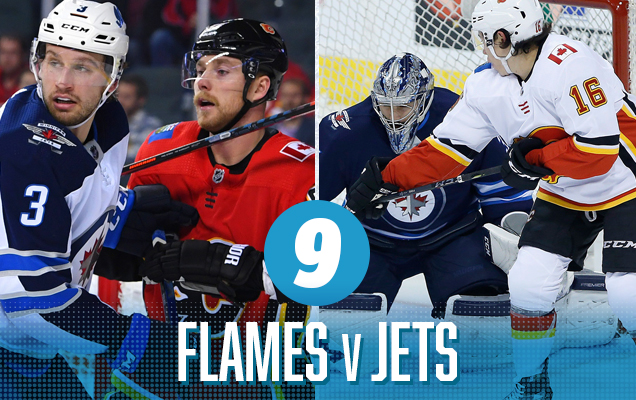
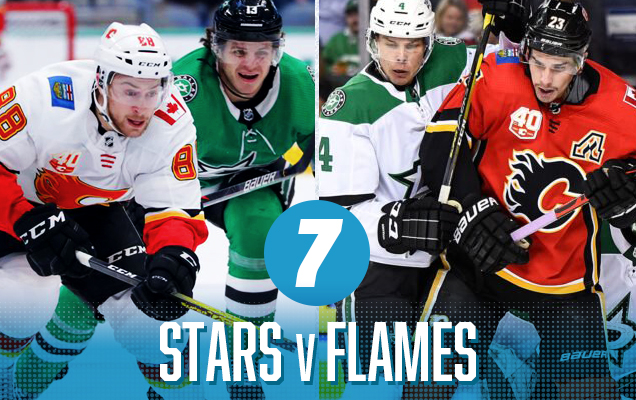
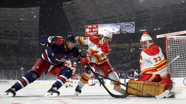
It’s another classic red-vs-blue matchup, probably the most classic of all sports jersey matchups. What helps this one is that both sets of jerseys are extremely modern and superfluous in their aesthetics, with stripes galore and they end up complementing each other because of the colour balance. But the superfluous also keeps them lower on the list, because there’s just so much going on. Now, if we could just convince them to just wear their Heritage Classic jerseys for all these games…
• More: BTLNHL #13: Calgary Flames
• More: Worst to First Jerseys: Calgary Flames
• More: BTLNHL #15: Winnipeg Jets
• More: HbD Breakdown: Jets and Sharks Third Jerseys
• More: Worst to First Jerseys: Winnipeg Jets
Brand-Based Prediction: Jets

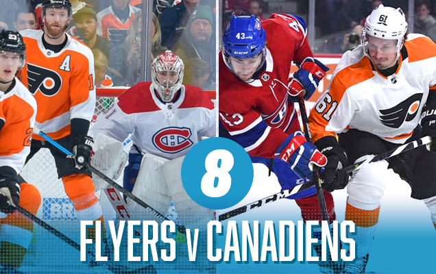
Is this 1967? Aside from the update to the construction of the jerseys (and design modifications forced by those updates), it certainly could be. While the classic look plays strong here, the clash of orange-vs-red is pretty aggressive on the eyes. There’s a lot of white (and some black) to break it up a little bit, but you definitely can’t say this is a bland visual matchup at all. Just not the most complementary.
• More: BTLNHL #3: Philadelphia Flyers
• More: Worst to First Jerseys: Philadelphia Flyers
• More: BTLNHL #5: Montreal Canadiens
• More: Worst to First Jerseys: Montreal Canadiens
Prediction: Canadiens
Again, the Calgary Flames do not have a well-designed jersey, but the Dallas Stars represent what is probably their most ideal matchup in the league from an aesthetic perspective. Both teams bring a ton of colour and vibrancy to their jerseys, and the red-vs-green sets up a clash between complementary colours as well. In equal doses, complementary colours are visually competing with each other, and that’s exactly what happens here, setting up a battle on the ice and a battle for your eyes.
• More: HbD News: New Dallas Stars Logo Leaked
• More: Worst to First Jerseys: Dallas Stars
• More: BTLNHL #13: Calgary Flames
• More: Worst to First Jerseys: Calgary Flames
Prediction: Flames
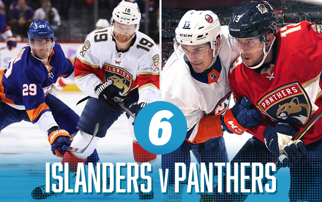
Another red-vs-blue matchup, but with significantly better-designed jerseys than the previous matchup. Despite the classic-vs-modern aesthetics on these, they both feature large stripes that complement each other. The orange-beige/gold-red combo is pretty gross, but luckily it doesn’t play a huge role here.
• More: BTLNHL #20: New York Islanders
• More: Worst to First Jerseys: New York Islanders
• More: BTLNHL #26: Florida Panthers
• More: Worst to First Jerseys: Florida Panthers
Brand-Based Prediction: Panthers
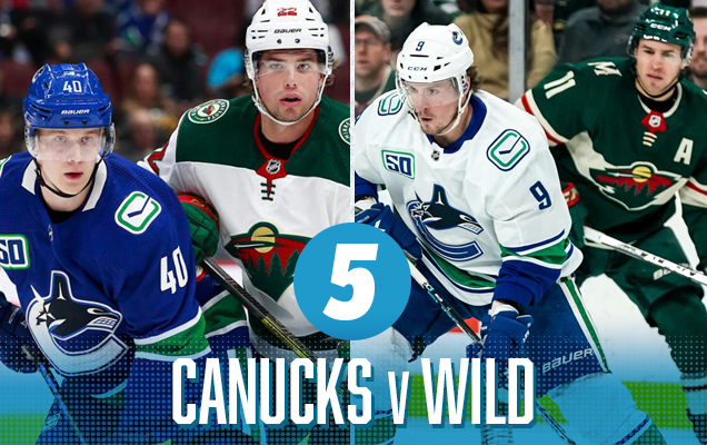
The Canucks and Wild matchup feature two of the better jersey sets in league, with a common them of green to connect them and a very cold-toned palette given some vibrancy thanks to the Wild’s red elements. It helps that red and green are complementary colours, playing off each other well here as accent colours on both jerseys. It’s a more unique colour matchup that has both modern and classic qualities to it.
• More: BTLNHL #10: Vancouver Canucks
• More: Worst to First Jerseys: Vancouver Canucks
• More: BTLNHL #16: Minnesota Wild
• More: Worst to First Jerseys: Minnesota Wild
Brand-Based Prediction: Wild
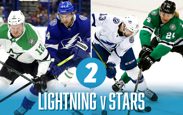
This is a a really fantastic visual match-up. Blue and gold play off each other really well, and both teams have a jersey set that has a classic style to them, with Tampa’s being the more minimalist. Mix in a lot of contrast with healthy amounts of black and white (too much maybe for games “in Boston”), and you’ve got a simple, classic, and great-looking match-up.
• More: BTLNHL #22: Tampa Bay Lightning
• More: Worst to First Jerseys: Tampa Bay Lightning
• More: BTLNHL Finals: Boston Bruins v Detroit Red Wings
• More: Worst to First Jerseys: Boston Bruins
Brand-Based Prediction: Boston
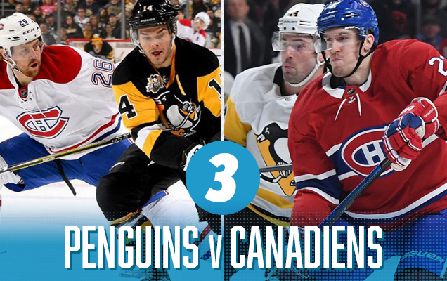
It’s a primary colour explosion! With red, blue, and yellow all playing prominent roles here, it’s a visual matchup that smacks you across the face…but in a good way! All the colours are fairly balanced, and the heavy inclusion of black and white help tone them down enough that they end up complementing each other instead of fighting for attention. And they’re two of the best jersey sets in the league too.
• More: BTLNHL #6: Pittsburgh Penguins
• More: Worst to First Jerseys: Pittsburgh Penguins
• More: BTLNHL #5: Montreal Canadiens
• More: Worst to First Jerseys: Montreal Canadiens
Brand-Based Prediction: Canadiens ✓
It’s the first blue vs green Cup Finals since 1981’s Islanders vs North Stars. And it’s pretty glorious, especially since neither team brings any other colours to the table, and the use of green and blue is extremely liberal, even on the white versions, relatively speaking. And their jersey styles are complementary: modern aesthetics based on classic styling. It’s really a great match-up, just a little bit on the cool side. If they were complementary colours though (foreshadowing!)…
Tampa Bay Lightning Visual Brand: Decent logo, pretty good uniforms, and a disastrous jersey legacy featuring some of the worst things that ever graced the ice, not to mention their latest addition to a Bolts third jersey library of horrors. Despite all that, they’ve embraced a superior classically inspired minimalist aesthetic overall and have mostly held to that.
• More: BTLNHL #22: Tampa Bay Lightning
• More: Worst to First Jerseys: Tampa Bay Lightning
Dallas Stars Visual Brand: Their jerseys are really nice (and their recent Winter Classic jerseys don’t hurt either), but for everything else, they’re pretty average. They have a good, but not great logo, and a visual legacy that includes some truly iconic jerseys, but also the mooterus. It’s a decidedly mixed-bag.
• More: HbD News: New Dallas Stars Logo Leaked
• More: Worst to First Jerseys: Dallas Stars
Prediction: Lightning in 7 (in 2OT)

Another match-up of complementary colours, this time featuring blue and orange against each other. And these two jersey sets bring tons of colour to their jerseys, with the orange working as a thread to visually connect the two, and lots of white to add some contrast. It’s bright, aggressive, colourful, and the best matchup from the entire 2020 playoffs. Now, if they would just let them go colour-vs-colour jerseys…
• More: BTLNHL #3: Philadelphia Flyers
• More: Worst to First Jerseys: Philadelphia Flyers
• More: BTLNHL #20: New York Islanders
• More: Worst to First Jerseys: New York Islanders
Brand-Based Prediction: Flyers
Agree? Disagree? Let us know in the comments below or join the conversation on Twitter, Facebook, or Instagram!


:format(jpeg)/cdn.vox-cdn.com/uploads/chorus_image/image/47015794/GettyImages-55882140.0.jpg)
/cdn.vox-cdn.com/uploads/chorus_image/image/66013298/usa_today_13861689.0.jpg)
Leave a Reply