
Worst to First Jerseys: Vancouver Canucks
As we go through the 2019-20 season, we’ll be updating all of the Worst to First Jersey posts every Monday, as almost all the teams in the league have unveiled new jerseys since their original posts. We’ll start with the ones most needing updating and work our way through the league. Today, it’s time for the Vancouver Canucks to get updated.
Also, a huge thanks to SportsLogos.net and NHLUniforms.com for most of the jersey images and references.
Ah, my beloved Canucks. Any reader of my blog knows that I’m a die-hard Canucks fan. After 50 years and counting of Stanley Cup futility, they haven’t always been the easiest team to cheer for, and the same goes from a jersey perspective. There’s some pretty horrid jerseys that they’ve played in, and have generally been reviled as having one of the worst jerseys to ever grace the ice, but I love them anyway.
Here’s how this works: I’ll count down, from worst to first, all the jerseys the Canucks have ever worn. Homes and aways will be lumped into the same category (so, more of a jersey “era”) and I won’t worry about small changes (like slightly changed positions of piping for example). Third jerseys will stand on their own. And I’m focusing on the jerseys only, not the entire uniform. The jersey images are compliments of the fine people over at nhluniforms.com. For the Canucks, there’s ten different jerseys/eras. And we’ll start with the worst one:
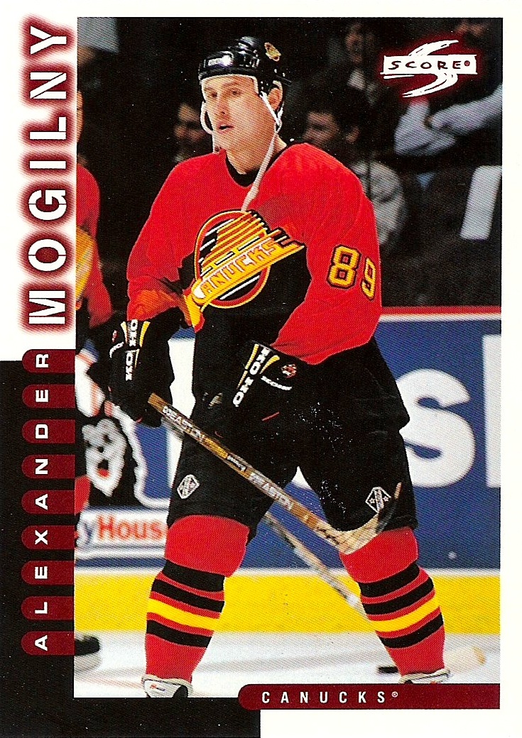
10. 1995-97 Third Jerseys
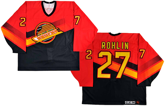
You were probably expecting the ’80s-era “Flying V” jersey was going to be at the bottom, as most people who do the “worst jerseys of all time” blog posts list that one near the top. But you’d be disappointed. That jersey does not compare with the horridness of this one.
The Canucks were one of the first teams to be part of the first NHL third jersey program, and almost every single jersey that came from that first batch were pretty awful. It’s the worst jersey the Canucks have ever come up with, but it wasn’t even close to being the worst one of that initial third jersey program. Thankfully, third jerseys have gotten better. Okay, not always.
Back to the Canucks, what makes this jersey so bad? It’s a combo of the logo and the jersey. The skate blade logo at the time is one of the most complex and detailed logos in the history of the league. I counted 18 separate and distinct lines going in the exact same direction. Some window blinds have less uni-directional lines. It’s excessive and obnoxious. So, the obvious thing to do is throw in a couple more lines on the jersey, amirite?
I’m assuming that the shape of the lines on the jersey is meant to both “accentuate” the lines on the logo and, given the shape of a V, give some sort of homage to the old Flying V jersey. If you’re going to do a giant V on a jersey, don’t pull a Mason Raymond and go around and around the zone. Be Todd Bertuzzi* and charge for the net.
*Punching people in the back of the head and pushing them to the ice not recommended.
But part of the problem is also the placement. Putting those extra black and yellow lines right underneath the logo makes an already confusing logo even more visually complicated. The uniform also removes some of the things that make hockey jerseys distinctive and great, like the piping on the sleeves, shoulder and the bottom of the jersey.
And giving the lines a gradient fading out on both sides is, well, pretty ’90s and there’s a reason why it’s rarely seen in sports uniforms. It’s ugly. Fugly even. Which is real ugly. Very, very ugly. The gradient lines look weak, awful on the back, and just awkward on the sleeve. I could go on, but I’ll stop there, because this jersey is just awful.
Jersey Recommendation: #89 Mogilny. Like the jersey, he wasn’t with the team for very long, and always kind of felt out of place.
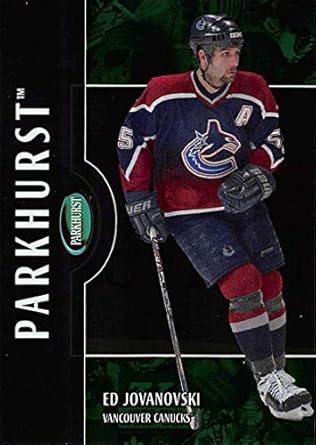
9. 2001-07 Third Jerseys
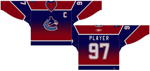
Speaking of gradients, here’s another jersey that featured one. In a non-dramatic twist of non-irony, it’s the second worst jersey in the Canucks history. The gradient is treated slightly better than in the previous jersey, as it’s more of a background feature than being more integral to the overall design. But it’s still a gradient of red to blue, and it looks like one of those fake electric fireplaces. It’s like their shirts are on fire, which could cause some shock and alarm, but really, don’t worry, there’s no rush to put it out.
The gradient also dates the jersey badly. The bigger problem, though, is that the lighter blue on the logo (theoretically, the primary colour of the Canucks logo scheme) is featured nowhere on the jersey, so the logo suddenly looks awkward and out-of-place, like that feeling you got in high school all the time.
A few other things: The dark blue is too dark, and watching it live makes it look more like black than a real colour. Also, like the previous jersey, a V is incorporated into the design, this time on the sleeves. It’s pretty half-assed again (go Bertuzzi, not Raymond), and it makes the sleeve numbers slide way too far down, like they just enjoyed the Insano waterslide.
Jersey Recommendation: #55 Jovonoski. Offensive defenceman for an offensive jersey.

8. 1985–89 Home and Away Jerseys
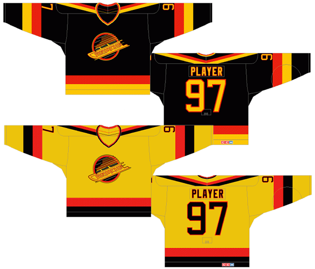
I like the black road jerseys. I like them a lot. It’s got thick burnt orange and gold stripes that add a lot of brightness to a black jersey (which is the only way that black jerseys really work well). But they’re not perfect. The shoulder piping is awful (again a V!) as it doesn’t fit with the rest of the jersey at all. The V in there is still drawing on the jerseys immediately preceding these ones, the (in)famous Flying Vs, but on this jersey, they basically clipped its wings and made it look awkward and out-of-place.
But otherwise, it’s a pretty solid jersey, doing what it can with overly aggressive colours and (as previously talked about) a mediocre and complicated logo.
But the golden home jerseys. Yikes. So much of that golden colour makes it look more like a mustard yellow. Without enough black or (any) white on the jersey, there’s nothing to break up the aggressive gold and burnt orange colours and it becomes a jersey worthy of Woodstock – a muddy mess. Just ask the Steamer. He just saw his reflection in the glass in this photo.
One thing I’ve never understood about the use of this logo on the jerseys is the space inside the “C” and between all the letters in “Canucks”. On the home jersey, it’s filled in with the same mustard yellow colour, but instead of going black on the road jerseys, it’s left the same yellow colour. Weird.
As an addition, we had a great comment on the original post about these jerseys. Here’s what Michael McKenney said:
Just a quick shout out to the Canucks 1986-89 jerseys.
The Golden Skate logo was used on both home and road jerseys, so the black jersey did have yellow behind the word “Canucks”. (I wish it was white, it would have been easier to read the word “Canucks” in the logo. In fact, in 85-86, the yellow embroidery in the crest was a brighter yellow that the mustard yellow color in the jersey. This was fixed a year after.
And the color secondary color the Canucks used was always orange from 1978-1992. It was technically called “burnt orange” by the CCM company, and was slightly darker than the same color orange used today. Too many pictures from the 80’s Canucks make it look red.
I happen to own 2 Canuck jerseys from the 80’s. A Garth Butcher black for 83-84 flying V and a Frank Caprice sunflower yellow from 1986-87. Pictures don’t do these jerseys justice! Yes, even the yellow one looks nice, when not under the harsh florescent light of a hockey arena and skating on white ice.
So maybe the yellow looks that much better in-person than in photos. But, they’d still get placed here in 8th.
Jersey Recommendation: #9 Tanti. Arguably the best player on the team during this era. And although he was great, most don’t remember him which is pretty sad. Get the home jersey. If you’re gonna be bad, just go all out.
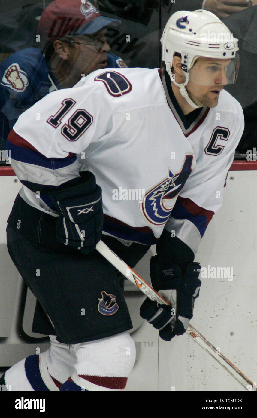
7. 1997-2007 Home and Away Jerseys
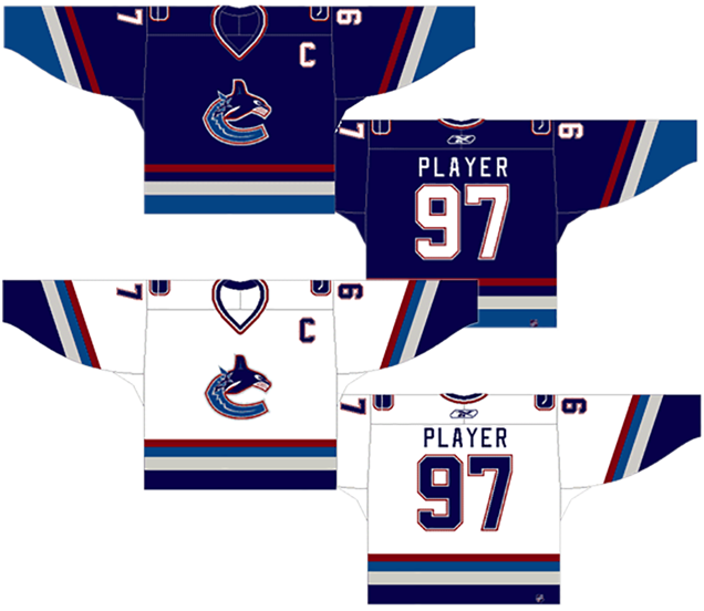
We’re getting into the middle of the pack, so there’s good and bad things to talk about. A couple of the things that I mentioned about the third jersey during this era holds true for these jerseys. Mainly, that the navy blue on the home (dark) jerseys are so dark that it looks black during the games. If you’re going to have a colour, make sure it can be seen as a proper colour. The Canucks are not the only ones guilty of this. The Jackets, the Jets, and many others have done the same thing, so it’s not exactly a new problem.
I’ve never liked this iteration of the logo either, or more specifically, it’s colour scheme. The darker blue is too dark (or just make it black if you want to put an orca on there), the lighter blue is too placid and needs to be more aggressive. The grey is, meh, well, grey. But the red just never made sense to me. For one, it’s more of a calming maroon colour when matched with the blues. In the ’80s, it was a super-fiery burnt orange. In the ’90s, it was more of a deep blood red. In this logo/jersey, it’s a bluish-maroon red. Doesn’t have the same impact.
Also, what’s with the orca’s bleeding gums?
The colours come across as too soothing and not being aggressive enough, and that carries over into the jerseys of course, because having a jersey that’s different colours than the logo is just crazy. Aside from what I mentioned about the home (dark) jersey being too dark of a blue, the road (white) jersey looks pretty sharp. The contrast of the white against the darker colours makes everything jump out a little more.
For both jerseys, the piping is a little strange, using different widths of stripes and being a little stripe-heavy (seriously, 4 stripes, do you need that many?) but way more refined than some of the predecessors on this list so far. It’s like this jersey continuously brings back books late to the library.
Fined over and over. Re-fined. Get it? Ba-dum-ching.
Jersey Recommendation: #19 Naslund. This was his team while they wore this sweater and the West Coast Express was dominant at the time. Wear it with pride in the road whites. Or get a #11 Messier if you feel like getting beat up.

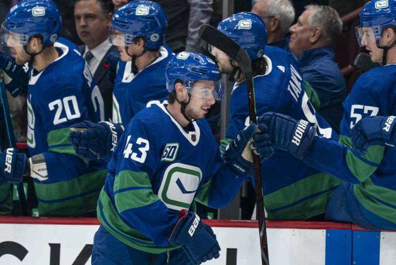
6. 2019–present Heritage Jersey
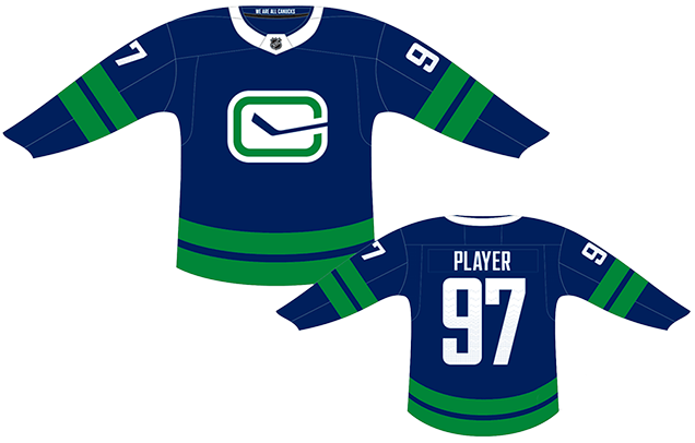
This year, the Canucks unveiled a brand new third heritage jersey, and their first unique third jersey since 2006. The thirds from the last decade or so were basically just the home blues with the stink-in-rink logo replacing the main one, but this is an obvious departure from that.
• More: HbD Breakdown: Vancouver Canucks 2019 Jerseys
Here, the visual contrast between the new and improved stink-in-rink logo on a blue background really works, as it’s meant to be the focus of the jersey. The green “C” looks is more dominant and looks great, the removed silver outline gives it an elegant simplicity.
But the contrast between the white and blue is almost too much given that it’s not balanced elsewhere on the jersey aside from the overly-prominent white on the uber-thick Adizero collars. Because of this lack of balance, the rest of the jersey – the minimalism, the green stripes – falls flat.
The two thick green stripes that are used on the sleeves and the bottom of the jerseys are a callback to the Canucks’ original jersey design. In concert with using a modified stick-in-rink logo, this is an attempt to modernize those originals to celebrate the 50th anniversary, using the old as a foundation to make something new.
It’s not bad, and it looks better during game play than not, but it’s still missing some contrast below the new-and-improved logo crest.
Jersey Recommendation: #43 Hughes. Not sure why, but I just associate these jerseys with Quinn Hughes. New, interesting to look at, different, and he’s arguably the most exciting defender the Canucks have ever employed, so it’s not like he’s a bad choice either.
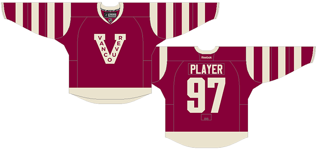
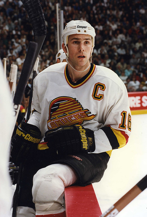
5. 1989-1997 Home and Away Jerseys, 2019–present Third Jerseys
No non-physical substance intoxicates the mind more than nostalgia. These jerseys have made a comeback this year in celebration of the Canucks’ 50th anniversary to the rabid pleasure of the fan base (#freetheskate). But let’s take these jerseys outside of their 1994 context. They’re…okay.
• More: HbD Breakdown: Vancouver Canucks 2019 Jerseys
Everything bad that I had mentioned about the 1985-89 jerseys previous pretty much got fixed with these jerseys. The V-shaped piping is taken off the shoulders, the mustard yellow is removed from the home jerseys and replace with a crisp white that really makes the logo stand out a lot better.
Other things: the piping is refined slightly, with the different widths of coloured stripes so it’s not quite as aggressive. Halfway through this era they also changed the red from an orangey-red to a deeper blood red, which works really well. The jersey isn’t as bold as the previous version, but it’s still got the bright dominant colours to be an eye-catching jersey.
They used white behind the “Canucks” on the logo on the road (black) jerseys, which is an odd choice (that they continue to use). So I photoshopped it into a jersey to see what it looks like. It simplifies and opens up the logo a little more and actually makes the word a little more legible on the jersey. But refinement and minimalism was not exactly a trademark of the ’80s and ’90s.
Beyond that, they’re just bland. The bright red/yellow stripes help balance the white and black backgrounds, but the stripes are pretty standard and nondescript. Aside from a weird overly-complicated logo, there’s nothing about these jerseys that make them stand out.
They’re not close to being the best the Canucks have ever worn. But it’s so wrapped-up in positive nostalgia that it’s difficult to convince some otherwise, and they’ll probably sell like crazy now that they’ve been brought back.
Jersey Recommendation: #16 Linden. Get it in the superior home whites (don’t @ me). If you want, sprinkle some blood on it and go hug a goalie and recreate this iconic picture. Or get the #10 Bure in road black and recreate this moment over and over and over again.
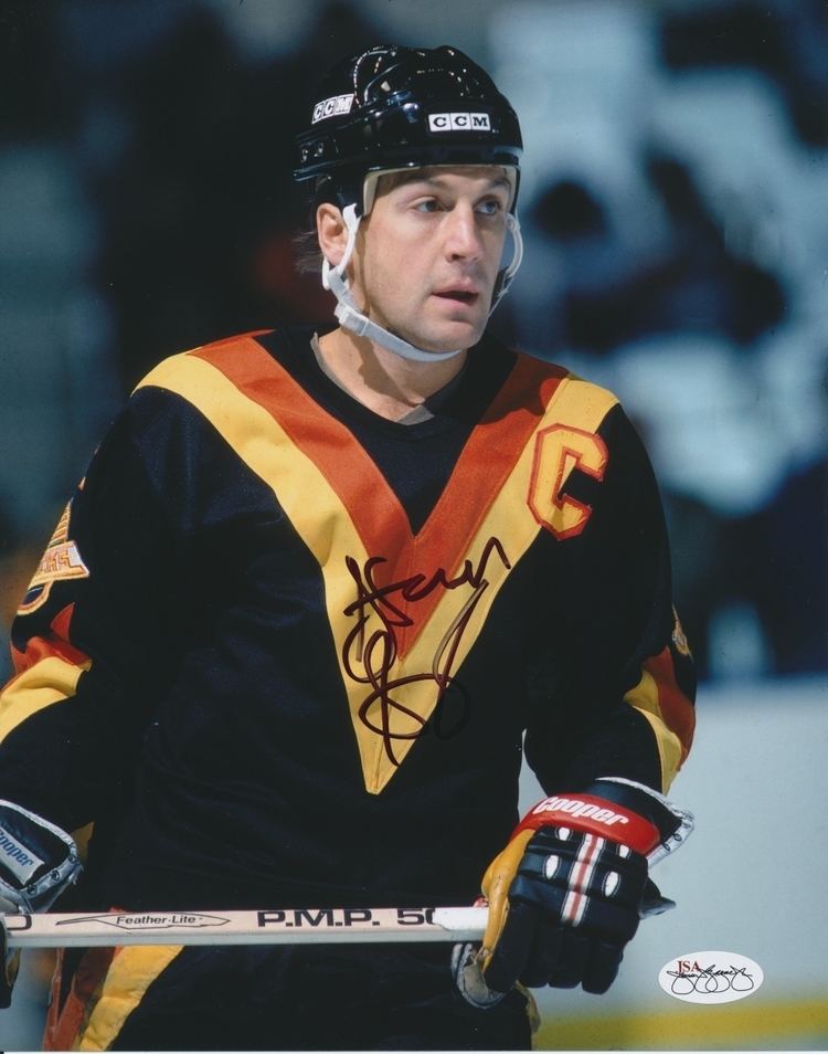
4. 1978–1985 Home and Away Jerseys
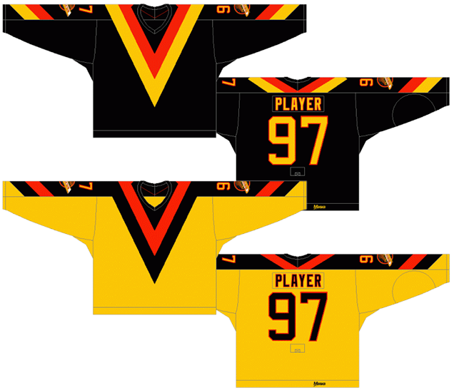
Wait, what? The Flying Vs this high? I’m sure I’ll get some disagreement on this one, but there has arguably never been a more distinctive and unique jersey in all of hockey as this one. There are two people wearing this jersey in this photo of the crowd at Rogers Arena. My guess is you can find both of them within about 8 seconds. Yes, it’s garish and sticks out and is totally weird, but that’s what makes it absolutely great. (And they looked just as great as last Saturday.)
For the home jerseys, I hated on the mustard yellow jersey from the era immediately after this one, but it works better on this jersey because it’s broken up by the massive black and red V on the front. That being said, I still like the road jerseys better, as the contrast of the black makes the massive gold and red V come out and visually punch you in the face.
From a design standpoint, the simplicity of it is really stunning. You have strength, you have movement, you have aggressiveness. There’s even a certain gracefulness to it and its incredibly distinctive. The lack of piping along the bottom of the jersey doesn’t bug me at all, as it would just take away from the awesome simplicity of the V. It’s the greatest thing going for this jersey.
And it’s incredibly unique. Not many teams – before or after – moved their main logo to the arms to make way for what’s essentially a design element. I would’ve loved to be in those meetings between the designers that created it and the team, because they must have done an incredible Don Draper-style selling job on it. Getting teams (or any company for that matter) to break the mold and try something completely new is not an easy task.
I’ve heard the design firm said the V stood for Victory, not Vancouver. Obviously, they weren’t familiar with the Canucks at all, that they were from a place called Vancouver and that by 1978 they hadn’t really been Victorious in much of anything.
In the last couple years they used these jerseys, they moved the numbers that were at the very bottom on the sleeves (near the wrists) to the top (near the shoulders) which was definitely a good move. And personally, I’d get rid of the V on the arms altogether. Just have the giant V on the front, with the main logo and numbers on the sleeves. Done. Simple, distinctive and in-your-face. Now, the whole uniform, with Vs on the pants as well, is awful. All the simplicity is lost.
Anyway, you can now roast me in the comments section below.
Jersey Recommendation: #35 Brodeur. The King was the only reason the Canucks got a sniff of the Stanley Cup in 1982, becoming the franchise’s first star goaltender. Of course, a #12 Smyl wouldn’t be bad too. Either way, get the black jersey though. The gold is still a little gross.

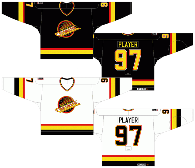
3. 1970–1978 Home and Away Jerseys, 2006–07 Third Jerseys, 2008–17 Third Jerseys

I lumped all of these together into the same grouping because aside from some slight colour switches and piping changes, they’re essentially the same jersey. The most notable (and best) alteration was the “V” on the sleeves from 1970–72.
And finally, you have a jersey with colours that aren’t too dark and/or too soothing – like during the late ’90s and early ’00s – but still bold and aggressive without being incredibly intense – like during the ’80s and early-’90s. Plus, the colours actually make sense with the location of the team (blue ocean and green trees) and they look great on a jersey. What’s not to like?
Well, I’ll tell you. For one, and I realize I may be in the minority in this, I don’t like the logo. Or, at least, I don’t like the logo as much as some other people like the logo. Sure, I like the extreme simplicity of it, and the clever use of the stink/rink to make a C, but if you have read my discussion of logos over during the BTLNHL Countdown on this site, you’ll know that a hockey logo needs movement and aggressiveness to it, as those are key attributes to the game of hockey. This logo is seriously lacking in both of those aspects. The third jersey that the team wore from 2008–17 has a slightly altered version of the logo, but the new third/Heritage jerseys have the best iteration of them all.
But seriously, that’s pretty much my only beef with this jersey. The blue is rich and gorgeous, and the amount of green on there balances it out perfectly. The piping is well designed, especially on the home whites. The road jerseys have a bold colour (instead of something like black, which isn’t nearly as interesting). I’m not crazy about the reversed out logo in this case, as it’s too dominantly white, but again, that’s more a beef with the logo than the jersey.
Jersey Recommendation: #7. André Boudrais was the first offensive star the Canucks had, as well as being a defensive specialist. He was the Canucks’ Bob Gainey and Guy Lafleur rolled into one, although not as proficient obviously. I’d get it in the home whites, but the road blues would look good too. And don’t put the name on there, as those weren’t included until 1977, after he had left the team.
2. 2012–2015 Alternate Jersey, 2014 Heritage Classic Jersey
These are awesome specialty jerseys. Full stop. They are not awesome full-time jerseys, or even regularly-used third jerseys. Their style is just too unique today, and too historical-looking to fit in with the general aesthetics of today’s NHL – which is not surpising considering the Millionaires stopped playing in 1922.
• More: Heritage Classic Jersey Countdown (2019)
It’s pretty incredible how true they remained to the original jerseys, as they really are almost exact replicas from what was worn by the only team based in Vancouver to have won a Stanley Cup in 1915. Yes, the logo is weird in the sense that nobody except for some Asian countries reads up to down, and absolutely nobody then reads down to up. And the font’s in Helvetica, which is a great font for readability, but has no character at all when placed on a hockey jersey. But the simplicity and ballsy bizarreness of it – as well as understanding that it was designed in a total different era where you could get away with weird things like this – makes me totally okay with it.
Aside from that, I love the simplicity of the uniform in general. One colour and white, which is what the Maple Leafs have been thriving on and succeeding with for decades. The stripes on the sleeves is a common aesthetic for the early days of hockey and it’s actually done quite well in this case.
It’s also pretty much the only currently-used jersey that I know of that doesn’t use numbers on the sleeves during game play. I’m assuming it’s a league-regulted thing that they allowed for special circumstances, which is why it’s probably only allowed to be used infrequently. But that could also be because they’ve never won wearing them either, losing to the Red Wings, Senators (in the Heritage Classic) and the Avs.
But it’s still awesome and, hopefully, we’ll see them worn on the ice again.
Jersey Recommendation: #1 Luongo. Or is that just trolling? #14 Burrows. He scored only 6 seconds into the game against the Red Wings the first time the Canucks wore these jerseys. And it was all downhill from there. Hmmm…maybe #6, for Silas Griffis, the captain of the 1915 Cup winning team.
1. 2007–present Home and Away Jerseys
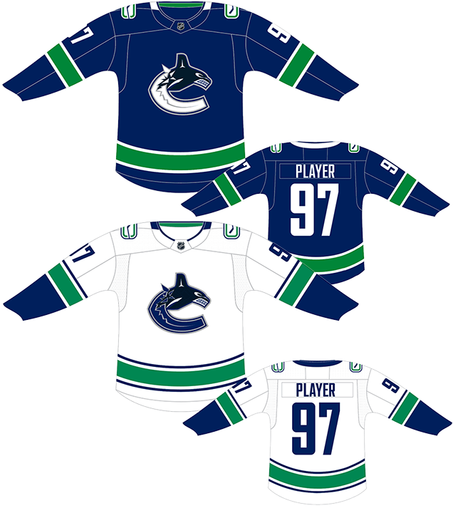
The best jersey the Canucks have ever worn is their current one, and it’s not particularly close. It took all the right elements from their historic 1970s jersey and mixed it with the current logo. And the logo’s colours were simplified and refined, getting rid of that sleepy red colour and deepening the lighter blue colour.
Sure, the logo might be a little bit ’90s, but the foundation for a really strong logo is right there and with some tweaking/refinement, could challenge for one of the best in the league.
More: BTLNHL #10: Vancouver Canucks
All of the Canucks’ previous jerseys (and the jerseys of every single other team) used the generic angled-off square font for the numbers and names on the back. It took until 2007, but they picked a great font called Agency, a font professionally created, versatile and well-suited to the constraints of a hockey jersey (it’s narrow), so that if this anyone like this Swedish player joins the Canucks, it’ll work.
Typography aside, it’s an awesome jersey. I wasn’t sold on the original inclusion of “Vancouver” above the logo, until I realized that it’s an homage to the Canucks’ WHL jerseys. Visually speaking, this year’s version without the text is stronger though, and the whites are legit one of the best road jerseys in the game today.
The balance and green and blue – a unique combination within the league – is perfect, and the amount of white used gives some strong contrast to the jersey. The striping patterns are relatively standard but it still has some depth and it’s definitely more visually interesting than some of their predecessors.
This is a great jersey, don’t let anyone tell you otherwise. And it deserves to be slotted at the top of list.
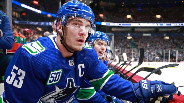
Jersey Recommendation: #33 H. Sedin or #22 D. Sedin. These guys were once-in-a-generation phenoms. Seriously, no two players in the league (ever?) have played this well for so long and so consistent as a two-some, and they’re the best players to ever wear any Canucks’ jersey. If you want something more modern (sans “Vancouver” on the front), the obvious choice is #40 Pettersson, but #6 Boeser or #53 Horvat aren’t bad choices either.
Agree? Disagree? Let us know in the comments below or join the conversation on Twitter, Facebook, or Instagram!


How come nobody understood the original logo? (70-78) The stick was the “V” and the rink was the “C”. It was very subtle. Too subtle actually. When they came into the league, the Canadians were THE team. They had to compete with that Habs classic logo that endures to this day. In my opinion, they tried to at least mimic the classic Habs logo.
They failed. It was too good. Nobody got it. All people saw was the stick in a rink when in all actuality it was a V and a C. When they updated the original logo on the heritage jersey they slanted the stick, I mean the V so you could finally tell that it was a V and a C and still nobody got it. In my opinion it was one of the best logos that never received the recognition that it deserved.
[…] • Rating the all-time jersey designs of the Vancouver Canucks. [Hockey by Design] […]
[…] • Ranking the all-time jersey designs of the Vancouver Canucks. [Hockey by Design] […]
Uhm… There’s 5 Flying Vs in that pic:
1: Yellow, directly above the large rally towel in foreground
2: Yellow, sitting about mid-way up lower bowl, roughly above the “NHL.com”
3: Black, kid sitting at the glass above Cody Glass
4: Yellow, 2/3 way up lower bowl, waving rally towel, roughly above Sedin twins
5: Yellow, facing to left about mid-way up lower bowl, above the camera guy
Good eye!
[…] • More: Worst to First Jerseys: Anaheim Ducks• More: Worst to First Jerseys: Vancouver Canucks […]
I see “three” in that photo with “V’s” (two home and one away) 😉
[…] • More: Worst to First Jerseys: Vancouver Canucks […]
[…] • More: BTLNHL #10: Vancouver Canucks• More: Worst to First Jerseys: Vancouver Canucks […]
[…] • More: Worst to First Jerseys: Vancouver Canucks […]