
HbD Breakdown: Vancouver Canucks Jerseys
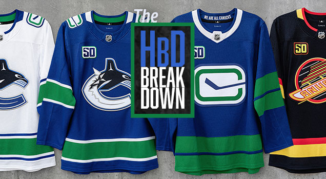
Draft day usually means a bunch of different jerseys get unveiled, but this year, it was only the hosts in Vancouver taking the opportunity to showcase not just a single new jerseys, but four brand new (kind of) jerseys they’ll be wearing for the upcoming season in commemoration of their 50th anniversary. And we’ll break them down, right after the jump.
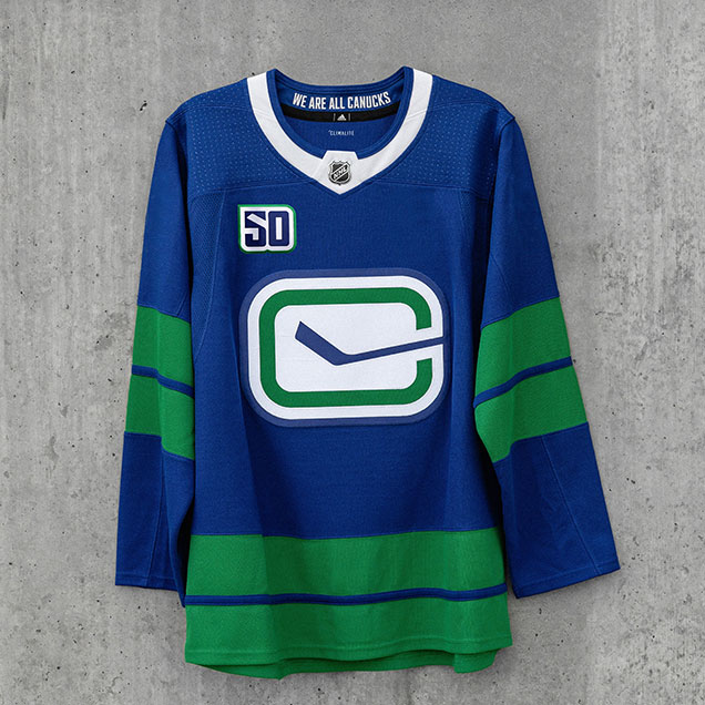
The Homes

There are really only two changes here from their previous home jerseys: (1) the removal of the word “Vancouver” arching over the orca logo, and (2) the inversion of the stink-in-rink shoulder patches.
Although I never had a huge problem with the inclusion of the “Vancouver” over the crest originally – as it was a homage to the team’s WHL days immediately prior to joining the NHL in 1970 – its removal here is definitely an overall positive. It’s less cluttered and allows the logo crest itself to be more prominent place on the jersey.
• More: BTLNHL #10: Vancouver Canucks

But, it also makes the jersey less distinctive, because the rest of it has pretty bland, minimal striping, and that’s about it. Or maybe I’m just not used to seeing the “Vancouver” on there. Like everyone hating Facebook whenever it changes a single thing and then forgetting about it two days later, it sometimes takes time to adjust.
The other change is inverting the shoulder patches from a white stick in a blue rink to a blue stick in a white rink.

In a vacuum, the new version of the alternate logo/shoulder patch is better: cleaner lines, more minimalist, the green “C” is stands out more, the silver is removed.
On the home blue jerseys though, the predominantly white patches on a blue jersey is too high of a contrast and demands too much attention. The eye naturally wanders up to the shoulders because of it, which is not where the focus of the jersey should be.
The Aways
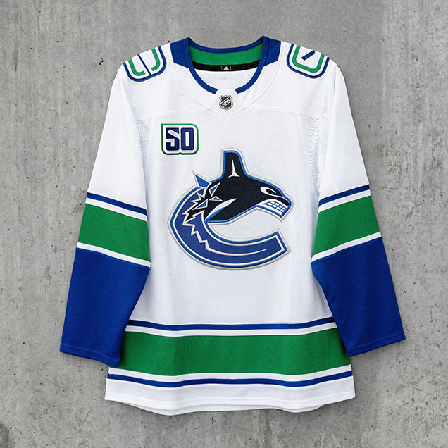
Just like the Home jerseys, there’s only two changes here: the removal of “Vancouver” and the inverted shoulder patches.
For “Vancouver”, its removal is an even greater positive here, as the rest of the jersey has more characteristics to it compared to the blue home jerseys. The striping patterns are a little more complex and the solid blue cuffs give it some weight and balance. The newly-missing text isn’t really even missed at all.
And the patches look better here too, as the white patches on a white jersey is less distracting overall, and it even matches the rest of the stripes on the jersey with a blue-white-green-white-blue pattern.
All the changes here are great. And one of the best (and probably most underrated) road jerseys in the league just got better.
• More: Worst to First Jerseys: Vancouver Canucks

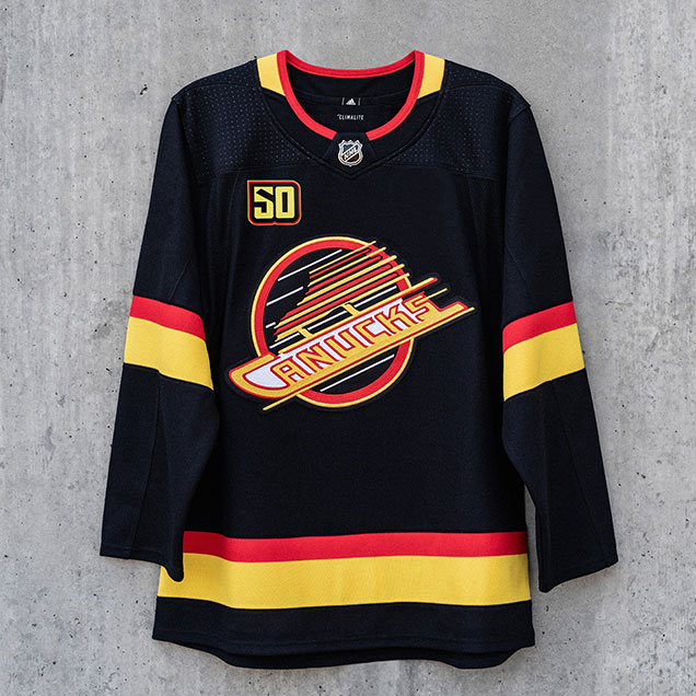
The Thirds
Of all the four jerseys the Canucks unveiled, this is the only truly new one with no elements from last year’s jerseys that form the foundation of this one. Last year’s thirds were basically just the home blues with the stink-in-rink logo replacing the main one, but this is an obvious departure from that.
Here, the visual contrast between the new and improved stink-in-rink logo on a blue background really works, as it’s meant to be the focus of the jersey. The green “C” looks is more dominant and looks great, the removed silver outline gives it an elegant simplicity.
But the contrast between the white and blue is almost too much given that it’s not balanced elsewhere on the jersey aside from the overly-prominent white on the uber-thick Adizero collars. Because of this lack of balance, the rest of the jersey – the minimalism, the green stripes – just falls flat.
The two thick green stripes that are used on the sleeves and the bottom of the jerseys are a callback to the Canucks’ original jersey design. In concert with using a modified stick-in-rink logo, this is an attempt to modernize those originals to celebrate the 50th anniversary, using the old as a foundation to make something new.
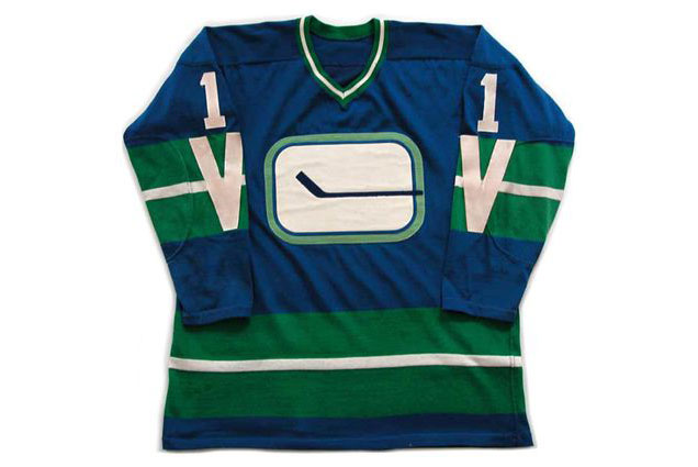
But the originals include a thin white stripe between the two green thick ones to balance out the high contrast created by the logo crest. Also, the Vs on the sleeve stripes were always one of my favourite parts of these jerseys, albeit I’d like to see them more subtle – in blue, for example, so they become negative space, like in the original white jerseys.
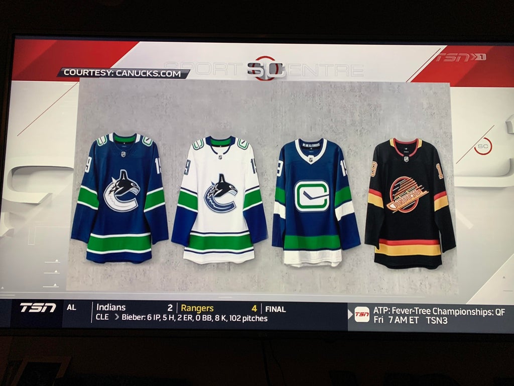
I’ve already seen multiple edits on social media by other designers that improve the balance of the jersey overall, and all the successful ones involved being white included elsewhere. One even made it onto TSN as the “official” jersey.
These thirds are a good attempt to modernize an old jersey, but the lack of balance throughout the jersey make these the weakest of the group so far.
The Black Skates
This jersey’s inclusion is a pure nostalgia circle jerk. It was voted in by the fans last season to be included, and with this one being the easy winner, the Canucks delivered on their promise by re-releasing the jersey that best symbolizes their 1994 Cup Finals run.
Aside from modifications to accommodate for the Adizero collar (which was handled pretty well, with consistency to the sleeve stripes), they’re pretty much identical to the originals that they wore back then.
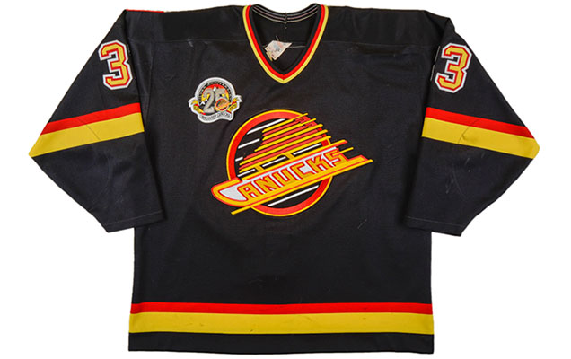
This may be sacrilege to say in some Canucks quarters, these jerseys are just okay. It features a not so great logo. They’re not close to being the best the Canucks have ever worn. But it’s so wrapped-up in positive nostalgia that it’s difficult to convince some otherwise, and they’ll sell like crazy. Visit our Canucks’ Worst to First Jerseys post for a more detailed explanation.
The one thing about these jerseys that has always driven me nuts is the white around the “Canucks” in the logo, which makes zero sense as they’re presented as negative space in the skate blade. I fixed that. Better?
For a 50th Anniversary celebration, sure, let’s bring back the most nostalia-induced loved jersey in the Canucks history, and let the fans revel in seeing players like Pettersson and Hughes wear jerseys the fans watched as kids (if they’re even old enough for that).
Let’s just assume though, that come their 51st Anniversary, they’ll be dropped once again.
Final Verdict

The new road whites are awesome. Small improvements were made to one of the best road jerseys in the league.
The new home blues are a small improvement. It was more of a two-steps-forward-one-step-back kind of thing. I’ve always said the whites were superior to the blues for the Canucks, and this widens that gap slightly.
The new third/heritage jerseys are not bad, but the lack of balance between the elements on the jersey makes it fall a bit flat and be the weakest of the bunch.
The Black Skates are replicas of mediocre jerseys that are so drenched in nostalgia that while they’re probably the worst of the bunch from a design-perspective, they’ll probably be the best-selling.
Agree? Disagree? Let us know in the comments below or join the conversation on Twitter, Facebook, or Instagram!


[…] look back at the history of the Canucks’ jerseys. Can’t wait to purchase an Elias Pettersson ‘Electric Skate’ sweater this […]
[…] look back at the history of the Canucks’ jerseys. Can’t wait to purchase an Elias Pettersson ‘Electric Skate’ sweater this […]
[…] look back at the history of the Canucks’ jerseys. Can’t wait to purchase an Elias Pettersson ‘Electric Skate’ sweater this […]
[…] look back at the history of the Canucks’ jerseys. Can’t wait to purchase an Elias Pettersson ‘Electric Skate’ sweater this […]
[…] look back at the history of the Canucks’ jerseys. Can’t wait to purchase an Elias Pettersson ‘Electric Skate’ sweater this […]
[…] look back at the history of the Canucks’ jerseys. Can’t wait to purchase an Elias Pettersson ‘Electric Skate’ sweater this […]
[…] look back at the history of the Canucks’ jerseys. Can’t wait to purchase an Elias Pettersson ‘Electric Skate’ sweater this […]
[…] look back at the history of the Canucks’ jerseys. Can’t wait to purchase an Elias Pettersson ‘Electric Skate’ sweater this […]
[…] look back at the history of the Canucks’ jerseys. Can’t wait to purchase an Elias Pettersson ‘Electric Skate’ sweater this […]
[…] look back at the history of the Canucks’ jerseys. Can’t wait to purchase an Elias Pettersson ‘Electric Skate’ sweater this […]
[…] look back at the history of the Canucks' jerseys. Can't wait to purchase an Elias Pettersson 'Electric Skate' sweater this […]
[…] look back at the history of the Canucks’ jerseys. Can’t wait to purchase an Elias Pettersson ‘Electric Skate’ sweater this […]
[…] look back at the history of the Canucks’ jerseys. Can’t wait to purchase an Elias Pettersson ‘Electric Skate’ sweater this […]
[…] look back at the history of the Canucks’ jerseys. Can’t wait to purchase an Elias Pettersson ‘Electric Skate’ sweater this […]
[…] look back at the history of the Canucks’ jerseys. Can’t wait to purchase an Elias Pettersson ‘Electric Skate’ sweater this […]
[…] look back at the history of the Canucks’ jerseys. Can’t wait to purchase an Elias Pettersson ‘Electric Skate’ sweater this […]
[…] look back at the history of the Canucks’ jerseys. Can’t wait to purchase an Elias Pettersson ‘Electric Skate’ sweater this […]
[…] look back at the history of the Canucks’ jerseys. Can’t wait to purchase an Elias Pettersson ‘Electric Skate’ sweater this […]
[…] look back at the history of the Canucks’ jerseys. Can’t wait to purchase an Elias Pettersson ‘Electric Skate’ sweater this […]
[…] look back at the history of the Canucks’ jerseys. Can’t wait to purchase an Elias Pettersson ‘Electric Skate’ sweater this […]
[…] look back at the history of the Canucks’ jerseys. Can’t wait to purchase an Elias Pettersson ‘Electric Skate’ sweater this […]
[…] • More: HbD Breakdown: Vancouver Canucks 2019 Jerseys […]
[…] • More: HbD Breakdown: Winnipeg Jets Heritage Classic Jerseys• More: HbD Breakdown: Vancouver Canucks 2019 Jerseys […]
The new ‘ Stink-in-Rink’ logo does not look better.
It has not improved.
It doesn’t work with the background and no it doesn’t look great.
It’s not more minimal. The green of the c is too prominent, the rounded corners are to curved. The gap of the ‘C’ is too wide. The stick is now bent, warped and too large for the emblem.
Please change it back to how it was when it was balanced, even, flat and harmonious.
[…] jersey has been covered numerous times on Hockey by Design. From our Worst to First rankings to the 50th Anniversary Season jerseys and even the Alexander Mogily Top 5, it has a unique perception amongst both Vancouver fans and […]