
NHL Playoffs 2020: Qualifying Round Countdown and Predictions

For going on eight years now, we’ve made predictions for all the playoff rounds based on the branding of that team, and since – after much delay –it’s that most wonderful time of the year when the most difficult and gruelling tournament in all of sports to win the most beautiful trophy in all of sports begins again (with an extra round thrown in for good measure!), we’ll do all this again for the ninth year in a row.
So how does it work? We’ll compare the overall branding of each series and see how they match-up. This includes the logos, alternate logos, jerseys, historical logos and jerseys, general legacy and everything else that builds a team’s brand.
But on top of that, the match-ups are going to be ranked according to which will be the best to watch from an aesthetic standpoint. Some jerseys work better together than others, and you’ll see why.
Our record through the years?
- 2019: 9-for-15
- 2018: 4-for-15 (ouch!)
- 2017: 7-for-15
- 2016: 9-for-15
- 2015: 9-for-15
- 2014: 9-for-15
- 2013: 10-for-15
- 2012: 5-for-15
So over 8 post-seasons, we’re 62-for-120, or 51.7%. I think we can now definitively say that good branding and design will help you win an extra 1.7% in the playoffs, right? Right? In the playoffs, you gotta give it 101.7% each shift.
Okay, let’s start with the worst jersey match-up in the first round of these playoffs!

It seems weird to have such an iconic jersey like the Blackhawks ranked at the bottom, but it’s just not a great aesthetic matchup against an Oilers jerseys that’s too navy of a blue and too peachy of an orange. The red of the ‘Hawks and the orange of the Oilers visually compete with each other too much. On top of that, both road jerseys are kinda monochromatic and bland. Yup, I’ll say it again, the Blackhawks road jersey are overrated. They’re nice, no question, but there’s better ones out there. Their home jersey though? *chef’s kiss emoji*
Edmonton Oilers Visual Brand: A story of extremes, Edmonton has won more Cups than the vast majority of the league, and have been mostly terrible for the last decade plus, with several last-place finishes and this being only their second playoff appearance since their trip to the Finals in 2006. They have one of the better logos in the league and, despite dabbling in different colour schemes (see: navy and copper), then going back to their classic orange and blue from their glory days, and now sadly having a distorted version of those colours that just don’t work as well.
• More: BTLNHL #11: Edmonton Oilers
• More: Worst to First Jerseys: Edmonton Oilers
Chicago Blackhawks Visual Brand: They have one of the absolute best jerseys in the league, with their home reds. They have history (as the logo hasn’t changed at all since 1964, and the same concept since their inception in 1926). They have the Madhouse on Madison, a passionate fanbase, overall high-quality design, and Vince Vaughn on their side. They’ve even improved their outdoor game jersey game, with their latest monochromatic beauties. Overall, from a branding perspective, they’re a beast.
• More: BTLNHL #7: Chicago Blackhawks
• More: Worst to First Jerseys: Chicago Blackhawks
• More: 2020 Winter Classic Jersey Countdown
Prediction: Blackhawks in 3

This is a weird round of jersey match-ups, as they all generally match up together fairly well…which knocks down this blue vs blue matchup near the bottom. On their own, they’re both fine jerseys, but one’s firmly stepped in modern aesthetics, the other firmly in classic aesthetics, which makes it a little jarring to see them side-by-side. And there’s just a lot of blue with much else.
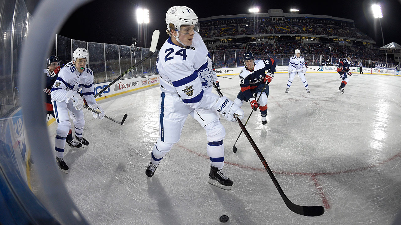
Toronto Maple Leafs Visual Brand: Toronto’s generally renowned for having one of the best logos and best visual legacies in the league, so it’s tough to see anyone somehow getting by the Leafs here. Their jerseys are great, and while that Stadium Series uniform was a hard pass, there’s just so much history here.
• More: BTLNHL #8: Toronto Maple Leafs
• More: Worst to First Jerseys: Toronto Maple Leafs
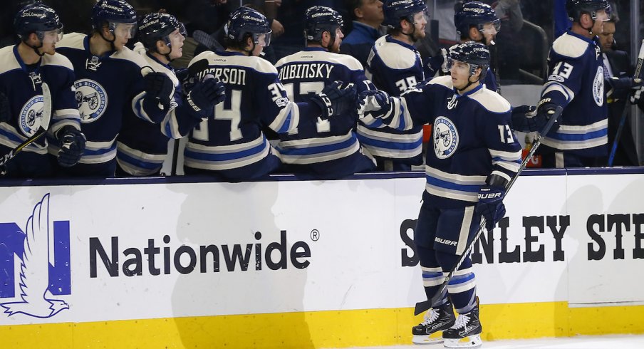
Columbus Blue Jackets Visual Brand: Meanwhile, there’s Columbus. Relatively uninspiring jerseys with a mediocre logo and aside from a really nice third jersey, there’s never been anything here to get too excited about.
• More: BTLNHL #23: Columbus Blue Jackets
• More: Worst to First Jerseys: Columbus Blue Jackets
Prediction: Maple Leafs in 3


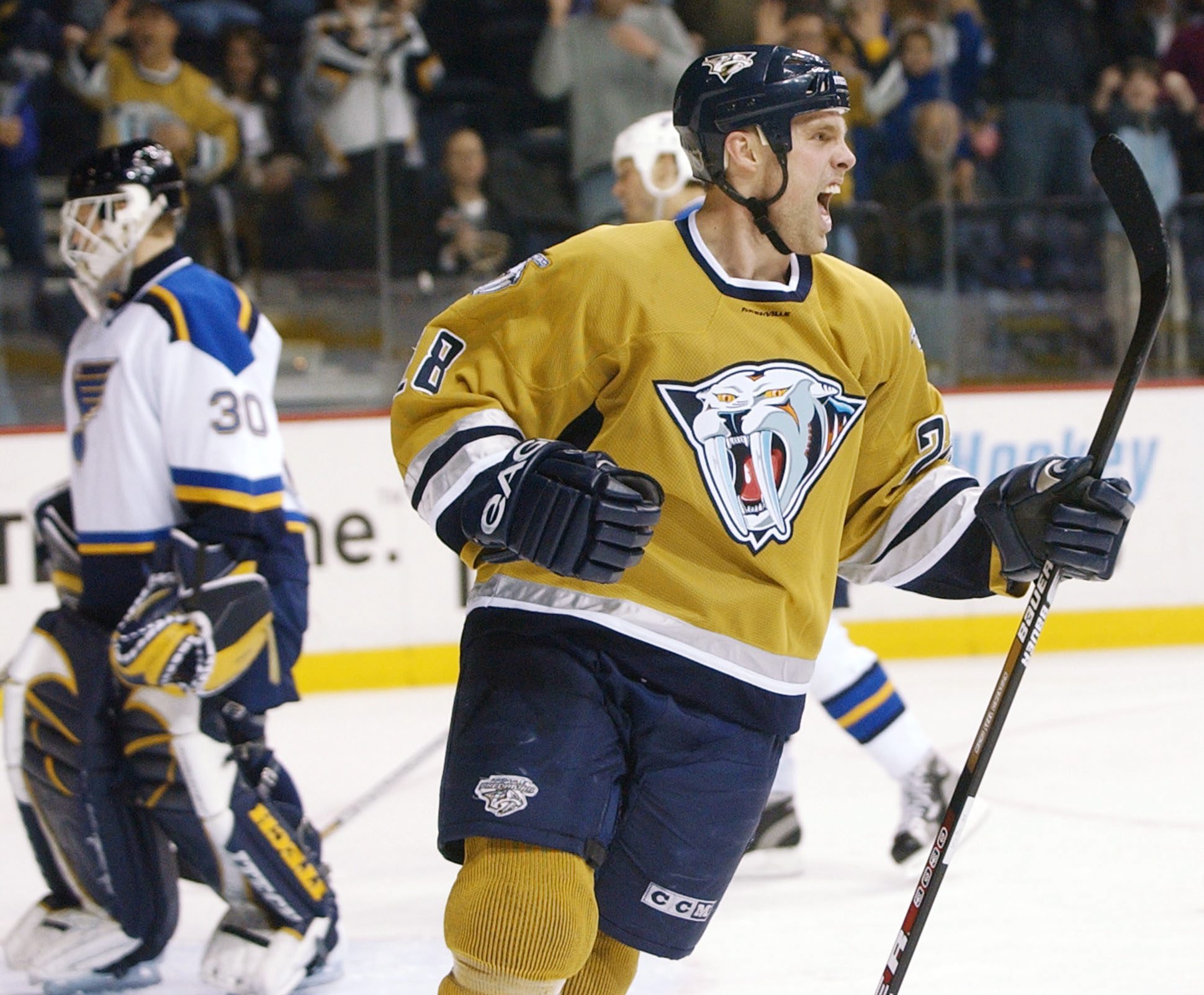
It’s probably the most unique and modern visual match-up in the Qualifying Round, with the golden Predators against the burgundy Coyotes. Their modern jersey designs complement each other – both featuring chunkier blocks of colour paired with thin stripes – but neither jersey is particularly well-designed. The gold and burgundy is a bit aggressive visually as well, grating on the eye. Especially with those gold helmets. Still can’t get used to them.
Nashville Predators Visual Brand: They’ve pretty much got the worst jerseys in the league at this point, with an average logo and some truly horrendous jerseys in their library. They do get bonus points for always been experimental with their visual brand though, pushing the boundaries…for better or worse.
• More: BTLNHL #18: Nashville Predators
• More: Worst to First Jerseys: Nashville Predators
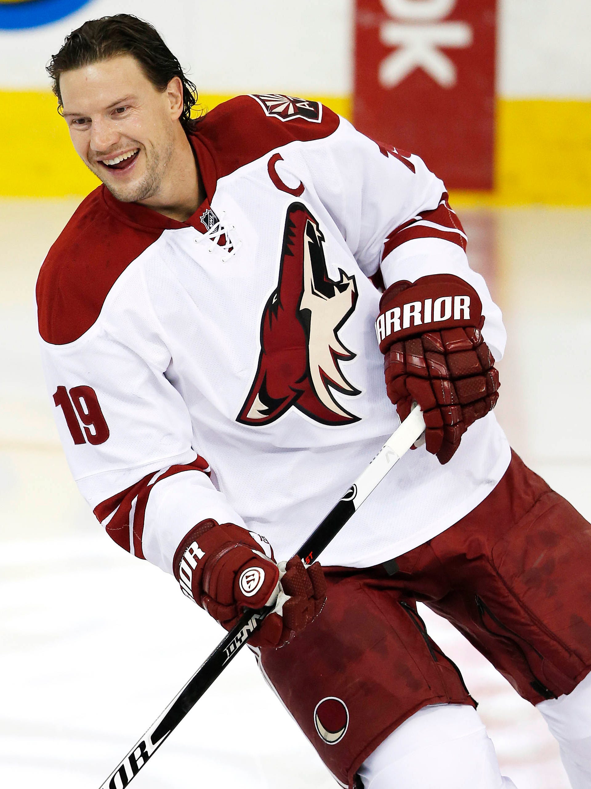
Arizona Coyotes Visual Brand: It’s cool to like their Kachina-styled ’90s jerseys again, but they’re still not great. And that’s not even close to being their worst jersey unfortunately. But their current logo is well executed and while they dropped the ball with their current jerseys, their previous versions were classic and modern at the same time.
• More: BTLNHL #9: Arizona Coyotes
• More: Worst to First Jerseys: Arizona Coyotes
Prediction: Predators in 5 (in 3OT)

Get rid of the games in Carolina when Carolina is wearing their home jerseys, and this could be one of the best matchups of the year – and also one of the most unique with two jerseys that don’t feature a logo on the chest. While Carolina’s is most modernly-designed, the connection of the red between the Rangers and the ‘Canes jerseys makes for a visually striking matchup. It’s Carolina’s third jerseys (that they’ll be wearing for these playoffs) that drag the match-up down, make for a relatively monochromatic white-vs-black jersey matchup, although the Rangers do their best to add a good amount of colour.
Carolina Hurricanes Visual Brand: Carolina has a chance here because of – and all apologies to Connecticut – having those amazing Whalers unis on the ice again. It’s pretty easily the best jersey they’ve ever worn, and having a logo mistaken for a toilet bowl doesn’t help much.
• More: BTLNHL #19: Carolina Hurricanes
• More: Worst to First Jerseys: Carolina Hurricanes
New York Rangers Visual Brand: The Original Six teams are dominant brands in the league (with history usually comes legacy and becoming iconic). They’ve used a solid logo concept since the 1920s and nobody in the league save the Canadiens can match the uniqueness and iconic nature of the Rangers’ home jerseys that have stood the test of time. Often imitated (by the ‘Canes too), never duplicated. Their alternate logo and third jerseys are just okay, but not enough to take away from the brand overall.
• More: BTLNHL #12: New York Rangers
• More: Worst to First Jerseys: New York Rangers
Prediction: Rangers in 4


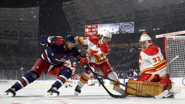
It’s another classic red-vs-blue matchup, probably the most classic of all sports jersey matchups. What helps this one is that both sets of jerseys are extremely modern and superfluous in their aesthetics, with stripes galore and they end up complementing each other because of the colour balance. But the superfluous also keeps them lower on the list, because there’s just so much going on. Now, if we could just convince them to just wear their Heritage Classic jerseys for all these games…
Calgary Flames Visual Brand: Their current jerseys aren’t great – one of the worst in the league – which is baffling considering the classic third (and Heritage Classic) jerseys they have staring them in the face. They’re a mess, with inconsistent and overly complex striping everywhere, and they’ve had some pretty bad jersey designs and alternative logos in the past. That being said, their great logo and decent brand legacy keeps them in the game. Visually, they’ve been incredibly consistent with their logo, using the same logo and colour scheme since moving from Atlanta in 1980.
• More: BTLNHL #13: Calgary Flames
• More: Worst to First Jerseys: Calgary Flames
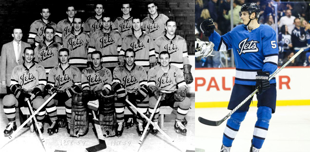
Winnipeg Jets Visual Brand: The Jets visual brand is the epitome of middle-of-the-road. An average logo. An average jersey set. And (aside from the afore mentioned Heritage Classic jerseys) it’s pretty much always been that way. Oh, and their third jersey is a total rip-off too, which doesn’t help.
• More: BTLNHL #15: Winnipeg Jets
• More: HbD Breakdown: Jets and Sharks Third Jerseys
• More: Worst to First Jerseys: Winnipeg Jets
Prediction: Jets in 5

Another red-vs-blue matchup, but with significantly better-designed jerseys than the previous matchup. Despite the classic-vs-modern aesthetics on these, they both feature large stripes that complement each other. The orange-beige/gold-red combo is pretty gross, but luckily it doesn’t play a huge role here.
New York Islanders Visual Brand: Their current classic look is great…for the Islanders. The consensus is that they still don’t have a great logo, their jerseys are not too bad, and their third jerseys don’t stand up against some of the others in the league (and they have a history of some much, much worse ones). Oh, and Captain Gorton is still too recent to be completely forgotten.
• More: BTLNHL #20: New York Islanders
• More: Worst to First Jerseys: New York Islanders
Florida Panthers Visual Brand: Their new visual brand from the 2016-17 season made these cats look more refined and grown up. And good riddance. Their previous logo was never very good, being too complicated and cartoonish and the colour scheme of blue, red and yellow (all the primary colours) with the beige of the logo, is just too aggressive and obnoxious to work. You gotta give them points for at least being very consistent with just the one major brand change since their inception in 1993.
• More: BTLNHL #26: Florida Panthers
• More: Worst to First Jerseys: Florida Panthers
Prediction: Panthers in 5 (in OT)


The Canucks and Wild matchup feature two of the better jersey sets in league, with a common them of green to connect them and a very cold-toned palette given some vibrancy thanks to the Wild’s red elements. It helps that red and green are complementary colours, playing off each other well here as accent colours on both jerseys. It’s a more unique colour matchup that has both modern and classic qualities to it.
Vancouver Canucks Visual Brand: The Canucks have had a spotty past in terms of logos and jerseys, and regular rebrands every 10 years or so doesn’t speak to having any confidence in your visual identity (although the current one is finally seeming to stick). They’ve had jerseys that have pretty much been universally reviled. And a putrid home jersey. That being said, the Canucks have a solid concept for a logo (the execution is a bit too ’90s though), and one of the best alternate logos in the league. But again, their current jersey set is one of the best in the league. But yes, their first 30+ years prior were a bit of a mess.
• More: BTLNHL #10: Vancouver Canucks
• More: Worst to First Jerseys: Vancouver Canucks
Minnesota Wild Visual Brand: Their logo is generally loved (except by me apparently) and one of the better ones in the league. That, and some really great, understated jersey design over the last decade has solidified their visual brand as the best to emerge from the most recents waves of expansion in the last 20+ years.
• More: BTLNHL #16: Minnesota Wild
• More: Worst to First Jerseys: Minnesota Wild
Prediction: Wild in 4

It’s a primary colour explosion! With red, blue, and yellow all playing prominent roles here, it’s a visual matchup that smacks you across the face…but in a good way! All the colours are fairly balanced, and the heavy inclusion of black and white help tone them down enough that they end up complementing each other instead of fighting for attention. And they’re two of the best jersey sets in the league too.
Pittsburgh Penguins Visual Brand: No expansion team has played with their jersey design more than the Penguins, going from baby blue, to navy blue, to gold, to white, to Vegas gold, to a lettered-chest, to gradients. It’s exhausting. But their logo (aside from their corporate robo-penguin) has remained consistent. And they’ve finally settled on what’s their best jerseys of all time. They took a weird, winding, creative path, but they got there.
• More: BTLNHL #6: Pittsburgh Penguins
• More: Worst to First Jerseys: Pittsburgh Penguins
Montreal Canadiens Visual Brand: Uh yeah, it’s the Canadiens. The most iconic hockey sweater in existence that has endured for almost 100 years now. The “bleu, blanc et rouge” is on par with the Yankee pinstripes and has been celebrated in book and film. The logo is almost equally iconic. Montreal is a visual brand beast.
• More: BTLNHL #5: Montreal Canadiens
• More: Worst to First Jerseys: Montreal Canadiens
Prediction: Canadiens in 4
Agree? Disagree? Let us know in the comments below or join the conversation on Twitter, Facebook, or Instagram!


/cdn0.vox-cdn.com/uploads/chorus_image/image/46388580/5thCup.0.0.jpg)
/cdn.vox-cdn.com/uploads/chorus_image/image/52663085/623535160.0.jpg)
Everybody always doubts Carolina. When are y’all gonna learn that we thrive in the playoffs? Yeah you’re prediction aged well lol! Go Canes!
[…] • More: NHL Playoffs 2020: Qualifying Round Countdown and Predictions […]