
Worst to First Jerseys: Toronto Maple Leafs
As we go through the 2019-20 season, we’ll be updating all of the Worst to First Jersey posts every Monday, as almost all the teams in the league have unveiled new jerseys since their original posts. We’ll start with the ones most needing updating and work our way through the league. Today, it’s time for the Toronto Maple Leafs to get updated.
Also, a huge thanks to SportsLogos.net for most of the jersey images and NHLUniforms.com for the jersey references.
In the franchise’s 100+ year history, the Maple Leafs weren’t the Maple Leafs until 1927. In the original post, we tackled just the “Maple Leafs” jerseys, but now we’re adding in the pre-1927 jerseys for the St Pats and the Arenas/HC. Especially since the Leafs have started wearing those pre-1927 jersey as throwbacks in recent years.
Specifically for the Maple Leafs, their jersey hasn’t really changed that much over the years, which makes things slightly more difficult in ranking the jersey’s eras – or even in clearly defining different jersey designs that they’ve had – but I’ll have a go at it anyway, because there’s definitely still some winners and losers here. But some of the differences will be relatively minute.
Here’s how this works: I’ll count down, from worst to first, all the jerseys the Toronto franchise has ever worn. Homes and aways will be lumped into the same category (so, more of a jersey “era”) and I won’t worry about small changes (like slightly changed positions of piping for example). Third jerseys will stand on their own. And I’m focusing on the jerseys only, not the entire uniform. For the Arenas/St Pats/Leafs, there’s 15(!) different jerseys/eras. And we’ll start with the worst one:
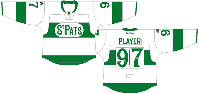
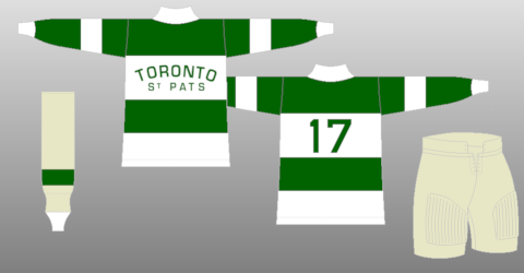
15. 1919–20, 1921–22, 1926–27 St. Pats Jersey, 2001–02 Heritage Jersey
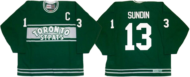
Most recently worn in 2001 with the celebration of their 75th anniversary, these jerseys are about as far away from the Maple Leafs visual brand of today as you can get: a forest green with chest stripes that feature just text. The only real visual connection to the Leafs of the modern era is the double-white striping on the bottom.
But what gets these jerseys ranked at the bottom isn’t that brand disconnect, it’s the lack of crest other than text; it’s a chest stripe that doesn’t bother to wrap around the whole jersey, just ending awkwardly at the sides; and it’s the equally awkward overlapping of the text over the chest stripes, making the text look uncomfortable in it’s space.
I’ve lumped in their 1919–20 and 1921–22 jerseys with these, since the concept is generally similar, even though the solid white chest stripe works better with the text. The addition of sleeves stripes makes it the superior jersey as well.
Jersey Recommendation: #4. Hap Day (on the far left in the linked image), a Hall-of-Famer, played for Toronto from 1924–37, becoming captain of the team in 1926 and was one of the top defencemen in his era. But don’t get the name on the back…those didn’t appear until much later.
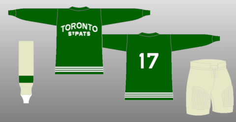
14. 1920–21, 1925–26 St. Pats Jersey
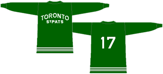
Another St. Pat’s jersey takes the next spot, with a simplified version of the previous jersey. It’s still green and lacks a crest other than text, but the simplicity here works better with the amount of text – it no longer looks crammed into a defined space.
The triple white stripe along the bottom is a nice touch to add some subtle complexity to the jersey. Or “sweater”, if you like. Back in these days, that’s exactly what they were.
The image above is their 1925–26 jerseys. The 1920–21 jerseys were extremely similar, but with a solid stripe along the bottom instead. Personally, I like the 1925–26 version better.
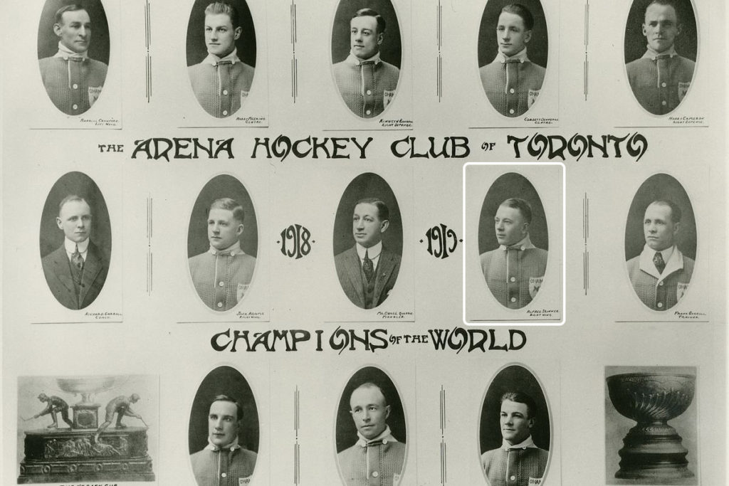
Jersey Recommendation: #6. Corb Denneny has the honour of being the only player in history to wear an Arenas, St Pats, and Maple Leafs jersey in their playing career. He also led the St. Pats in scoring in 1920 and is one of only 8 players in the history of the NHL to score 6 or more goals in game.

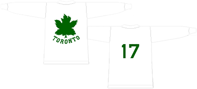
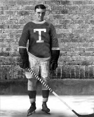
13. 1917–18 Arenas Jersey
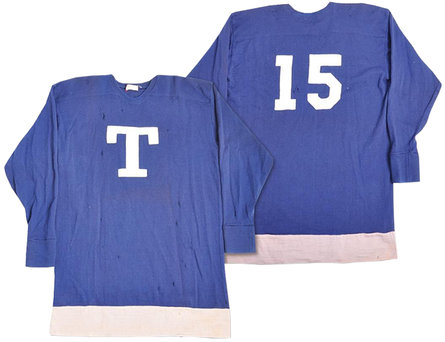
The original Toronto franchise jersey features a “T” crest…and that’s about it. Sure, there’s a solid stripe of white along the bottom, but it’s an extremely minimal look, even for the NHL’s inaugural season, especially compared to what the Ottawa Senators wore.
The “T” itself is nice and solid, I suppose, with the slab serif typeface being used. But, the most striking thing for me is that their inaugural jersey formed the foundation of a minimalistic blue-and-white approach for more than an century, and counting.
Of note, the Arenas weren’t generally known as the Arenas back in 1917. They also went by the “Torontos”, “Blue Shirts”, or just Toronto HC. But Arenas has become the standard nomenclature for those two pre-St. Pats seasons, after the NHL engraved the name on the Stanley Cup in 1948.
Jersey Recommendation: #3. Reg Noble, a Hall-of-Famer, was with the Leafs franchise since its inception in 1917 unto 1925, winning the Cup in 1918 and 1922, and was one of the most prolific scorers in the early days of the NHL.
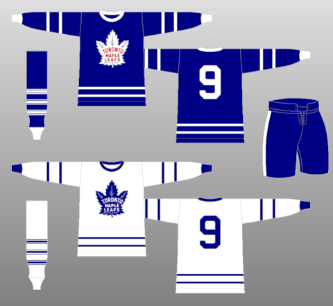
12. 1927–34 Home & Away Jerseys, 2014 Winter Classic Jersey
The first actual “Maple Leafs” jersey joins the rankings, with these blue jerseys which were also used in the 2014 Winter Classic. And, to be honest, they looked fantastic, and it almost made me rank these jerseys higher. But pretty much all of the Leafs jerseys are pretty fantastic (which is why they haven’t changed much in over 90 years), and they’re all better than these ones.
• More: The 2020 Winter Classic Jersey Countdown
But about these, holy stripes! Holy different look between the home and away jerseys! Holy wacky leaf design!
First, the stripes on the road blues. There’s overkill. Then there’s overkill. Then there’s Overkill. And then there’s the stripe pattern on this jersey. Granted, I’m talking about a jersey whose aesthetic is rooted in a society that really seemed to like stripes on their hockey jerseys (something the Bruins, the Blackhawks, the Detroit Cougars and the NY Americans can attest to) and not necessarily reflective of today’s style. And I confess I have no idea as to the production and design restrictions for hockey jerseys of the area, so that could definitely be coming into play as well. But still, this is a bit much.
I’m usually a big fan of historic aesthetics and how they defined a certain era in hockey. In this jersey’s case though, it’s the constant variety between the width and the pattern of the stripes, which just doesn’t work when being repeated how it is. If you’re going to use these many stripes, you need some sort of consistency to it, like the Senators or the Montreal Maroons had.
The other strange thing about these jerseys is how incredibly different the home whites are from road blues, being the complete opposites of each other aesthetically. Again, maybe there was a practical reason for this, but it completely throws out any sort of modern-day idea of branding. Sort of like Apple (who usually goes for very minimal aesthetics) designing the website for the latest iPhone based on your old Angelfire website from the mid-90s. At least the Leafs made sure both jerseys are only blue and white.
That being said, I actually like the extreme minimalism of the home white jerseys. Back in the ’20s, it may have been an issue of cost and production to leave it like that, but in today’s sports-design world, such a design would be seriously ballsy.
The wacky leaf logo is, I would assume, a product of a design era more than anything, and critiquing the logo isn’t the main focus of this post. It’s the jersey. But still, that’s one strange-looking leaf.
Of note, the Leafs also wore these in the 1996–97 season for the 65th anniversary of Maple Leaf Gardens.
Jersey Recommendation: #6. Irvine “Ace” Bailey was – until the Leafs retired 17 umbers at once – one of only 2 numbers officially retired by the Leafs and he also happens to be in the Hall of Fame. Get it in the wacky blues.
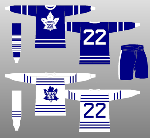
11. 1970-92 Home & Away Jerseys
This one is easily the worst jersey in the modern era of the Maple Leafs, and it’s predominantly because that large solid stripe that goes from cuff to cuff, over the shoulders.
That being said, the Leafs employ it more successfully than others did since they stuck to only a single band going across, which is something similar to what the Flyers currently use on their jerseys. While the simplicity and strength of the solid stripe is admirable, it automatically dates the jersey to a specific era. The reason it works better on the Flyers’ jerseys of today is that Philly’s stripe flares out near the cuffs and gets broken up with a black ring around the cuff. The solidness of the band on the Leafs’ jersey is certainly cleaner in that sense, but it’s a fine line between simple and striking vs boring and ordinary.
The boringness is duplicated around the bottom of the jersey, with another solid band. If the road jerseys positioned at #7 on this list fell victim to the illness of window-blind-itis with its manic striping, this jersey took way too much of the antidote.
It was a jersey that worked well during its time, but like most things from the ’70s and ’80s (like Wendel Clark’s moustache and perfectly coiffed mullet), it’s not something that’s timeless. Plus, these were the Harold Ballard years, so what Leafs fan wants to remember it anyway?
Jersey Recommendation: #27 Sittler. He’s the best player the Leafs had during the ’70s and one of the best Leafs ever. Or, how about #17 Clark. He was their star draft pick in 1985, and pretty much the only thing that went right for the Leafs in the ’80s. Either way, get it in the whites.

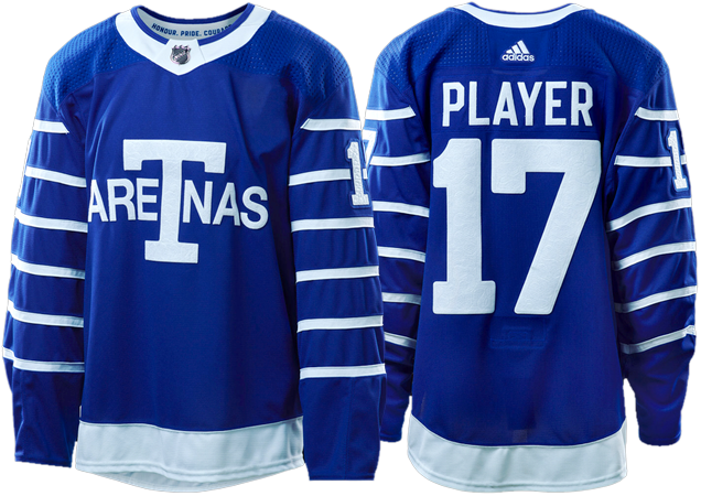
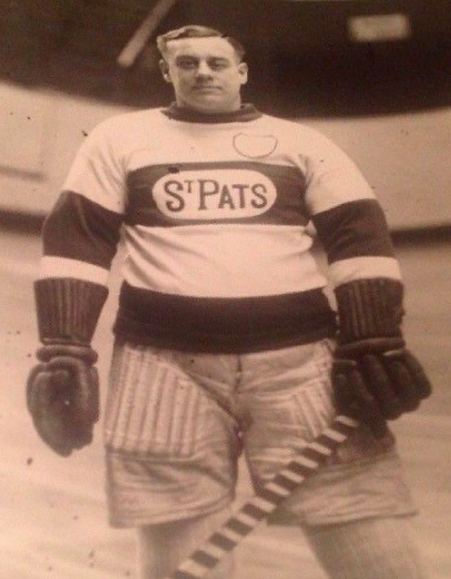
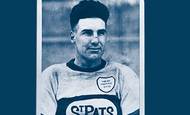
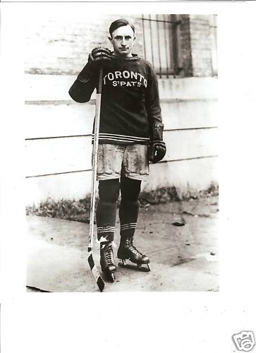
10. 1922–25 St. Pats Jersey
This is the St. Pats jersey that Toronto fans would be the most familiar with, as the Leafs have been wearing them around St. Partick’s Day every year for the past couple seasons. The updated versions are remarkably similar to the originals, aside from numbers on the sleeves and back. Which is my greatest complaint about these jerseys.
Adidas designer Andrew Harrington gave some great insight in a comment on the original breakdown post on these jerseys, confirmed that they’re not historically accurate, with their research stating that the numbers were contained within the green stripe on the back. That wasn’t possible given the current NHL’s requirements, so they went with the faux-retro look.
• More: HbD Breakdown: Maple Leafs’ St. Pats Jerseys
Personally, the number treatment tries too hard to be historical. The Celtic-esque numbers combined with slapping a green number on a white box with a big X stitched over top is…over-the-top. Throw in the space between the two numbers, and it’s too distracting and awkward to really be considered authentically historical.
But it’s still the best St. Pats jersey ever worn, so they brought back a good one to wear. The removal of “Toronto” works well, minimizing the amount of text on there and turning it into something more closely resembling a logo icon of some sort (as opposed to just type). And I like that the chest stripe actually wraps around the entire jersey.
Jersey Recommendation: #4. Cecil “Babe” Dye was the NHL’s top scorer in the 1920s and still holds the Leafs record for the highest points-per-game average. And he was an all-around great athlete, also playing minor baseball (with the Buffalo Bisons, Baltimore Orioles, and…Toronto Maple Leafs), and pro football (Toronto Argonauts). Amazing!
9. 1927 Jersey
This jersey lasted only half a season, from when Conn Smythe bought the Leafs on Valentine’s Day 1927 to the end of the 1926-27 season. It’s also the only jersey ever worn by the Maple Leafs that’s not blue and white (aside from 3 seasons in the 1940s where, oddly, the writing on the Leafs’ logo was red on the road blues). So there’s a certain amount of historical significance and uniqueness to this jersey.
But back to design. As I said above, there’s a fine line between simple and striking vs boring and ordinary. Pajama tops aside, the fact that these jerseys don’t have any sort of design element at all aside from the logo and the players’ numbers is both unexpected – at least in today’s design stylings (and unique) even for the rest of the jerseys worn in 1927 – places this jersey strongly in the former: simple and striking. The extreme complexity of the maple leaf logo and the stylized text below it save these from being too minimalist, striking a balance between complex and simple.
And that’s about all the jersey has, so I’ll bore you with some historical ramblings about the jersey. Conn Smythe bought the Toronto St. Pats on Valentine’s Day 1927 and immediately changed the name to the Maple Leafs. The name is based on the Canadian WWI Maple Leaf Regiment. The regiment, being a proper noun, would be pluralized as Leafs, not Leaves, which is why this peculiarity still exists. But the hockey team was not the first team to be called the Toronto Maple Leafs, or wear only blue and white, as there was a baseball team that existed at the same time with the same name and a very similar logo. So Conn Smythe was basically a blatant plagiarizer and we should reconsider having trophy named after him. Can I nominate the Harold Ballard Trophy instead?
Jersey Recommendation: #5. Bill Carson was the second-highest scoring player on the team that season, behind only Ace Bailey.
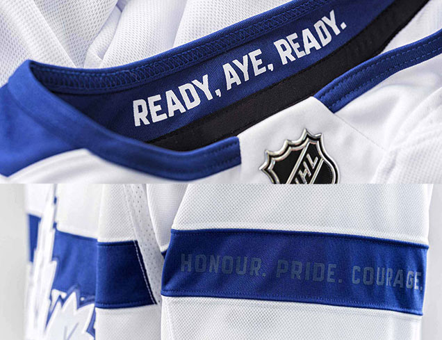
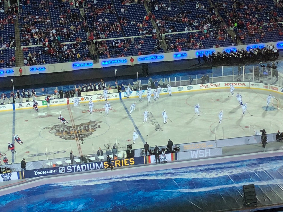
8. 2018 Stadium Series Jersey
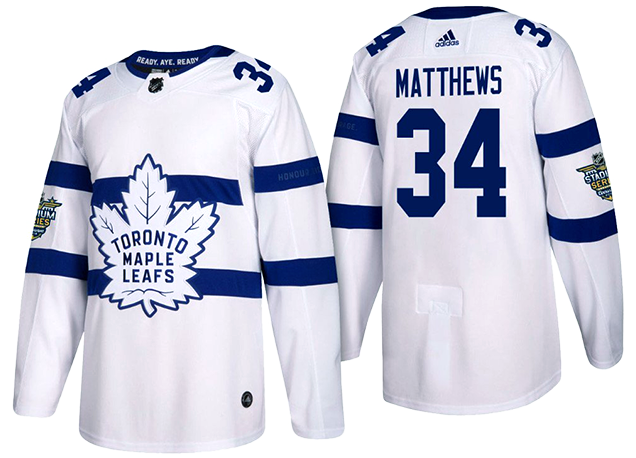
Finally, we’re heading more into the modern era of the Maple Leafs franchise, with this, basically their newest jerseys. I applauded the minimalist nature of the previous jerseys on this ranking because of its balance with the complex logo crest. And that’s evident here too.
So, the minimal-complex balance is there, and the overly-large and overly-simple elements that are standard bearers for all Stadium Series jerseys over the last few season are not overly distracting at all – which in itself is a win, as the enlarged classic Leafs-double-stripe works as a chest stripe (and as we’ve seen, there’s definitely historical precedent for it). Overall, the design is still a bit flat, but there’s also some nice details.
• More: HbD Breakdown: 2018 Stadium Series Jerseys
Given their tribute to the Royal Canadian Navy with these jerseys, another nice touch is the inside of the collar featuring the RCN’s credo: “Ready, Aye Ready.” Another subtle text inclusion is the Leafs’ credo of “Honour. Pride. Courage.” on the upper sleeve stripe. It’s become a common occurrence in modern jerseys to include something like this on the sleeves, and it almost always works.
But, context! The jerseys themselves are not too bad on their own, out of context, but the blindingly white uniform? It’s obnixous and ill-conceived within the context of hockey aesthetics. A jersey and uniform that doesn’t mind its surroundings bugs me. It’s too obnoxiously white in a setting that demands colour. And it’s hard to judge these jerseys outside of the context of their overall uniform concept.
Jersey Recommendation: #11 Hyman. Toronto lost this game to the Caps 5–2, so it’s not necessarily easy to pick someone from the game to honour on this jersey, but Hyman scored the Leafs’ opening goal in the game, so we’ll give it to him.

7. 2017 Centennial Classic Jersey
For their Centennial Classic jerseys, the Maple Leafs delved into as much of it as they could to celebrate their (and the NHL’s) 100 years of existence, including elements from their days as the Blueshirts, the Arenas, the St Pats, and of course, as the Maple Leafs.
• More: HbD Breakdown: Red Wings and Maple Leafs Centennial Classic Jerseys
• More: The 2020 Winter Classic Jersey Countdown
There are some real positive attributes to the jersey…like the excellent and subtle use of the silver, especially in their crest. The thirteen veins in the logo (representing the 13 Cups they’ve won), have been altered from blue to silver, along with a thin outline around the logo. For a team that formerly had a logo that, from 1967 to 2016, had only a maple leaf and “Toronto Maple Leafs”, making the veins more subtle connects the jersey to that part of their history. It’s a smart inclusion of the silver.
But the lack of anything visually innovative or interesting makes the jersey fall a bit flat. The balance between minimalism and complexity that was evident in the previous jersey isn’t here because it’s not minimalist enough, but there’s no complexity to it as well, falling somewhere in the muddy middle.
It’s not a bad jersey at all. I just would’ve liked to see something more celebratory, or innovative, or more authentically historical-looking, to celebrate 100 years. Instead, it’s a rather benign, inoffensive jersey with some nice details.
Jersey Recommendation: #34 Matthews. First star of the game with two goals, including the overtime game winner makes the newest Leafs superstar the natural choice for this jersey.
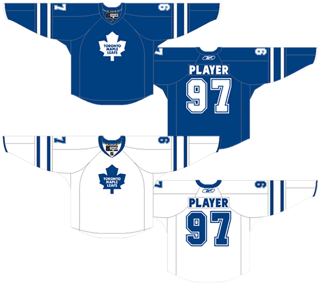
6. 1918–19 Arenas Jersey, 2017 Next Century Game Jersey
On December 19, 1917, the Toronto Arenas/Blueshirts/Torontos played their first game in the NHL. 100 years later to the day, the Toronto Maple Leafs played their Next Century Game by wearing the jerseys that they didn’t wear 100 years earlier. These are from 99 years earlier. It was close enough though.
From the library of early Toronto jerseys, these are pretty easily the best ones. The logo crest itself isn’t incredibly inspiring (what exactly is an “aretna”?), but it’s an early-20th century attempt at a logo for a team that was only owned for two seasons by the Toronto Arena Company (now you know where the name came from). As you can see in the image above, at least they used Helvetica…which was developed in 1957.
The jerseys themselves are quite nice, and you can see the foundation of future Maple Leafs jerseys that were to come in future (after the green St Pats era). The skinny white stripes on the sleeves, a solid blue stripe along the bottom, the simple blue-and-white aesthetic…it’s all there.
Of course, these jerseys take the sleeve striping to the extreme, but it’s not outside the aesthetics of the era, an era which also didn’t have to worry about numbers on the sleeves either. The stripes also create that complexity–minimalism balance as well, offsetting the lack of elements on the rest of the jersey.
While I wouldn’t say it should be worn regularly today, as the elements date it and the logo isn’t great, it’s overall a well-designed jersey from the early days of the NHL.
Jersey Recommendation: #6. Alf “Dutch” Skinner was the Arenas’ leading scorer during the 1918–19 season, a down year for a team that missed the playoffs. But Skinner was also the star of their 1918 Stanley Cup championship run from the season previous.
5. 2007-10 Home & Away Jerseys
The rest of these rankings feature the very familiar-looking modern era Leafs jerseys, with only minor differences between them, mostly in the striping. There’s a case to be made that all of these jerseys could be lumped into one, and that would definitely be more expedient. The details, though, are where the devil resides. While these are all very nice jerseys, the details definitely make some of these jerseys worse than others. Like this one, for example.
In 2007, the NHL switched all the their jerseys to the Reebok Edge model, changing the contours and look of the hockey jersey. Some teams, including the Leafs, took the opportunity to try removing the piping along the bottom of the jerseys. Before 2007, all hockey jerseys were flat at the bottom and having solid straight lines at the bottom of jersey then made sense. But now, with a curved and contoured bottom of the jersey, these teams thought that maybe this particular element of a hockey jersey should be rethought, so logically, I can see why it would make sense to remove it.
What wasn’t necessarily expected was how integral and important those lines along the bottom were for a hockey jersey to be considered a hockey jersey, looking more like practice jerseys and pyjamas. The removal of any shoulder patches doubled-down on the extreme minimalistic approach to the jersey.
In short, there’s next-to-no complexity to balance out the minimalism inherit with removing the bottom stripes. It’s comes out flat. And the double-outlined numbers do not fit the aesthetics of the rest of the jersey at all.
Jersey Recommendation: #15 Kaberle. How about we give Kaberle some love, the Leafs’ long-time stalwart on defense during this mostly sad era for the Leafs.

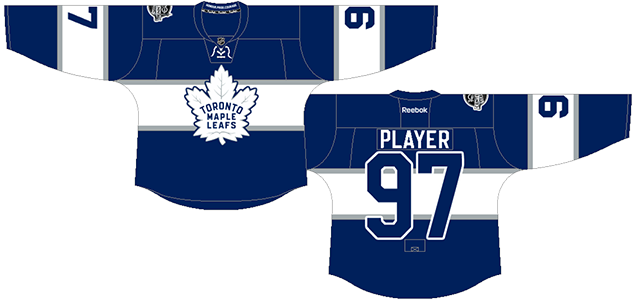
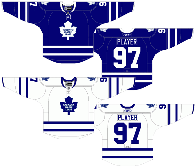
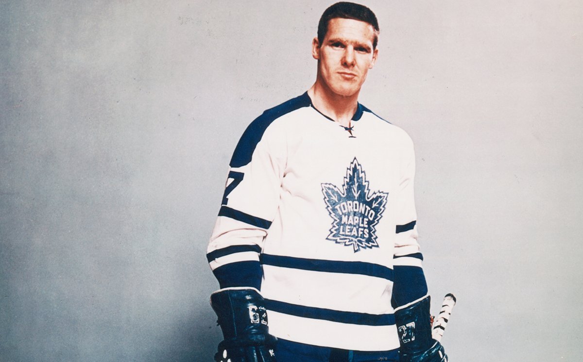
4. 1958-67 Home & Away Jerseys; 2000-07, 2008-11 Third Jerseys
What makes these jerseys stand out from the rest of the Leafs jerseys over the past nine decades is the thick stripe on the cuffs, and more obviously, the blue shoulder yokes on the white jerseys.
There’s also the addition of the laces which, from 1958-67 were not considered that odd at all as more teams than not had them on their jerseys. As a third jersey in the ’00s however, it gives them a historical and nostalgic feel. I’m a big fan of the laces.
But it’s the blue shoulder yokes that make these jerseys stand out. Compared to the minimal and clean aesthetic of the blue jerseys which – unlike Scott Stevens – delivers a clean shoulder, it adds too much clutter to the sleeves. It’s not too bad on the front of the jersey, but still feels unnecessary, especially given that the collars of both jersey use a different colour to add a bit of contrast. That’s all that’s needed.
The striping pattern along the bottom of the jersey is something that’s iconic with Leafs jerseys – an element that they’ve used on the majority of their years as the Leafs, an element that when repeated on the sleeves creates a minimal but iconic look to the jersey.
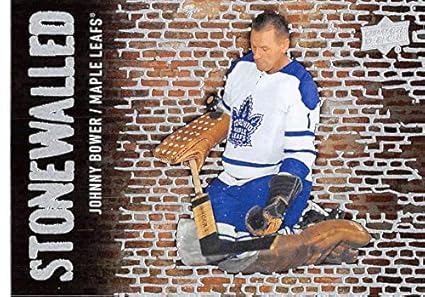
Jersey Recommendation: #27. Frank Mahovlich‘s number is an easy selection for this era, one of the dominant players of his time and one of the best players to wear a Leafs sweater. If you don’t like the idea of wearing a number of someone who later went to play for the Habs and you like goalies, a #1 (Johnny Bower) is a must. Or if you like doughnuts, get a #7 (Tim Horton). For posterity, get it in the shoulder-yoked whites.
3. 1967-70 Home & Away Jerseys, 2011-16 Third Jerseys
As iconic as the Leafs’ double-stripe is, I’ve got to give these jerseys some love, as their unique (for the Leafs) striping design is a damn fine alternative.
It’s also got one of the better logos the Leafs have ever had. The shape of this maple leaf has a little more personality than their 1970–2016 logo, both in the shape of the leaf and the arced “Toronto” text. The font, although quirky, feels more like a hockey font – more movement, strength and personality – than their current usage of Kabel, which is just too friendly and passive of a font for use in a hockey logo. It’s like having Barney Rubble on your hockey team.
More: BTLNHL #8: Toronto Maple Leafs
The striping pattern is a callback to their 1927–34 jerseys, but obviously not in the crazy over-repetitve manner that those jerseys used, and it works really well to create a jersey that has a designs that’s just a little more striking and bold – simple, yet stronger and distinctive.
The use of laces? *thumbs up emoji*
The only drawback, the blue shoulder yoke of blue on the whites, which is what hurt the previous jersey on this list.
Jersey Recommendation: #18. Jim Pappin has the honour of being the last Leaf to score a Stanley Cup winning goal, in 1967. He also led the league in playoff scoring that year. Or #14 (Dave Keon), the Conn Smythe Award winner that year and another Leaf great. Either way, get it in the blues.
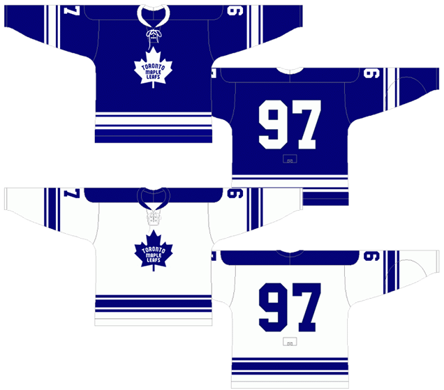
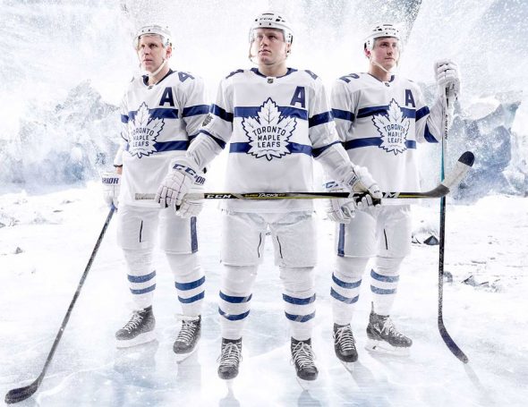
2. 2016–present Home & Away Jerseys
The current Leafs jerseys are a cut above the rest of the modern-era jerseys we’ve seen so far for a few different reasons.
It’s got the iconic double-stripe on the sleeves that define a Leafs jersey. There’s no shoulder yokes on the white jerseys, and it features what is largely considered to be the best logo in the league, and probably the best logo the Leafs have ever had.
• More: HbD Breakdown: Toronto Maple Leafs Logo
So, why the #2 ranking? It’s a minor detail, but the lack of consistency in the striping – going for a thick solid stripe along the bottom of the jerseys rather than having the double-stripe – keeps this jersey from the top spot.
Well, that and the awkward collar design, but I’m willing to pin that more on Adidas than Toronto.
Otherwise, it’s a fantastic jersey set. The complexity of the logo is balanced by the simplicity of the rest of the jersey. It hits all the iconic notes as well, looking both historical and modern at the same time.
Jersey Recommendation: #16 Marner. We’ve already given Auston Matthews some jersey love, so I’ll give this recommendation to the other budding superstar on the Leafs roster.
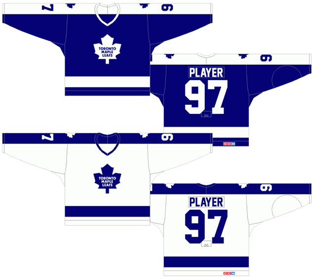
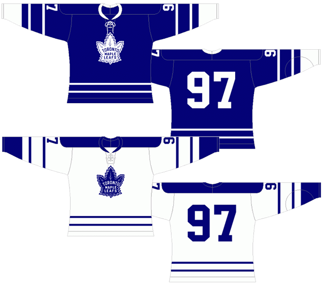
1. 1934-58, 1992-2007, 2010-16 Home & Away Jerseys
Everything I just said about the previous jersey you can pretty much repeat here. But this jersey gets the top nod because of one difference between the two jerseys: the iconic double-stripe along the bottom makes for a more consistent aesthetic across the jersey.
Sure, this jersey doesn’t feature the best logos the Leafs have ever worn –although their 1934–58 logo is just a less refined version of today’s (let’s just forget about those 1945–48 red-text versions). But the consistency in the striping just nudges these to the top spot.
Let’s also forget about the 1934–37 white jerseys that featured a bit too many stripes.
Otherwise, everything that’s right with these jerseys is what I’ve already talked about. It’s an iconic Leafs jersey with the double-thin stripes and the simplicity of the blue-and-white that (up until the Lightning stole it) belongs solely to the Leafs organization. It’s the best the Leafs have ever worn.
Jersey Recommendation: #13 Sundin. He may not have left on the best of circumstances, but he’s one of the best leaders that Toronto has ever had and one of the best players to ever wear a Leafs jersey period. If he’s left too bad of a taste in your mouth, how about a #93 Gilmour, an iconic Leaf during the ’90s.
Agree? Disagree? Let us know in the comments below or join the conversation on Twitter, Facebook, or Instagram!


[…] • More jersey design banter: Hockey By Design ranks the Maple Leafs sweaters from worst to first. (Hockey By Design) […]
The 70s jersey with the blue stripe from neck to sleeve was their best looking jersey ever. Not the worst. Will give you the fact that the Philadelphia Flyers stripe design was a notch better though. If the Leafs had their home whites (back when all teams wore white at home) with the Flyers shoulder bar blue stripes that tapered, then that jersey would take the top spot
That jersey never won a gawd damned thing and should have been blown up and buried. It was Ballard’s Leaf.
[…] • More jersey design banter: Hockey By Design ranks the Maple Leafs sweaters from worst to first. (Hockey By Design) […]
I don’t see the jersey with the TML on the sleeve. I thought the TML was pretty bad. The rounded numbers were also around for a long time. They never seemed to fit in either.
Yeah, stuff like different shoulder patches and font changes and such get lumped in with their specific jersey designs…otherwise these lists would be three times as long!
[…] • More: HbD Breakdown: 2018 Stadium Series Jerseys• More: Worst to First Jerseys: Toronto Maple Leafs […]
[…] More: Worst to First Jerseys: Toronto Maple Leafs• More: Worst to First Jerseys: New Jersey […]
The current Jersey with a double stripe on the bottom would easily be the best of the best. I much prefer the old style Leaf logo to the more modern look, the detail makes it.
The white one should have a shoulder yoke. There’s too much white when they’re on the ice and that would break it up a bit.
All the nhl league jersey color changes are in my respectful opinion ugly I can’t wait to return to recent original colors
Have the Leafs EVER won a game while wearing the “St Pats” jerseys? They’ve lost all three games I’ve seen across a couple of seasons while wearing them. In each game, the goaltending was not merely bad, it was terrible, even laughable; the players seemed incapable of making two consecutive passes. The team as a whole succeeds only in playing down to the level of their opponent.
[…] • More: BTLNHL #8: Toronto Maple Leafs• More: Worst to First Jerseys: Toronto Maple Leafs […]