HbD Breakdown: 2018 Stadium Series Jerseys

Images from capitals.nhl.com and mapleleafs.nhl.com
The 2018 iteration of the annual outdoor Stadium Series happens this Saturday (March 3) at Navy-Marine Corps Memorial Stadium in Annapolis, MD between the Washington Capitals and the Toronto Maple Leafs. As usual, the two teams have released specialty jerseys that they’ll be wearing for the event, and as usual, we’re here to break them down.
The Stadium Series jerseys of previous years have typically featured extremely minimalist designs with x-large elements on them. The theory is that you need this design style to allow spectators to be able to “see” the jerseys better, which is bullshit. If you’re in the nosebleeds in a 30,000-to-60,000-capacity stadium, you’re not seeing much anyway.
I’m sure the NHL/Adidas (and Reebok before them) realize this and are just using the events as an excuse to try for a uber-modern, minimalist approach, which is a great idea in theory. In practice, it works better some years than others. What about for 2018? We’ll break them down after the jump.
Washington Capitals
Images from shop.nhl.com
Capped Out
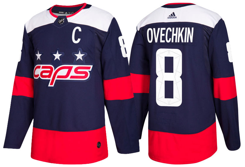
We’ll start with the home team, and the jersey that was first unveiled back in January. Washington follows the quicksand-laden, ROUS-infested, fire swamp path first traveled by the Senators and Lightning by featuring their nickname on the jersey: “Caps”. And sorry Ovi, but you ain’t no Wesley.
The Capitals primary logo is among the worst logos in the league (the worst, according to our Brand Power Rankings), so doubling-down and abbreviating it with their nickname isn’t necessarily a good look, even though it’s actually a better logo – more refined, more compact, less complex – but not by much. It’s especially disheartening when they’ve had something like the Weagle staring them in the face for the past decade or more, as well as the “W” that they used in their latest Winter Classic outing…which they modified (see: bolded) and slapped on the pants instead, which actually would’ve worked well on the chest instead of “caps”. Sigh.
Anyone else find it ironic that the logo is all lowercase letters? Especially since their hashtag of choice is #allcaps? Anyone?
RED, White and Blue
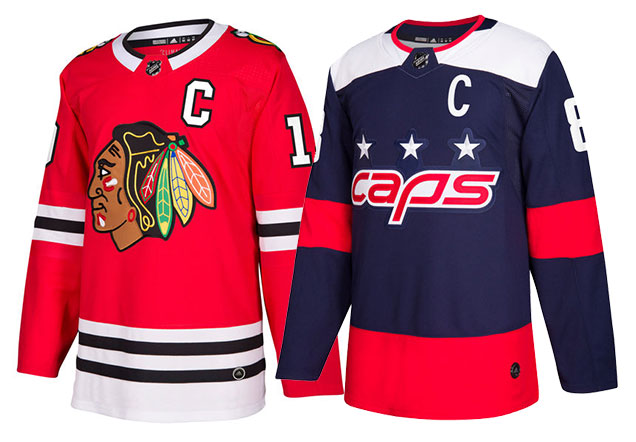
Okay, let’s move to the humongous big red elephant in the room: that red stripe across the bottom of the jersey. What the actual fuck? I need someone at Adidas to explain to me the thought process that led to having the stripe that large, because I just don’t get it. Sure, it doesn’t take up any more real estate on the jersey than, say, the Blackhawks home jerseys (actually, it’s even slightly less). So why does one – among the most celebrated jerseys in the league – look fantastic, but the other look unbearably large?
Images from shop.nhl.com
Simply, there’s nothing to break up this massive amount of intense red. What that does is two things. First, it makes the cummerbund the focal point of the entire jersey. Or at least, it’s fighting to be the focal point. The white shoulder yokes and logo elements against the navy blue is higher-contrast than red/blue, but that red is so intense that it keeps dragging the eye down to it, and the contrast at the shoulders drag the eye back up, and down, and up, and down, etc…, making the whole jersey incoherent.

Image from nhl.com
Second, it makes the jersey look very heavy, like the entire thing is being pulled down by a gigantic red elastic that could snap back up and smack Ovi in the face at any second.
It also makes him look pregnant, but I think that’s just bad posturing and the photo’s angle, but the red cummerbund certainly doesn’t help. According to NHL.com:
…the thick red stripes and hem stripes evoke thoughts of the city flag of Washington D.C.
I like that concept a lot, but then why don’t you actually make the thick red stripe two thinner red stripes. You know, like the flag you’re basing the design on? It would look fantastic on the sleeves and socks as well.
The League’s desire to make the Stadium Series jerseys as simple and minimalist as possible hits another in a series of snags with these jerseys for this element alone.
Don’t let anyone tell you that “less is more”, because this is proof that it isn’t. More isn’t more either. “Just enough” is more. And there’s just not enough happening within the red stripe to make it work.
Great 8
 There is a minor detail in these jersey that works really though, and that’s the stitching within the numbers. From NHL.com:
As a historic tribute to team’s hometown, the numbers are accentuated with a perforated pattern based on Pierre Enfant’s original grid plan for the city of Washington D.C.
It’s a somewhat obscure and subtle visual reference (which is not necessarily a bad thing), but the visual representation of it comes out really nicely regardless. It’s strong, simple, geometric (like the jersey), but with great details, so it’s not boring or badly weighted (unlike the rest of the jersey).
Final Verdict
Unbalanced, too minimalist, and a missed opportunity to utilize a better logo they already had at their disposal that doesn’t rely on slang and nicknames to be original. Another example of the League’s Stadium Series-mandated minimalism and intensely large elements gone awry to create a jersey that’s obnoxious and boring at the same time.
Toronto Maple Leafs
Images from shop.nhl.com
White x 10 to the Power of White
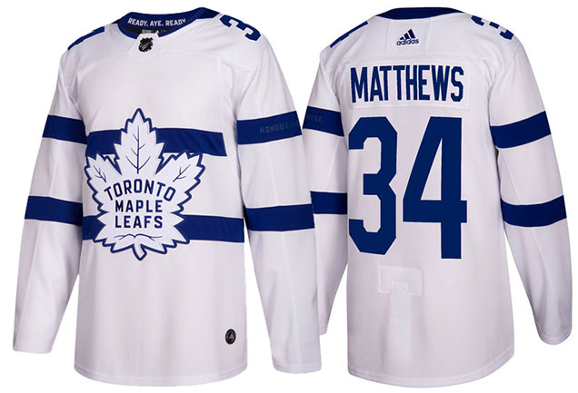
So, these jerseys are white. Are so are the gloves. And the pants. And the socks. And the helmets. On a sheet of white ice. And possible snowing. The Leafs’ strategy to this game is to go full camouflage and do try playing hockey guerrilla style. Oh, but wait, they’re wearing black skates? I like to imagine it’s because Lou Lamoriello pulled a Jean-Luc Picard. And when the league pushed back, he went full Picard.
“Okay, okay, jeez Lou, you can keep the black skates.”
 Just like the Capitals’ jerseys were obnoxious with their big red cummerbund, these are obnoxious for the liberal use of white. Like everywhere.
And also like the Capitals jerseys, it feels like the obnoxiousness was an exercise in extreme minimalism without much thought for what really works or for the aesthetics of the game overall. White uniforms on white ice is visually uninteresting, even with the blue stripes thrown in there.
But it’s not all a “because we can” approach, there’s also a conceptual element at play here.
In the Navy
Because the game takes place at the stadium inside the US Naval Academy, Toronto decided to heavily incorporate the Royal Canadian Navy’s aesthetics into their uniform design. A common uniform for the RCN is full attire white, from head to heel. The shoes are black. Which is a more logical reason for the black skates than Uncle Lou losing it…albeit less fun.
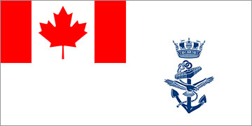
Image from wikipedia.com
The RCN flag is also predominantly white, with a Canadian flag in the corner and a blue seal. The white-and-blue aesthetic obviously jives well with the Maple Leafs general aesthetics, so they doubled-down on that approach and went full-Navy. Their beautiful website dedicated to outlining the naval influence of the jersey is a good site to ready through.
But you never go full-Navy in a hockey game. Why? Because it’s hockey, not the navy. It’s a spectator sport, not warfare in the middle of Pacific-nowhere. I get the idea of commemorating the navy through its uniforms design, but this feels like designing in a vacuum, without context, and ignoring the aesthetics of the game. Change the pants to blue and you’d have a good-looking uniform. Which somebody already photoshopped together:
Worked a little photoshop magic (rushed haha my bad) and I’ve come to the conclusion that the new Leafs #StadiumSeries jerseys would look a lot better with blue pants. pic.twitter.com/O3O5E8rFZL
— KP8 (@KP8Design) February 10, 2018
Plus, they included another great element to salute the navy. On the inside of the collar is written the RCN’s credo: “Ready, Aye Ready.” It’s a fantastic and subtle element that allows the jersey to clearly demonstrate where its influence came from, and the general concept behind it without foregoing the aesthetics of the game.
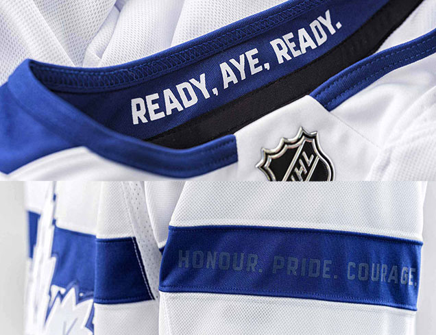 Another subtle text inclusion is the Leafs’ credo of “Honour. Pride. Courage.” on the upper sleeve stripe. It’s become a common occurrence in modern jerseys to include something like this on the sleeves, and it almost always works. It’s a subtle way to reward those who wear the jerseys (or buy them, for that matter) and reinforce the team’s chosen vision and brand.
The Uncommonly Common
The other common occurrence in modern jerseys is the chest stripe. What was once synonymous with the Montreal Canadiens is seemingly now fair game to all, from the Panthers, the Wild, and now Leafs for the third time (St Pats, Centennial Classic, and these).
It’s an easy way to allow the jersey to not seem too minimalist (or look like a practice jersey) while not including any stripes along the base of the jersey. And it looks good in this instance as well and continues the Leafs tradition of a double-blue stripe at the same time.
But, the big chest stripe is starting to feel a little bit played at this point. Or, it’s starting to feel like the Leafs are trying to imbue the Habs’ aesthetics to help pump up their own brand. Win a few more Cups Toronto, and then we’ll talk.
Final Verdict
The minimalism of the design elements don’t bug me. Using the RCN as inspiration doesn’t bug me. Even the chest stripe doesn’t really bug me. But a jersey and uniform that doesn’t mind its surroundings bugs me. It’s too obnoxiously white in a setting that demands colour.
Agree? Disagree? Let us know in the comments or join the conversation Twitter, Facebook and Instagram! And if you’re interested, we’re now on Pinterest too.





I actually like the all white look because it’s bold. If you were to add the blue pants, since they’re using a white logo, it detracts from the crest. Also, the all white gives this uniform some character, without it it’s just a rip-off of the habs with nothing interesting about it.
The caps unis I hate. Like you said, the giant stripe brings down the entire jerseys, and uniform. When I first saw these this was my reaction. I looked at the white yokes first, (which I love) then I saw the thick sleeve stripes and the nickname crest (meh, it’s the stadium series, screw around) then I saw the giant waist stripe and all my high expectations were crushed. Well, another reason to hate the Caps, I guess.
I don’t mind at all the Leafs doing something bold with their uniforms – and it’s not too dissimilar from the NFL’s Colour Rush concepts – but all white on a white surface? To me, that makes no sense. It’s like an NFL team having a grass-coloured colour rush uniform, or an all-beige NBA uniform. It’s just not a good look.
An NFL team has already tried that. The Seahawks with their garish all-neon green uniforms. I could not watch more than a quarter of that game. They actually only looked okay when someone did a simulation of it on Boise State’s blue field. All neon is still garish though. Good thing no NHL teams caught on to the neon craze after the Seahawks released their new unis in 2012.
I hate being a nitpicker, but this website is largely about the details so… Why use a picture of Australian sailors to illustrate a Canadian naval uniform?
Erm…yeah…that was an error. That one came up in my Google search and I didn’t double-check. Thanks for catching it, there’s a new image there now.
[…] • More: HbD Breakdown: 2018 Stadium Series Jerseys […]
[…] • More: HbD Breakdown: 2018 Stadium Series Jerseys […]
[…] • More: HbD Breakdown: 2018 Stadium Series Jerseys […]
Hi, its good article about media print, we all be aware of media is a impressive source of data.
magliette calcio
The article shows some burning questions and issues that ought to be discussed and
clarified. In addition, it is vital to understand within the very detail.
In the article, an individual can easily find something fundamental, remarkably for him, something which may be hugely helpful.
So I am delighted with the information I have just got. Thanks a lot!
[…] • More: HbD Breakdown: 2018 Stadium Series Jerseys […]
[…] • More: HbD Breakdown: 2018 Stadium Series Jerseys […]