
The 2019 Stadium Series Jersey Countdown

It’s that time of the year again…the annual Stadium Series featuring 4 games 2 games 1 game on February 23, 2019 with the Flyers and the Penguins renewing the Battle of Pennsylvania with a game at Lincoln Financial Field in Philadelphia. So, it’s time to do our annual countdown of the all the Stadium Series jerseys in existence. With two new additions this year, we’re up to 19 jerseys. Where will these editions of the Penguins and Flyers fit in with the rest of them, and are either of them good enough to take top spot? (Spoiler: nope.)
Just to be clear, design elements that are related to the league-mandated jersey templates (like 2014’s stupidly slanted sleeve numbers, or the stupidly large sleeve numbers, for example) won’t be considered, as they were league-mandated, leaving the teams with little recourse but to include them.
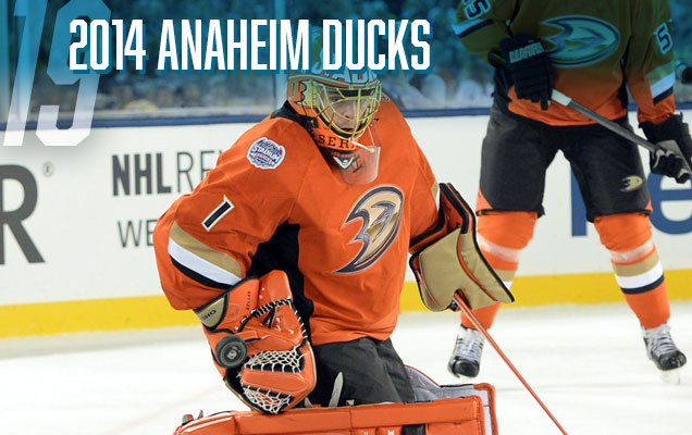
Yup, still at the bottom. These are little more than orange pyjamas with a bad fake-chrome jersey on them. There’s too few other elements to counteract the extremeness of the orange that completely dominates the entire uniform. It needed full sleeve stripes, as well as striping along the bottom of the jerseys, and maybe ever the shoulder yokes. Just orange is just too much, and with the black gloves and pants, it’s getting a little Halloween-esque. And in case nobody has yet mentioned it (I’ve mentioned it many times on other posts), orange and beige don’t really work together. Kudos to Jonas Hiller though, for fully embracing the monstrosity of it all, by adding an orange helmet and pads to compliment these jerseys…if you can use the word ‘compliment’. If I may offer an alternate idea for the Ducks that would have been awesome? How about the jerseys from the movie they’re originally named after?
• More: HbD News: Stadium Series Jerseys Announced for LA and Anaheim
• More: Worst to First Jerseys: Anaheim Ducks (Redux)
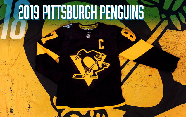
Let’s face it, none of the 2019 entries into the Stadium Series jersey library are very good. The ultra-modern/minimalist approach to the Stadium Series in general goes overboard here, paring down the Penguins logo to a single colour with a few gold stripes on a black jersey…and that’s it. I applaud Adidas for trying to do some new things here and pushing the boundaries of a hockey jersey, but these jerseys push it too far, taking it into bland pyjama/practice jersey territory. So why the Penguins lower? At least the Flyers have an orange jersey.

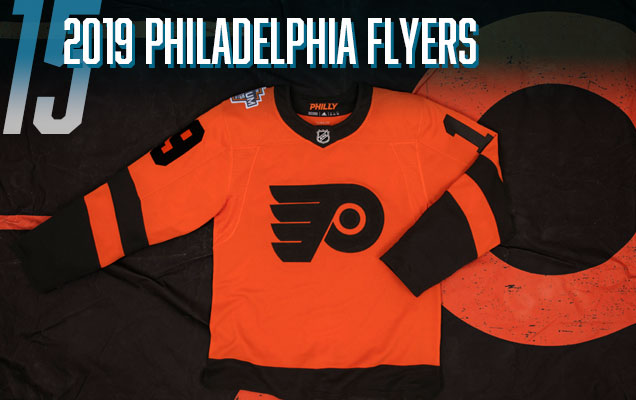
Speaking of Philly…these are just not good jerseys. Extremely similar to the Ducks all-orange jerseys above, these all-black pyjamas get a higher spot because they have some bold orange stripes on them. I understand it’s difficult to create something amazing when you’ve already got one of the best jersey sets in the league, but this is a complete missed opportunity to do something that was at least somewhat interesting. They’re just so underwhelming and missing anything to get even the smallest amount excited about, we’ll just move along to the next jersey on the list thanks.
• More: HbD Breakdown: Penguins and Flyers Stadium Series Jerseys

“Everybody’s talkin’ ’bout my white pants. I got my white pants, I got my white pants on.” White, tight, close enough. Even the coach is voicing his displeasure. Sure, this is a “jersey” countdown, but the solid colour from nipples to knees is a strange choice, and it makes it even worse when it’s white. Black, okay (see further down the list), but white? Caman! Like the Ducks’ jerseys at the bottom of the list, it’s too minimal, and needs something else to break up that white. The white helmet doesn’t help either. And using this particular jersey template for the Kings doesn’t work as well since they literally have no colours in their team branding, with the grey just looking like a dirty white. On the plus side, having two crowns on the black collar ring is a nice touch, to commemorate the Kings’ two Cup wins. And especially impactful considering the team they played wearing these jerseys. #itwas3tozero
• More: HbD News: Sharks and Kings Stadium Series Uniforms Announced
• More: Worst to First Jerseys: Los Angeles Kings (Redux)
The Flyers entry into the 2019 Stadium Series is, like the Penguins’, underwhelming (see the Penguins write-up above for more details). The Flyers logo doesn’t get altered much, but making that circle black just kills it. The lack of white to create some contrast on the jersey overall just makes this flat and uninspiring. Again, kudos to Adidas for trying something, but a hard pass from me. At least there’s a good amount of orange on here.

All things considered, these are fine jerseys. Then why so low? Because there’s not much to discuss. The Devils (aka Lou Lamoriello) were extremely adverse to any sort of alternative- or celebratory-anything outside of their brand. They’ve changed their designs once, in 1992, going from green-and-red to black-and-red and slightly simplifying the design of their jerseys. That’s it. So, for the Stadium Series, they’re just brought back their green-and-red jerseys, identical to what they wore pre-1992 and called it a day. As I said earlier, it’s not a bad jersey at all (although those extra white stripes on the sleeves are weird) but there’s so little creativity or celebration of anything involved, it’s hard to get excited about it at all. A complete missed opportunity, and that pushes it down this list. On the plus side, they didn’t go with a fake-chromed logo like the rest of the 2014 Stadium Series teams. And they ignored the jersey template given by the NHL. Lou Lamoriello didn’t care what Gary Bettman demanded apparently. #thuglife
• More: Worst to First Jerseys: New Jersey Devils

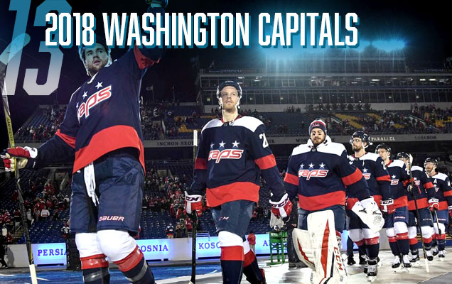
The Capitals enter this list at 13, with a jersey that’s unbalanced, too minimalist, and a missed opportunity to utilize a better logo they already had at their disposal (hello Weagle!) that doesn’t rely on slang and nicknames to be original. This jersey is another example of the League’s Stadium Series-mandated minimalism and intensely large elements gone awry to create a jersey that’s obnoxious and boring at the same time. And can we just stop staring at Ovechkin’s red belly please? He may look pregnant, but he’s no Arnold.
• More: HbD Breakdown: 2018 Stadium Series Jerseys
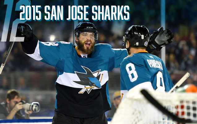
Using the same NHL-mandated template as the LA Kings’ jerseys this year, the Sharks at least have some colour to work with in their branding. And the template works better in this format, in the very least because their nipples-to-knees colour is black, and teal looks good on top. But why does San Jose cling to the orange as part of their visual identity? It’s barely used in their current jerseys and here? Well, it’s only used as the colour on the collar, making it look more like a choker necklace. They’ve successfully shaken off their choker status given their recent run to the Stanley Cup Finals, but it was still a thing when these jersey were worn, making it a really strange inclusion. I’m sure the Sharks organization loved even the NHL rubbing their faces in it with the jersey template. #trolling
• More: HbD News: Sharks and Kings Stadium Series Uniforms Announced
• More: Worst to First Jerseys: San Jose Sharks (Redux)

The Leafs join the list with their 2018 inclusion to the Stadium Series jersey canon. It’s dropped a few spots from last year due to the fact that they looked even worse on the ice than in concept. The jerseys themselves are not too bad on their own, out of context, but the blindingly white uniform? It’s obnixous and ill-conceived within the context of hockey aesthetics. The minimalism of the design elements don’t bug me. Using the Royal Canadian Navy uniforms and aesthetics as inspiration doesn’t bug me. Even the chest stripe doesn’t really bug me. But a jersey and uniform that doesn’t mind its surroundings bugs me. It’s too obnoxiously white in a setting that demands colour.
• More: HbD Breakdown: 2018 Stadium Series Jerseys

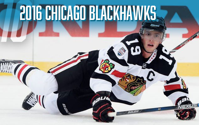
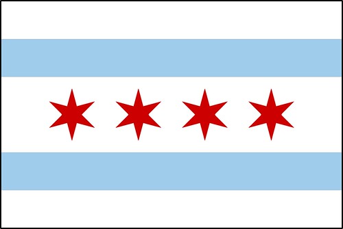
The lowest-ranked 2016 jersey belongs to the Blackhawks. It’s not a bad jersey per-se, but it’s just genuinely uninteresting. A white jersey with a few chunky black lines and a couple logos. It seems like there just wasn’t much effort put behind it compared to the other teams in the 2016 series. That could possibly be because this will be Chicago’s fourth outdoor game (compared to Colorado and Minnesota’s first, and Detroit’s third), so there’s only so far they’re willing to delve into their history to create interesting and/or on-brand one-off jerseys. And that cut-off date appears to be 1955 for them, so they’re starting to run out of options. Or there’s the option of asymmetric collars. Blah, no thanks. I like the Chicago flag stars on it, but the black-and-white half-collar just looks ridiculous.
• More: HbD Breakdown: Blackhawks and Wild Stadium Series Jerseys

The Rangers reached back to their Gretzky days for inspiration for these jerseys, closely replicating the stripe pattern on the sleeves, collar and base of the jersey. The colours/outlines of the numbers are also the same. But they added in the shoulder yokes from the 2014 Stadium Series jersey template and, of course, switched out quadruple-outlined super-spiky Lady Liberty logo for their classic diagonal text. It’s not a horrible jersey, but the “New York” being forced to be chromed because of the league just makes it look out-of-place. The sleeve stripes are a little too complex given the relative minimalism of the rest of the jersey too and look odd because of that. And there’s the issue of the blue being way too dark compared to their usual colours, which looks flat during the game. There’s good and bad, so the middle-of-the-pack is a good place to put this jersey. And it’s better to just ignore it. But again, kudos to Lundqvist for doing something creative, like having pinstriped pads and gear to pay homage to the Yankees.
• More: HbD News: Rangers and Blackhawks Stadium Series Jerseys Announced

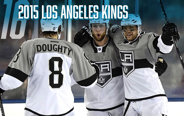
I’ve changed my mind a bit about this jersey. Originally, it was way down the list. Last year, it’s jumped up all the way to sit right outside the podium. This year, middle of the pack. There’s still issues, like how the light grey looks more like dirty white. And there were other possibilities, like bringing back the purple and/or yellow and using them on these updated Stadium Series jersey templates. But sometimes, when you see a jersey in action during the game, it works better than it does seeing it static. There’s enough black and white thrown in with the grey to give it a lot of contrast and movement, and actually worked against a sheet of white ice. The “LA” shoulder patch still looks good and I’m glad they used some shoulder yokes. So, it gets a bump up the list. But it still doesn’t work on their 50th anniversary jerseys.
• More: HbD News: Stadium Series Jerseys Announced for LA and Anaheim
• More: HbD Breakdown: Los Angeles Kings 50th Anniversary Jerseys


Yeah, these jerseys are pretty minimalist and cool-looking, but black?! C’mon, what is this, the late-’90s? Aren’t we over this black jersey phenomenon yet? The biggest problem with the black jerseys is that they made the chromed-up logo look incredibly cheap, because of the deep richness of the black. Against the black hair on the logo, it looks more like dark grey. In that sense, these are the worst jerseys in the whole Series in terms of working with the logo. Take the logo out of the equation and they’re pretty nice. Simple but strong red and white stripes along the sleeves and bottoms to barely keep them from looking like black pyjamas (take note, Anaheim). It still might have been nice to have seen red shoulder yokes on these.
• More: HbD News: Rangers and Blackhawks Stadium Series Jerseys Announced

The jersey is essentially a reversed version of their original 1926-27 Cougars jersey, but with the stripe put on a slant and taken off of the back, and made to look more modern. Which seems to be its main detriment. It’s a jersey that is trying to be old and new at the same time. It looks over-designed, but at the same time, it’s clean and minimalist. It looks like an on-brand Red Wings jersey, but also feels out-of-sync. So, it’s neither an outstanding jersey, nor an awful jersey. I don’t really mind it, but I’m definitely not in love with it.
Full Analysis: HbD Breakdown: Red Wings’ Stadium Series Jerseys

The first Colorado Avalanche outdoor jersey definitely hits some good marks. Overall, these are some pretty nice looking jerseys and it’s nice to see the home team wearing white (as it should be). Its clean simplicity will work well in the context of the venue, and it’s one of the better Stadium Series jerseys we’ve seen yet. But there’s minor details take it slightly down a notch, like the black-hole sun, the black collar, needing a stripe along the bottom. Minor details maybe, but it keeps it a little bit down on this list.
• More: HbD Breakdown: Avalanche Stadium Series Jerseys


For a special one-off event like the Stadium Series, the Penguins ticked all the boxes: unique, interesting, on-brand, great details, Stadium-Series-esque. It’s well designed and conceptualized, but there’s some small mis-steps like the stencilled numbers and the while collar triangle, and they wouldn’t work as part of the full-time Penguins jersey roster. But for what they are, you can’t help but see these as a win for the Penguins and the Stadium Series jersey library as a whole. And Pens fans should be ecstatic to see a fully gold jersey again.
• More: HbD Breakdown: Penguins and Flyers Stadium Series Jerseys

The only team to really introduce a new, or alternate, logo to the original 2014 Stadium Series was the Islanders, removing everything from their current logo except for the “NY”. It makes for a more iconic, but strange and modern, logo (kind of like this highrise). Again, it just needs to get rid of the chrome though. The rest of the jersey is solid, with just enough orange to compliment the blue, and keeping the super-thick stripe pattern that the Isles have on their current jerseys, a look they’re using well. The white shoulder yokes are unexpected and stand out a little bit too much, but overall, this is a solid jersey design for something like the Stadium Series, given the template their working with in terms of what the NHL gave them and their brand’s colours. And they even become their third jersey…for one season. Which is waaaaaay better than their previous thirds, not to mention their most recent ones as well.
• More: HbD News: NY Islanders’ Stadium Series Uniforms Announced
• More: Worst to First Jerseys: New York Islanders

This was the jersey that best used the mandated 2014 Stadium Series jersey template/design restrictions that were obviously given to the teams by the league. Everything on it just works. The striping along the bottom works well. They knew that these stripes would work just fine if it didn’t wrap around the whole sleeve. Even adding the strip of Vegas gold to the shoulder yokes is a nice touch that compliments the rest of the jersey well. The whole thing looks classic and forward-thinking at the same time, which is what that league appears to have been going for with the Stadium Series as a whole. Easily, this one was the best of that bunch.
• More: HbD News: Penguins’ Stadium Series Jerseys Announced
• More: Worst to First Jerseys: Pittsburgh Penguins (Redux)

Minnesota is quietly developing one of the best modern sets of jerseys in the entire league and this latest addition – combining the simple and minimalist modernism of the Stadium Series jerseys with distinctively Minnesota Wild branding elements – is excellent. All the elements works together perfectly: colours, stripes, minimalist, modernism, simplicity, details, etc. It sets a new high bar for Stadium Series jerseys. Touchdown Minnesota. Get it? Stadium Series? Touchdown? I’m here all week folks. Enjoy the peanuts on your way out.
• More: HbD Breakdown: Blackhawks and Wild Stadium Series Jerseys
Agree? Disagree? Let us know in the comments below or join the conversation on Twitter, Facebook, or Instagram!


[…] addition to the special threads for the game at Lincoln Financial Field, the goalies will be donning some new gear as well. Flyers […]
[…] • More: HbD Breakdown: Blackhawks and Wild Stadium Series Jerseys• More: The 2019 Stadium Series Jersey Countdown […]
[…] • More: 2019 Stadium Series Jersey Countdown […]
[…] • More: Stadium Series Jersey Countdown (2019) […]
[…] • More: 2019 Stadium Series Jersey Countdown […]
[…] • More: Heritage Classic Jersey Countdown (2019)• More: Stadium Series Jersey Countdown (2019) […]