
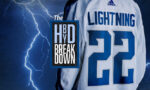
HbD Breakdown: Penguins and Flyers Stadium Series Jerseys
 The annual NHL Stadium Series continues in 2017 with the Battle of Pennsylvania. The Philadelphia Flyers are traveling to Heinz Field – home of the Steelers – to take on the Pittsburgh Penguins on February 25, 2017. But we’re more interested in what they’ll be wearing to the game.
• More: Stadium Series Jersey Countdown (2016)
Both the Pens and Flyers unveiled their jerseys a few weeks back, so now that we’ve had time to fully digest them, let’s break them down.
It’s seemed that in previous Stadium Series, there’s always been a league-mandated template for the teams to use. Or, at least, the teams have worked together to create similar styles in the their jerseys. There seems to be a deviation from that this year…to a certain extent. While there’s still some similarities between the Pens and Flyers jerseys, they both have what’s becoming a Stadium Series hallmark: extreme simplicity and very large elements.
Philadelphia Flyers
Back In Black
 I can definitely sympathize with the Flyers. Of all the 1967 expansion teams, they’ve been the most consistent from a brand perspective. Exactly the same logo (aside from a slight colour change in the orange) with very few jersey changes. And why would they? The home/away set they have now is fantastic, one of the best in the league. So, this being their 3rd outdoor game and 1st Stadium Series game, how do you continually try to improve on what is already near-perfection?
You really can’t. These jerseys are proof of that.
• More: Worst to First Jerseys: Philadelphia Flyers
Readers who have following this site for a long time generally know how I feel about black jerseys: a wasted opportunity to add some colour to what’s otherwise a blank canvas of white ice, especially considering the other team mostly wears white. Black jerseys just make everything mono-chromatic and visually boring. It’s the first black Flyers jersey since 2010, at which point they switched back to their original 1967 jersey design full-time. At least those old black jerseys had way more white to balance the black…and they still were always the lesser of their jersey set.
For these Stadium Series jerseys, the only white is in the outlines of the numbers and the logo. Otherwise, there’s some thick orange stripes on the sleeves, but not enough to create enough contrast to balance the overwhelming black jerseys/uniform. It’s an example of going too minimal, too simple, which makes them look like border-line practice jerseys. Or black Flyers pyjamas. Either way, not a great look.
Or worse, it’s just an ashy-logo step away from being an atrocious Black Ice jersey.

I See Nothing! Nothing!!
And there’s not much else to talk about. It’s basically a black void of a jersey…albeit with the Flyers (awesome, but predominantly black) logo with some orange stripes on the sleeves and the waist that have to be there, because the Flyers need orange somewhere. And some giant numbers, as is the usually with Stadium Series jerseys…which is ludicrous by the way, as they never feel the need to have giant numbers with the Winter/Centennial/Heritage Classics, even though they often take place in stadiums as well. So, they’re large for no real reason, other than to look ridiculous.
• More: BTLNHL #3: Philadelphia Flyers
The nameplate on the back is larger as well. I’m assuming that this is done to help people see the names from the distance, but having black text on orange isn’t going to help anything, and nobody would be able to read them regardless. So, like the numbers, it makes zero sense other than to take up space. Generally, being big just for the sake of being big doesn’t make it better. Although there are exceptions.
Final Verdict
It’s boring. It’s practice-jersey-esque. It’s devoid of anything meaningful. And any element on there is oversized, because Stadium Series. I understand it’s difficult to create something amazing when you’ve already got one of the best jersey sets in the league, but this is a complete missed opportunity to do something that was at least somewhat interesting.
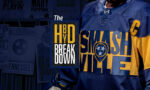
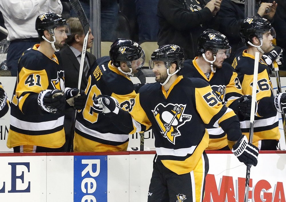
Pittsburgh Penguins
And Now For Something Completely Different

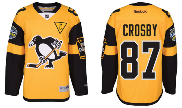
The Penguins unveiled something that fans have been hoping for since the beginning of the season, when they went back to their early-Lemieux-era jerseys: a gold jersey.
Personally, I’m glad they’re sticking with a white road jersey full-time, but for an event like the Stadium Series, a gold jersey makes a lot of sense. It’s a chance to wear something different, interesting, and on-brand without committing to it past one wearing.
And for a Stadium Series jersey, which in the last few years can either be described as either oddly boring or boringly odd, these manage to strike a balance between extreme minimalism and obnoxious oversized elements to have something that kind of works. But yeah, the gold definitely helps.
Simple Stripe Strikes Strong Sentiment
What keeps these jerseys from looking odd is that they maintained a level of traditional hockey jersey design, and especially within the Penguins new visual brand of jerseys. Just like their new (old) jersey set, the sleeves are a different colour from the rest of the jersey, which allows the gold to be repeated in a single simple sleeve stripe (alliteration ftw).
It seems like not much, but it allows the jersey to look like an actual hockey jersey and not pyjamas. Plus, it has the added bonus of balancing out all the gold and fitting within the new jersey for Pittsburgh very nicely. It’s smart and simple. Superb!
And the black collar goes a long way to balancing out the gold as well, something the Flyers could’ve taken note of to balance all that black.

Make the Logo Bigger
For the first time in their history, the Penguins will be wearing a penguin without its triangle on their jerseys…and it works. My assumption is that the decision was made to allow the penguin to be even larger on the jersey…because otherwise nobody would be able to tell which team it is. Apparently. Because…NHL corporate management oversight.
Despite all that, it works. The gold triangle on a gold jersey is, frankly, overkill. And it would cause some unfortunate (but necessary) outlines around the logo. While it’s an odd and generally frowned upon decision (from a branding perspective) to just use certain parts of your logo this prominently, there’s no denying it makes sense here. And hey, that’s pretty much Starbucks’ logo strategy.
Triangulating
 To make up for it, the Pens used their golden triangle (which represents the city of Pittsburgh, btw) is a couple different places. First, as the marker for the captaincy indicators…a great use of the triangle and not unlike what the Flyers used for their 2012 Winter Classic jerseys.
Then, there’s a white triangle at the collar, holding the NHL logo. This is one element the jersey could’ve done without, as the white draws undue attention to the collar and the league logo and away from the rest of the jersey. Because it’s white and borders a black collar, it’s a point of high-contrast and will draw the eye. There’s really no point to do that unless the League demanded it.
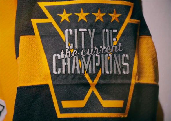
City of Champions…?
 There’s one more triangle featured on the jersey, on the City of Champions patch worn on the left sleeve of the jerseys. The triangle, holding four stars representing the Pens’ four Cup championships turn into two hockey sticks held within a keystone shape (representing Pennsylvania of course), all with “City of Champions” laid overtop.
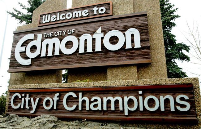
As patches go, it’s really great, cleverly incorporating many different symbolic elements (the city, the state, the Cup championships, the sport) all within one simple shape. They could have left it at that and it would’ve been really great. But…City of Champions? I’m not sure Pittsburgh can hold claim to that. Then again, neither can Edmonton anymore.
Let’s see, the Pens are the current Cup champions, yes. The last Steelers Super Bowl win was 2008. The Pirates? 1979. Even within hockey itself, the Pens have won in 2016 and 2009, yes. But I’m confident the Kings and Blackhawks could make a claim as well. Or the Bruins, with the Patriots, Red Sox and Celtics all winning their championships in the last decade.
The whole thing is a bit presumptive, but don’t worry guys, I fixed it for you.
Type-ical
The last element is the typeface used, a stencilled version of a standard sports-inspired typeface with the angled-off corners. What it does is give the jersey an interesting feature that completely distracts from the rest of the jersey. And for no good reason that I can tell.
Does it look cool? Sure, I could see some of the fans really liking that look. But, it doesn’t serve any purpose other than to look different. Stencilled lettering often evokes military or guerilla graffiti aesthetics, but it has nothing to do with (a) the jersey or (b) the team. For a one-off jersey like this one, I guess I can’t complain too much, as the jersey itself is short-lived, but it seems like it was included just to look cool, which means it will probably look very non-cool in a short time. And the jersey looks just as great without it.
UPDATE: Ah, okay, yeah. I get it now.
@HockeyByDesign guessing the stencilling look is a nod to the steelers pic.twitter.com/fCbIYn285q
— Vena (@AnthonyVena_) January 23, 2017
Final Verdict
For a special one-off event like the Stadium Series, the Penguins ticked all the boxes: unique, interesting, on-brand, great details, Stadium-Series-esque. It’s well designed and conceptualized, but there’s some small mis-steps, and they wouldn’t work as part of the full-time Penguins jersey roster. But for what they are, you can’t help but see these as a win for the Penguins and the Stadium Series jersey library as a whole.
Agree? Disagree? Let us know in the comments or join the conversation on Twitter, Facebook and Instagram! And if you’re interested, we’re now on Pinterest too.


Re: Your reasonable city of champions questions; I live in Pittsburgh and Pittsburgh calls itself the City Of Champions in tribute to a string of successes in the 1970s (Panthers, Steelers, Pirates). It’s very much a locally intelligible nickname that you see on lots of unlicensed gear in city shops and stalls (apparently for like over 40 years).
So while other fanbases in other NA cities might contest its literal accuracy, it has resonance and purchase with the local market, and not only among hockey fans.
Cool, good to know, thanks for sharing. So, not really unlike Edmonton making the same claim.
Boston is more of a “city of champions” than pitt is by a landslide. Every Boston area team has at least 1 title in the last 10 years. “string of successes in the 1970’s”? Tom Brady and the Pats did in 15 years what took your Steelers 4 decades to do lol.
[…] • Breaking down the design aesthetics of the Pittsburgh Penguins and Philadelphia Flyers Stadium Series jerseys. [Hockey By Design] […]
[…] • More: HbD Breakdown: Penguins and Flyers Stadium Series Jerseys […]
[…] • Breaking down the design aesthetics of the Pittsburgh Penguins and Philadelphia Flyers Stadium Series jerseys. [Hockey By Design] […]
[…] • More: HbD Breakdown: Penguins and Flyers Stadium Series Jerseys […]
[…] • More: HbD Breakdown: Penguins and Flyers Stadium Series Jerseys […]
[…] • More: HbD Breakdown: Penguins and Flyers Stadium Series Jerseys […]
[…] • More: HbD Breakdown: Penguins and Flyers Stadium Series Jerseys […]
[…] • More: HbD Breakdown: Penguins and Flyers Stadium Series Jerseys […]