HbD News: Rangers and Blackhawks Stadium Series Jerseys Announced
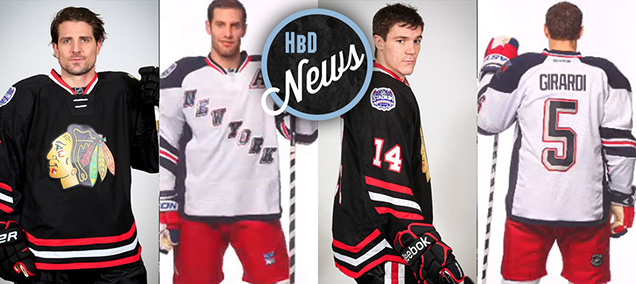
 Today, two more Stadium Series jerseys were announced. My reaction to them can be summer up like this: meh.
Neither of them are fantastic. Neither of them take any sort of risks, positively or negatively, outside of what has become the Stadium Series’ quirky template that the teams were given to work with. Neither of them are offensive in any way. And neither of them surpass what the Penguins recently released for their inclusion in the Stadium Series jersey lexicon.
But neither of them are as bad as the Ducks’ Stadium Series jersey, so that’s always nice.
NY Rangers
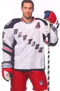
 First, the Rangers. Some of the details on these jerseys are really nice, with the red/white/blue pattern on the collar and from the images that have been released, I like the solid band of navy blue down the sides of the jersey, but I’m not convinced how they’ll look in action, during the game. I guess we’ll find out when they play the Devils (now the last team to release their Stadium Series jersey) on January 26th and NY Islanders on the 29th.
The decision not to have any striping along the bottom of the jersey aside from a very narrow navy blue along the hem is, I think, a pretty good one when combined with the fact they’ll be wearing bright red shorts with the jerseys, adding a splash of colour the might have made been too much when mixed with more stripes along the bottom. And the shapes of the shoulder yokes are nice on the these jerseys, as with the rest of the Stadium Series jerseys. Also, I thought I would dislike the multi-shadowed/outlined “New York” and jersey numbers, but they work quite well. Overall, the jersey design is simple and strong, so it has that going for it.
As for the negatives, there are a few. As with all the other Stadium Series jerseys, the slanted numbers are gimmicky, cheap and unnecessary, but that’s nothing new that I haven’t discussed on the previous jerseys. One thing I haven’t mentioned are the elongated numbers on the back of the jerseys. I don’t mind them personally, but would rather have seen that replicated on the sleeves as well. If you’re going to do something, don’t half-ass it. Do it consistently.
The stripes on the sleeves are really awful. It’s not consistent with the striping happening elsewhere on the jersey (collar and bottom), and this version of stripes is the most over-designed and complicated one on the jersey. It’s an homage to their bad jerseys in the ’90s and ’00s, which already tells you something. Removing one of the thicker blue bands would have helped immensely. Or bringing the lower blue band all the way to the cuff of the arm, colouring the whole bottom part of the sleeve, would have been nice as well. But, to its favour, at least it wraps around the whole arm. That look works on the Penguins jersey, but something tells me it wouldn’t have worked on these ones.
Also, the multi-coloured gloves come across as being gimmicky as well. With the rest of the jersey/uniform being quite strong and simple, the gloves are flashy, overcomplicated and don’t fit with the aesthetic of the rest of the uniform.
And again, like the rest of the Stadium Series jerseys, the chromed-out logos, or in this case word-mark, are as gimmicky and cheap as the slanted numbers. The seemingly oversized logos from the rest of the jerseys are utilized here as well, to its detriment, with the “N” in New almost emerging out of player’s armpit. It’s definitely not like that on their current word-mark jerseys, so it seems strange they would force that on these jerseys. Especially with no striping along the bottom of the jersey, there’s tons of room to create a slightly steeper slant for the letters. Or just slightly decrease the letters’ size and there wouldn’t be a problem.
So, there’s good and bad, enough to give the Rangers’ jerseys a passing grade. I’m glad they didn’t bring back the alternate Lady Liberty logo though. How many outlines does a logo need?
Chicago Blackhawks
 Just like the Rangers, there’s some aspects of the Blackhawks jerseys that are both good and bad. Easily the best aspect of the Blackhawks’ version is the simple and striking simplicity of them. The ‘Hawks already have some of the nicest jerseys to have ever graced the NHL, so they kept to their strong design roots with consistent and well-designed striping along the bottoms, collars and sleeves of the jerseys.
But are they too simple? Because they went with the non-wrapped sleeve stripes and no shoulder yokes, it starts to look like a black practice jersey (or black pyjamas) when the arm is raised (like Sharp’s left arm in the picture to the left).
Also positive, they seem to have left the logo relatively normal-sized, which is good.
Speaking of the logo, let’s head to the negative aspects of these jerseys. Man, does a black jersey ever man those chromed-out non-stitched logo crests look like a horribly cheap knock-off of a jersey. The black hair on the ‘Hawks is always going to be dark-grey in comparison because of the fake sheen that’s part of the logo’s design and because of the material that the logo is being printed on for these Stadium Series jerseys, contrasting with the deep, rich black of the jerseys. It just looks so incredibly bad.
Also, black! I would’ve loved to see the Blackhawks use the opportunity to play around with their red home jerseys – which are beautiful jerseys – to create something that’s both rooted in history and might evolve hockey jersey design in an exciting and innovative direction. But instead, they dragged us back into the ’90s with black jerseys (and fully black uniforms, including the gloves, by the looks of it). When playing on an empty canvas like a sheet of white ice – especially in this case when you’ll be playing outside! – use the opportunity to add some colour and stand out visually when you’re playing. Instead, we’re stuck watching white Penguins jerseys against black Blackhawks jerseys on March 1.
Other than that, slanted numbers are bad and non-wrapped sleeves stripes are bad (in this instance anyway).
Again, there’s some good things and some bad things, giving these jerseys a pass. And a complete missed opportunity for an outdoor game.
Agree? Disagree? Let me know in the comments.


Great idea for a blog and particularly on point in this post regarding the ‘Hawks sweaters.
Woah this weblog is very useful i’m keen on understanding your articles. Continue the truly amazing works of art! You recognize, lots of individuals feel the need about due to this data, you could potentially enable them to drastically.
[…] News: Stadium Series, All Chromed-Up HbD News: Rangers and Blackhawks Stadium Series Jerseys Announced HbD News: New Canada Olympic Jerseys Announced BTLNHL #7: Chicago Blackhawks HbD Masks #1: Tim […]
[…] • More: HbD News: Rangers and Blackhawks Stadium Series Jerseys Announced […]
[…] More: HbD News: Rangers and Blackhawks Stadium Series Jerseys• More: HbD News: Stadium Series, All […]