
HbD News: Sharks and Kings Stadium Series Uniforms Announced
 Last week, the San Jose Sharks announced what they’ll be wearing at the Stadium Series game in February. Today, we got the officially official announcement from the LA Kings. Everything seems to be have confirmed the various leaks that came out for both teams’ uniforms over the last week or so, so we’ve had some time to digest what the two teams will wear on February 21, 2015 at Levi’s Stadium in Santa Clara. So, let’s break them down shall we?
First off, like last years’ Stadium Series, there’s a template that’s being used, most likely designed and mandated through the league (in fact, I can definitely confirm that they were), for both the jerseys. The league’s taking over full control of the jersey designs (in co-operation with Reebok of course) for the Stadium Series uniforms it seems, forcing individual teams to go along with their designs. It’s a curious decision, but a brand-specific one for the league. They want to make sure everything’s consistent across the board, unlike the Winter Classic jerseys, which are hit and miss.
Related Reading: The Best Winter Classic Jerseys (2014)
This year’s version of the Series’ uniforms feature some common elements that are obvious: a jersey with a top half and a bottom half, separated by a thick stripe, all in team colours. Essentially, it’s an exaggerated shoulder yoke than comes halfway down the jersey, interacting with the other design elements, like the logo on the front and the numbers on the back. Here’s a quote from Reebok about some of the considerations they made in the design process:
While grounded in tradition hockey uniform design motifs, the 2015 Stadium Series uniforms re-interpret these elements in a more streamlined and amplified way. As part of this design process, the Reebok Design Team, NHL, and the San Jose Sharks worked together to reduce the elements of the uniform design down to its core design markers. Designers then explored how to take this core set of motifs and turn up the visual volume on them. One question repeated throughout the process was “If you can’t see it from 200 yards away, does it need to be there?” The final result are uniforms that still look like hockey uniforms, but are streamlined and bold in their visual.
These are all excellent points and I’m glad to hear that there was actual thought put into the design process, as it’s taking the context of the game into the design of the jerseys/uniforms. To be honest though, I can’t quite decide at this point whether I like or not. It seems that it’s innovative enough to be unfamiliar and slightly off-putting, but iconic enough to be familiar and respectful of hockey jersey design’s history at the same time. It’s a tough balance, and these jerseys try to pull it off.
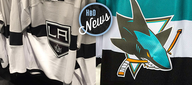
 The biggest and strangest feature is the stripe that runs through the team logo. It seems somewhat innovative, but it’s actually reminiscent of the most iconic and historical jersey in all of hockey: the Habs’ home reds. That jersey is one of the very few to have ever tried something like that. The Montreal Wanderers had something similar as well. So, these new jerseys tap into the historicity of the league, but simplify it to work for an stadium environment. It’s actually quite smart. But does it work?
No, for a couple reasons:
(1) That stripe ends on the sides of the jersey, not continuing around to the back, which creates this strange dynamic between the two sides of the jersey that doesn’t seem to have a sense of purpose. Kind of like the Buffalo Sabres’ horrible third jerseys. The numbers are clearly outlined, very large and would be visible with the stripes, so having the stripes underneath isn’t a readability or visibility issue. So, it just makes no sense.
(2) How the stripes interact with the logo is problematic. It’s less of an issue for the Kings which have a very solid, simple crest as the main shape of the logo, but for the Sharks, it adds visual clutter to an already busy shape and logo. I can guarantee you that, from 200 yards away, the shape and details of the Sharks logo will not be visible at all, and that’s further compounded by placing it on stripes of different colours.
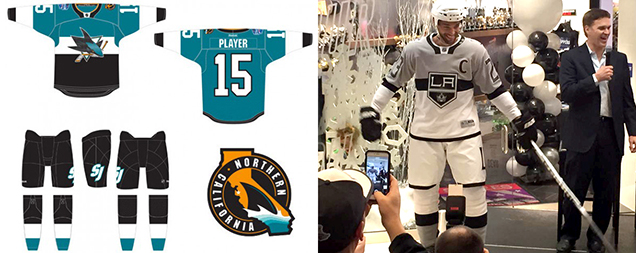
Another somewhat unique element is having two-toned jerseys: one colour above the stripe, another below. There’s also thick stripes on the sleeves to line up with the ones on the torso. The sleeve numbers, based on the mock-up, appear to be abnormally huge, which is likely because of the above quote, making sure that people can see the numbers from 200 yards away.
The two-coloured jerseys are a nice touch for the Sharks, which can never seem to decide whether they want to wear their teals or their blacks at home, unless they’re getting reverse-swept by the Kings of course and the black are then deemed bad mojo. This way, they can wear both. The white stripe in the middle brings a certain amount of attention to the logo (as that’s where the largest amount of contrast between black and white will draw the eye), but as we mentioned already, from 200 yards, no one’s going to see the logo anyway…so why not remove it altogether? Suddenly, it looks more like a stadium jersey (i.e. – a football jersey). Add big numbers to the front, and voila, a real-life football jersey, something that might befit the Jacksonville Jaguars.
I don’t like that look at all, but I’m just raising the point that their reasons is contradictory. Essentially, they wanted to make a football jersey without making a football jersey, so they slapped a historically-relevant stripe on it and kept the logo on the front, because that’s the essence of a hockey jersey. I get it, but then let’s call a spade a spade. It’s a football-esque hockey jersey. Suddenly, the design is becoming less and less innovative, but rather a merging of two traditions that create something that doesn’t necessarily work for either in a stadium or a comparatively-intimate arena. The only true innovation is having a jersey that’s essentially two colours – and yes, which is also like the Buffalo Sabres’ third jerseys.
For the logo crests, they seem to be fabricated on some shimmery fabric, to make them look chromed-up, but for real this time, not all fake-like. When you’ve got a comparatively flat and simple uniform design, it clashes with a shimmery logo. Not a fan.
Related Reading: HbD News: Stadium Series, All Chromed-Up
As for the individual teams:
San Jose Sharks
 The Sharks just can’t stop including orange in their uniform designs. The current jerseys eliminated it almost completely, aside from a very thin stripe on the sleeves. Here, they only have it as a stripe around the collar. Obviously, it’s reflecting the orange in their logo, but when it’s used so incredibly minimally, why bother? Black, white or teal – any one of those – would have worked better. (And by the way, I’m all for removing it from their logo as well.)
Speaking of the collar, the high-contrast design is strange, using a white block featuring the NHL logo surrounded by a black and orange ring, sticking out from the rest of the jersey like a sore thumb. It makes little sense, looking almost like a choker neckla…aaaaah, I get it now. Nice trolling, NHL.
The other unique element in the NorCal shoulder patch. The design of it is actually pretty great, but to fit better with the jersey, decreasing the amount of orange in there would have been a better choice. The only complaint is the point of highest contrast (that will naturally draw the eye to it) is where the black fin meets the white wave of water…which is in southern California. Defeats the purpose of the patch a bit, but at least there’s a star over San Jose to clarify.
Also, the Sharks will be wearing a single, unbroken colour from their nipples to their knees (alliteration, yo) which is very unusual and could look strange during the game. But at least it’s black, which can be worn anywhere. The other team, however…
Los Angeles Kings
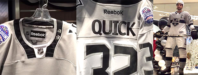 This is probably the biggest complaint about these jerseys: the white stretching from mid-way point of the jerseys to halfway down the socks (with a thin black stripe along the bottom of the jerseys and shorts). It’s like wearing a white tux, but with a black-lined silver cape and high stockings. It just looks bizarre, slightly off-putting and pyjama-like. But again, it’s impossible to tell for sure until we get into the actual game and see it in action. But yeah, a little strange nonetheless. The white helmet doesn’t help either. Black shorts would have absolutely worked better.
Other than that, the big “LA” from last year’s Stadium Series jerseys return, but this time living extremely large on the shorts. A nice touch with having two crowns on the collar to commemorate their two Cup wins.
Speaking of the collar, it has the same design as the Sharks’ jerseys do, but because there’s not a strange out-of-context colour placed there (the orange), it’s easier to forget how awful they look. Still looks like a choker necklace, but that’s a difficult joke to pin on the Kings.
Also, the back of these jerseys are not completely white, like the Sharks’ are completely teal. Having grey at the top is definitely a better choice and creates something a little more cohesive.
So, overall: Inventive? Kind of. Unique? Kind of. Interesting? Kind of. It’s a middling design that shows an interesting effort but the numerous mis-steps derailed the overall product.
Agree? Disagree? Let us know in the comments below!


[…] Here is the ultimate breakdown on both the Kings and Sharks Stadium Series uniforms. [Hockey by Design] […]
[…] besuchen. Dort gibt es einen langen, langen und sehr detaillierten Text zu den beiden Jerseys. Hier ist der […]
[…] • Now that both jerseys have been released, HbD breaks down the looks of the Kings and Sharks stadium series ensembles. [Hockey by Design] […]
[…] Related Reading: HbD News: Sharks and Kings Stadium Series Uniforms Announced […]
[…] I don’t know about you guys but I seriously dig the Kings’ Stadium Series kit. […]
[…] already seen the jerseys, and frankly, they’re not as bad as they could have been (see last year), but now it’s time to take a look at the goaltenders’ masks to go along with them. […]
[…] More: HbD News: Sharks and Kings Stadium Series Uniforms Announced • More: Stadium Series Jersey Countdown […]
[…] Full Analysis: HbD News: Sharks and Kings Stadium Series Uniforms Announced […]
[…] HbD News: Sharks and Kings Stadium Series Uniforms Announced More: The Stadium Series Jersey […]
[…] More: HbD News: Sharks and Kings Stadium Series Uniforms Announced • More: Worst to First Jerseys: Los Angeles Kings […]
[…] More: HbD News: Sharks and Kings Stadium Series Uniforms Announced• More: Worst to First Jerseys: Los Angeles Kings […]
Thank you for bringing up this topic. I enjoy how you present and argue all
the facts in addition to your general writing style.
Sometimes, there is a shortage of time to read long bits, but is brief and concise, I spent just a couple of minutes to read the entire article.
It is essential since nobody has enough time to browse.
You did a terrific job! This post seem extremely good.
I like the way you write your ideas! Your article is well-structured, therefore it’s not hard to browse, you even do
not need to read the whole article, it’s possible to just read the paragraph and find
an answer. In contrast, this very day I have read the content https://bestgunsafeusa.com/vault-doors/, it almost
concerning the same, however the info is given in not reader-oriented way.
Thanks for the article and keep visiting writing, you are a great author!
Last weekend I’ve finished this post https://bestgunsafeusa.com/best-gun-safe-buying-guide/ and
made the erroneous conclusions. But now I have read this one together with the
more fundamental approach and clear facts, so I am ready to
view it from another side. Thank you !
[…] More: HbD News: Sharks and Kings Stadium Series Uniforms• More: The 2020 Stadium Series Jersey […]
[…] More: HbD News: Sharks and Kings Stadium Series Uniforms Announced• More: 2020 Stadium Series Jersey […]
[…] USA. Gun Storage Solutions creates new kinds of gun rack merchandise that can effectively retailer http://hockeybydesign.com/2014/12/hbd-news-sharks-and-kings-stadium-series-uniforms-announced/ and display firearms and accessories. Gun Storage Solutions is a household run enterprise with […]
[…] cursive on this third grade writing written account by tracing the letters, then writing their own (news). Te gustara verlo en la edicin en espaol. Nuestro contenido est disponible y personalizado para […]