Worst to First Jerseys: San Jose Sharks
Ed note: We’ve all been shaken from the recent pandemic outbreak, not to mention the indefinite hiatus of hockey (and all sports). Our little site has never relied heavily on hockey games being played to keep pushing out content, but we’re going to try some different concepts and ideas over the coming weeks to try and help give all our minds our own little hiatus from the tragedies happening outside our front doors. So, for now, we hope we can help you through this in our own little way, wash your hands, and stay home.
As we go through the 2019-20 season, we’ll be updating all of the Worst to First Jersey posts every Monday, as almost all the teams in the league have unveiled new jerseys since their original posts. We’ll start with the ones most needing updating and work our way through the league. Today, it’s time for the San Jose Sharks to get updated.
Also, a huge thanks to SportsLogos.net and NHLUniforms.com for most of the jersey images and references.
Pre-1991, green (worn by Hartford and Minnesota), orange (Philadelphia) and light blue (Quebec) were the most adventurous teams got in a sea of otherwise black, blue and red jerseys. Part of that was due to jersey production restrictions, but San Jose was the first team to introduce a non-traditional colour into the NHL – teal. It was hugely successful, selling more merchandise in all professional sports than every other team save for the Michael Jordan-led Chicago Bulls. Anaheim (eggplant/teal), Colorado (burgundy) and Phoenix (a virtual shit-mix of colours) followed suit in the coming years. So the Sharks are trendsetters of sorts, but colour is one thing. How you design a jersey with those colours is completely different.
Here’s how this works: I’ll count down, from worst to first, all the jerseys the Sharks have ever worn. Homes and aways will be lumped into the same category (so, more of a jersey “era”) and I won’t worry about small changes (like slightly changed positions of piping for example). Third jerseys will stand on their own. And I’m focusing on the jerseys only, not the entire uniform. The jersey images are compliments of Chris Creamer and the fine people over at Sportslogos.net. For the Sharks, there’s eight different jerseys/eras. And we’ll start with the worst one.
8. 2015 Stadium Series Jersey
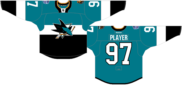
This jersey is a bland mess, but you can’t blame the Sharks entirely for it, as it’s more of a League-mandated bland mess.
2015’s Stadium Series featured only one game, the Sharks vs the LA Kings, and both teams wore jerseys that were similarly-designed, with a single stripe across the chest and sleeves, with one colour above and one colour below, and stupidly enormous sleeve numbers. And while San Jose’s was definitely the better of the two jerseys from 2015’s Stadium Series (at least these had some colour on them), there’s no escaping the fact that these are still the worst jerseys the Sharks have worn.
• More: HbD News: Sharks and Kings Stadium Series Uniforms Announced
• More: 2020 Stadium Series Jersey Countdown
For starters, the white stripe across the chest doesn’t wrap around to the back for no reason whatsoever. And don’t tell me that it would impede with the readability of the letter, because then it definitely impedes with the readability of the smaller and much-more-detailed logo on the front. It makes the black just awkwardly end at the hemline on the sides.
Other than that, it’s a pretty basic (read: bland) jersey, trying desperately to be minimalist so the design elements are clearly visible in a large stadium…which oddly doesn’t seem as big of a concern for the Winter Classic games. Basically, they tried the super-minimalism, and it doesn’t work that well.
The only other element to note is the orange collar ring, the only place on the jersey that includes the orange (aside from the logo and shoulder patch). I know orange is part of San Jose’s colour palette, but was it really that necessary here? And considering who they were playing (#itwas3to0), it was an open invitation for choker jokes.
Jersey Recommendation: #88 Burns. He scored the only goal for the Sharks that game, and if you have a crazy beard like him, you can effectively hide most of the jersey anyway.
7. 1998–2007 Home & Away Jerseys
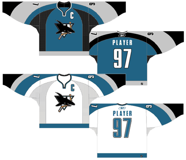
Aside from a few exceptions (which we’ll get to later), the 1990s should generally be considered the dark ages of design in the NHL. Things really started going downhill around the mid-90s, when bad typography, stupid logos the third jersey program got going. It was a time of extreme excess design-wise, with no signs of restraint or thoughtful consideration during a time of rapid expansion and growth. These jerseys are definitely a product of that era.
I haven’t seen this many curves on a man since the Victorian age, turning the ’80s-inspired cuff-to-cuff shoulder yoke design into something else entirely – into something that resembles graceful cherub wings when worn by the players. And graceful cherubs are not the first thing that comes into your mind when you see this guy. Well, except for maybe his hair.
But there are certain levels of restraint being shown here, keeping the same color scheme of teal, black and grey throughout (instead of throwing buckets of paint at the jersey like Phoenix and Florida did). The bottoms of the jerseys are kept minimal, to a single band of colour (which is impressively prescient, given how it’s become more common in the last few years). The patterns are consistent between the jerseys and, because of the complexity of the striping, they knew to keep the rest of the jersey relatively simple, so there’s some good things happening.
But there’s no question the teal jersey is the lesser sibling of the pair. With the additional black-mesh armpit-stain stripe coming to a point right at the collar, the jersey becomes way too clustered and almost sun-burst like (if the sun gave off rays of black, grey and teal that is). The white jersey at least removes the armpit stripe and comes across as a fairly well-designed jersey.
But the curved cuff-to-cuff thing is hard to pull off without it looking dated, especially with multiple stripes. It also creates odd points on the sleeves which really inhibit the numbers on the sleeves in size and placement. Sure, there’s issues with the jerseys, but if this is the worst that the Sharks could do, it’s not bad considering what their California cousins have come up with.
Jersey Recommendation: #18 Ricci. A face that you just can’t forget, and not necessarily in a good way. But also captain of the Sharks (albeit for only 10 games) and one of their more important contributors during this era. Get it in the whites, the better of the pair.

6. 2007–13 Home & Away Jerseys
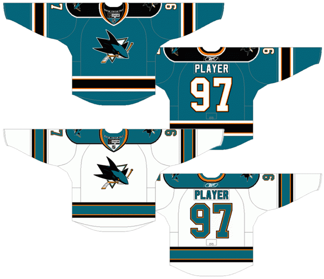
Remember what was said in the previous post about excess? Well, this jersey represents the one time in their history when the Sharks did just that. Over-designed, overly-complicated and number patches where they shouldn’t be drop this jersey to near the bottom of the list. What kept it from falling further down the list is that it held onto some traditional jersey aesthetics so it didn’t get too weird.
To go with a slightly altered logo design meant to create a more aggressive and updated look, the Sharks redesigned their jerseys at the same time, which also coincided with the new Reebok Edge jerseys being introduced to the league. It marks a return to more traditional jersey aesthetics for the Sharks, which is slightly ironic since other teams (like Colorado and Florida, for example) took the opportunity to redesign their jerseys into something that more closely resembled the previously discussed Sharks jerseys (to varying degrees of success). While traditional aesthetics is usually advantageous to a jersey, the introduction of orangey-yellow into the jerseys hurt more than helped.
• More: BTLNHL #25: San Jose Sharks
• More: HbD Interviews: Terry Smith (San Jose Sharks)
The Sharks have always had that colour in their logo – the hockey stick that the shark is biting into – but this is the only time it was introduced anywhere else, or at least to this degree. What is does is just add more lines that don’t really do anything. The orange is just enough to be an added distraction but not enough to actually work as an accent colour to the teal. It’s there, but not necessarily doing anything useful.
So, the rundown on the jersey becomes: five stripes along the bottom (black, orange, teal, orange, black), five stripes on each sleeve, two outlines around the numbers (black, orange), shoulder yokes that also have an outline around them, and double-outlined numbers on the front of the jersey thrown in there as well. Oh…and shoulder patches…and the main logo of course…and stripes around to collar for good measure. It’s maddening excessiveness. The jersey becomes a visual cacophony (which is a bad thing) of elements that weighs down the entire design and overcrowds the main logo.
Take a look at this photo, and tell me it doesn’t remind you of some European league’s jerseys.
Another negative is the typography. From 1998 to 2007, the Sharks used a typeface on their jerseys that, while not great, wasn’t the generic chopped-off corner font that is stereotypical for a lot of sports. Going back to to this is a bit of a step backwards. The clunkiness of the numbers and letters are accentuated when doubly-outlined and just add to the heavy look of the entire jersey.
Again, the thing saving this jersey from falling down the list is that it went back to timeless jersey design as the foundation, making sure that it would look relevant (but still bad) for as long as they wore it.
Jersey Recommendation: #19 Thornton. Nothing against Thornton at all for recommending his number on this low-ranking jersey. During this era, he was the face of the franchise more than any other player and helped make them a powerhouse team the entire time they wore the jersey. He’s arguably the best player to ever wear a Sharks jersey. Get it in the home teals.
5. 2018–present Third Jersey
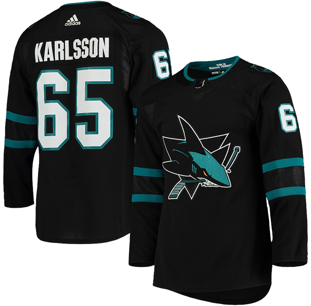
I think that after getting reverse swept by the LA Kings in 2014 (#itwas3to0), we were finally witnessing the end of the black jersey era for the San Jose Sharks. They refused to wear them in the playoffs following that meltdown and with no third jerseys last year, it was removed completely. Instead, they jumped right back into the black water with a jersey even darker and more ugh-inducing than before. Like the Jaws movies, the shark just keeps looking worse and worse.
• More: HbD Breakdown: Jets and Sharks Third Jerseys
We have to go back to the Black Ice jerseys – those awful neon-and-black vomit-producing cash grabs – to find something comparable. To create anything that mimics those jerseys and wear them during a game is insulting. And somehow, these are less interesting and more pyjama-like than those Black Ice jerseys.
The main reason why I don’t like black jerseys on principle is because of the greater context of hockey. It’s a sport played on a sheet of white ice, with white boards (we’re ignoring all the ads at this point), with one team always wearing white. When the other team wears black, the entire game is visually monochromatic. Compare this to this. It’s not even close what’s more interesting to watch.
These black jerseys take their level of blackness to a whole new level though. It’s similar to their pre-Adizero black jerseys with the main differences being their removal of white and orange elements.
Gone is the white stripes on the sleeves. Gone is the primarily-white “SJ” shoulder patches. Gone are the white laces. They went with their primary logo instead on an alternate, but gone is the white triangle in the logo (replaced with black). Even gone is the orange stick, replaced with teal. The shark’s eye is the only orange element left.
• More: BTLNHL #25: San Jose Sharks
They took their old third jersey and purposely stripped out as much non-teal or black elements as possible, implausibly (and confusingly) making it more mono-chromatic. It’s a good time to remind you of this essential design quote. These jerseys just don’t have enough. It’s minimalism taken too far.
The most interesting and innovative element of these jerseys is also its most subtle. The black section between the two teal stripes on the sleeves has a subtle textured element that alludes to the Silicon Valley that San Jose lives in. This, I like. This, I wish there was more of. Not just on the Sharks jersey, but on hockey jerseys in general. It’s a unique element that takes advantage of new manufacturing technologies that can create something like this. And here, you can barely see it, which makes the best thing about this jersey still a disappointment.
Jersey Recommendation: #65 Karlsson. He was the first Shark to ever wear this jersey in public, and while he’s still a good player, he’s never been the difference-maker the organization had hoped and bordering on a disappointment. Kinda like these jerseys.
4. 2008–17 Third Jersey
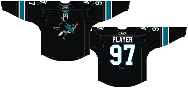
I already gave my rant above regarding black jerseys, and while these are extremely similar to the third jersey we just discussed above, it’s not quite as minimalist, with more teal and white included. The orange is still removed completely (except for in the logo of course), as are the stripes along the bottom and the shoulder yokes.
Are they still too minimal? Maybe, as hockey jerseys can start looking like practice jerseys – or, even worse, pyjamas – when there’s not enough elements on them. The laces help, as do the “SJ” shoulder patches. It also makes the numbers of the front of the jerseys look okay, but they’re still a useless addition to any hockey jersey.
Laces are added in there as well, which is almost always a great thing.
But as third jerseys go, it’s incredibly restrained and oddly minimalist when seeing the jerseys that were worn during that same era, creating a pretty sleek and refined look. And it’s a good example of how small changes in details can make a big difference to a final product.
Jersey Recommendation: #22 Boyle. Dan Boyle joined the Sharks right when these jerseys are introduced. And – like these jerseys – he’s been a terrific contributor to the team, but – again, like these jerseys – fell out of favour after the 2014 playoffs, and he subsequently left the team.

3. 2001–07 Third Jerseys
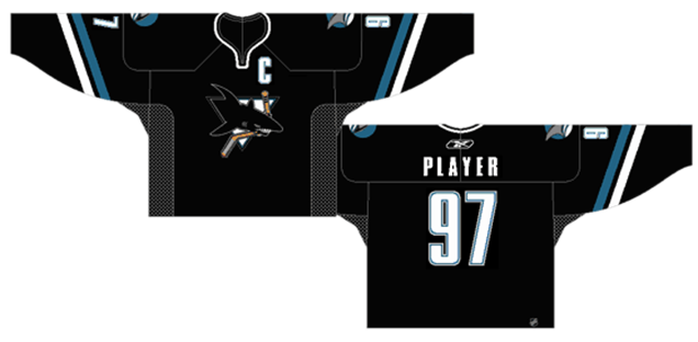
Again, another example of how small changes in minor details can make a big difference to the end product, as these jerseys are remarkably similar to the previous two jerseys discussed.
The white and teal stripes on the sleeves are slightly different and also angled. These differences are generally positive, creating a little more movement in the jersey and, while it can be seen as something more traditional as hockey jerseys go, it plays around with it a little bit to create something more modern.
Other differences: there’s no laces (a bad thing) but also no numbers on the front (a good thing) and the shoulder patches are different (a tie). The collar is white instead of black, which is probably a good thing since it’s a pretty minimalist jersey overall. Also, the typeface used is different which, as previously discussed, is definitely a good thing.
The biggest surprise with these jerseys are the era in which they were created, in the late-’90s and early-’00s when other third jerseys looked like this. And this. And this. To introduce a third jersey that showed this much restraint and professionalism is actually nothing short of remarkable. So, while we’re still dealing with a black jersey, there’s no question it’s better than the Sharks’ current third jerseys.
Jersey Recommendation: #12 Marleau. Some of Marleau’s best days as a Shark came during this era, and it’s also the era in which he was captain of the team. As Shark who spent almost his entire career in San Jose, then left, then came back (and then left again), he deserves to have his name on any fan’s back.
2. 2013–present Home & Away Jerseys
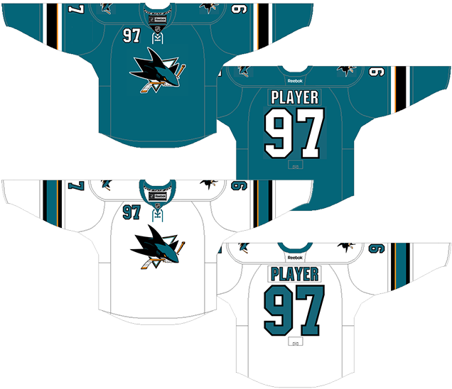
When these jerseys were introduced, one the biggest things that players talked about was how much they liked the third jerseys they had been wearing (ranked #4 on this list) because they were lighter and easier to play in, so they were happy that these new jerseys mimicked those third jerseys almost exactly. The only discernible differences in the actual design (other than the main logo being used other than the alternate one) is a single thin stripe of orange on the sleeves and the white jersey has a collar that’s coloured different than the rest of the jersey. Otherwise, they’re identical in every single way.
So, every positive and negative said against those third jerseys apply to these jerseys as well, with the biggest exception being that they’re not black. That’s enough to boost it up the list this far.
• More: HbD News: New San Jose Sharks Jerseys Announced
The biggest knock against the jerseys is that they’re too minimal. When it’s not a black alternate jersey, these minimalist designs can take on the look of practice jerseys. But over-minimalist is always preferably to over-excess. You may have heard the expression “less is more”, but less is not always more, just like more is not always more. “Just enough” is more. And that’s where these jerseys fall a little bit, there’s just not quite happening here to give them top placement. Adding a little bit of something to the bottom of the jerseys would’ve helped. A single stripe right along the bottom perhaps?
The players talked about the weight of the jerseys, but I’ll make the claim that it wasn’t the actual weight of the previous jerseys (#5 on this list) that was the problem: it was the visual weight. As heavy as they looked, we’re talking ounces in real weight which is barely noticeable when you’re wearing pounds and pounds of hockey equipment. These just visually look lighter, easier to move in, faster, not as constricting. Psychologically, it makes a difference and hockey players are just as human as the rest of us and would be affected by that. Besides, if they were really concerned about weight, they should have just removed the numbers on the front to save a few ounces.
These are great jerseys and the minimalist approach is definitely appreciated. It’s just the slightest of details (and slightest lack of details) that keeps them in second place.
Jersey Recommendation: #39 Couture. The newest Sharks captain and leader has been as consistent a contributor for the Sharks and their jerseys feature teal. A #48 Hertl would be great too. Get either of them in the home teals.
1. 1991–98 Home & Away Jerseys
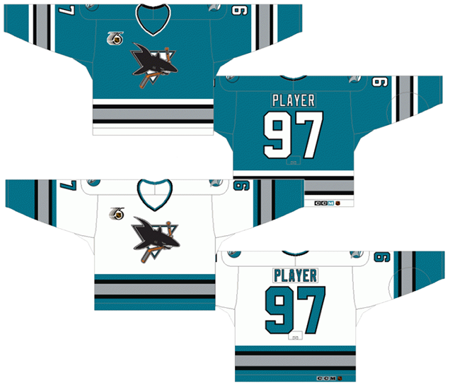
The first Sharks jersey ever is also the best one ever. The teal/grey/black jerseys were an instant hit with fans of hockey everywhere, selling in the thousands. It was a jersey that women could wear and look as comfortable in as any man. It was something new and exciting, and invited (for better or worse) a new era of hockey jerseys for a new generation of fans. It sounds like I’m over-selling it, but these jerseys were trendsetters and really did break new ground in the league. The extreme volume of sales alone spawned copycat teams to try new colours with fans to cash in on this new wave. You could even say that it helped spawn the third jersey program, as traditional teams that would never change their colours wanted to try new things as well. This jersey was, in a word, groundbreaking.
Complimenting the new colour scheme is a very traditional design that’s simple and, more importantly, consistent. The stripes on the sleeves are the same as the stripes along the bottom of the jerseys, creating the jersey strong and simple. Because the colour was so new, it was a good decision to keep the overall design very classic and traditional. Breaking too many barriers at once just starts to look strange and all progress happens a small step at a time.
The only complaint is that there’s a lot of stripes happening on the jerseys – the same amount as the #5 ranked jersey – but the lack of shoulder yokes or numbers on the front help to balance that out.
Aside from that, this is a jersey that looks classic and modern at the same time, and still looks somewhat relevant today, over 20 years after it was first introduced. For any designer, achieving that, is definitely a win.
Jersey Recommendation: #13 Baker. While these jerseys are the best, the Sharks were still an expansion team during this era and had little success and a constant rotations of players entering and leaving the organization. So why not celebrate the jersey with what’s perhaps the biggest goal ever scored for the Sharks, in their 1994 improbable upset of the Red Wings in the first round. Get it in the (then) home whites.
Agree? Disagree? Let us know in the comments below or join the conversation on Twitter, Facebook, or Instagram!


I like the 1998-2007 teal jerseys best. 1991-98 seem pretty generic to me, you change the colours and logo and it could be just about any team’s jersey. I don’t like the sharks in black, I like the teal jerseys better than the white, and I don’t like the orange trim, so that negates most of the jerseys ranked #2 – #6. The issues listed with the 1998-2007 jerseys are all valid points. But when I think best jersey I also think most distinctive and unique, like the red Ottawa jersey 1997-2007. For the 1998-2007 San Jose jersey, yes the sharks logo is dated and too 90’s ish, and there are issue with the stripes. But when I picture a San Jose jersey, that teal version is what I picture.
I lived in San Jose during those first few seasons. And while not a fan of the Sharks (I roll with a certain team decked out orange and black), I sill thought the logo and uniform colors were pretty stylish. It was a pretty exciting time as a hockey fan in an expansion city…