
HbD Breakdown: Jets and Sharks Third Jerseys
 The new season has begun, goals are up (as usual in October), and nightmare-inducing mascots are all the rage. Hockey’s back baby!
And with that are a slew of new third jerseys that have been released over the past month. And we’re here to break them down. Today, we’ll look at the the third jerseys that Winnipeg and San Jose will be wearing this year. Right after the jump, of course.
Winnipeg Jets

Inspiration vs Theft
“Good artists copy. Great artists steal.” –Pablo Picasso
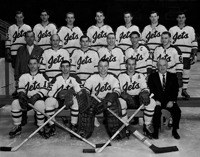
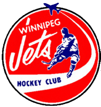
Something has to be brought up first before breaking down the aesthetics of the jersey. It was brought to my attention soon after the Jets announced their new third jersey (via @gameplanchicago on Twitter) that this may not be the same time this exact jersey design has been featured on the ice. The Johnstown Jets of the EAHL from Johnstown, PA – yes, that Johnstown that was the basis for the Charlestown Chiefs and the Hanson Brothers of Slap Shot fame, and where the movie was predominantly filmed in – had a jersey that not just eerily similar to these new Jets jerseys, they’re basically identical.
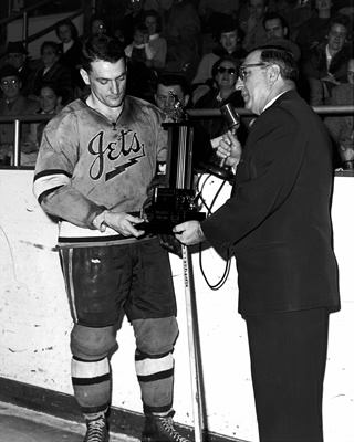
EHL’s Johnstown Jets (circa 1950s)
The only minor change is to the “Jets” script crest, modifying the lettering slightly, and replacing the zig-zagging underline with a smooth line. It’s tough to find any information about when these jerseys were worn exactly as they seemed to only wear it briefly (or sporadically) since a different jersey set is more commonly featured with them. And since there’s little-to-no colour photographs for the team in this era, it’s hard to tell what colour the base of the jersey is. Considering the tone of grey in the photographs, and that their other jerseys always featured blue, I don’t think it’s that far of a stretch to think these were no different.
So, you have two blue jerseys, both with a “Jets” script lettering as the main crest, both with a large white stripe with thinner black/navy blue stripes on both sides of it featured on the sleeves and bottoms of the jerseys. The differences? 1: The aforementioned minor differences in the crest. 2: White crest with black/navy outline vs black/navy crest with white outline. 3: Thin white collar vs thin black/navy collar. Those are three very minor differences overall. Everything else is identical in concept, execution, and layout. They’re way too similar to be considered a coincidence, especially since this is so far outside of anything the Winnipeg Jets have ever had in either of their iterations.
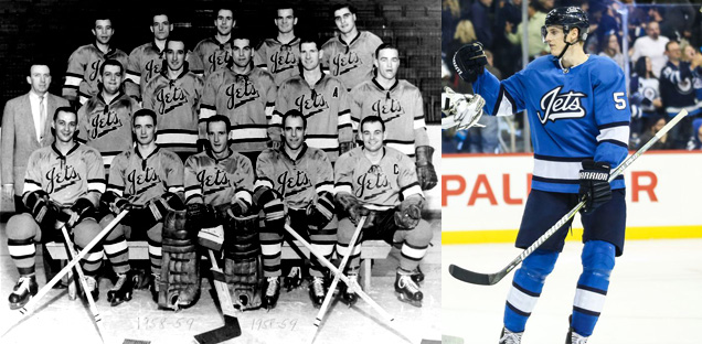
EHL’s Johnstown Jets (circa 1950s) and the new Winnipeg Jets jersey
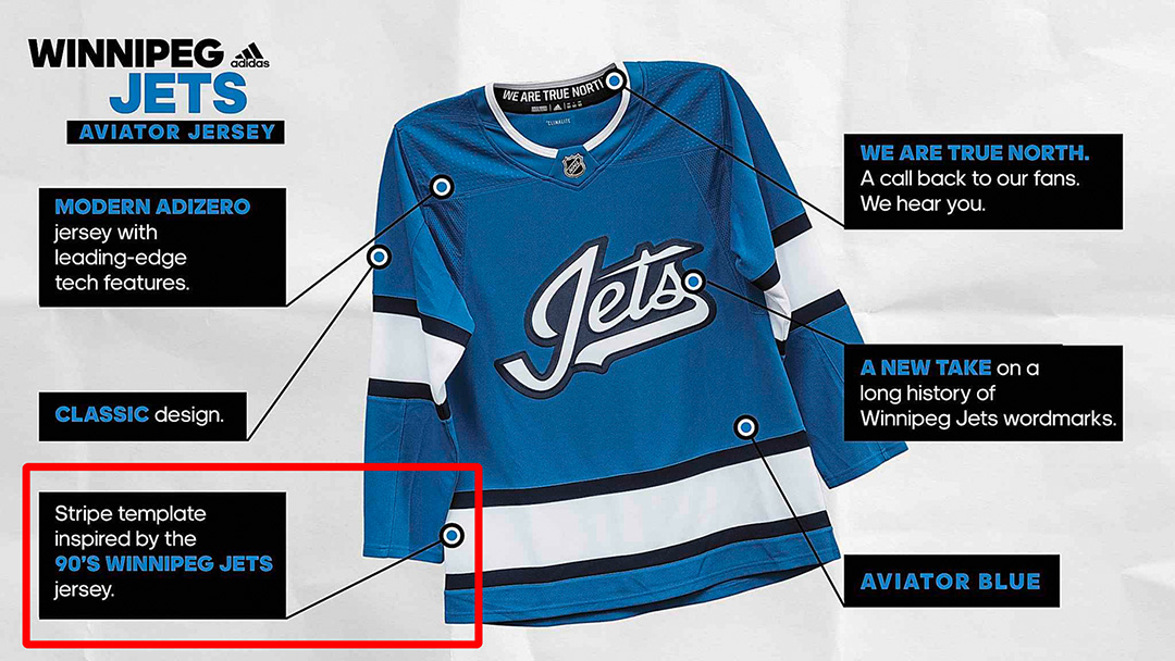
I would have less of a problem with this if they had mentioned it somewhere in the press releases – something that mentions they drew inspiration from it, or even just a metaphorical nod of the head to it – but there is absolutely nothing to be found anywhere that mentions it. In fact, they say the stripes are inspired by the ’90s Jets jerseys.
The only conclusion I can draw is that somebody completed ripped off the original design from the Johnstown Jets and nobody else at Adidas, the League, or the Jets realized where it was originally from (which is easy to understand given its relative obscurity) and it got approved and pushed through to production.

I’ll say it again because it can’t be understated…this looks like a stolen design – a complete rip-off from a designer who figured nobody would find out the source, and called it a day. For someone to think it’s possible to get away with nowadays (in the age of the internet and social media) is asinine. For it to get through the design process (involving just Adidas, the League, and the Jets) without knowing its source is totally understandable, as it’s a very obscure jersey and I wouldn’t have known of it either had someone not let me know.
For that, no matter what I say going forward about the aesthetics of the jersey, it gets a huge thumbs-down from me.
Everything Else
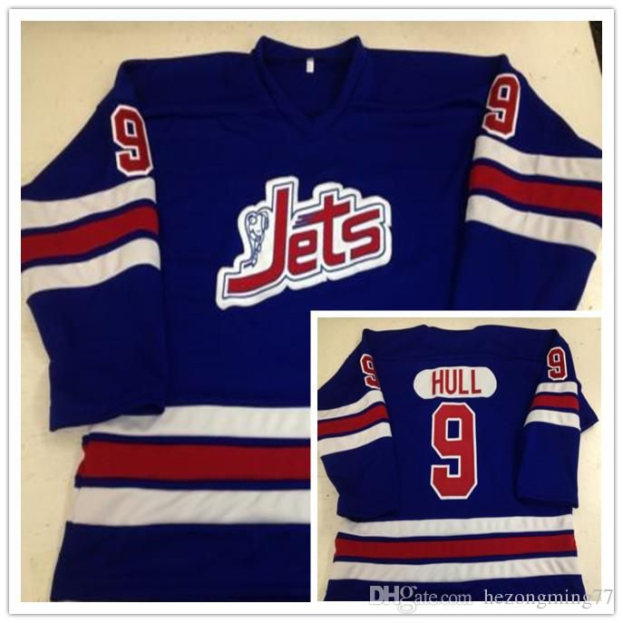
 With that out the way, I love the sky blue base of these jerseys. It’s rich, relatively unique within the league, plays with the Jets’ visual brand, and looks great on the ice. The navy/black and white stripes are classic and certainly do evoke the Jets’ ’90s jerseys.
The text within the collar is a nice touch…and brought to you by the proud owners of the Winnipeg Jets, coincidentally called True North Sports & Entertainment.
 The wordmark crest is really nicely executed too, which is apparently hard to come by in this league. It’s also very unique for the Jets brand to use something like this on their jerseys. The closest they’ve ever come is their original 1972-73 jerseys. The original 1972–74 logo comes a little bit closer. I wouldn’t call either of these a “long history of…wordmarks.”
They also subtly integrated a jet illustration into the wordmark, which is definitely a nice touch.
 The jersey as a whole is definitely a combination of both classic and minimalist modern design aesthetics, and for the most part, they balance each other out really nicely while still being visually interesting.
But, I just can’t shake the feeling that there’s something missing.
Inspiration vs Theft (Part 2)
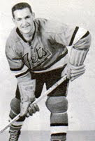
EHL’s Johnstown Jets (circa 1950s)
I wasn’t planning to go back to this, but it’s in relation to the last sentence above. The perception that there’s something missing – as many off-the-cuff critiques I’ve seen online have stated in one version or another – is a major component indicating this could be a stolen design. A Winnipeg Jets jersey has never been without red on it. It’s never not had the primary logo on the chest, aside from their inaugural WHA season in 1972–73. It’s never had completely bare shoulders since 1977.
• More: BTLNHL #15: Winnipeg Jets
• More: Worst to First Jerseys: Winnipeg Jets
This doesn’t necessarily constitute proof that they took the Johnstown Jets design and called it their own, but it’s all these little pieces piling up. This new jersey is just oddly off-balance, and so oddly off-brand. If it is indeed a stolen design, then its lack of additional design elements makes sense.
If not, then the lack of additional elements is the single biggest flaw in the jersey. I understand what they were going for – classic jersey design combined with modernist minimalism – but it leans too far on the minimalist side.
Final Verdict
Blah, blah, blah, it’s hard not to come to the conclusion that it’s a ripped-off jersey from the Johnstown Jets. It’s too similar to that jersey and too off-brand to the Jets jerseys to be seen a coincidence. So, fuck this jersey.
San Jose Sharks

Back in Black (Ice)
Speaking of minimalism…
I think that after getting reverse swept by the LA Kings in 2014 (#itwas3to0), we were finally witnessing the end of the black jersey era for the San Jose Sharks. They refused to wear them in the playoffs following that meltdown and with no third jerseys last year, it was removed completely.
Instead, they’ve jumped right back into the black water with a jersey even darker and more ugh-inducing than before. Like the Jaws movies, the shark just keeps looking worse and worse.

We have to go back to the Black Ice jerseys – those awful neon-and-black vomit-producing cash grabs – to find a comparable jersey. To create anything that mimics those jerseys and wear them during a game is insulting. And somehow, these are less interesting and more pyjama-like than those Black Ice jerseys.
• More: Black Ice Jerseys Suck
At least these don’t have those awful grey-out team crests. And given the jersey we first discussed, at least they’re original.

White Out
The main reason why I don’t like black jerseys on principle is because of the greater context of hockey. It’s a sport played on a sheet of white ice, with white boards (we’re ignoring all the ads at this point), with one team always wearing white. When the other team wears black, the entire game is visually monochromatic. Compare this to this. It’s not even close what’s more interesting to watch.
These black jerseys take their level of blackness to a whole new level though. It’s similar to their pre-Adizero black jerseys with the main differences being their removal of white elements.
 Gone is the white stripes on the sleeves. Gone is the primarily-white “SJ” shoulder patches. Gone are the white laces. They went with their primary logo instead on an alternate, but gone is the white triangle in the logo (replaced with black). Even gone is the orange stick, replaced with teal. The shark’s eye is the only orange element left.
• More: Worst to First Jerseys: San Jose Sharks
• More: BTLNHL #25: San Jose Sharks
They took their old third jersey and purposely stripped out as much non-teal or black elements as possible, implausibly (and confusingly) making it more mono-chromatic.
It’s a good time to remind you of this essential design quote. These jerseys just don’t have enough. It’s minimalism taken too far.
The Digital Age
The most interesting and innovative element of these jerseys is also its most subtle. The black section between the two teal stripes on the sleeves has a subtle textured element that alludes to the Silicon Valley that San Jose lives in.
 This, I like. This, I wish there was more of. Not just on the Sharks jersey, but on hockey jerseys in general. It’s a unique element that takes advantage of new manufacturing technologies that can create something like this. And here, you can barely see it, which is disappointing.
Final Verdict
The sleeve digital pattern is great. The rest of it? Bleah. It’s way too minimal, and trying to hard to equate the colour black with being cool and intimidating. Instead, it’s just boring.
Agree? Disagree? Let us know in the comments or join the conversation on Twitter, Facebook and Instagram!


Yeah. Neither of these are great or slightly inspiring. Shame, because the shark colour palette is strong. Curious what the triangle in the shark logo is for? At least in the Penguins logo, you know there is a three rivers reference. But why in San Jose? It’s always reminded me of a Marine Land show trick of having a shark jump through a triangle hoop.
Wondering what you think of the Shark logo introduced in 2017 with no triangle and a bit more of a profile to the shark as seen here:
http://www.sportslogos.net/logos/view/2627482017/San_Jose_Sharks/2017/Secondary_Logo
…maybe a bit too much of the scary teeth thing you might see in a lower division logo. But, I like the full length of the shark with tail, the movement in the profile of the shark, and the lack of trick show hoop jumping.
Brant
I think the artistry and execution of their alternate logo is great…it looks really good. But, I think it’s a little too over-the-top/minor-league for the NHL.
As for the triangle, I’m not sure. Anaheim, Atlanta, Minnesota, Florida, they all used triangular shapes to their logos at the time. Shapes, just like colours or fonts, can go through fads and trends.
[…] • More: HbD Breakdown: Hurricanes and Coyotes Third Jerseys• More: HbD Breakdown: Anaheim Ducks Third Jersey• More: HbD Breakdown: Jets and Sharks Third Jerseys […]
[…] • More: HbD Breakdown: Jets and Sharks Third Jerseys […]
[…] More: BTLNHL #15: Winnipeg Jets• More: HbD Breakdown: Jets and Sharks Third Jerseys• More: Worst to First Jerseys: Winnipeg […]
[…] More: BTLNHL #15: Winnipeg Jets• More: HbD Breakdown: Jets and Sharks Third Jerseys• More: Worst to First Jerseys: Winnipeg […]
[…] More: BTLNHL #15: Winnipeg Jets• More: HbD Breakdown: Jets and Sharks Third Jerseys• More: Worst to First Jerseys: Winnipeg […]