
Top 5: Worst Designs of 2018

Christmas is over. 2019 is right around the corner, so it’s that time of the year where everyone and their top-5-favourite-dogs-of-the-year are counting down the best and worst lists for 2018. We’re not immune to such things. In fact, we do it on a semi-regular basis.
So today, we’re got the Top 5 Worst Designs of 2018 in the hockey world. We’ll tackle the Best Designs as well, but Worst is first because you always pick the bad news before the good news when given the option. Always. Remember, these are the Top 5 Worst Designs that were announced in 2018. Not all of them have necessarily been used in a game yet or some were excluded from this list because they were announced in 2017.
• More: Top 5: Best Designs of 2018
• More: Top 5: Worst Designs of 2017
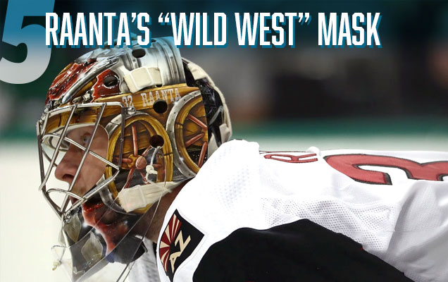
Raanta’s 2018-19 mask is fun for a team located in the desert (see full version of the mask here), but the composition contains enough for about five masks all jammed into one. The wagon is so compacted that the design looks cluttered from the bottom up. The choice to make the dogs the same color as the wagon doesn’t help Gunnarsson’s design from a legibility standpoint either, as all of the workmanship and detail just gets lost in this huge shuffle. Kudos for creativity and running with a signature theme here, but this mask is another case of when less would have been more.
• More: HbD Masks: 2018-19 Western Conference Bucket Preview

Unbalanced, too minimalist, and a missed opportunity to utilize a better logo they already had at their disposal that doesn’t rely on slang and nicknames to be original. The Washington Capitals’ addition to the Stadium Series jersey archives is another example of the League’s Stadium Series-mandated minimalism and intensely large elements gone awry to create a jersey that’s obnoxious and boring at the same time. Plus, it made Ovi look pregnant somehow. I don’t know how the Capitals survived the embarrassment of wearing these jers…oh, never mind then.
• More: HbD Breakdown: 2018 Stadium Series Jerseys


Sorry Americans, but your 2018 Olympic jerseys just don’t work well. Part of that is because of design issues, but the biggest problem of the jerseys for the Red, White and Blue is…where’s the red? Then, there’s ditching a crest in favour of the modernist tech-y font, and it’s one of the worst applications of Nike’s unique zig-zagging stripe patterns used for all the teams.
• More: HbD Breakdown: 2018 Olympic Hockey Jerseys

When the Maple Leafs arrived on the ice in Annapolis, MD, it wasn’t the minimalism of the design elements that bugged me. Using the Royal Canadian Navy as inspiration doesn’t bug me. Even the chest stripe(s) doesn’t really bug me. But a jersey and uniform that doesn’t mind its surroundings bugs me. White jersey, white pants, white gloves, on a white surface, with white boards, outside surrounded by white snow and white clouds. If they wanted to win via camouflage, well, it still didn’t work.
• More: HbD Breakdown: 2018 Stadium Series Jerseys

Honestly, the entire Top 5 could’ve almost been filled entirely with these jerseys, but it seemed to constitute an unwelcome trend of resuscitating black retro jerseys (Arizona), modifying retro jerseys to be black (Anaheim), or somehow trying to give life to those awful old Black Ice jerseys in various ways (San Jose, Carolina). Each of them have various elements of awfulness, but they all share a dominance of black that look too monochromatic on the ice against an opposite team wearing white. Black jerseys can be awesome if you do it right. But none of these teams did.
• More: HbD Breakdown: Hurricanes and Coyotes Third Jerseys
• More: HbD Breakdown: Anaheim Ducks Third Jersey
• More: HbD Breakdown: Jets and Sharks Third Jerseys
So that’s the worst of the worst in NHL design this year. Want to know the best designs of 2018? Click here!
Agree? Disagree? Let us know in the comments or join the conversation on Twitter, Facebook and Instagram! And if you’re interested, we’re now on Pinterest too.


[…] More: Top 5: Worst Designs of 2018• More: Top 5: Best Designs of […]
[…] More: Top 5: Worst Designs of 2018• More: Top 5: Best Designs of […]
[…] More: Top 5: Worst Designs of 2019• More: Top 5: Best Designs of […]
[…] More: Top 5: Worst Designs of 2019• More: Top 5: Best Designs of […]
[…] More: Top 5: Worst Designs of 2020• More: Top 5: Best Designs of […]