Top 5: Best Designs of 2018

Christmas is over. 2018 is right around the corner, so it’s that time of the year where everyone and their top-5-favourite-dogs-of-the-year are counting down the best and worst lists for 2017. We’re not immune to such things. In fact, we do it on a semi-regular basis.
So today, we’re got the Top 5 Best Designs of 2017 in the NHL (we tackled the Worst earlier). Remember, these are the Top 5 Best Designs that were announced in 2017. Not all of them have necessarily been used in a game yet or some were excluded from this list because – even though they were used in 2017, they were announced in 2016.
• More: Top 5: Worst Designs of 2018
• More: Top 5: Best Designs of 2017

Yeah, they’re pretty much identical to their 2017 Winter Classic Jerseys (which we already featured on the Best of 2016 post), but credit St Louis with recognizing excellence and giving it life again, but I really love it. The striping is classic old-school aesthetics. The colours are fantastic. The Adizero collar – while not necessarily “Heritage” – made the best decision possible given the possibilities. And the logo is awesome, as always. For a Heritage jersey, it hits all the right notes.
• More: HbD Breakdown: St Louis Blues Third Jersey

Painted by Stephane Bergeron, the striking gold and navy design is the perfect execution of minimalism that I wish the league had more of (see full mask here). Using gold foil on white to execute all of the graphics, you won’t find any light flares or holographs here. The bold lines of the panther head applied in solid gold really pop off the stark white background, and the navy blue accents give the design the perfect amount of color and contrast. Yes, Luongo’s mask was featured on last year’s Best Of as well, but he keeps killing it in the mask design department.
• More: Hbd Masks: 2018-19 Eastern Conference Bucket Preview


Primarily, this is a white-vs-black matchup, which is probably my least favourite matchup, but both of these jerseys succeeding in being unique, interesting, and incorporating different elements that balance the whole monochromatism of the matchup. For Boston, it’s a really great hybrid between the classic style of the league’s early years and the more contemporary jerseys of today. For Chicago, it’s bringing something unique back to life, using its monochromatic appearance as a strength rather than a weakness to create something visually interesting and attention-grabbing. It’s probably the least colourful of the Winter Classic matchups, but from a design perspective, it’s pretty top notch.
• More: HbD Breakdown: 2019 Winter Classic Jerseys

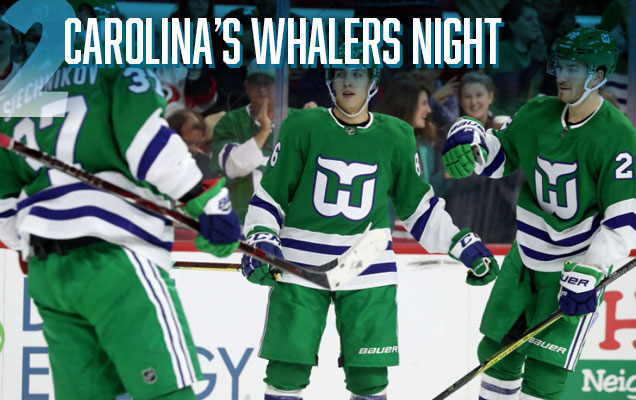
Sorry Connecticut. I know that seeing these jerseys hit the ice in a city that ripped your beloved Whalers out of your heart must have been pretty painful. And I totally understand and sympathize. Lucky for me, I’m not from Connecticut and I’m a big fan of design, so it was pretty magical seeing the classic Whalers uniforms rip around the ice again. Since there’s little-to-zero chance of a team moving back to Hartford anytime soon (oh hai Seattle!), it was nice to see one of the best logos on one of the best jerseys to ever exist in the league being utilized once again.
• More: BTLNHL Vintage: Hartford Whalers
• More: Worst to First Jerseys: Carolina Hurricanes

Speaking of Carolina, they recently played one of the extremely few instances of a colour vs colour jersey matchup. The Hurricanes owner dislikes their white road jerseys enough that they’re wearing it as little as possible, asking their opponents to wear their road whites at home so Carolina can wear their home reds. In Anaheim, the Ducks instead wore their home blacks, creating a colour-vs-colour matchup. And while the Ducks have some of the worst home jerseys in the league, at least it was a step down a path that can only end in more aesthetically-pleasing matchups (à la 2014’s Detroit-Toronto Winter Classic). There’s now precedent, and it’s the best development to happen this year.
Agree? Disagree? Let us know in the comments or join the conversation Twitter, Facebook and Instagram! And if you’re interested, we’re now on Pinterest too.


[…] More: Top 5: Best Designs of 2018• More: Top 5: Worst Designs of […]
[…] • More: Top 5: Worst Designs of 2018• More: Top 5: Best Designs of 2018 […]
[…] • More: Top 5: Worst Designs of 2019• More: Top 5: Best Designs of 2018 […]
[…] probably be disqualified from this discussion anyway and b) would like to gently request that “color vs. color” stays a novelty rather than becoming a regular […]
[…] • More: Top 5: Worst Designs of 2020• More: Top 5: Best Designs of 2019 […]