
HbD Breakdown: 2019 Winter Classic Jerseys
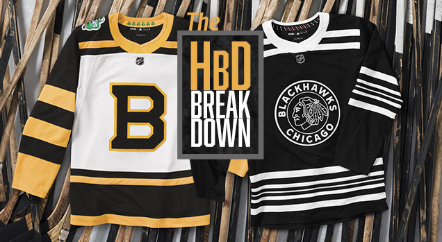 The jerseys for the 2019 edition of the Winter Classic was unveiled recently. Both the Bruins and the Blackhawks dived deep into their jersey history to find inspiration for what they’ll be wearing on January 1, 2019 at Notre Dame Stadium in Indiana. And we break them down, right after the jump.
Side note: the NHL in Indiana. Weird.
Boston Bruins
Modern History
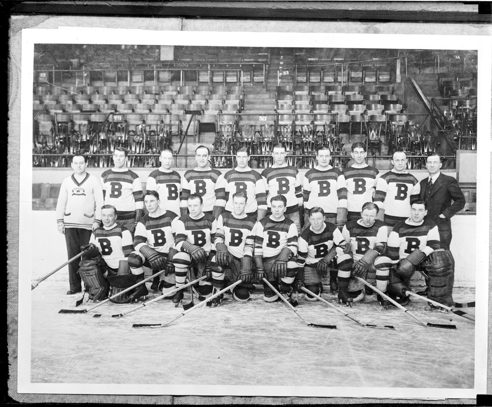
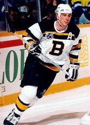
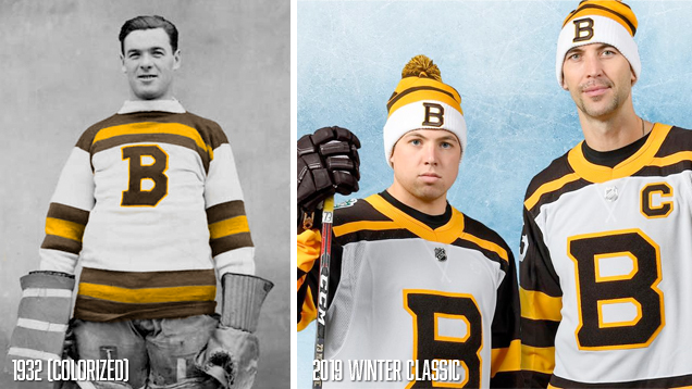 For an outdoor matchup of two of the league’s oldest franchises, the Bruins threw it all the way back to the 1930s for their Winter Classic jersey inspiration. The white, brown and gold design is almost identical to the sweaters worn almost a century ago and one that was reprised for the team’s 75th anniversary in the 1992-93 season. “That’s the balance,” Bruins President, Cam Neely told BostonBruins.com. “You certainly want to have that tradition of the Bruins and what’s happened over the years, but also understand that it’s 2018, so I think we had a nice combination there.”
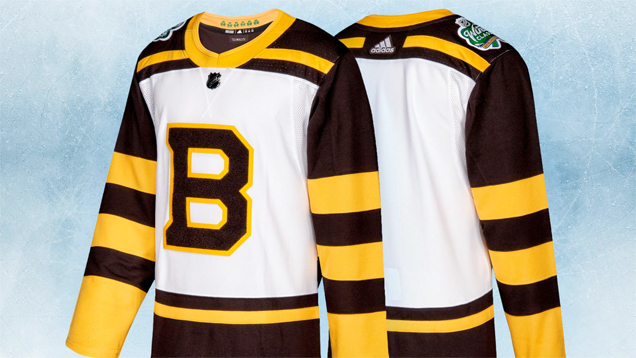 Adidas did a really nice job of keeping the essence of the original sweater while adding enough of the modern touches that Neely spoke of to bring this jersey into the 21st century. The collar is perhaps the most noticeable difference, with the addition of the gold neckline intersecting the chest stripes, along with streamlining of the gold stripes along the waist.
The chunky stripes weren’t totally abandoned however, as the addition of striping all down the sleeves of the Winter Classic sweater is a nod to the look of the original. The more minimal elbow stripes would’ve actually been preferable, as they are far less cumbersome (and less Steelers-esque), but the heavier striping is more in line with the color blocked sleeve style Adidas has been going for.
All in the Details
 With the transition to Adidas taking over the design and construction of all NHL jerseys, we’ve seen a big (and welcomed) uptick in the attention to detail, and these jerseys are no exception. What is a pretty simple overall design is elevated by the small details and textures that make the sweater feel richer and more authentic.
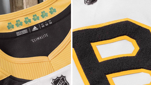
The B logo on the front, used by the team from 1932 to 1949, is applied using two layers of fabric – a golden felt base underneath a chocolate brown chenille. The Bruins also used the chenille fabric on the bear of their 2016 Winter Classic sweaters and a felted spoked-B in 2010, but this combination feels really rich and substantial.
Bruins continuing trend of non traditional material for Winter Classic jersey crest (hard to tell 2010 is felt) pic.twitter.com/Ias9gurMUN
— jeff israel (@jeffisrael25) November 8, 2018
The other nice detail on this, which has also become somewhat of an Adidas signature, is the imprint inside of the neckline. The Bruins incorporated their franchise’s six Stanley Cups with the iconography of Notre Dame Stadium, the site of the 2019 Winter Classic. “I wanted to pay a little homage to Notre Dame and the shamrock that is so famous there,” Cam Neely explained. “We put the years of the Stanley Cups in the collar just to give it a little bit more flavor. It ties in Notre Dame a little bit with the success of the franchise and the six Stanley Cups.”
What’s in a Name?
 Photos via @mattgrahamx
Like on the front of the jersey, the back is equally packed with small details that make these sweaters a success. In contrast to the single-layer felted numbers and letters on the 2016 Winter Classic jerseys, the 2019 iteration layers two colors of felt for the numbers, while keeping the lettering clean with a single layer of brown felt. Fortunately, Adidas hasn’t followed in Reebok’s footsteps in adding oversized typography on outdoor game jerseys, as the numbers and letters are applied at standard size. My only issue with the numbers is that the gold border brings the characters too far into modern day style, which takes away from the classic cleanliness of the stark, brown letters.
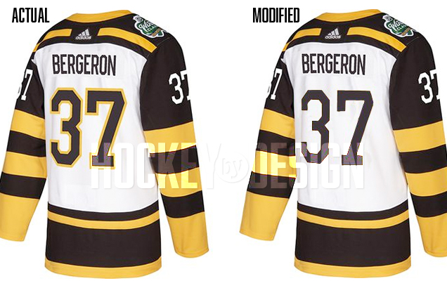
That being said, the letters and sleeve numbers are applied with a really nice stitching pattern around the edges, which along with the white-on-white nameplate on the back, brings the same level of depth and texture that we get from the front of the jersey. I don’t think removing the gold layer would do any harm to the amount of visual interest and would ultimately make things look cleaner and more authentic.

Final Verdict
This jersey is a really great hybrid between the classic style of the league’s early years and the more contemporary jerseys of today. While there are some slight changes I’d like to have seen, overall these are really stellar. This a great build on the 2016 concept that fell a bit short in terms of visual interest, and I think they’ll look great on the ice on New Year’s Day.
Chicago Blackhawks
Article of Interest
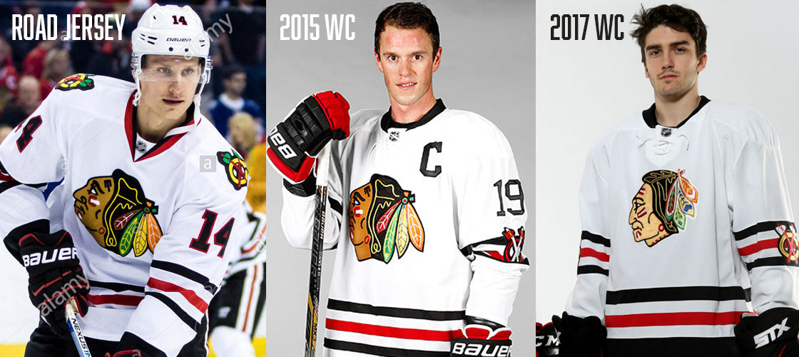
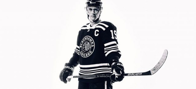 Finally! The Blackhawks have done something interesting with their Winter Classic jerseys! After the last two times they played in the annual New Year’s Day game inspired jerseys that were little more than slightly-altered versions of their regular road whites, it’s nice to see them reach way back into the annals of their jersey history again to give us something completely unique and visually interesting in today’s era of hockey jerseys.
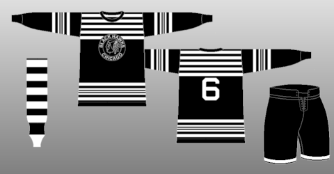
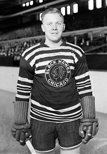
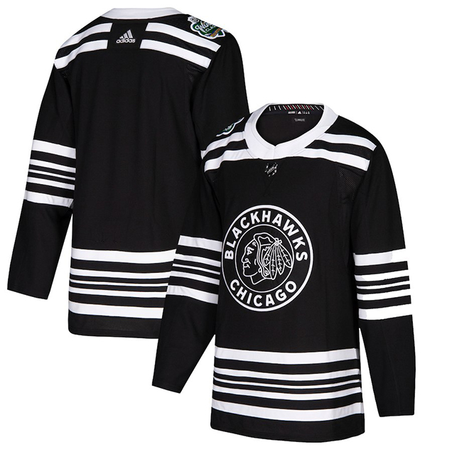 These monochromatic jerseys are a callback to their 1927–34 versions. More specifically, their 1930–34 uniforms, which have the same white collars (the 1927–28 jerseys had black collars), and a white stripe down the side of the pants (the 1928-30 uniforms had just a white stripe along the bottom of the pants).
There are still some minor differences, like white stripes on black socks vs black stripes on white socks, and a few less stripes coming down from the shoulders. We can’t ask for everything I suppose, but hey, at least it gives us something to talk about!
The White Stripes
 I’ve often railed against black jerseys on this site, especially monochromatic jerseys that add no burst of colour to a literal blank canvas of white ice. But, these are so aggressively monochromatic because of the hyper amount on contrast created by the multitude of white stripes all over the jersey. Like most of The White Stripes’ music videos, it grabs the eye’s attention and won’t let go. Like, seriously, you can’t stop looking.
But despite the onslaught of stripes, the fact that it’s monochromatic forces a simplicity and minimalism to it that it would otherwise have. Add any amount of colour to the exact same design and the stripes will start looking obnoxious and over-bearing. But as just black and white, it’s hypnotic, and surprisingly elegant.
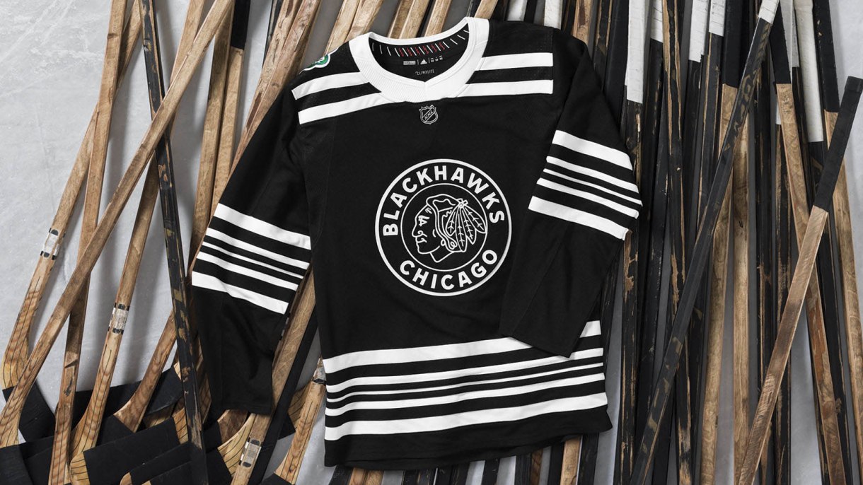 Part of the elegance is from the stripes’ consistency on the bottoms and the sleeves (and socks), as well as the varying but symmetrical variance in the stripes’ thicknesses. It creates some depth and movement to the design. And again, the black-and-white forces minimalism on something that would otherwise be too complex. Here, it works.
The removal of some of the stripes is somewhat disappointing. In lieu of that, it would’ve helped to keep the striping consistent throughout the jersey, as the two stripes at the stop are really heavy and dominating, especially when paired with the thick white collar. For me, that’s the only main misstep here. But it’s still a pretty minor one.
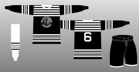
Head Honchos
Left: sportslogos.net; Right: blackhawks.nhl.com
The logo on the jersey’s chest is also monochromatic, mimicking the original jersey’s crest. The 2018-19 version uses their current logo instead of trying to replicate the original Indigenous head logo.
Keeping the logo monochromatic is important. Having the multi-coloured version of the logo in there would’ve made it attract more attention as being the only spot on the jersey with any colour, which would’ve made it heavily complete with all the high-contrast stripes everything, making your eyes bleed. Nobody likes that.
And, of course, the new logo reflects the new spelling of the team name (all one word!) that happened back in 1986.
Colour Collar
There is actually one spot of colour on the jersey: on the inside of collar.
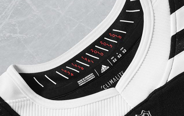 In-between the slanted lines that ring the back of the collar are six years written out in red – the six years that the Hawks have won the Cup. It’s obviously a nice additional element to the jersey, and using a more unique way of including it – white slanted lines and Rangers-esque diagonal text – makes it a little more interesting than just slapping the numbers on there. And it mimics the striped goodness on rest of the jersey.
Update: Unlike 99% of the internet, we have great comments on this site, like the guy who let us know that the angled stripes on the Blackhawks’ collar are meant to mimic the end zones at Notre Dame Stadium, which makes them even better. Thanks for that!

Final Verdict
Black jerseys are usually bad, but this one is definitely not. It’s rooted in the history of a team that has some very deep roots, bringing something unique back to life. It uses its monochromatic appearance as a strength rather than a weakness to create something visually interesting and attention-grabbing. Any Blackhawks fan should be slobbering to add this to their jersey collection.
Agree? Disagree? Let us know in the comments or join the conversation on Twitter, Facebook and Instagram!


No mention of why the slanted lines are on the inside collar of the Blackhawks jersey? (See the end zone design for Notre Dame Stadium)
That’s because I’m not super-familiar with the ND stadium, so I didn’t think to look at that. Thanks for letting me know!
[…] • More: HbD Breakdown: 2019 Winter Classic Jerseys […]
Just FYI, the intent was for both teams to wear the uniforms they won their first Stanley Cups in. Thus, the Boston uniform is based on their 1929 design, not the 1932-34 design shown above. We presented it with the proper crest for 1929 (cleaned up in similar fashion to Chicago’s crest, of course), but the team went with the updated B design because they felt the 1929 crest would have been too similar to the 1924 crest they wore in their previous appearance.
https://dyn1.heritagestatic.com/lf?set=path%5B1%2F2%2F2%2F9%2F4%2F12294180%5D%2Csizedata%5B850x600%5D&call=url%5Bfile%3Aproduct.chain%5D
I forgot to mention, the two-color numbers are also accurate to the 1929 uniform.
https://i2.wp.com/www.amalamaglia.it/wp-content/uploads/2015/02/boston-bruins-1927.jpg?resize=750%2C420
Thanks for the insight Andrew, it’s super interesting, and makes a lot of sense now. Much appreciated!
I got what you mean, thanks for posting. Woh I am
happy to find this website through google. https://homenetix.org/
[…] • More: HbD Masks: 2018 Winter Classic Masks• More: HbD Breakdown: 2019 Winter Classic Jerseys […]
[…] • More: HbD Breakdown: 2019 Winter Classic Jerseys […]
[…] • More: HbD Breakdown: 2019 Winter Classic Jerseys […]
[…] Having replaced the original bear logo with a felted varsity-style B (we’ll get more into that one in a moment), the stripes, shoulder yokes and logo all have a really nice weight to them that give this a bold and traditional feel on the cut of a modern day jersey. From our Winter Classic jersey breakdown: […]
[…] More: HbD Breakdown: 2019 Winter Classic Jerseys• More: 2019 Winter Classic Jersey […]
[…] For the 2019 Winter Classic, the Bruins took a similar design approach, using the team’s 1926 sweaters as a template but replacing the logo with the heavier, varsity-style B that debuted in the 30s. From our 2019 Winter Classic jersey breakdown: […]
[…] • More: HbD Breakdown: 2019 Winter Classic Jerseys […]