
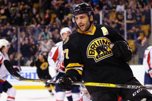
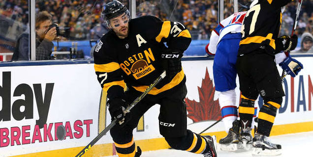
HbD Breakdown: Boston Bruins Third Jerseys
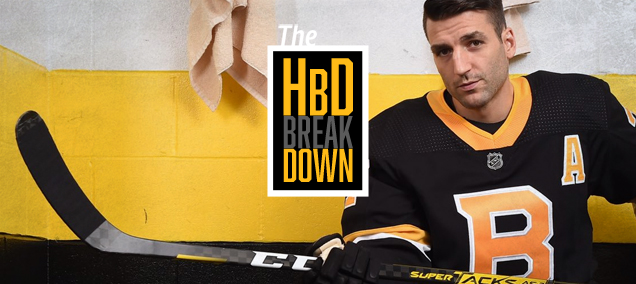
While they first leaked over the summer, Sunday afternoon’s Season Ticket Holder event in Boston was our first official look at the Bruins’ new third jerseys. Since retiring the beloved “men in black” uniforms and adopting the 2016 Winter Classic sweaters as their alternates, the Bruins haven’t had a third jersey since Adidas took over the league’s jersey development.
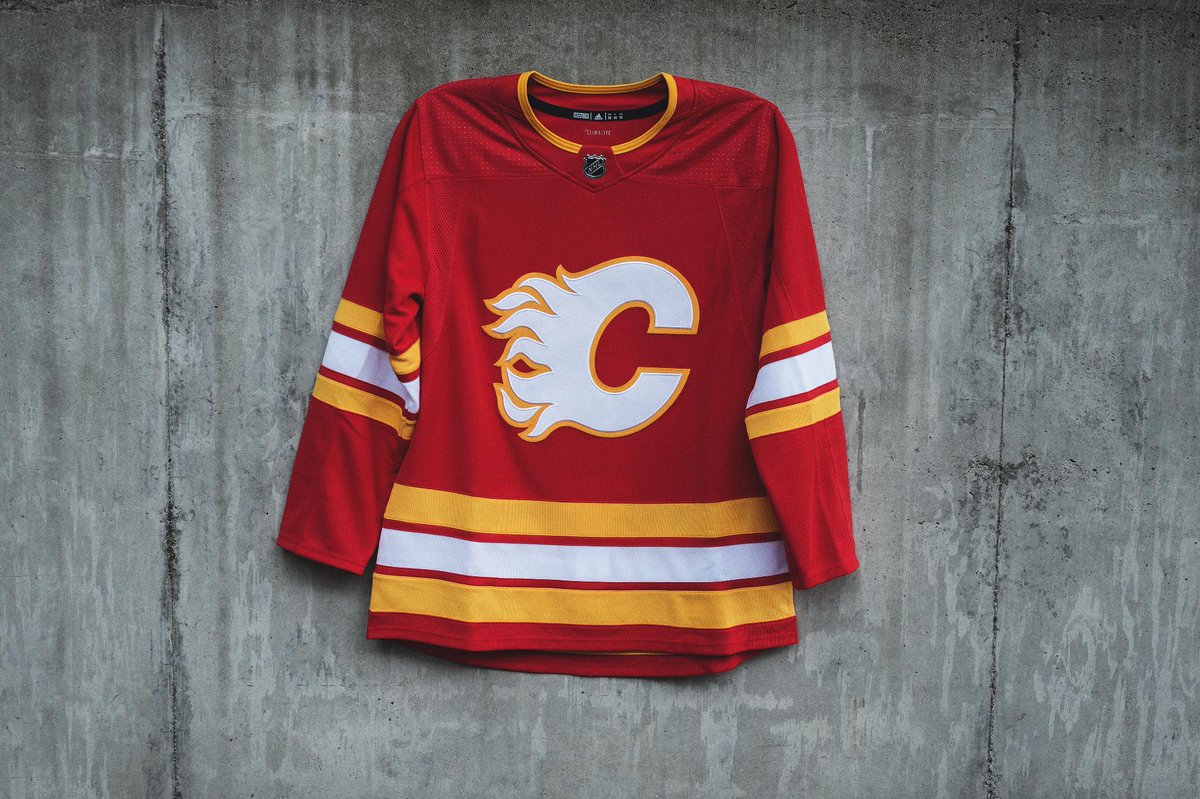
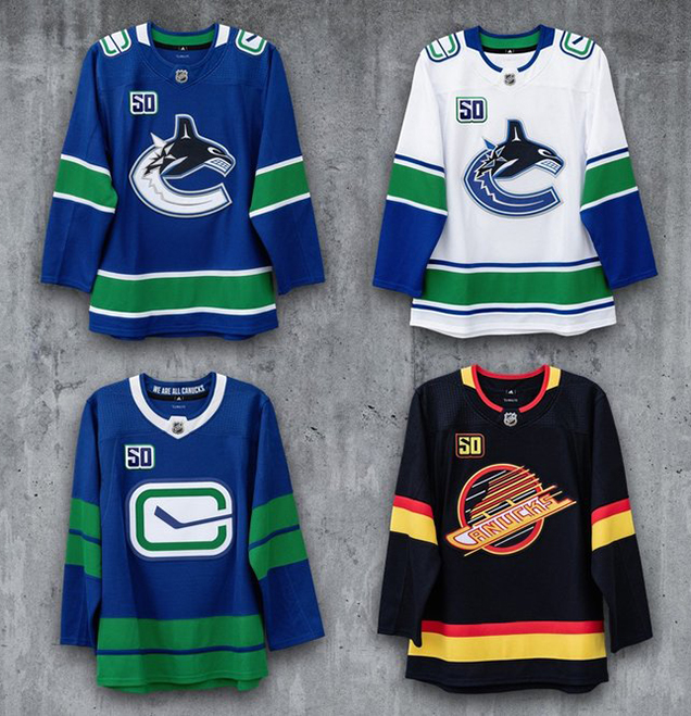
Many of the alternates we’ve seen from Adidas so far have been pure throwbacks (see Calgary, Vancouver, etc. etc.), and the Bruins certainly have no shortage of history to have taken the same route. Instead of modernizing a singular sweater from Boston history, the Bruins opted for an iconic hybrid of sorts that’s really grown on me since the initial leak. Having had the opportunity to check out the new threads in person, let’s discuss in more detail.
A Modern Hybrid
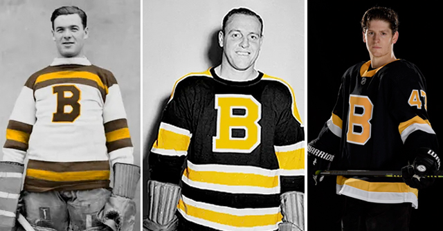
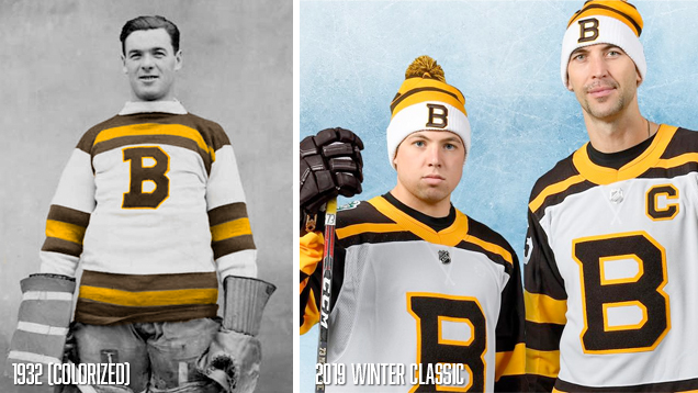
Before the unveiling, Bruins president Cam Neely gave a brief introduction to fans, prefacing that for this third jersey, they had a lot of options to pull from. “The great thing about our organization, we can pull from so many different eras,” he shared, adding that “this one in particular touches on the 30s, 40s and 50s.”
For the 2019 Winter Classic, the Bruins took a similar design approach, using the team’s 1926 sweaters as a template but replacing the logo with the heavier, varsity-style B that debuted in the 30s. From our 2019 Winter Classic jersey breakdown:
Adidas did a really nice job of keeping the essence of the original sweater while adding enough of the modern touches that Neely spoke of to bring this jersey into the 21st century. The collar is perhaps the most noticeable difference, with the addition of the gold neckline intersecting the chest stripes, along with streamlining of the gold stripes along the waist.
Now you might be saying, “Ally, I came here to read about the new thirds, not last year’s Winter Classic,” but I bring this up because rather than reinvent the wheel from a process perspective, Adidas gave themselves a path to replicate the success of the 2019 sweaters with these new thirds by taking the same hybrid approach.

“I started looking back at the history of the team and what marks we’ve used historically,” Neely told Bruins reporter Eric Russo. “I like to bring that into the present day as well. It’s good for our players to really understand the history of our organization.”
Adidas pulled elements from Bruins jerseys past like the heavy block B and gold and white stripes, and paired them down to modernize the look. The gold collar follows that of the Winter Classic yet feels similar to the fan favorite men in black thirds. This fusion of jerseys from throughout history could have easily gone awry, but luckily Adidas remembered Coco Chanel’s famous advice of taking one thing off before you leave the house and kept things minimal, classic and clean.
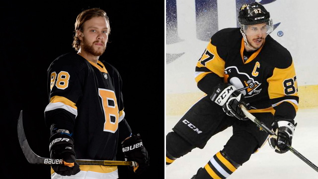
Will the Real black and gold please stand up?
With the Penguins returning to Pittsburgh gold and Adidas templatizing many of their primary jerseys, it’s natural for parallels to be drawn between the Bruins’ and Pens’ sweaters. With a color palette that’s not entirely unique, added importance becomes placed on other branding elements to distinguish one team’s uniforms from another.
This is one area these sweaters fall short for me, as the lack of personality (or really any Bruins branding outside of the B) makes these feel like they’re missing something.
With the vast number of alternate logos and shoulder patches from Bruins jerseys past, it seems like a missed opportunity to not include the beloved crack bear in a small way to inject some personality and additional branding into an otherwise very traditional and borderline generic sweater.
For me, what helped really sell these was the way in which the team presented them, but we’ll get to that in a moment.
Bridging the Generational Divide
One of the interesting challenges we see teams face, particularly those with a history as deep as the Bruins’, is striking the right balance between respecting the club’s history and embracing the future of the game. This certainly holds true when it comes to jerseys, but is also a factor in everything from marketing to roster construction.
• More: Worst to First Jerseys: Boston Bruins
The Bruins have slowly moved away from the “Big Bad Bruins” identity of the 70s into adopting the faster paced skill game of today’s NHL, a transition sometimes met with resistance from fans of old time hockey, but even the eldest generations of Bruins fans can’t not welcome young talents like David Pastrnak or Charlie McAvoy into the Boston lineup.
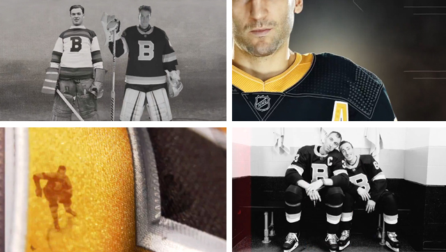
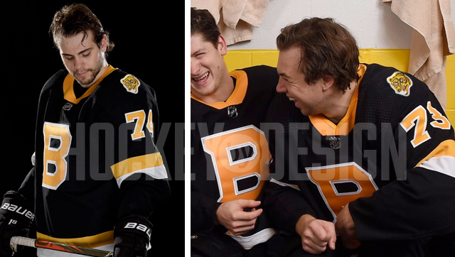
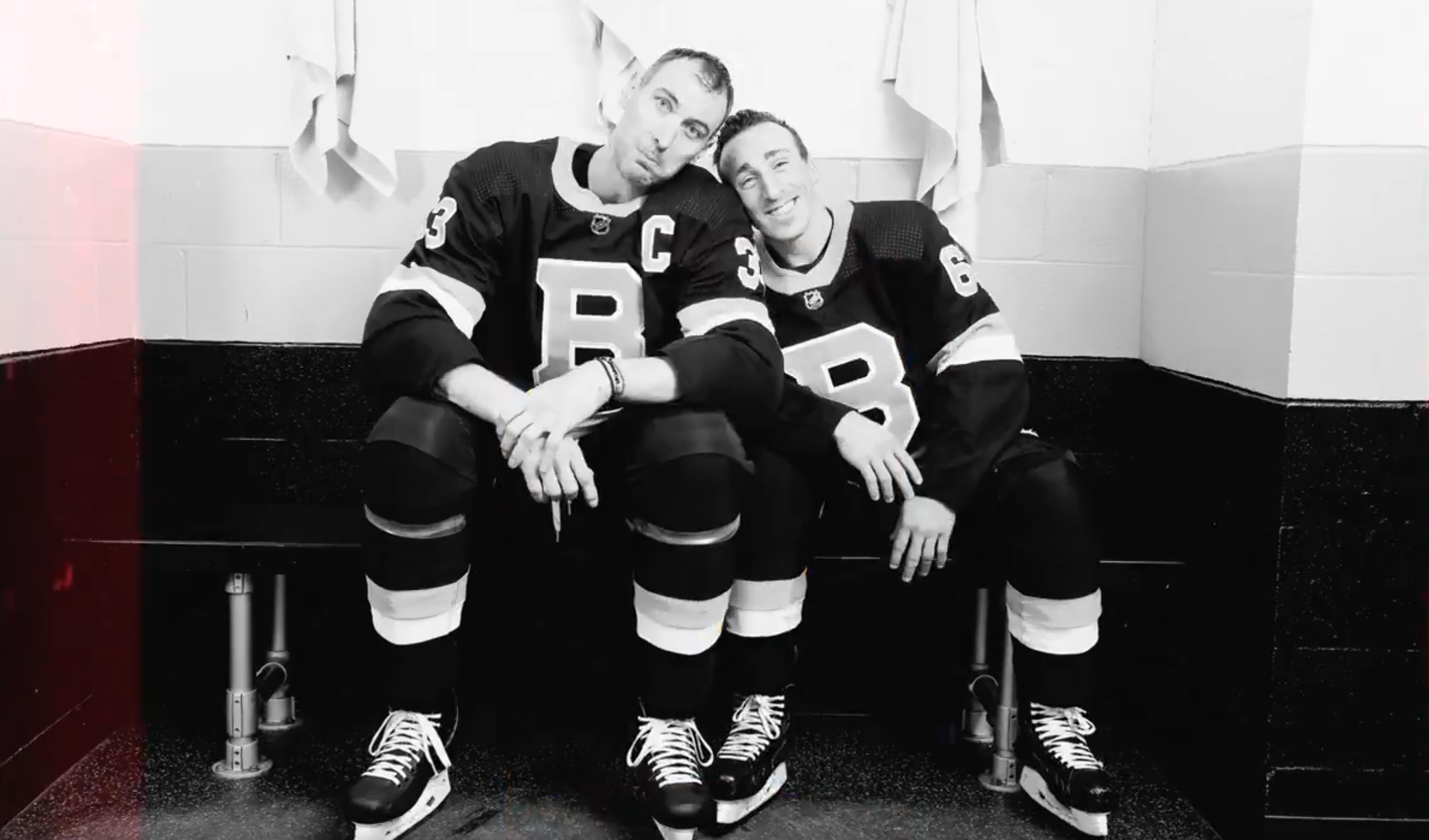
At Sunday’s jersey unveiling, what impressed me perhaps even more than the jerseys themselves was the way in which the team presented them in video and photographs. The video shown after Cam Neely’s address, similar to what was shared on Twitter, overlaid images from Bruins past with personality and technology-infused footage of the current team and sweaters, perfectly and artistically illustrating how the jerseys bridge the team’s history with its present.
Plus, how can you not love a goofy locker room photo shoot of the Bruins young guns laughing side by side, or Zdeno Chara cozying up to Brad Marchand in a precious father-son like moment?
Final Verdict
When a jersey is this simple, there’s not a whole lot to complain about, which really isn’t a bad thing in this instance. Are there areas for improvement to give this thing some more pizazz? Sure, but overall it’s a sharp looking uniform that will stand the test of time. Particularly with some of the other more.. um.. creative jerseys coming out this year, I’ll take clean and classic over something like, let’s say “roller hockey, but cocaine” any day of the week.
Avalanche: It’s an abstract interpretation of our classic logo, with a playful use of negative space. One can feel the Saul Bass influence.
— Greg Wyshynski (@wyshynski) November 22, 2019
Kings: What if roller hockey, but cocaine? pic.twitter.com/99aiWtDXK8
For more background on the Bruins’ new thirds, visit NHL.com.
Agree? Disagree? Let us know what you think in the comments or join the conversation on Twitter, Facebook and Instagram!


[…] • More: HbD Breakdown: Boston Bruins Third Jersey […]
[…] • More: HbD Breakdown: Boston Bruins Third Jerseys […]
[…] was going to be my pride and joy, it’d have to be this one. If you read my breakdown of the Bruins’ new thirds or my Bruins worst to first ranking, you already know my affinity for these now retired “men […]
[…] • More: HbD Breakdown: Boston Bruins Third Jerseys […]