
Ally’s HbD Closet Breakdown

We’ve ranked the jerseys of every NHL team and broken down every new release, but what about the jerseys found in our own closets? As hockey fans ourselves, we’ve each amassed jersey collections of our own, and whether for sentimental reasons or ones purely aesthetic, we thought it would be fun to take a closer look at the sweaters we wear (or maybe don’t anymore) ourselves. Thus begins the HbD Closet Breakdown series where we break down the objective aesthetics of the jerseys in our own closets, plus give some color around each jersey’s story and sentimental value.
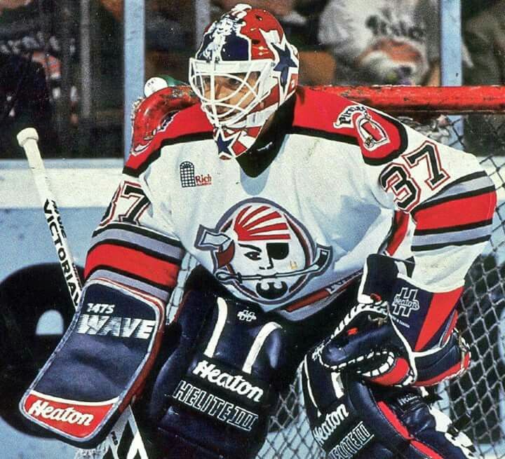
Looking back at the roots of my hockey fandom, I can probably trace it back to the Portland Pirates, a now defunct AHL team that resided in Portland, Maine from 1993 to 2015. Growing up about two hours from Boston, the minor league club that boasted alumni like Olaf Kolzig and Shawn Thornton was my first introduction to pro hockey.
Since my days watching the Pirates play at the Cumberland County Civic Center, I’ve visited seven different NHL rinks, attended over 100 college hockey games, and even two Stanley Cup Final games, during which time I witnessed my hometown Bruins win a Cup in 2011 and alma mater, Northeastern University, win three consecutive Beanpots and a pair of Hockey East championships. In that span, I’ve also acquired a number of jerseys from NHL and college clubs, some more beloved than others, but each with their own backstory.
In this series, we’ll give you a look at our own jersey collections, share some anecdotes around their meaning, and of course, break down the objective aesthetics of each one. In order of acquisition, let’s get after it!
Northeastern University, 2009

The Backstory
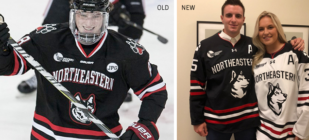
This was the first jersey I ever purchased, and I still wear it to this day, so it’ll always have a special spot in both my heart and my closet. In the 2008-09 season, which happened to be my freshman year of college, the Northeastern men’s hockey team spent most of the year ranked second in the nation with a goaltender who was shattering school records left and right (more on that later). Student tickets sold out FAST and on a regular basis (yes, that was really the box office line for a regular season game), and I quickly hopped aboard the Husky fan train, not knowing of course that it would take nearly another decade before the team would bring home a meaningful trophy.
• More: HbD Breakdown: Northeastern Huskies Rebrand
This jersey, while now starting to tear and fray a bit, has seen over 100 Husky hockey games, from the most heartbreaking of losses to exhilarating victories.
The Objective Breakdown
While Northeastern’s since rebranded and ditched the demon-eyed husky for a more contemporary-looking logo, rolling out a sharp new uniform set with Under Armour, the bones of this Blackhawks-esque jersey are actually quite good. As our guest contributor Mark Majewski pointed out in his review of the jerseys back in 2017, the length of the school name paired with the double drop shadow and serif typeface creates some legibility issues, but most of that has been remedied with the Under Armour redesign.
I still prefer the split color paw print shoulder patch over the new iteration, but the classic look of the solid black sweater and triple stripes will never go out of style.
Boston Bruins, 2011

The Backstory
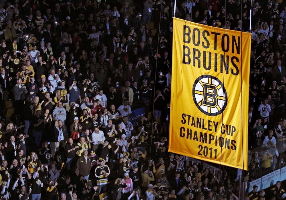
In 2011, I was in my third year of college and landed my dream co-op working as a designer for the Boston Bruins. Little did I know when I accepted the position that I would be employed there for the team’s first Stanley Cup in nearly 40 years. Everyone obviously knows of the magical season and playoff run had by Tim Thomas, winning the Conn Smythe and Vezina at 37 years old, with a goaltending style perhaps more suited for an earlier era of hockey.
• More: Worst to First Jerseys: Boston Bruins
Throughout that season’s playoff run, I told myself if the Bruins won the Cup that I’d buy a Thomas jersey, and that I did, complete with 2011 Stanley Cup patch commemorating the season’s accomplishments. Of course, we know what came next for Thomas (and more recently, the unfortunate reason why), so this one’s taken a bit of a hiatus since 2012 in my game day rotation.
The Objective Breakdown
When Adidas took over the NHL’s jersey rights, fortunately little was changed on these sweaters, ranked 6th in all-time Bruins jerseys and 2nd in black jerseys. From that ranking:
The colour palette is very strong, aggressive, and energetic…and nobody pulls it off better than the Bruins, specifically their latest iteration of it, with the gold and white shoulder yokes and stripes framing what is one of the best logos in the league. The striping on the sleeves and jersey bottoms are classic and consistent, and among the best examples of classic jersey design out there. Balanced, visually impactful, and full of intensity, these jerseys are among the best in the league.
The Stanley Cup patch is also nice and understated, mimicking the simple rectangular banner hung in the Garden rafters and without any excess muss or fuss. My one gripe with this jersey, at least the one in my closet, is where the numbers overlap the waist stripes. Not sure why Reebok couldn’t figure out how to scale the number size based on the jersey size, but it really is a killer for me.

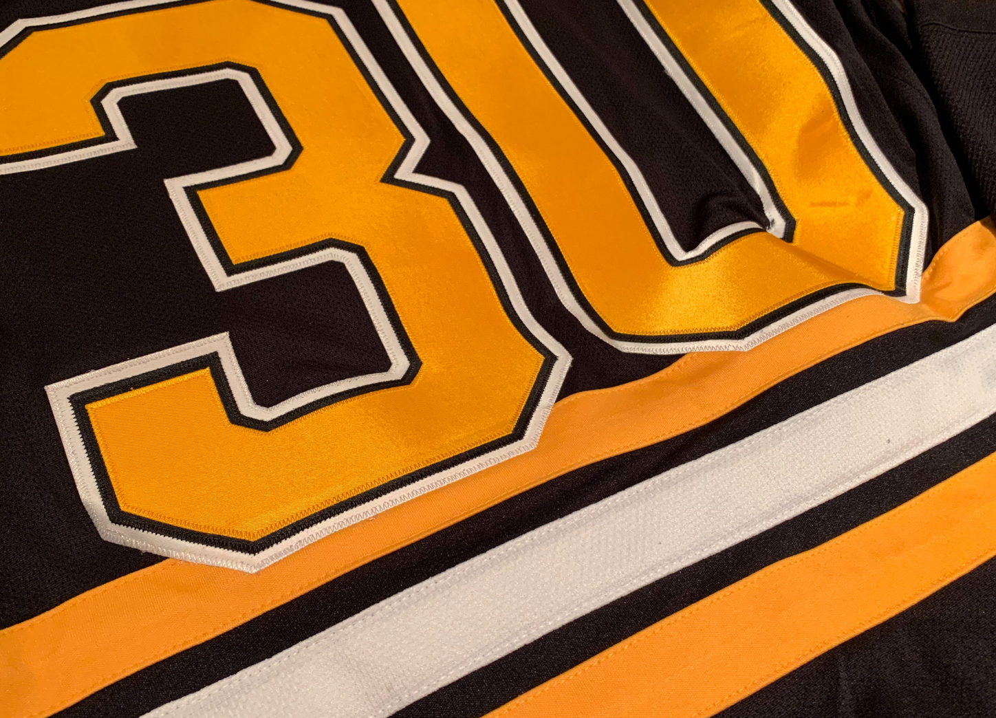
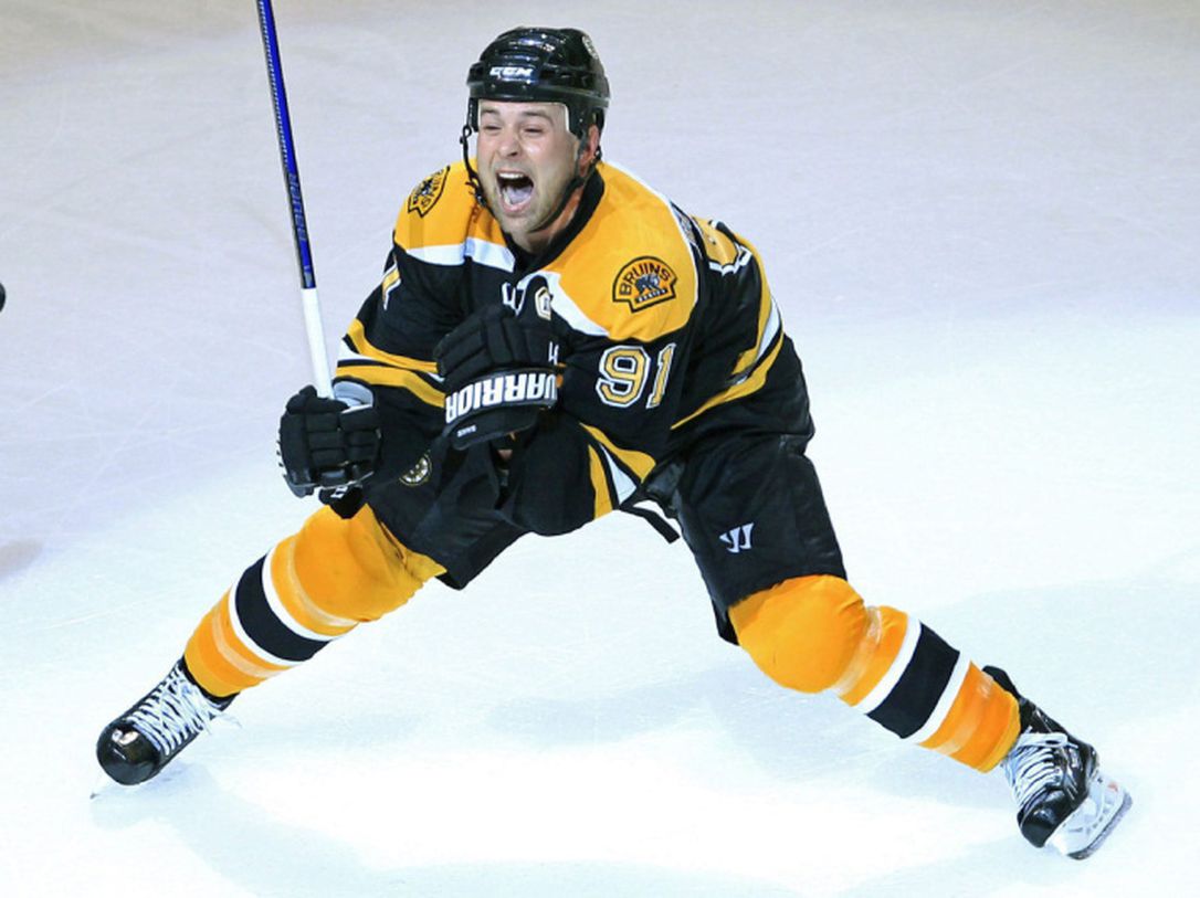
Boston Bruins, 2013

The Backstory
If one jersey was going to be my pride and joy, it’d have to be this one. If you read my breakdown of the Bruins’ new thirds or my Bruins worst to first ranking, you already know my affinity for these now retired “men in black” jerseys, so when you also throw my favorite current Bruin into the mix, it’s basically perfection.
Purchased as a college graduation gift to myself during the 2012-13 season, this sweater has become my game day go-to, having seen Bergeron score in his 1,000th game, witnessed a Marchand hat trick, and traveled to games in LA, Chicago and New York, to name a few.
The Objective Breakdown
Like I said, I really like this jersey. It’s simplicity might get me some heat for giving it such high marks, but it truly was a fan favorite, and with merit (not like you, Pooh Bear). The collar is very similar to what Adidas adopted on the new thirds, probably the closest cousin to the new sweaters in the Bruins’ robust catalogue of past jerseys. From the Worst to First ranking:
While admittedly less iconic than the spoked-B, this modernized take on the original bear logo brings the right amount of gold into the design while keeping the stealthy look of the all black. Because who doesn’t love a nice all black jersey?
The streamlined typography on the back is more in line with what Adidas has adopted, eliminating the black layer from the numbers and nameplate, and the sleeve stripes sans-waist stripes gives a sleeker look without going full practice jersey a la Tampa Bay.
Chicago Blackhawks, 2013

The Backstory
Three of the last four jerseys I’ve acquired have actually never been worn, one being this Blackhawks jersey that was gifted to me by one of my dearest friends, who at the time was living in Chicago and became somewhat of a hockey fan (thanks to my positive influence).
• More: Worst to First Jerseys: Chicago Blackhawks
Aside from the 2013 Stanley Cup Final (which honestly doesn’t upset me all that much, given that Chicago simply had the better team), I quite liked the Blackhawks in the early 2010s. They had young stars, likable veterans, and were all around a group you could really root for.
The Objective Breakdown
The only Blackhawks games I’ve attended have been against the Bruins, so while I’ve never actually had the opportunity to wear this jersey, it really is a stellar one. Earning the top spot in Chicago’s worst to first ranking and arguably one of the nicest jerseys in the league, it’s truly a classic design that has stood the test of time:
They’re pretty much as close to perfection as you can get. The red-white-black combination is powerful, and it’s offset by the multitude of colours in the logo crest (and shoulder patches) which, surprisingly, doesn’t detract from the overall aesthetic but enhances it by balancing out the aggressiveness of the colour scheme with some character and relative softness.
Plus, throw in a handful of pop culture references, and really what’s not to love?
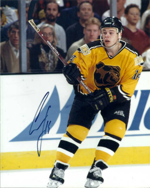
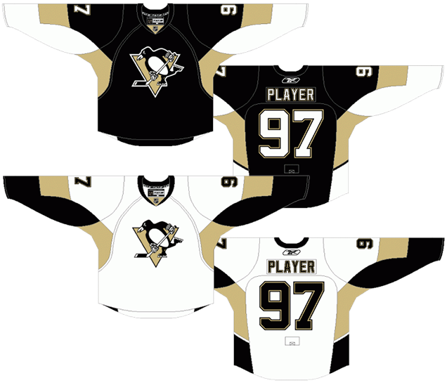
Pittsburgh Penguins, 2012

The Backstory
This jersey came into my possession via eBay, and for a couple of reasons, so bear with me. The year was 2008, and a young Pittsburgh Penguins roster had just lost in the Stanley Cup Final to a far more veteran Detroit Red Wings team. Jump ahead a year to the spring of 2009, Pittsburgh gets their retribution by defeating the Red Wings, and Sidney Crosby becomes the youngest captain to ever win a Cup at just 21 years old. With such a talented young team, how could you not love the late 2000s Penguins!? From the 2008-09 season forward, Pittsburgh would become my second favorite team.
Now rewind a few months and bring your attention back to that Northeastern goalie I mentioned who broke every damn school record in the 2008-09 season. The Huskies’ roster that season was pretty unremarkable, but the majority of the team’s success could be credited to goaltender Brad Thiessen, who was named Hockey East Player of the Year, a Hockey East all-star, All-American, and Hobey Baker Award finalist. Not too shabby. Undrafted, Thiessen signed with the Penguins at the end of the college season, and ultimately joined that 2009 Cup-winning roster as a black ace.

While Thiessen’s stint in the NHL was brief––playing just a few games with Pittsburgh and Columbus––he was around long enough for one of his game issue jerseys to make its way onto eBay. With my combined affinity for the Penguins and one of my alma mater’s greats, there was no way I wasn’t pulling the trigger on this find.
The Objective Breakdown
Sentimental value aside, this jersey is decent, but not among one of the best in Pittsburgh’s history. One of the best things about Pittsburgh sports is that all of their teams wear the same black and gold color palette, so the switch from Vegas gold back to Pittsburgh gold was a smart one. The organic shaped panels under the arms are also a bit odd, as outlined in the Penguins worst to first breakdown:
The induction of the Reebok Edge jerseys in 2007 allowed teams to play around with traditional hockey jersey aesthetics and try find some more innovative ways of using different design elements. The Penguins created something that’s simple and complex at the same time.
Certainly not the sharpest looking jersey in my collection, but still respectable by all means.

Boston Bruins, 2010

The Backstory
Despite the number of Pirates games attended throughout my childhood, I didn’t actually go to my first Bruins game until 2009, at which time Marc Savard was hands down my favorite Bruin. A talented center with a tangible passion for the game, Savard was truly so fun to watch, making the manner in which his career ended all the more tragic. After the rollercoaster of his comeback from concussion followed by a heartbreaking and premature retirement, Savard would still remain one of my favorite all-time Bruins, even though his playing days are long behind him.
Call it a tribute or nostalgia or what will you, but I purchased this jersey a few years back, and it’s since made its way into my game day rotation alongside Bergeron’s.
The Objective Breakdown
Black is obviously more iconic when it comes to the Bruins, but as the road twin to my Reebok Thomas jersey, really all the same thoughts apply. It’s simple, balanced and timeless –– all the things you want in a jersey.
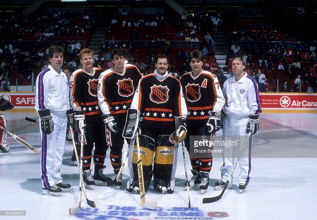
NHL All Star, 2017

The Backstory
Perhaps my most fun jersey acquisition story, I was visiting my college roommate and fellow Bruins fan in LA during 2017 All Star weekend, where we were attending the skills competition at the Staples Center. We were wandering around, enjoying the festivities at LA Live, when we noticed the Bruins tweeting out giveaways around the arena for anyone dressed in Bruins gear (which obviously, we were).
Ally & Hannah from Boston scored this jersey. Thanks to our fans at #NHLAllStar for playing! pic.twitter.com/RYZtVJko8u
— Boston Bruins (@NHLBruins) January 28, 2017
Now I don’t consider myself to be particularly lucky, but if there’s one gift I have, it’s winning things from the Bruins’ Twitter, and in four minutes time, we sprinted around the outside of the Staples Center to claim a signed Tuukka Rask jersey hanging on the edge of the “Hockeywood” sign outside.
The Objective Breakdown
I’ll start by saying that I enjoyed winning this jersey far more than I enjoy the jersey design itself. There are a few elements I really like, particularly the stars around the waistband and extended shoulder yokes that give off a late 80s-vibe. The silver accents are a nice touch as well, a nod to the Kings as the host team, and also the NHL 100 ceremony taking place the same weekend.
• More: HbD Breakdown: 2017 NHL All-Star Game Jerseys
What I really dislike about these is the wacky prism pattern in the back numbers. I guess it was supposed to look like jewels, maybe? But in execution it just looks busy and a tad tacky.
If you’d like to join us and share your own jersey collection, save our Instagram story jersey bingo template and check off all the sweaters in your closet! Be sure to tag us, and we’ll re-share our favorites!


Hello, I would love to thank you for sharing such an impressive blog. Furthermore, the stuff suggested here will be very helpful for lots of people.
Wow, very impressive story, I really like how you start your business. It definitely helps lots of people that how would we start any business.