HbD Breakdown: 2017 NHL All-Star Game Jerseys
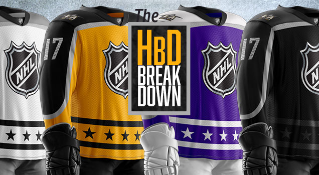 (Ed. note: The above image is not *exactly* what the uniforms look like, but a close facsimile, using a jersey template to re-create them. The pant/gloves are minimalist guesses, for example.)
This is the last night of hockey games for points in the standings before the league takes its annual (minus Olympic years… and lockout years) break for the All-Star Game. This year’s event in Los Angeles uses the same 3-on-3 4-team mini-tournament format that proved so successful last year. But, this marks the first time that all 4 teams will get their own jersey, righting a strangely non-sensical wrong from last year. So wrong, it made our annual super-wrong list last year.
• More: Top 5: Worst Designs of 2016
But they’re not four totally distinct jerseys, as they all have the exact same striping patterns, shoulder yokes, logos, etc, just in different colour schemes. I’m not complaining about that, as it makes perfect sense and follows the general jersey design from previous All-Star Games. Plus, it will make this post easier to write, so we’ll leave the colours for last and tackle the templated elements first.
Old School
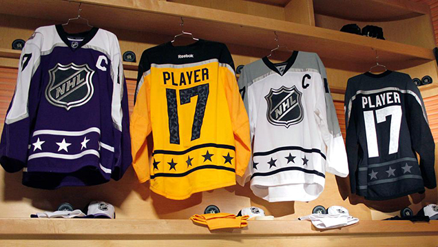 You can’t help but feel that these jerseys have an old-school ASG vibe to them, and that’s because there is. They borrow heavily from the classic 1989–93 (sans 1992) ASG jerseys, which featured a double-stripe along the bottoms of the jersey with a row of stars in-between them, an NHL logo on the front, and an outlined shoulder yoke that stretched from cuff-to-cuff. That pretty much describes these new jerseys exactly.
Sure, the shoulder yoke doesn’t quite go all the way to the cuffs, but once you get the gloves on which will cover a good part of the sleeve ends, they might as well be. Having the shoulder yokes end just below the elbows with a more modern angled curve might be the only contemporary design element on the whole jersey.
• More: Best and Worst All-Star Game Logos
• More: Top 5: Best NHL All-Star Jerseys
• More: Top 5: Worst NHL All-Star Jerseys
Four on Fore
Perhaps the reason for the old-school design is from having four teams, because any of these combinations of jerseys could play each other. Getting too fancy or complicated with any design elements could cause nightmares if they need to differentiate themselves meaningfully for game play. In other words, KISS. That is, Keep It Simple Stupid. That’s almost always a good decision.
Gone are the nightmarish Monster Energy inspired jerseys, gone are the overly-busy line patterns, gone are the Stadium Series-esque jersey designs. Just simple, classic jersey design…and it all feels a little bit boring, with almost nothing innovative about them. For good or bad, the NHL has almost always used the ASG to push the conversation in regards to jersey design. That’s been seemingly abandoned this year, but again, that could be because of the four-jersey conundrum.
Don’t get me wrong, these are not bad jerseys by any means. Again, they’ve got classic striping, simple elements, timeless appeal. The star-stripe is classic. The outlined yoke is a great blend of modern and classic. The pattern in the numbers doesn’t quite fit with the more classic design of the jersey, but it makes a visual connection to the ASG patch on the shoulders. The problem is, there’s just nothing that really stands out about them either though.
Or, it could be that Reebok doesn’t give a shit anymore since they lost the NHL contract and just basically stole an old sweater design, threw the LA Kings’ colours on it, and called it a day. We’ll never know.
UPDATE: From what I can tell, the image posted previously (with an atrociously non-subtle pattern in the numbers) is incorrect and probably a cheap knock-off. Thank gord!
Metropolitan White
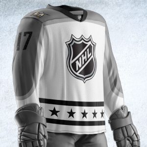 All-Stars from the
 Neapolitan Metropolitan Division will be wearing the white jerseys, with black stars/stripes and a grey shoulder yoke. (Side note: the outline on the shoulder yoke is a light-grey on all of the jerseys.) From the LA Kings jersey library, this would be the love-child of the current road whites and their 2014 Stadium Series jersey.
• More: Worst to First Jerseys: Los Angeles Kings (Redux)
With a white base (rather than silver grey), the grey actually works way better as a complimentary colour. Having two tones of grey (the yoke outline) is a bit much though, and would’ve looked better in black instead to compliment and balance the black stars/stripes. In fact, this is the only jersey of the set that has different coloured yokes and stars/stripes, which seems strange both for consistency’s sake, but also because the grey stars/stripes would look just fine.
The grey shoulder yoke does distinguishes itself though from the gold jerseys – with gold and white being the two jerseys on the lighter side of the spectrum. But, it’s not a bad look at all, with the white/grey scheme creating a simple and modern look that should look great on the ice.
Atlantic Gold
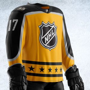 The Atlantic All-Stars will be wearing the
 gold yellow jerseys, with black shoulder yokes and stars/stripes. This is a good example of what happens when you remove just one colour from a branded palette, as this doesn’t look like a Kings jersey at all without the yellow’s purple partner. It’s more in line with the Bruins, and a purple shoulder yoke probably would’ve worked fine within the four jersey set. Instead, we have the love-child of the Kings’ current home jerseys and the vintage 1980–88 golds.
If there’s one jersey where the light grey yoke outline doesn’t work, it’s this one, where it sticks out negative – becoming more of a distraction then working with the other colours, especially the yellow. Otherwise, there’s a reason why the Bruins have some of the best jerseys in the league…gold and black is a great combo. But therein lies the problem. This is supposed to be a Kings-inspired jersey, not the Bruins.
Outside of that context, it’s not a bad jersey. But the awkward inclusion of the light-grey yoke outline kind of kills it for me.
Central Purple
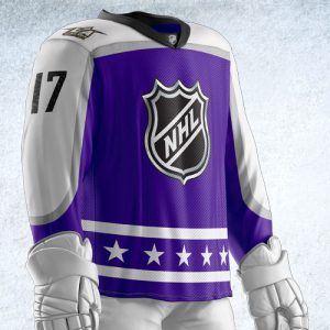 The Central All-Stars will be donning the love-child of the King’s 1999–2007 purple jerseys and their current road whites. Or more simply, the purple jerseys, which have a white stars/stripes and shoulder yoke.
Of all the combinations put forth, this one is the most modern mix. Purple is used extremely rarely in the NHL, with only the Kings ever using the colour in any meaningful way. Mixed with the white (instead of black or gold, as the Kings usually used it) gives it a more unique (or at least, flashier) look from all the rest of the jerseys in the set, and probably vaults this one to my personal favourite, although I could be persuaded otherwise.
The white yoke/trim also creates a strong differentiation from the other darker jersey in the set, the Pacific Division blacks.
Pacific Black
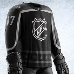 Speaking of which, the Pacific All-Stars will be wearing the last, and darkest jerseys, of the bunch. They’re black, with a dark grey shoulder yoke and stars/stripes. My assumption is that the Kings, being the host, got to pick which jersey in the set they wanted to wear, and the obvious choice was the one that they’re the most comfortable in which closely resembles their current home jerseys.
I’m not generally a fan of all-black jerseys, but given the circumstances of 4 different jerseys needing to work together, a black jersey was inevitable and, for the most part, it works well. It’s the one that the light-grey yoke outline looks best with, but I would’ve liked to have seen it instead with the same mid-grey as the white jerseys for the shoulder yokes and stars/stripes, as they striping barely stands out at all on these compared to the other jerseys.
Sure, it’s as black a jersey as you’ll see in the league, but it’s not the worst of the bunch.
Final Verdict
A classic jersey design that successfully incorporates (mostly) four different colour schemes based on the Kings’ jersey library. That’s no small feat, so in that sense, they’re a success. But, it’s not innovative or particularly interesting which, given the League’s recent ASG jerseys, is a switch. These jerseys are solid and well-designed, but largely forgettable.
Agree? Disagree? Let us know in the comments or join the conversation on Twitter, Facebook and Instagram! And if you’re interested, we’re now on Pinterest too.


[…] • More: HbD Breakdown: 2017 NHL All-Star Game Jerseys […]