Top 5: Worst NHL All-Star Jerseys
The beauty of the All-Star Game jerseys is that they’re temporary, worn for only one game and then can either be recycled the following year or just forgotten completely. It’s only in the last couple decades that there’s been new designs being pumped out almost with every new ASG. Why? Because the NHL is a business that likes selling jerseys and people keep buying them. But, it also allows the jerseys to be much more trendy and rooted in the specific aesthetics of a certain era. Some are great and become timeless. Others, not so much, and it’s these latter ones that we’ll be talking about today: the worst of the worst from 60+ All-Star Games that the league has put on.
One you won’t see in this list is this year’s ASG jersey. Why? Because it’s not even the worst. Yikes. (Also, all jersey images are compliments of the fine people over at nhluniforms.com.)
Related Reading: HbD News: NHL Announces All-Star Jerseys
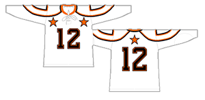 The reason these make the list should be pretty obvious. Those shoulder yokes are all kinds of crazy. Looking at the jerseys just from the front, they’re odd but passable, but as soon as you see them during regular game play, they’re odder than vintage Halloween costumes. No NHL team has worn something close to this, turning the shoulder yokes into circular shapes emerging from the collar, and then doubled them up and outlined them, essentially setting up target practice for people’s shoulders. Just weird. The rest of the jersey is fine for a vintage-era jersey: simple, iconic even, but those shoulders are just impossible to get past.

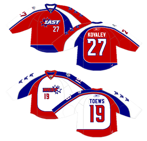 These asymmetrical wonders are just horrendous. The shoulder yoke stripes that go down the side and form the stripe along the bottom, with a different coloured shoulder yoke on both sides that don’t really lead anywhere and look more like a weird baby sling than anything else, with design elements that are different on both sleeves, with ugly logos on the front that don’t need numbers on them as well, with all the curves flowing everything that suddenly go straight along the bottom, with complicated grey striping thrown in, with stars with years of the other years Montreal hosted the ASG (because people care about that). Yeah, that was a run-on sentence, but there’s just so much wrong with these jerseys it’s hard to stop. It reminds me of those old asymmetrical Thrashers jerseys, but these might actually be worse.
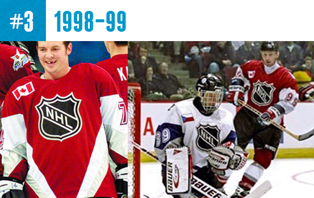
 The spotlight is shining on the all-stars at the ASG, but these jerseys took that way too literally. It’s a deceptively-ugly jersey. In game play, you can’t really see the spotlight striping pattern, and it looks pretty plain, minimal and, well, boring. Outside of gameplay, when you can really see the jerseys in detail, you realize just how ridiculous of a concept it is, with giant-Vs pointing right to the players’ genital area. Remember the last time a jersey featured large Vs? The jerseys are something that’s busy and boring at the same time. It’s a difficult thing to pull off something that bad.

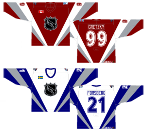
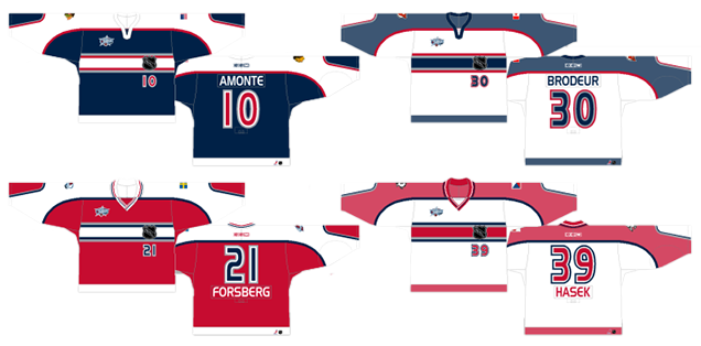 These are more rugby jerseys than hockey jerseys, with the v-neck collar (which is really weirdly super-striped on the red jerseys, but not the blue ones) and the thick colour band going across the chest. The thing is, that’s usually where rugby jerseys stop in terms of design elements. The NHL threw in a shoulder yoke the same colour, with additional striping, as the chest stripe. Than those shoulder yokes went around to the bottom of the cuffs for some reason. With jerseys that otherwise only have straight stripes, it’s an odd choice. Then, they also slapped the NHL logo and player numbers on the front, and added a stripe along the bottom for good measure. The result? An overly-busy mess of a jersey. Oh yeah, and the goalies wore similar, but different, jerseys for whatever reason. Because soccer? No idea.
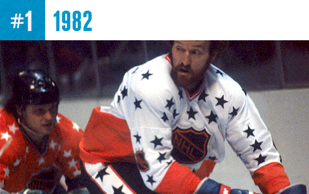
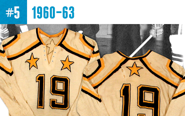
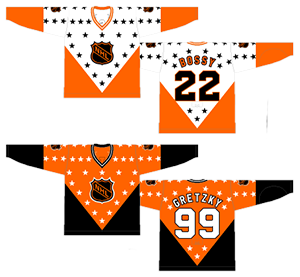 Um, yeah. There’s emphasis, there’s Overkill, and then there’s overkill. These jerseys are definitely the latter, placing a star in every possible empty space available, and making it with the highest contrast possible, ensuring that your eyeballs will start bleeding every time you look at them. And there’s the big giant V at the bottom of the jersey, which still looks strange today and would have been completely unheard of in the early-80s. It’s just a complete mess of a jersey and one of the few from before 2000 that only lasted for one game, which is really not surprising, because there’s are really really bad.
Agree? Disagree? What’s your favourite All-Star jersey to hate? Let us know in the comments below.





[…] Reading: Top 5: Worst NHL All-Star Jerseys Related Reading: HbD News: NHL Announces All-Star […]
The 2015 ASG jerseys should be deemed “the worst of the worst” because they failed one of the minimum functional requirements of jerseys: uniquely identifying the players. Watching on high-def tv, it was not possible to read the numbers or names on the back of the black jerseys. The numbers were black outlined in neon green against a black background when they should have been solid green or white outlined in green. Apparently even Doc Emerick was unable to read the jerseys from the broadcast booth since he rarely identified a member of Team Folio by name during active play. I’m surprised this problem hasn’t received more media coverage. I realize most of the hockey MSN attended the game instead of watching on tv, but surely they’ve heard complaints from family and friends.
Team Foligno, damn auto-correct (wow, can’t even swear accurately at the auto-correct; changed it to dawn)
Totally valid point, and not something I considered (or knew at that point) when writing the post.
Yeah, the game hadn’t been played yet, had it? I was shocked the NHL didn’t test how the jerseys would look during live action on tv. Just please add them to the top of the worst list when the topic comes up in future years.
[…] Top 5: Worst NHL All-Star Jerseys More: Top 5: Best NHL All-Star Jerseys More: HbD Breakdown: 2016 All-Star Game […]
[…] • More: Best and Worst All-Star Game Logos • More: Top 5: Best NHL All-Star Jerseys • More: Top 5: Worst NHL All-Star Jerseys […]
[…] More: Top 5: Best NHL All-Star Game Jerseys • More: Top 5: Worst NHL All-Star Game Jerseys • More: Best and Worst NHL All-Star Game […]
[…] More: Top 5: Best NHL All-Star Jerseys• More: Top 5: Worst NHL All-Star Jerseys• More: Best and Worst NHL All-Star Game […]
[…] • More: Top 5: Best NHL All-Star Jerseys• More: Top 5: Worst NHL All-Star Jerseys […]
[…] bottom five worst All-Star jerseys. No. 1 is so gloriously […]
[…] bottom five worst All-Star jerseys. No. 1 is so gloriously […]
[…] bottom five worst All-Star jerseys. No. 1 is so gloriously […]
[…] bottom five worst All-Star jerseys. No. 1 is so gloriously […]
[…] More: Top 5: Best NHL All-Star Game Jerseys• More: Top 5: Worst NHL All-Star Game Jerseys• More: Best and Worst NHL All-Star Game […]