
HbD Breakdown: 2019 All Star Game Jerseys

The 2019 NHL All-Star Game is happening this weekend in San Jose, featuring the same 3-on-3 mini-tournament divisional convention from the last 3 years. But the jerseys they’ll be wearing for the game are, well, less conventional. We’ll break the down after the jump.
• More: Top 5: Best NHL All-Star Jerseys
• More: Top 5: Worst NHL All-Star Jerseys
• More: Best and Worst NHL All-Star Game Logos
Ocean Wise
First, let’s get down to the coolest part of these jerseys. Adidas has teamed up with Parley – an organization dedicated to eliminating marine plastic pollution (check out their site here) – to create jerseys that are manufactured from recycled materials removed from the oceans. From the NHL’s article about the jerseys:
Created with Parley Ocean Plastic™, a range of materials made from upcycled marine plastic debris, each jersey is crafted to be a symbol of change in the movement to protect the oceans. By spinning a threat into thread, the adidas x Parley partnership gives new purpose to plastic bottles (polyester) and other plastic waste intercepted in marine environments. As a part of their partnership and joint commitments to ending marine plastic pollution through the Parley AIR Strategy (Avoid, Intercept, Redesign), adidas and Parley rework these various marine plastic waste materials into technical fibers that create the material framework of a durable, yet breathable fabric that is optimal for adidas performance apparel.
As someone who, you know, accepts science (can’t believe that needs to be said), climate change is the largest crisis facing the world right now, and even though a few dozen hockey jerseys aren’t going to make much of a dent in anything, it raises awareness and encourages recycling and looking at sustainable alternatives, and I think that’s awesome on all kinds of levels.
A jersey made from plastic ocean debris? Awesome, I’m all for it.

Ocean Dump
What I’m not all for is what they slapped on the recycled ocean debris.
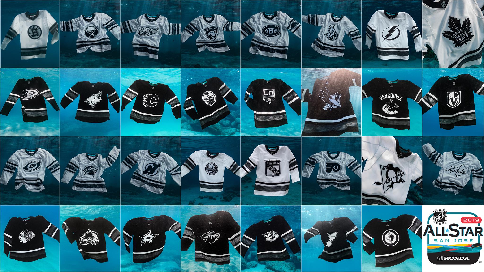
Taking a page from last year’s NBA All Star Game, these jerseys went full monochromatic and (for the first time ever) features the player’s team logo on the chest rather than the League or Conference logo. And because of the mini-tournament format of the event, all players needed to have both a white and a black version of their jerseys made, instead of having a different jersey for the four different divisions, as they’ve done the last two years.
I guess that means more debris removed from the ocean to make a bunch of jerseys which won’t even be worn/used? I guess, but when you’re using trash to make trash, does it really make a difference?
So, that begs the question…why? Why throw convention out the window? Why use the team logos? Why have only two jerseys for a four-team tournament? Answer: dolla bills, y’all.

Show Me The Logistical Nightmare!
According to a reliable source, the NHL wasn’t super-enthusiastic about the sales of their All-Star Game jerseys recently, or at least, they want them to be better. So, the idea was to put the team logos on the chest instead. And it makes sense. As a fan of, say, the Penguins for example, would you rather buy a Crosby jersey with an NHL logo on the front, or a Penguins logo? Probably the latter. When was the last time you saw someone wear an All-Star Game jersey at a regular season hockey game?
But, that makes things get a bit complex. Let’s take a walk through this…
The game’s in San Jose, so – using the general convention from the last couple years – let’s say you have black, white, teal, and orange jerseys, one for each division. It’s the Sharks home arena, so they’re given the option to choose which jersey they want, and they decide they want to wear the teal jerseys.
Makes sense, but then that means you’re going to also have an Anaheim and Los Angeles logo on a Sharks-inspired teal jersey. Or what about the other divisions…a Habs or Leafs logo on an orange jersey?

The idea that Ducks and Kings fans would be willing to buy a teal jersey is untenable, and as the source told me, the teams just won’t allow it. Who’s going to buy it? It all gets problematic and the League’s original goal of trying to up jersey sales vanishes.
The only alternative that would please every team (or rather, not get teams too angry) is if everyone goes neutral, meaning monochromatic. Black-and-white. No colour at all. Of course, for a team like the Kings, they’re totally fine with it. For other teams, it’s a compromise they can live with. The source tells me that the plan is to look at incorporating more colour in future years. It’s a testing-the-waters/baby-step process at this point.

But that means only two jersey colours are available, which means you have to make both a black and a white version for each player because nobody knows who’s going to be in the finals of this mini-tournament. If two black teams or two white teams advance, one of them has to switch. At the very least, you need one Conference, or half the players, double up on jerseys.
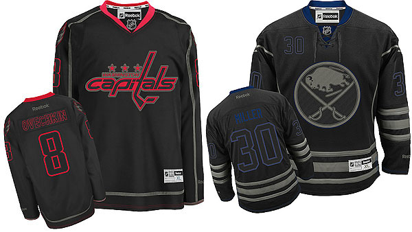
So, you get aberrations like a black Habs jersey, or a black Rangers just with their logo on it. I’m not entirely sure how much this will boost sales, but people did buy those Black Ice jerseys, so who knows. Plus, having jerseys that won’t get used doesn’t seem like the most environmental-friendly thing to do, even if it does remove more trash from the ocean. The first R is Reduce, Reuse, Recycle isn’t Reduce by accident.

Plus, the All Star Game will feature 3 games, all with a team wearing all white against a team wearing all black, on a sheet of white ice with chasing a black puck. The most colourful thing on the ice will be the ads.
"…the only colorful thing on the ice will be the ads."
— Nathan Gruenholz (@fleshwound_NPG) January 9, 2019
🤔🤔🤔🤔🤔🤔🤔🤔🤔🤔 https://t.co/8ciOrHb3Qn
All this, to hopefully sell a few more jerseys.
Shark-Infested or Infested Shark?
Any professionally-designed logo should work it has to be used as a single colour (in this case, black). And for the most part, all of the team logos do. Some, like the Lightning or the Maple Leafs, are super easy.

Others are more problematic, and ironically, the worst of the bunch may be the host team’s logo. With the patch on the top of the shark forcibly changed from a more subtle teal-on-black to white, it demands a lot of attention and looks more like some strange skin disease is attacking the shark. It’s not a great look.
• More: BTLNHL #25: San Jose Sharks
• More: HbD Interviews: Terry Smith (San Jose Sharks)
Lame Duct
As for the actual design of the jerseys, having a set of black-and-white jerseys that can accommodate any of the 31 team logos necessitates using a minimalist and classic approach, and Adidas did just that.
It’s a simple, clean approach with classic hockey striping that’s consistent across the sleeves and bottom of the jerseys, but there’s enough elements to keep these jerseys from looking too much like a practice jersey. The middle stripe brings back the heather-like textured greyscale pattern that was featured (too) heavily on the Team North America jerseys from the 2016 World Cup.
• More: The World Cup of Hockey Jersey Countdown

It’s more subdued here, especially when compared to the Team NA white jerseys. While I’m not crazy about it looking like little more than duct tape on a jersey, it’s applied better and adds some much needed visual depth and interest to a minimalist jersey that would otherwise be nothing but black and white. Even the Kings have some “silver” on theirs.
Still, there’s no other pattern they could’ve used? Even a less subtle version of the pattern on the Sharks third jersey would’ve worked too, and fit with (a) the host team’s aesthetics, and (b) the tech vibe they’re trying to give the event. Maybe it wouldn’t have worked with the Parley manufacturing process? If the duct tape worked, I’m guessing they could’ve figured it out.
Final Verdict
Honestly, they’ve grown a bit on me since they were first unveiled, just because it’s such a different approach for the league, and it’s nice to see them pushing boundaries a bit, both in terms of the design and the jersey production. But the best part of the jersey is still unquestionably the Parley collaboration and raising awareness around sustainability and the environment.
Everything else suffers though. Going with completely monochromatic jerseys for a sport that’s predominantly monochromatic in nature already just removes a layer of visual dimension to the game experience. As much as it was a logical road to go down in order for all 31 teams to get their logo on the chest, it comes at a cost that doesn’t justify the slight uptick in sales that might happen.
Agree? Disagree? Let us know in the comments or join the conversation Twitter, Facebook and Instagram!


My first thoughts were why didn’t they go with Teal, Orange, Black and White Jerseys? They could’ve just made each teams logo monochromatic as not to clash with the colours.
The bit about the Parley collaboration is cool but it doesn’t make the jerseys any more interesting to look at, unfortunately. Maybe they should do that with all jerseys in the future?
[…] By Design breaks down the NHL All-Star jerseys, which again, are made of […]
[…] By Design breaks down the NHL All-Star jerseys, which again, are made of […]
[…] By Design breaks down the NHL All-Star jerseys, which again, are made of […]
[…] By Design breaks down the NHL All-Star jerseys, which again, are made of […]
[…] By Design breaks down the NHL All-Star jerseys, which again, are made of […]
[…] By Design breaks down the NHL All-Star jerseys, which again, are made of […]
[…] By Design breaks down the NHL All-Star jerseys, which again, are made of […]
[…] By Design breaks down the NHL All-Star jerseys, which again are made of […]
[…] By Design breaks down the NHL All-Star jerseys, which again are made of […]
[…] • More: HbD Breakdown: 2019 All Star Game Jerseys […]
[…] • More: HbD Breakdown: 2019 All-Star Game Jerseys […]