
HbD Breakdown: 2020 All-Star Game Jerseys

The 2020 NHL All-Star Game and Skills Competition are this weekend in St Louis, and Adidas and the NHL recently unveiled what the teams will be wearing in the annual 3-on-3 four-team tournament. They’re unconventional for both an ASG jersey, and a hockey jersey in general, with the press release citing inspiration from St Louis’ musical heritage to design the jerseys. We’ll break them down after the jump.
Dollar Dollar Bills Y’All

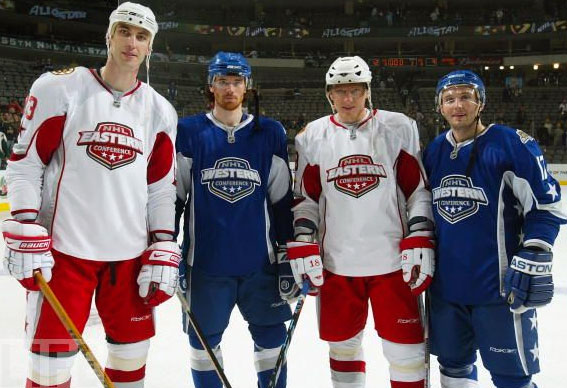
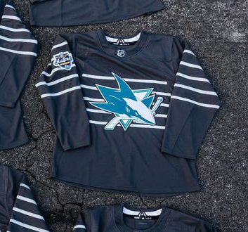
I think there’s a safe assumption to make with the unveiling of these jerseys: Money was made. If you remember, the ASG last year in San Jose featured the first time in the modern era that the team crests were used on the chest of the jersey, rather than an NHL logo, or special West/East logos. They’re doing it again this year because (I’m assuming) they sold well.
• More: HbD Breakdown: 2019 All-Star Game Jerseys
On top of the premise that fans are more likely to buy a jersey with their favourite team’s logo on it, my assumption is based on the premise that it’s way more complicated to create a jersey that will work for 31 different logos rather than just one or two, especially when accommodating for 31 different logos that all use different colours and have their own visual brands and styles that can’t be referenced in the new jersey’s design as to not show preferential treatment to any team (aside from, maybe, the host team).
So why do that difficult process unless you know it will sell? If you want to tackle it as a great design exercise, I’m all for that. But it’s going to create very tight constraints, probably take more time, and cost more money. It’s an extremely difficult task that’s ripe for a potential disaster.
Speaking of which…
Just-Enough?

Oof. I’m trying hard to like these. I really am. And there’s definitely reasons to like them.
First, they’re very innovative and unconventional, pushing the boundaries of what a hockey can (or should) be. I’m all for experimentation in jersey design and if there’s a place to try experiment, it’s for a one-off game like the All-Star Game.
Second, it definitely has a more urban, modern aesthetic to it, which (given the track record of Adidas jerseys since they took over in 2017) I’m sure is something they were striving for here. Having the promo shots of the jersey feature cracked asphalt is a good hint too. It speaks to appealing to a new and high-growth demographic that hockey doesn’t traditionally reach. For that reason, some people will really like this jersey, and I can understand why. It speaks to them, and that’s totally cool.
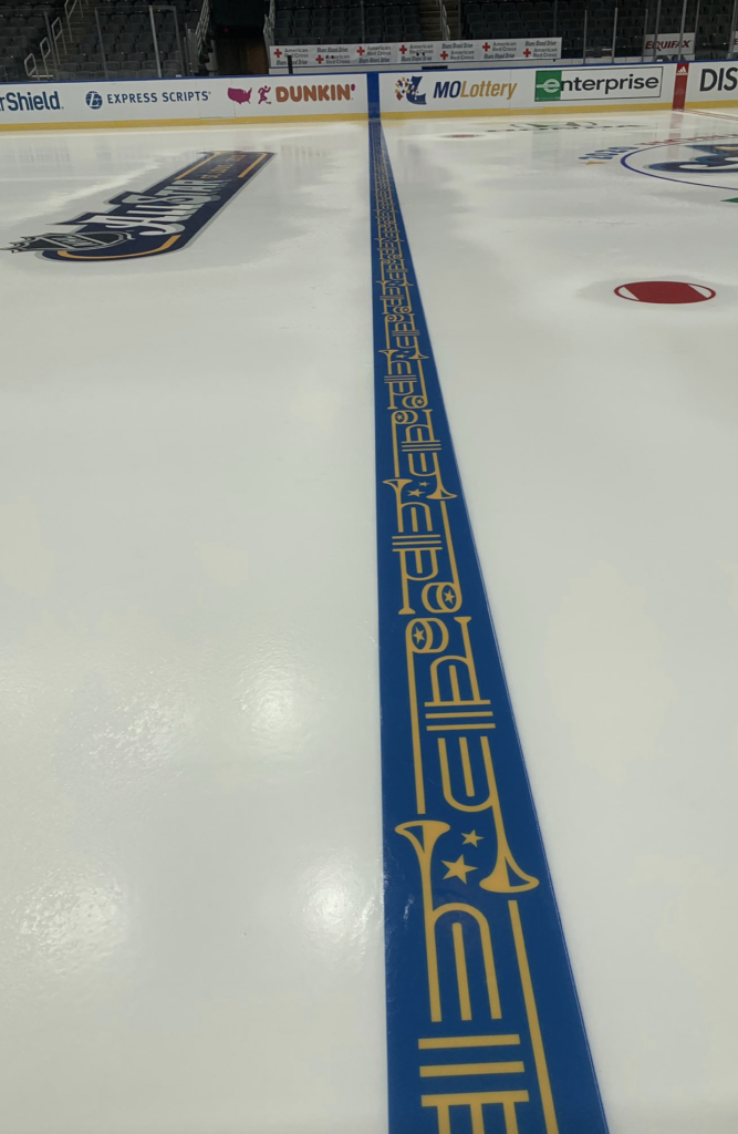
Third, I love the idea of incorporating the musical heritage of St Louis into the design, and using the five lines of a musical staff as a main design element is really cool, especially as a chest stripe which is becoming all the rage these days after the Canadiens claimed it for their own for so long. Using silver thread for the stripes is also a nice way to honour the traditional All-Star aesthetic.
Fourth, the constraint and minimalism achieved here is admirable, and difficult to achieve. Less is not more, more is not more, just-enough is more, and knowing where that “just-enough” lies is basically the crux of visual design in a nutshell. If you can consistently figure that out, you’re golden. But getting there demands restraint and patience, and while these show that, I’d argue that there’s just not enough to get to just-enough.
• More: Top 5: Best NHL All-Star Game Jerseys
• More: Top 5: Worst NHL All-Star Game Jerseys
• More: Best and Worst NHL All-Star Game Logos

Singing the Blues

But I just can’t give these jerseys a passing grade because of the critical misfires with them. And most of them revolve around the possibly insurmountable constraints of having 31 different brands featured on a single light and dark jerseys set.
First, the jersey’s base. While the musical staff element is great, having thin silver lines on a dark grey or white jersey without any other element is literally the equivalent of wearing a piece of sheet music. Except the sheet music is more interesting because it has notes on it.
Really, what speaks to the vibrancy and excitement of St Louis’ musical heritage than *checks note* a black/white jersey with some grey stripes.
The most vibrant, interesting part of the jerseys are on the inside of the collar, with the St Louis arch and trumpets. But nobody will ever see it during the game unfortunately, except on the ice.

Okay, that’s all a bit facetious, but the monochromatic minimalism of these jerseys destroy any character that the musical staff is trying to convey. For an event like the All-Star Game – which is inherently meant to be a festival-type atmosphere staged primarily for corporate interests and kids – why have the jerseys suck out all the aesthetic joy out of the game itself? Imagine a monochromatic circus. Why? Why would anyone do this?
Maybe because you don’t have a choice?
Because you have 31 different teams/brands you need to accommodate for. What other choice do you have but to go monochromatic?
Well, at least there will be colour on the team logos, right?
One Colour To Rule Them All

For reasons that were never made clear, all the team logos used their one-colour versions. While these versions are usually reserved for black or white only in the branding world, the majority of them feature the team logo using only the team’s dominant colour. For a team like LA, Toronto, or Detroit, not a big deal. For other teams, it’s problematic.
Especially for teams that rely on a heavy dose of contrast to really bring their logos to life – teams like Boston, Pittsburgh, Edmonton, San Jose (with its blotchy white patch on top of the shark), and Nashville. The odd colourization flattens the logo and kills the energy of it. They just look bad.
And there wasn’t really any explanation given in the NHL’s press release about the jerseys as to why the logos were treated this way. So we have to guess, and my guess is that it was an attempt to include some element of colour and each team’s brand in a more interesting and unique way.
But, interesting and unique does not always mean it’s a successful design, and most of these miss the mark.

4-on-2

Four teams. Two jerseys. Makes zero sense.
Yeah, a team can switch from light to dark jerseys if necessary, but you’re guaranteed to be spending time and money to produce jerseys that won’t even be worn during the tournament.
And it seems it’s all because of the restrictions inherit in getting team logos on the chest. Again, I guess they’ll sell them. But I’d like see the cost-benefit analysis on this.
I’ll die on this hill. Don’t @ me.
Nil-Star Game

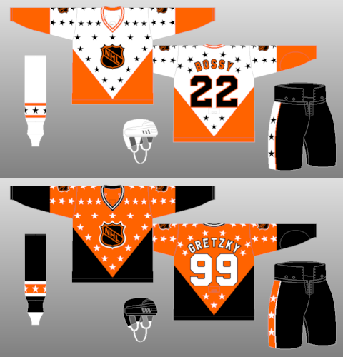
It’s also been an interesting choice for Adidas these last couple years to not include any stars on an ASG jersey. Kudos to the Dallas Stars for forcing it on there.
I’m not saying they have to go all 1982 ASG on us, but some subtle reference to the game that’s being played would’ve been nice. Maybe stitch a few stars on the lines to act like musical notes on the staff lines. Maybe on the shoulders somewhere, as patches. It doesn’t have to be overkill, but c’mon, something (other than in a place no one will see it) would be nice.
And that leads me to the final point. The ASG is a festival of sorts. It’s meant to be a fun game. The Skills Competition is meant to be fun. These jerseys are many things, but they don’t reflect the spirit of the weekend at all. They don’t mind their surroundings and look painfully out of context, especially when compared to the event’s logo, which puts more energy and spirit onto the jersey via a small shoulder patch than the rest of the jerseys have combined.
Final Verdict
I want to like these jerseys because of their innovation and different aesthetic that is meant to broaden hockey’s demographic and audience. For some teams, it’s not a bad-looking modernist take on the jersey (if your logo works well with the template). For others, it’s a bastardization of a team’s logo on an overly minimalist logo.
But overall, it’s devoid of any personality for a game that’s meant to exhibit the skill and grace that propels the game, and most of all, just be a fun display of hockey for the masses. The requirement of having the team logos on the chest is constraining the jerseys to the point of joyless minimalism.
Agree? Disagree? Let us know in the comments below or join the conversation on Twitter, Facebook, or Instagram!


/cdn.vox-cdn.com/uploads/chorus_image/image/62673741/usa_today_10515969.0.jpg)
:no_upscale()/cdn.vox-cdn.com/uploads/chorus_asset/file/19587588/thumb___2020_01_08T161030.212.jpeg)
[…] • More: HbyD Breakdown: 2020 All Star Game Jerseys […]