
Top 5: Worst Designs of 2020

Good riddance to 2020. It’s gone, it’s over, and for the most part, it was a flaming trash heap of garbage, with murder hornets, lockdowns, politics, and of course, a global pandemic. Here’s hoping to a better year in 2021, although 2020 lowered the bar so much, you have to dig to find it.
But things are looking up, with a full (albeit abbreviated) season of hockey on the horizon! It’s time to give our final adieu to 2020 by doing our annual countdown of the best and worst to grace the world of hockey design in 2020.
Today, we’re got the Top 5 Worst Designs of 2020. We’ll tackle the Best Designs as well, but Worst is first because you always pick the bad news before the good news when given the option. Always. Remember, these are the Top 5 Worst Designs that were announced in 2020. Not all of them have necessarily been used in a game yet, or some were excluded from this list because they were announced in 2019.
• More: Top 5: Worst Designs of 2019
• More: Top 5: Best Designs of 2019
Let’s get started, shall we?

Honourable mention goes to 2020. Just, ugh, what a year. A year designed by hell spawns.

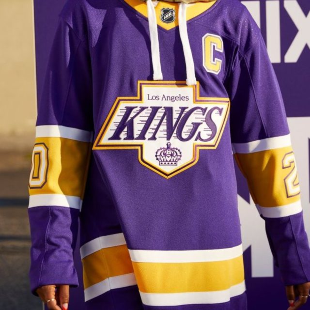
Some of the Reverse Retro jerseys are great. Some may even become iconic, with a great combination of old styles mixed together with new colours (or vice versa). But as was bound to be expected with an exercise that includes 31 jerseys announced all at once, some aren’t going to be very good, or worse, not really notable at all.
• More: HbyD Roundtable: Reverse Retro Jerseys
But, just like the plethora of heritage or classic jerseys that have been unveiled in recent seasons, most of them are nothing more than looking behind us than looking forward, and very few of the Reverse Retro jerseys feature anything that could be described as a meaningful step forward for hockey jersey design.
And given that a pandemic-plagued season with few games that allowed fans in buildings undoubtedly negatively influenced most of the owner’s bottom lines, this was a very easy way to play on nostalgia and get fans to open their wallets, so I don’t necessarily blame them for that.
Let’s look backwards a bit less and try looking forward a bit more.

Of course, if we’re going to try and push the limits of what a hockey jersey came be, there’s going to be some missteps…like the Kings’ Stadium Series jersey (yes, remember that 2020 Stadium Series game from about a decade ago?).
• More: HbyD Breakdown: 2020 Stadium Series Jerseys
• More: 2020 Stadium Series Jersey Countdown
It’s a top-heavy black met with what appears to be white at first glance, but is actually a very light grey separated by a thin white line. The result is a very segmented, clunky, and extremely color-blocked overall look. The motion lines on the “LA” are a nice callback to the Gretzky-era logo, but when used this large and obnoxiously, it’s just too rudimentary of an element. And those chrome helmets are…something.
Kudos for trying something innovative, but let’s hope we’ve seen the last of these jerseys.


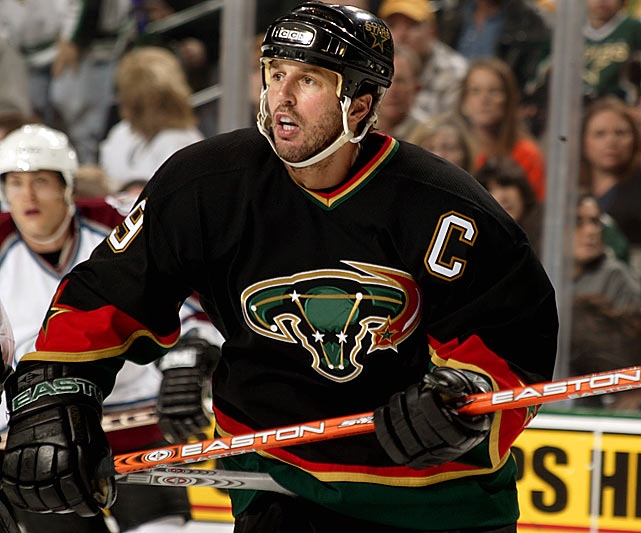
What is Dallas doing? After saying goodbye to years of bad jersey designs with a brand re-fresh in 2013, they maintained one of the better jersey sets in the league, and then built on that with a fairly good 2020 Winter Classic jersey. And then they lost in the Cup Finals and good all weird on us again.
First there was the Monster can of a jersey featuring neon green trim on nothing but black, reminiscent of those gawd-awful Black Ice jerseys from early in the last decade that were…not great. These new Stars versions reek of a desperate attempt to be “cool”.
• More: Black Ice Jerseys Suck
Then they unveiled their Reverse Retro jerseys which were the exact opposite: a thin green/black stripe on nothing but white, along with a light-silver logo that’s almost completely unreadable(!!). Didn’t Toronto already show us that camouflage doesn’t really work well with hockey?
Dallas, I know losing in the Cup Finals stings, but please don’t take it out on your designers.

In what’s starting to become an annual tradition, the All Star Game jerseys make an appearance on our Worst list (remember, that 2020 ASG from the 50 years ago?). Once again, a 4-team tournament features 2 different jersey variations (which alone makes very little sense). Once again, they’re predominantly mono-chromatic, because the league/teams are hoping that a jersey with a team logo on it sells better than one with the league crest, and there’s just too much colour diversity to have a design that works with each team’s logo.
• More: HbyD Breakdown: 2020 All Star Game Jerseys
The whole concept is so incredibly forced (and looks so boring and lacklustre on the ice), that it’s hard to find anything redeemable in it. Because it was in St Louis, there’s the inclusion of thin stripes across the chest like that of sheet music, because nothing gets across the vibrancy and vitality of Missouri’s music scene like a monochromatic jersey with lines on it.
The whole concept is done, it’s time to let it go.


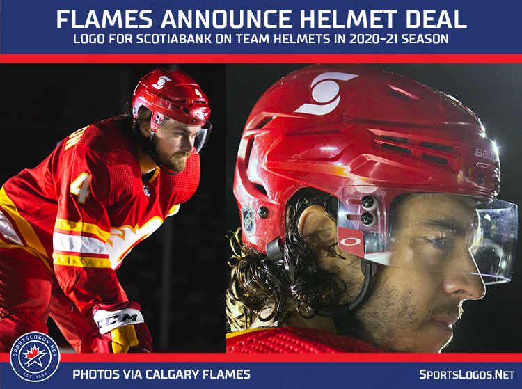
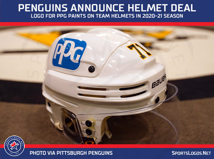
The Pandora’s Box has officially opened. As of now, there’s been at least 13 teams that have announced they’ll be selling off a piece of their helmet’s real estate, making it the first advertisements to make their way onto an NHL uniform. Some are relatively low-key and subtle. Others, not so much.
The NHL says it’s only for this season, but given the easy money it’s likely to generate for the owners who’s bottom lines have been hurt by the pandemic (and how most fans won’t really care about it), it’s hard to see how that will happen.
We all knew it was coming. It was inevitable, but it still feels gross. And the first ones – the Caps and Devils – were our parting gift from the last few days in 2020. Ugh. 2020.
Agree? Disagree? Let us know in the comments below or join the conversation on Twitter, Facebook, or Instagram!


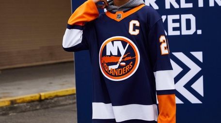
So, some owners felt a dire need to recoup cash by breaching the ad-space universe with helmet sponsorships, while others ignored the cash cow that is the alternate jersey by just punting on their Reverse Retros (Islanders, Oilers)
Strange days, indeed.