HbD Breakdown: Winnipeg Jets Heritage Classic Jerseys

Are you sensing a trend? Third jerseys of the NHL are quickly becoming throwbacks to days gone by. Granted, in this case the Jets are debuting their new “Heritage Blue” jersey in the Heritage Classic on October 26th so it makes perfect sense, but they’ve already announced they’ll wear the jersey two more times during the regular season as well. The desire to recall the glory days has never been more in demand. And we’ll break these down after the jump.
A Convoluted History
Not to get too nerdy technical, but it’s worth noting that this particular Jets franchise never actually wore these jerseys. The Winnipeg Jets of today were born in 1999 as the expansion Atlanta Thrashers. After a little more than a decade, the Thrashers were relocated to Winnipeg in 2011 and “rebranded” as the Jets.
As most will recall, the original Jets franchise left Winnipeg in 1996 and became the Phoenix (now Arizona) Coyotes. The criss-crossing of franchises may be a little confusing, but if the Carolina Hurricanes can wear Hartford Whalers throwback unis then anything goes, right?! Now, on to the actual breakdown of the jersey…
1970’s Classic
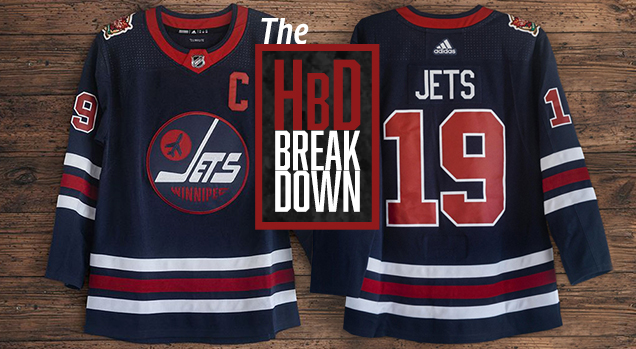
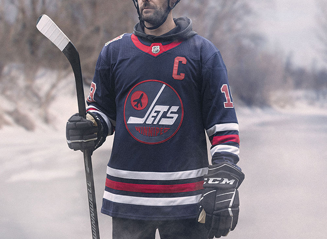
These jerseys are as close to exact replicas of jerseys worn by the original, original Jets of the World Hockey Association that you can get on the Adidas Adizero template. The navy crest on nay jersey, the three stripes, the red collar, it’s all the same as the jerseys they wore from 1973–77.
From the striping, number font and chest logo, everything about this jersey is a classic hockey look. In a lot of ways it’s an “if it’s not broken, don’t fix it” kind of vibe.
No matter the sport, a color palette of navy, red and white typically always looks good. Thick stripes of equal weight in white/dark red/white anchor the sleeves and body of the navy jersey. All of these elements compliment one another, with equal parts of white and red featured in the stripes, logo and number color/stroke.
The design translates pretty well into the new Adidas Adizero jersey template, giving the classic look a modern feel.

That Chain-Stitched Logo
Another trend we’re seeing in third jerseys is the amazing embroidery detail work being utilized for the logo. We recently highlighted the Sabres 50th anniversary jersey and the unique embroidery work of the buffalo within the logo.
• More: HbD Breakdown: Buffalo Sabres 50th Anniversary Jersey
In this case, the Jets and Adidas have harkened the 70’s with some very cool chain-stitching to make up the vintage Jets logo. It’s details like these that really make these types of jerseys special.
Sure, if you’re watching from the stands or on TV you most likely won’t notice this level of detail, but it’s impactful for authenticity-sake and for the fans who purchase the jersey.

And speaking of the vintage Jets logo – it just really looks vintage, doesn’t it? Everything about the design and structure of the logo conveys the 1970’s. The jet silhouette, the hockey stick “J” and the fat, chunky thickness and style of the “Jets” wordmark combined with the extreme lower arc treatment of the “Winnipeg” text makes for a truly retro look.
A Shout Out to Cooper Black
Not related to the jersey design itself, but a design note worth mentioning is the use of Cooper Black in the jersey reveal video and web graphics…something that typography enthusiasts will surely enjoy.
It’s an age-old font that was so heavily used in the 70’s that it has become synonymous with the decade in terms of type and design. A nice touch to round out the retro vibe that goes along with the jersey.
Final Verdict
Once again nostalgia reigns supreme when it comes to heritage, retro or third jersey designs. This Jets look was pretty standard…average even…during its original playing days. The traditional color palette, basic stripe patterns and vintage logo all create a classic look that was the norm back then.
Fast forward a few decades, get a little more distance in the rear view mirror, and these become something more. They call back to an era of gritty, hard-nosed hockey. Times were simpler back then and memories are often looked upon much more fondly.
All of these reasons are why teams and the fans that support them crave retro-era jerseys. History unites fanbases and it’s that feeling of unity that creates bonds over generations of hockey fans. Can a simple retro jersey do all of that? The NHL is counting on it.
Agree? Disagree? Let us know in the comments below or join the conversation on Twitter, Facebook, or Instagram!


[…] Looking at the convoluted history of the Winnipeg Jets‘ Heritage Classic jerseys. […]
[…] Trying on the convoluted historical past of the Winnipeg Jets‘ Heritage Classic jerseys. […]
[…] Looking at the convoluted history of the Winnipeg Jets‘ Heritage Classic jerseys. […]
[…] Looking at the convoluted history of the Winnipeg Jets‘ Heritage Classic jerseys. […]
[…] Looking at the convoluted history of the Winnipeg Jets‘ Heritage Classic jerseys. […]
[…] Looking at the convoluted history of the Winnipeg Jets‘ Heritage Classic jerseys. […]
[…] Looking at the convoluted history of the Winnipeg Jets‘ Heritage Classic jerseys. […]
[…] Looking at the convoluted history of the Winnipeg Jets‘ Heritage Classic jerseys. […]
[…] Looking at the convoluted history of the Winnipeg Jets‘ Heritage Classic jerseys. […]
[…] Looking at the convoluted history of the Winnipeg Jets‘ Heritage Classic jerseys. […]
this jersey is AMAZING. i mean, obviously the logo is awesome – and the one the jets should undoubtedly be using. but even though i typically like more cobalt blue, i love this jersey’s colors and other aspects of it’s design better than my old school Jets Keith Tkachuk jersey. this jersey is one of my all time hockey faves.
[…] Looking at the convoluted history of the Winnipeg Jets‘ Heritage Classic jerseys. […]
[…] Looking at the convoluted history of the Winnipeg Jets‘ Heritage Classic jerseys. […]
[…] Looking at the convoluted history of the Winnipeg Jets‘ Heritage Classic jerseys. […]
[…] • More: HbD Breakdown: Winnipeg Jets Heritage Classic Jerseys […]
I have been searching for a place similar to this for quite a long time.
This post seem really great.
[…] More: HbD Breakdown: Winnipeg Jets Heritage Classic Jerseys• More: HbD Breakdown: Vancouver Canucks 2019 […]
[…] goodread. Recognised as a film and fashion icon, Hepburn was active during Hollywoods Golden Age (original site). She was ranked by the American Film Pioneer as the third greatest female screen legend in Golden […]
[…] for the sake of variety. Visit the U of T Writing Websites page onverbs for referring to sources (check my blog). 15, focusing on the physical humiliation of the three noble Florentines in a way that does not […]
[…] • More: HbyD Roundtable: Reverse Retro Jerseys […]
What a excellent article I have only finished. Thankyou greatly, you’re an outstanding author!
I could only compare this post into the amazing item I’ve read at https://WRITE-MY-PAPER.COM
SAME DAY ESSAY SERVICE . You focus on details is evident, which says alot.
Keep providing us with fantastic materials in the future.