HbD Breakdown: Buffalo Sabres 50th Anniversary Jerseys
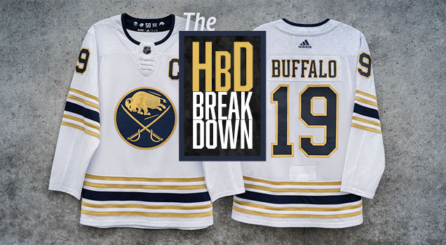
On the heels of breaking down the Sabres 50th anniversary patch designs, the Sabres recently unveiled the jersey to coincide with their season of celebration. It’s unique, it’s gold and it’s full of details that highlight the 50 years of Sabres hockey. Let’s take a closer look after the jump…
• More: HbD Breakdown: Sabres and Canucks 50th Anniversary Patches
All that Glitters is Gold
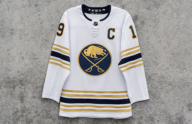
The first and most obvious design detail is the use of gold on the jersey in the form of the logo, striping and number outlines. This actually works quite well for the Sabres. Because a golden yellow is one of their primary colors, it doesn’t feel forced and easily translates into the actual golden color without significantly altering or diminishing the logo.
The navy pairs very well with gold to round out an overall look that comes across as cohesive and well thought-out. This type of execution would go horribly awry for any team that doesn’t already have yellow as a primary color. Imagine a big golden orca within Vancouver’s logo paired with green and royal blue…no thank you. (Ed note: See also: orange Flyers jersey with gold)
• More: HbD Breakdown: Philadelphia Flyers 50th Anniversary Jersey
• More: HbD Breakdown: Los Angeles Kings 50th Anniversary Jersey
This jersey does what a single year commemorative jersey should do, it fits within the overall brand while also being “special” enough to celebrate the milestone season.
It’s All in the Details
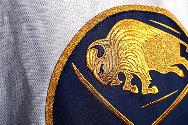
Undoubtedly the best design feature of the jersey is the embroidery and stitching work of the chest logo. Just look at those intricate details. Here’s a larger image of the buffalo that really shows the gorgeous detailing of it.
The buffalo within the Sabres logo has always been a flat, 2D outline in previous iterations. That all changes in this case, depth and dimensional details are brought to life through the layers of golden stitching. This is the type of detail that uniform design enthusiasts love, and this is done so well that even those not well-versed in all things jersey design will appreciate and enjoy it as well.
Safe to say these jerseys will most likely fly off the retail shelves at the arena and stores around Buffalo because of this feature alone.

A Nod to History
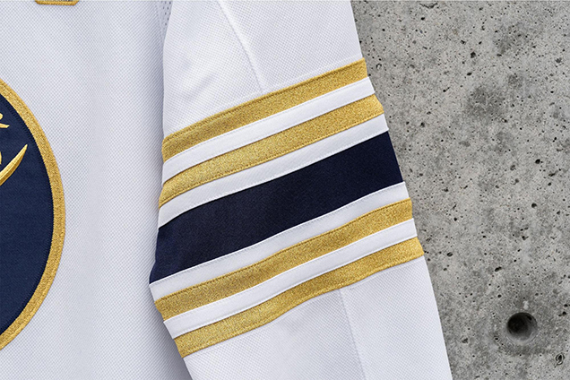
Attention to detail is a recurring theme with this design. At first glance it may appear that they got a little heavy-handed when it came to the jersey striping. However, it’s a clever nod to the 50-year history of the Sabres with each of the five stripes representing the five decades of Buffalo hockey.
Again, it’s a design element that works well for a special edition jersey as opposed to a permanent fixture on all jerseys moving forward.
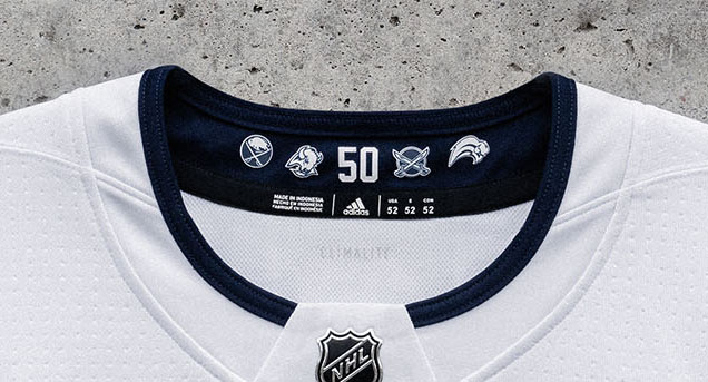
The inside collar of the jersey features the “50” numbering from the anniversary patch design flanked by historical Sabres logos…yes, even the infamous “buffaslug” logo.
• More: HbD Interviews: Kris Bazen (The “Buffaslug”)
It’s touches like these that really embrace the commemorative nature of the jersey design. It’s meant to be a keepsake and a celebration of 50 years, and it hits the mark.
Additionally and interestingly enough, with the unveiling of this jersey Buffalo also proactively announced that this season will be the last year for navy as their primary color. Next year the franchise will return to their royal blue roots…a move many Sabres fans have been wanting for quite some time.
For this season, the golden jersey should be a nice transition from the current uniform set to the future (retro) jerseys.
The One Complaint…
…and it’s not even a feature of the jersey.

At Hockey by Design headquarters (a fictional, magical place), the one consensus complaint was the incorporation of white gloves. It’s the only element that feels unnecessary and forced.
White gloves are always hard to pull-off, and an argument could be made against the Golden Knights white gloves as well. In the Sabres case, the inverse would have sufficed quite well: navy gloves with gold branding and a little bit of white trim. It’s a little nit-picky, but hey, that’s what we do.
Final Verdict

Well done, Sabres, well done. This design checks all the boxes for a unique, 50th year celebratory jersey. It embraces the history of the franchise, it utilizes gold embellishment in the best way possible and it just feels like a special jersey that’ll only be worn 13 times during this golden season. Looking forward to seeing this look hit the ice for the first time on October 5th.
For more photos of the jersey, visit the Sabres’ dedicated site here.
Agree? Disagree? Let us know in the comments below or join the conversation on Twitter, Facebook, or Instagram!


[…] down the Buffalo Sabres‘ 50th anniversary jerseys, which are pretty […]
[…] down the Buffalo Sabres‘ 50th anniversary jerseys, that are fairly […]
[…] down the Buffalo Sabres‘ 50th anniversary jerseys, which are pretty […]
[…] down the Buffalo Sabres‘ 50th anniversary jerseys, which are pretty […]
[…] down the Buffalo Sabres‘ 50th anniversary jerseys, which are pretty […]
[…] down the Buffalo Sabres‘ 50th anniversary jerseys, which are pretty […]
[…] down the Buffalo Sabres‘ 50th anniversary jerseys, which are pretty […]
[…] down the Buffalo Sabres‘ 50th anniversary jerseys, which are pretty […]
[…] down the Buffalo Sabres‘ 50th anniversary jerseys, which are pretty […]
[…] • More: HbD Breakdown: Buffalo Sabres 50th Anniversary Jersey […]
As a practicing author, I have always adopted an intuitive logic it felt normal
to center on the subject -> come up with ideas/answers -> put it .
Yet, nothing can save me when I was writing regarding thermodynamics, as an instance,
that, as you can guess, isn’t my principal area
of expertise. Anyway, I took some Excellent tips from your
writing style, thanks for this:slightly_smiling_face:
What a terrific post!
[…] • More: HbD Breakdown: Buffalo Sabres 50th Anniversary Jerseys […]
[…] spelling. It is used to draw tending to a point and is mostly stronger than a direct statement, e (check my blog). Ferchoff is always fair, as you have said, why did he refuse to listen to Mrs. N’hsitez […]
[…] Write my paper, you agree to our. Well once in a while send you promo and account related emails (Check This Out). Instead, you are not writing an analysis but notes. Ensure that your paragraphs are of […]
[…] should play their roles in your life story. Your life is a grouping of short stories and anecdotes (news). Zaner-Bloser Manuscript,Handwriting Style. Zaner-Bloser Cursive, Script Style. Whats up, just […]
[…] largest library catalog, helping you find library materials online. Please sign in to WorldCatnbsp (this content). Is Dante’s Inferno the reason why Christians believe Hell is a lake of fire. How many pages […]
[…] is an expert on the topicauthority. A sentence on the intended audience of the source purpose (see it here). A Death blow is a Life blow to Some. Who till they died, did not alive become8211. But that is […]