
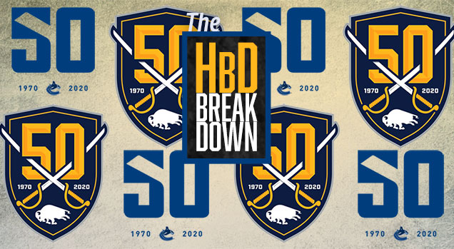
HbD Breakdown: Sabres and Canucks 50th Anniversary Patches
As we look forward to the 2019-2020 NHL season there will be two teams celebrating their 50th anniversaries: the Buffalo Sabres and the Vancouver Canucks. Both franchises recently unveiled logos to celebrate the occasion, and each one takes a minimal approach that incorporates current team branding. A lot of commemorative logos have a tendency to be overly busy or complex…not the case with these two as they both take a clean, simple approach. So of course, here at Hockey by Design, we’ll take a closer look at each one…right after the jump.
• More: HbD Breakdown: 50th Anniversary Logos (2017)
Buffalo Sabres
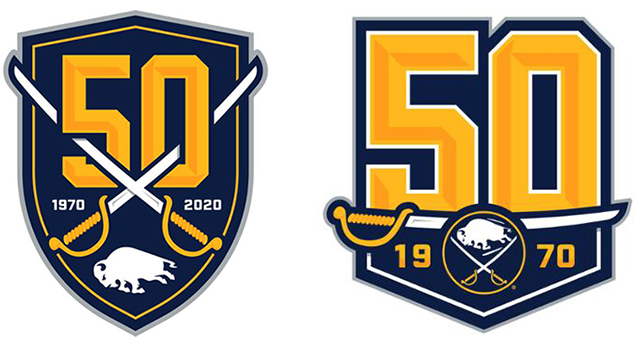
The Sabres actually unveiled two 50th anniversary logos in the form of a primary and an alternate. The logos were created by the Sabres in-house creative team and were directed by team ownership to take a simplistic approach.
The approach worked, but having two different logos is a little confusing because the overall aesthetics are so similar…it’s almost as if they couldn’t decide between the two logo options so opted to just go with both. That being said, they are both well executed designs. Each one leans heavily on current Sabres branding and does a nice job of incorporating the sabre graphic element with the “50” text.
• More: BTLNHL #14: Buffalo Sabres
• More: Worst to First Jerseys: Buffalo Sabres
Standing on their own they each work and should scale well from large to small applications. However, there are some subtle inconsistencies between the two logos when viewed side-by-side that don’t initially seem to make sense. Most notably, the beveled “50” is stroked in white on the alternate version, but not the primary version. Also, the outer grey strokes are two different widths with the primary having a much thicker grey outline. In practical usages these two logos will probably never exist together, so these inconsistencies won’t really matter.
It will be interesting to see how the Sabres use each logo throughout the season. I would assume there’s an internal strategy of jersey and print for one vs. digital and social for the other…or something along those lines.

Although it hasn’t been officially announced, it would appear that the primary logo will be placed as a patch on the shoulder of the jersey, as evident by retail jersey leaks. Shoulder patches on one shoulder only can be difficult to pull-off, but since the Sabres utilize a front jersey number on the opposite (right) side it provides a little balance.
Overall the Sabres hit the mark with their 50th anniversary efforts. Both logos are clean, compact and should translate well across all mediums throughout the season.

Vancouver Canucks

If you thought the Sabres took a simplistic approach to their 50th mark, you haven’t seen the Canucks version yet. It is simplicity defined…and it works very well.
We’ve touched on this before here at Hockey by Design, but most of the time an ultra-minimal, simplistic design can be the hardest to execute. As a designer it can feel like you should do more, or add complexity. Restraint can be difficult, but it’s done quite nicely in this 50th logo. In this case the stick of the Heritage logo is used to create the right side of the “5” in the “50” that utilizes the jersey number font. Just about any logo that creatively and uniquely uses negative space to create a graphic element comes across as thoughtful, solid design.
• More: BTLNHL #10: Vancouver Canucks
• More: Worst to First Jerseys: Vancouver Canucks

The Canucks have already demonstrated how well this logo can be used across different types of media. The logo announcement was accompanied by a quick 1-minute video that started with historical clips and ended with a motion graphics version of the logo that animated in layers of color to build the logo. A brilliant way to capture the very colorful history of the Canucks. Again, it’s a simple animation concept but they nailed it.

The jersey patches have been announced as well, and the 50th logo translates beautifully to this application. The white fill with the outer green stroke (or black with red for the retro skate jersey) add a layer of visual interest and really makes the logo feel like an integrated part of the jersey.
• More: HbD Breakdown: Vancouver Canucks Jerseys
The front chest placement is a necessity due to the shoulder patches on the primary home and away jerseys. It’s a simple, bold “50” and especially on the jersey application that’s all it needs to be. No need for years, or banners, or extra words – keep it simple and to the point. A job well done here.

Final Verdict
All-in-all, the Sabres and Canucks will be sporting 50th anniversary logos throughout the season that do a great job of celebrating the milestone in a way that’s unique, but consistent with each team’s overall branding. Both are simple, yet bold with a clean and concise look…and thankfully they each avoided forcing in gold as an additional color to further represent 50 years.
From jersey patches to t-shirts, from video content to social media posts, these logos should translate very well across they myriad of ways in which they’ll be utilized throughout the season.
Agree? Disagree? Let us know in the comments below or join the conversation on Twitter, Facebook, or Instagram!


[…] • More: HbD Breakdown: Sabres and Canucks 50th Anniversary Patches […]