HbD Breakdown: 50th Anniversary Logos
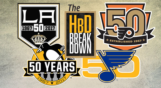 There’s not too many teams in the league that celebrate the same noteworthy anniversary in the same year, as expansion is usually just one or two teams at a time. But this year four franchise siblings – from the NHL’s largest expansion of 6 teams in 1967 – are celebrating their semicentennial: the Los Angeles Kings, the Philadelphia Flyers, the Pittsburgh Penguins and the St Louis Blues. We’ve already covered the Kings and Flyers anniversary jerseys, but all four teams featured a special logo/patch to celebrate the momentous event. Let’s break them down, in alphabetical order.
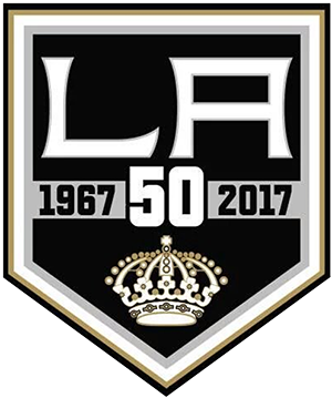 Los Angeles Kings
It just so happens, we’re also starting with the worst of the bunch. It’s been well-documented that I’m not a big fan of the Kings’ logo, so it should come as no surprise that I’m not a huge fan of their 50th anniversary logo either, from which the patch borrows heavily.
• More: BTLNHL #28: Los Angeles Kings
• More: HbD Breakdown: LA Kings 50th Anniversary Jerseys
My major complaint about their logo is that the “LA” takes up way too much room and forces the hyper-detailed crown to tiny icon status. And they still don’t seem to get that here with their 50th anniversary patch, changing the modern crown to a gold-and-white version of their original classic crown, and keeping it just as small…on a small patch. So, the detail in the crown basically becomes meaningless and a garbled mess when actually embroidered into a patch.
The idea of using a white-and-gold version of their original logo is still a good one, but relegating something so intricate and rich with detail to the status of an afterthought, especially when you have the unnecessarily massive “LA” above it…I’m not sure why anyone would think that’s a good idea.
Framing the logo in gold is a more subtle way to introduce the status of a golden anniversary into your logo as well, but it creates a ridiculous amount of outlines for the logo, especially when you’re combining it when another metallic substance throughout your logo/brand.
And finally, the “1967-50-2017” bar in the middle. It’s fine, albeit a bit redundant as you can just say “50” without including the years and still get the general point across. But, I find the typeface choice a bit disappointing. The Kings, for all the complaints I have about their branding, at least have a unique and recognizable typeface that they use on everything, from their logo to their jerseys. But they just abandoned that altogether on these patches, instead going for a more historical approach. A modern logo with an old crown and lettering creates a franken-patch that doesn’t look modern or historical…just out-of-sync.
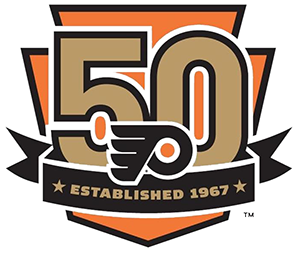 Philadelphia Flyers
The Flyers missed the same memo that the Anaheim Ducks ignore every chance they get: orange and beige don’t look good together.
I understand why the Flyers might have felt forced to create this combo though. They live and breathe orange. It’s the keystone of their visual brand and not having it as part of any commemorative patch seems sacrilegious. And how you can celebrate a golden anniversary without gold? And they definitely can’t use that bright yellow gold and those antarctic animals cross-state use. So…beige it is.
Personally, I think the answer is go full-beige/gold. While beige is essentially a desaturated and dirty version of orange, that also means that they have some similarities to them. I proposed this in the Flyers’ 50th Anniversary jerseys post (which are not that great either), and I stick to it. Go full gold. So good!
• More: HbD Breakdown: Philadelphia Flyers’ 50th Anniversary Jerseys
But, back to the actual design of the actual patch…the keystone background is cool and fitting because Keystone State and all. The giant “50” works and gives instant clarity to the patch’s primary purpose. The overlaying Flyers logo complicated things too much for my liking, but at least they an extremely elegant and minimalist logo, so it’s not horrible.
• More: BTLNHL #3: Philadelphia Flyers
The downfall of the entire patch is the banner. Almost every part of it is unnecessary: the stars (representing their two Cups perhaps?), the “Established”, the disparate typeface from the “50”, it’s actual existence in the first place. You could make an argument for including “1967” in there, but that’s about it. It’s one redeeming quality is that is that it frames the patch nicely to compliment the angles in the keystone background at the top, but it comes at too high of a cost, creating a overly-complicated and cluttered-looking patch. Which is odd because the elements themselves are quite minimal…they’re just layered all over each other to create a mess.
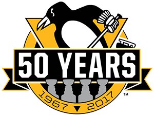 Pittsburgh Penguins
Of the six 1967 expansion teams, the Penguins have the same amount of Cups as all the other teams put together (not counting relocations, etc), and they just love to rub the other team’s faces in it. Imagine if the Flyers or Kings put two Stanley Cup icons in their patch? Pens be like…awwwwwww.
But it doesn’t negate the fact that this is not a great commemorative logo/patch.
First, they chopped their logo in half. That might not be a huge deal for some teams, but with a logo like the Penguins have that’s more illustrative than iconic, it makes for an awkwardly cut-off visual that eliminates some of the character of the logo…and has an awkward visual of a single upside-down skate on the right-hand side that doesn’t make a lot of sense. I understand that everybody will just see a cut-off logo without it being confusing, but from a visual design standpoint, it doesn’t make a lot of sense.
They went back to their classic yellow gold this season, so that “golden anniversary” aspect is easily and naturally taken care of.
The roundel element is problematic though. First it competes with triangular background of the logo, and the designers knew this. How do I know they knew this? Because they intentionally deleted some of the circle near the top of the logo/patch. It likely looked tio busy near the top if they would’ve connected the circle, but now it just looks awkwardly unfinished. With a random skate flying by. Upside-down.
If you ignore the top half, the roundel does work well on the bottom half of the patch, encasing the four Cups and the “1967–2017” nicely (and nice detail with the triangle replacing the dash).
As for the large “50 Years” banner through the middle, it’s just another element that competes with both the circle and the triangle. Plus, do we really need the “years” on there? True, it’s not 50 seasons, as that wouldn’t be until 2018-19, thanks to the lockout. But, the “1967–2017” already states the obvious, and “years” is doing nothing other than taking up space to fill the banner. What the generally means is that it’s time to go back and re-work the concept altogether.
Sorry Pens, you may have the most Cups, but your patch is a mishmash of elements and strange visuals that don’t jive together as a melodic whole…unlike your players.
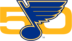 St Louis Blues
Most of my complaints about the previous patches have been that they’re too cluttered and/or using unnecessary elements. The Blues could be accused of being too minimalist with their approach, featuring just the Blues logos (which is one of the best in the league) with the number 50 behind it.
• More: BTLNHL #4: St Louis Blues
But it’s hard not to declare it the best of the bunch because there a simple elegance to it. Their branding palette already has the “golden anniversary” worked into it, so they decided to just not complicate things too much and put a “50” in there and call it a day. Simplicity like this may look easy and/or lazy, but trust me, it’s not. And usually, it takes a lot of guts for a designer to keep things this minimal because is forces every single detail to be featured prominently. You can’t hide anything in minimalism.
As a side note, the wide typeface used for the “50” works here. Simple, classy, but with a bit of character to it.
My only complaint about this logo/patch is that it would be nice to have a bit more integration with the Blues logo and the “50”. Maybe the logo pokes through the “O”? Maybe they share an outline? Not sure exactly how to do it without doing some experimentation, but the logo is a little heavy with it’s multiple outlines when compared with the “50”. The other version of this patch that they used works better in this regard…but without all that fake chrome/gold effects which just cheapen it.
Agree? Disagree? Let us know in the comments or join the conversation on Twitter, Facebook and Instagram! And if you’re interested, we’re now on Pinterest too.





This blog seems so helpful.Thanks
[…] • More: HbD Breakdown: 50th Anniversary Logos (2017) […]