
Worst to First Jerseys: Buffalo Sabres
As we go through the 2019-20 season, we’ll be updating all of the Worst to First Jersey posts every Monday, as almost all the teams in the league have unveiled new jerseys since their original posts. We’ll start with the ones most needing updating and work our way through the league. Today, it’s time for the Buffalo Sabres to get updated.
Also, a huge thanks to SportsLogos.net and NHLUniforms.com for most of the jersey images and references.
This instalment of the Worst to First Jerseys features the Buffalo Sabres, a team that has created some of the most-loved and most-reviled jerseys (and logos) in the league, so this oughta be fun.
Here’s how this works: I’ll count down, from worst to first, all the jerseys the Sabres have ever worn. Homes and aways will be lumped into the same category (so, more of a jersey “era”) and I won’t worry about small changes (like slightly changed positions of piping for example). Third jerseys will stand on their own. And I’m focusing on the jerseys only, not the entire uniform. For the Sabres, there’s nine different jerseys/eras. And we’ll start with the worst one.
9. 2013–2015 Third Jersey
I don’t even.
You knew this was coming in last place, right? And it’s not even particularly close.
These jerseys were laughed out of existence just two seasons after they were laughed into existence via an awkward and poorly executed social media stunt, where then-captain Steve Ott had a (obviously planned) Twitter argument with the Sabres’ Twitter account and decided he didn’t want to wait for the Sabres official account to unveil the new third jerseys. So, he did it himself, using photos that were awful production quality (to keep up the ruse) and did the jerseys absolutely no favours.
*Breaking News… Times up! @BuffaloSabres 3rd Jersey Leaked #MiseryIsOver Can’t wait for the season to start!! pic.twitter.com/7diRxEhDBJ
— Steve Ott (@otterN9NE) September 4, 2013
The stunt might be forgivable if the jerseys were any good. But they weren’t. And by the way, the Sabres’ “sneak peeks” of the jersey were absolutely ridiculous.
The unveiling was not as botched as the jersey itself though. They may get points for creating something unconventional (and certainly, a third jersey is the time and place to try something like that), but the only connection this jersey has to tradition jersey design is that the logo’s on the front and the name and numbers are on the back. Major changes to something like a jersey design have to come incrementally, or they’ll be ill-received. Big jumps like this one just come off as looking ridiculous (I’m looking at you Burger King). It doesn’t help that the changes the Sabres went for were just a shit mix of garbage.
The use of a light (road) colour on the front and a dark (home) colour on the back is just non-sensical, more likely to create confusion than applause for trying something different. I just can’t give a reasonable explanation as to why they would have tried something like this. It just, straight up, doesn’t make sense.
The striping is just terrible. In fact, there really isn’t any striping, at least none that would resemble even somewhat traditional hockey jersey striping. Instead, we’re given some wedges of light grey along the shoulder yoke hem (on the front only, of course), which just stop the hem-line, which gives the design more consideration for the hemlines than for the aesthetics of the jersey. Yeah.
And then they threw a couple wedges of grey on the back, near the bottom of the jersey. For some reason.
And then there’s the badly-tied bowtie at the jersey’s collar which, when place right by the dark navy blue – creating high contrast which will automatically attract the human eye (because: science!) – becomes distracting and serves no purpose other than to distract and pull attention away from the rest of the jersey. Uh-huh.
The grey cuffs don’t necessarily bother me that much, as different colours cuffs are not totally uncommon in hockey jerseys (although in most cases, there’s stripes to break up the main colour of the jersey from the sleeves), but why the two tones of grey on the sleeves? They couldn’t have used blue, or yellow, colours that they’ve already established? Why are they adding another colour into this? Hmmmm.
And finally, there’s the “Buffalo” across the front of the jersey, just above the logo. It’s borrowing jersey aesthetics from football, where having something like that is commonplace. But, that’s because the only thing prominently placed on the front of the jersey are the players’ numbers, not the team logo…which hockey does have. So, why are they trying to identify their team twice? Because Sabres.
I could go on and on, but I’ve already done that (click the link below). I’ve given enough time and space to this mess already.
• More: HbD News: New Minnesota Wild and Buffalo Sabres Jerseys
Jersey Recommendation: Just don’t buy one. No one deserves to wear this. Well, okay, maybe a #9 Ott, since he’s the one who “leaked” it.
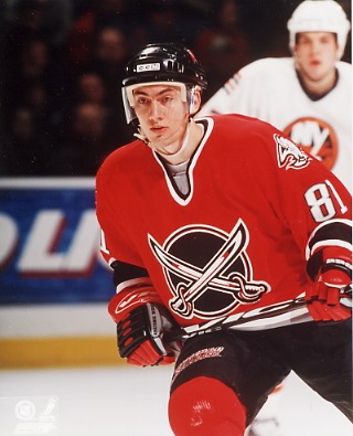
8. 2000–06 Third Jersey
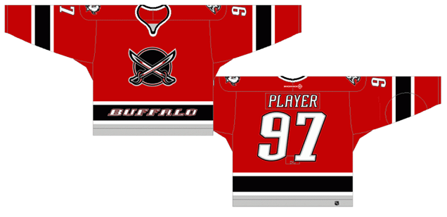
These jerseys represent the first third jerseys the Sabres wore, which was conceived during their mad-cow disease logo phase. And while it’s definitely not as bad as the jersey we’ve already discussed (because dammit, it actually looks like a hockey jersey this time), it’s still not that great.
The colours are fine for the team’s era, and it was great to see a red jersey instead of the black and white duds that they wore regularly, but that “Buffalo” across the bottom of the jersey just kills it for me.
For whatever reason, the Sabres just can’t keep themselves from placing superfluous text on the front of their jerseys (as we’ll see with forthcoming jerseys as well). There’s absolutely no reason why it needs to be there, especially in a typeface inconsistent with the lettering of the nameplate and numbers. They Sabres weren’t the only team guilty of this (see: Capitals) and it never works well. Why? Again, it doesn’t need to be there and adds nothing to the jersey other than being a distraction.
Here’s a tip about good design. Less is not more. More is not more. Just enough is not more. It’s addition through subtraction – this jersey would look better without the lettering there. Also, “it looks cool” is not a valid reason for including something in a jersey, because nothing looks cool forever and trends pass. Just don’t do it.
Another new component to this jersey? An alternate logo, which kind of re-introduced their original (and now current again) logo, but heavily stylized for the late-’90s/early-’00s design aesthetics to match their mad-cow disease logo, featuring the crossing sabres on a circle. Missing? The buffalo, which is maybe why they wrote it across the bottom? It’s not a bad logo necessarily, but it’s still a dated knock-off of the original.
The rest of the jersey? It’s a solid hockey jersey: simple and consistent striping with strong colours, but that’s almost a detriment for it, as it oddly becomes largely forgettable, like a templated design that somebody just slapped a logo (and “Buffalo”) on. And so these are largely forgotten in the Sabres’ jersey library. A third jersey that somehow didn’t really innovate anything, except for a single exceptionally awful inclusion.
Jersey Recommendation: #81 Satan. A red and black jersey, reminiscent of the charred depths of hell? Who better than Satan to put on it?

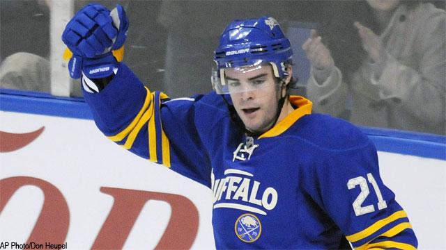
7. 2006–10 Home & Away Jerseys
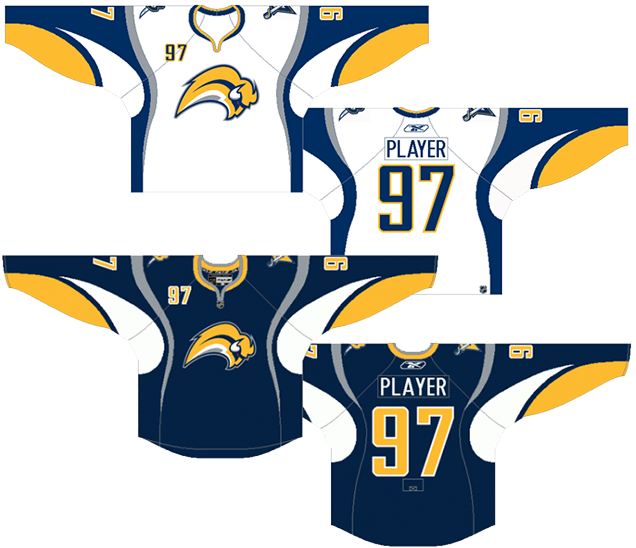
First off, let me say that this list is not about the logos on the jerseys, but more about the jerseys themselves. That being said, the infamous Buffaslug, being awful and much reviled, still plays a part in the ranking of the jerseys.
• More: HbD Interviews: Kris Bazen (Designer of the “Buffaslug”)
And the Buffaslug certainly doesn’t help the cause of a jersey that, while having a lot of movement and dynamism to them, have really odd trims and patterns to them – trim and patterns that don’t really even follow the hemlines of the jerseys. And these jerseys came out a year before the new Reebok Edge jerseys in 2007 that introduced all new curved hemlines. In that sense, these jerseys were extremely innovative. They weren’t the first to show off curved lines in jerseys (we’ll get to those later), but this is one of the most extreme examples of it.
And like the worst-placed jerseys on this list, there’s some non-sensical stuff happening. Like those light grey suspenders that just kind of appear out of nowhere and then disappear. The white armpits. The shoulder yokes that are kind of shoulder yokes but also kind of turn in side stripes and/or double suspenders with the grey suspenders. And then the grey under-cuffs that look like they accidentally dipped their sleeves into butternut squash soup (which is delicious by the way). Again, there’s a ton of flow and movement, but like power lines in India, it’s just too haphazard.
The blue home jersey is definitely the better of the two as, if you just removes the grey suspenders, you have a relatively solid jersey design. The white jersey though, with the blue shoulder yokes/side stripes, starts looking like a weird upper-body version of assless chaps or something.
Oh, and then throw the numbers on the front of the jersey, because that’s apparently a Buffalo thing to do.
Jersey Recommendation: #26 Vanek. His best seasons were wearing this jersey, and his 43-goal campaign was the first of this jersey’s existence. Dynamic with lots of of movement, just like the jersey. Definitely get it in the home blues.
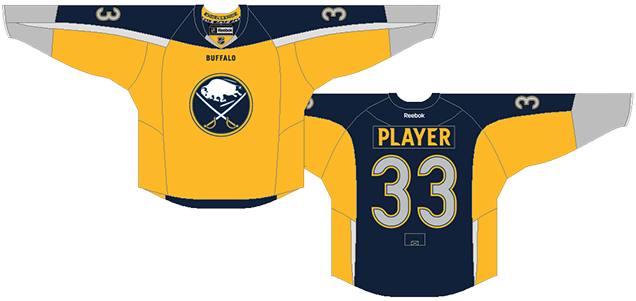
6. 2010–12 Third Jersey
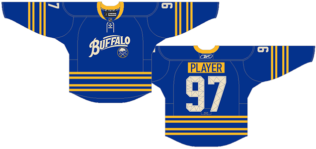
There’s haven’t been many teams who have attempted the scripted-lettering on the front of their jerseys (see Calgary, Minnesota and, of course, these ones), but the only really successful entry has been the Wild’s. This Buffalo one is a good attempt, but it just misses the mark.
Where these jerseys – celebrating the 40th anniversary of the franchise – did succeed, however, is in bringing back the classic royal blue and gold from their original jerseys. And aside from the front crest, the rest of the jersey is pretty lovely. Unique but consistent thin gold striping on the sleeves and bottoms of the jersey. Laced-up collar. Cool stitching on the numbers (but very weirdly applied as well to the captaincy letters). Coloured nameplate that Philadelphia made all the rage, and it worked well with the city of Buffalo’s brand, since the coloured nameplate historically represented a cheaper alternative to nameplates, making it more of a blue-collar aesthetic. It’s not for everyone, but for Buffalo, it worked.
But that script crest just brings the whole thing crashing down. For one thing, the typeface is a script font without wanting to be a script font. None of the letters actually connect, so it’s just an all-caps font that’s morphed into an arc to give it a script-like feel. It makes the execution all very awkward (like Rasputin), and that awkwardness is not helped by the almost random lines placed above and below the text. It’s obviously meant to frame it, but ends up looking like slabs of white there that don’t really serve a purpose.
And again, text on the front of the jersey. Because Buffalo.
Slap a tiny version of their original logo on there, with a “19” and “70” on it that’s so small nobody will be able to see unless they’re holding the jersey in their hand, and it doesn’t really amount to anything positive.
Jersey Recommendation: #21 Stafford. His best two seasons in his career were the two seasons the Sabres wore these jerseys. He deserves something for the effort.
5. 1996–06 Home & Away Jerseys
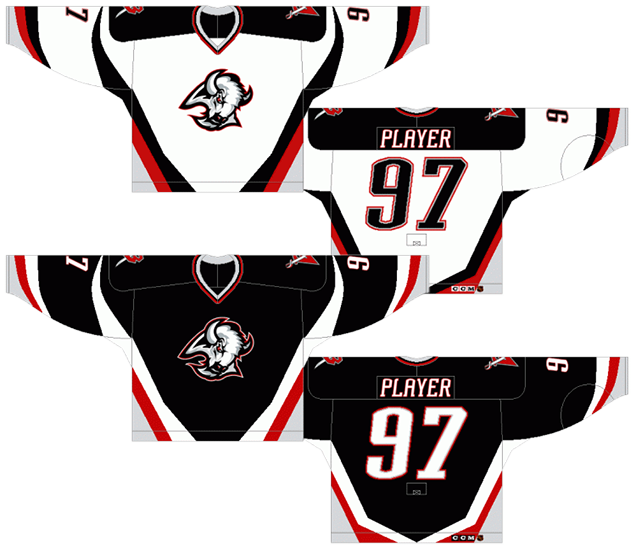
Back to the mad-cow disease logo era for Buffalo, but this time, with no text and no numbers on the front of the jersey, with lines that are much more modern and innovative than standard jersey lines (but not as crazy as some of the jerseys already discussed), and a jersey that came within a toe of winning the Stanley Cup. I’m not overly partial to black jerseys, but there’s a decent amount of red and white in there to bump these up the list.
The thick and consistent lines coming from the base of the jersey and up the sides give the jersey a lot of movement and dynamism, and it’s perfectly mirrored on the sleeves. This type of design element was relatively unique within the league when it was first worn in 1996. Other teams were playing with non-linear stripes on their jerseys (some to their extreme detriment), but Buffalo was one of the few to show a bit of restraint with it. The only problem with the striping is that it causes some strange effects on the side, where the flowing lines converge.
The main complaint I have about these jerseys is how there’s a shoulder yoke on the whites but not on the blacks, making it feel totally unnecessary on the whites…which they are, mostly because it’s a competing element to the rest of the lines on the jersey. Keeping a more minimal white jersey would have been better. But ‘minimal’ was not a word used often in the ’90s.
The mad-cow diseased logo doesn’t necessarily help either, but it’s a callback to a certain ’90s aesthetic (for better or worse), and it represents an era that got the Sabres the closest they’ve ever been to a Cup. I could see fans looking back on it with some amount of reverence. And the curves of the logo compliment the jersey pretty well.
And did you notice? There’s no text on the front! Progress!
Jersey Recommendation: #39 Hasek. Of course. There’s not really any other choice, is there? I guess there is Peca, or Briere, or Drury, but which of those players are in the Hall of Fame? Exactly. Get it in the black.

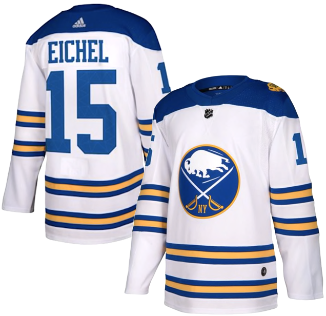
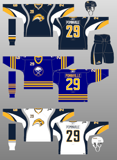
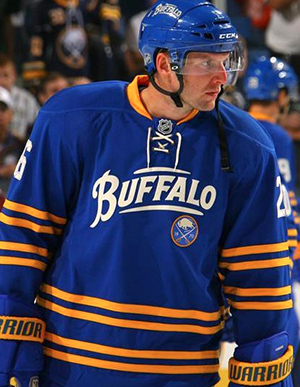
4. 2008–10 Third Jersey, 2010–present Home & Away Jerseys
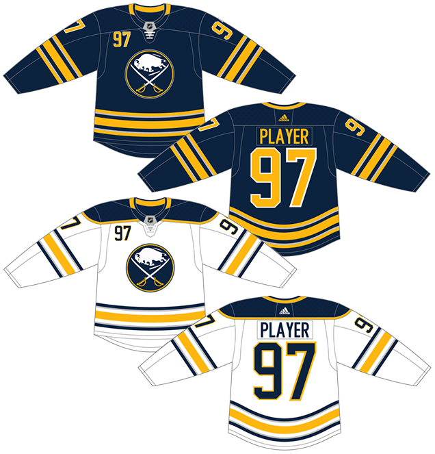
With everything that had gone wrong in the years preceding 2010 (the Buffaslug, the Mad-Cow, etc), the Sabres’ decision to finally listen to their fans and give them back what they never should have taken from them in the first place was welcomed by all. The Sabres returned to a close replica of their original jerseys and logo, with some modifications.
But before we get to those modifications, let’s look at the core of the jersey. Their classic logo may be oddly literal (a buffalo and sabres, not connected in any way, just hanging out in a circle), but it’s still become a classic that will probably remained unchanged for many seasons ahead (given their recent track record with new logos).
• More: BTLNHL #14: Buffalo Sabres
There’s also simple but consistent striping throughout the jersey, which balances the blue and the yellow perfectly. And it’s a smart move changing up the stripe colours from the dark blue jerseys to the white jerseys, going from all-yellow to a mix of blue and yellow. With two stripes (and the shoulder yoke) dedicated to blue, the yellow stays clearly visible, but blue remains the dominant colour. Well done!
But it’s all the alterations the team made to the classic jersey that keeps this one in second place. First of all, the grey. All the unnecessary grey. Splitting two of the three stripes on the shoulder and sleeves in half to add in some grey is awful. Instead of 3 stripes (good amount), you now have 5 (too much). And the two grey ones you can barely make out anyway.
The pit stains? Awful.
Until Adidas removed them in 2017, these jerseys also had the odd feature of curved grey stripes on the front of the jersey. Non-sensical.
And the numbers on the front? So Buffalo.
Jersey Recommendation: There’s a few options, but I’d go for a more obvious #9 Eichel. Current leader of the team who seems to bleed blue and gold, despite the team’s recent competitive issues. Get it in the whites.
3. 1970–96 Home & Away Jerseys,
2006–07 Third Jerseys, 2008 Winter Classic Jerseys
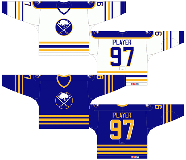
Exactly the same as above, but without the numbers on the front (aside from the 2006-07 edition), without the pit stains, all that damn grey removed, and a lighter shade of blue. All of which makes the jerseys so much nicer. The jerseys from 1970-80 has an slightly lighter shade of blue (the same as the 2010-12 third jerseys), so I’d favour those a bit more, but they’re not radically different enough to necessitate a whole new inclusion in the rankings.
Again, these are sweet, unique and classic jerseys. And originally, they were the best jerseys the Sabres have ever worn…but they’ve been surpassed by recent additions to the Sabres library.
Jersey Recommendation: There’s a lot of different players you could choose since these jerseys span so long a time (Andreychuk, LaFontaine, Barrasso, Turgeon, Housley, Mogilny), but for me, a #11 Perreault is the easy choice. The first draft pick, first leader and a dominant player in his time.
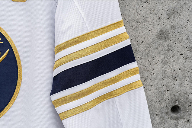
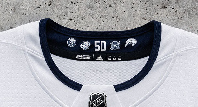
2. 2019–20 50th Anniversary Jersey
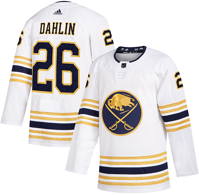
Well done, Sabres, well done. This design checks all the boxes for a unique, 50th year celebratory jersey. It embraces the history of the franchise, it utilizes gold embellishment in the best way possible and it just feels like a special jersey that’ll only be worn 13 times during this golden season.
• More: HbD Breakdown: Buffalo Sabres 50th Anniversary Jerseys
The first and most obvious design detail is the use of gold (because, 50th, of course) on the jersey in the form of the logo, striping and number outlines. Because a golden yellow is one of their primary colors, it doesn’t feel forced and easily translates into the actual golden color without significantly altering or diminishing the logo.
Undoubtedly the best design feature of the jersey is the embroidery and stitching work of the chest logo. Just look at those intricate details. Here’s a larger image of the buffalo that really shows the gorgeous detailing of it.
At first glance it may appear that they got a little heavy-handed when it came to the jersey striping. However, it’s a clever nod to the 50-year history of the Sabres with each of the five stripes representing the five decades of Buffalo hockey. Again, it’s a design element that works well for a special edition jersey as opposed to a permanent fixture on all jerseys moving forward.
The inside collar of the jersey features the “50” numbering from the anniversary patch design flanked by historical Sabres logos…yes, even the infamous “buffaslug” logo. It’s touches like these that really embrace the commemorative nature of the jersey design. It’s meant to be a keepsake and a celebration of 50 years, and it hits the mark.
• More: HbD Interviews: Kris Bazen (The “Buffaslug”)
This jersey does what a single year commemorative jersey should do, it fits within the overall brand while also being “special” enough to celebrate the milestone season. It’s really an instant classic, and so close to being the best jersey they’ve ever worn, but it’s hard to give that to a jersey being worn for only one year…
Jersey Recommendation: #26 Dahlin. Celebrate the past and the future of the franchise by putting who could become the best defenceman to ever wear a Sabres jersey on it.
1. 2018 Winter Classic Jersey
…so we’ll give it to a jersey that’s meant for just one game.
For the 2018 Winter Classic, the Sabres unveiled a new design that feels instantly historical and classic, in the best possible ways. The navy blue is gone in favour of the classic royal blue. Getting rid of all those unnecessary grey stripes doesn’t hurt at all either, making for a cleaner and iconic jersey.
• More: HbD Breakdown: 2018 Winter Classic Jerseys
The best feature, however, of these jerseys are the stripes. The classic Sabres jersey has always had the blue-yellow-blue striping pattern, but there’s always been white stripes in-between a single set of stripes. These jerseys those white stripes out and instead doubled-down on a second blue-yellow-blue pattern. What’s cool about this is that it creates something totally unique to Sabres jerseys, and yet feels so incredibly familiar. We’ve seen something similar in their 2010–12 third jersey.
All those stripes are balanced by leaving the rest of the jersey remarkably simple. There’s no stripes around the letters, there’s no stripes around the numbers, there’s no stripes along with shoulder yokes (which their original jerseys had). It’s simple, clean, and classic.
But the top half of the jersey isn’t totally devoid of anything of interest. The new alternate logo that they’ve introduced for this jersey is fantastic. It’s a great example of modern retro design in sports, reminding me of those old baseball logos – which were quirky af and had tons of character to them – but again, not going too crazy.
Overall: fantastic. It brings in some classic hockey jerseys aesthetics with a modern twist, which perfectly commemorates what the Winter Classic is all about. And it’s the best jersey that the Sabres have ever worn.
Jersey Recommendation: #23 Reinhart. Not only is he on pace for a career year for the Sabres this year, but he scored the first Sabres goal in the 2018 Winter Classic. Seems like a natural fit for this jersey.
Agree? Disagree? Let us know in the comments below or join the conversation on Twitter, Facebook, or Instagram!


/cdn.vox-cdn.com/uploads/chorus_image/image/58903461/usa_today_10650899.0.jpg)
Leave a Reply