Top 5: Best Designs of 2019

Christmas is almost here. 2020 is right around the corner, so it’s that time of the year where everyone and their top-5-favourite-dogs-of-the-year are counting down the best and worst lists for 2018. We’re not immune to such things. In fact, we do it on a semi-regular basis.
Last week, we tackled the Top 5 Worst Designs of 2019. So today, we’re doing the Top 5 Best Designs. Remember, these are the Top 5 Best Designs that were announced in 2019. Not all of them have necessarily been used in a game yet, or some were excluded from this list because they were announced in 2018.
• More: Top 5: Worst Designs of 2019
• More: Top 5: Best Designs of 2018
Let’s get started, shall we?
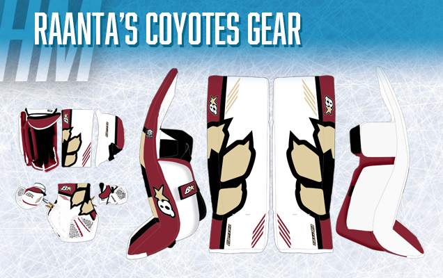
We’re giving an Honourable Mention here to our very own Kris Kern, who designed goalie gear you see above for Annti Raanta, and it was selected to be turned into professional gear. Look for him to wear it on the ice in a game soon!
We may have a touch of bias involved, but the mixture of simplicity with great detailing and an enlarged and strategically cropped element of the Coyotes’ alternate logo is right up our alley.
Well done Kris, and congrats!
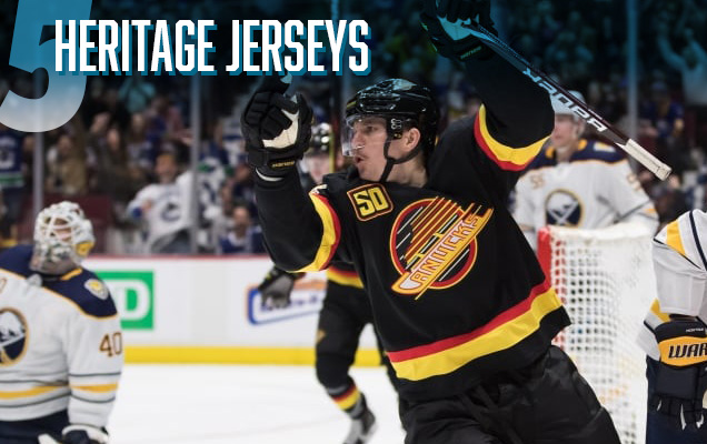
“Wait…wasn’t Heritage Jerseys on the Worst of 2019 list as well.”
Yes, yes it was. And we unequivocally stand by everything that we said there too. While I’m not crazy about the trend of rehashing old jerseys and calling it a day, I have to admit some of them look damn good and it’s fun seeing them out on the ice again.
• More: Top 5: Worst Designs of 2019
Whether it’s the Canucks, the Flames, the Jets, the Whalers/Hurricanes, etc, they’re almost all exquisite to look at and admire on the ice again. Except the Blues. Those things are just garbage.
But, let’s see some more jersey innovation in 2020, k?
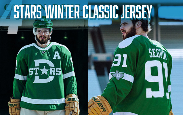
While the logo on the front of the sweater serves as an homage to one old Dallas Texans jersey, the shoulder yokes and arm patches pay tribute to another. This year’s Winter Classic is meant to highlight the history of hockey in the south.
Overall, these are really stellar. With questions around what era the team should draw their inspiration from, I’m really pleased with the direction Adidas and the Stars’ management ended up taking. Are there some flaws? Sure, but for the first time seeing a) southern and b) newer franchises in the Winter Classic, these are a great homage to hockey history in a southern state.
• More: HbD Breakdown: 2020 Winter Classic Jerseys

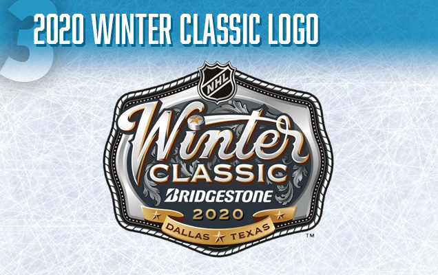
Speaking of the Winter Classic, we’ve got to give credit to the FanBrandz/NHL Creative Services design for the event’s logo.
The most striking thing about the logo is its uniqueness when compared to the rest of the Winter Classic logos over the years, but not looking out-of-place. The belt-buckle approach, creates a natural outline for a cohesive logo, and the detailing – from the layers of subtle gradients in the “Winter” text to the filigree elements in the background – is really well done.
The NHL obviously wants to celebrate the American south with this year’s classic, and this logo really sets the foundation for that.
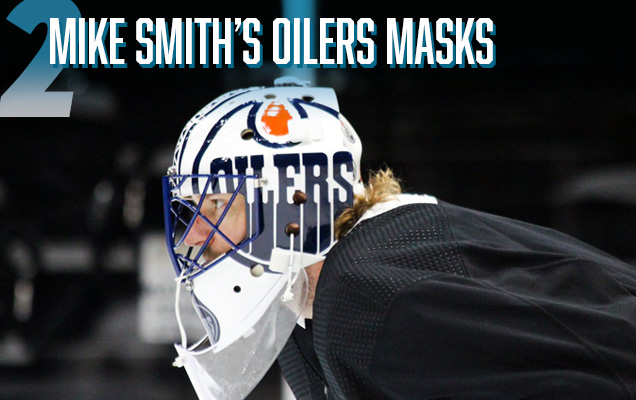
It’s not always easy to create a goalie mask that’s so striking, it grabs your attention while you’re watching a game. And this year’s series of Mike Smith masks, created by David Arrigo, does just that. The elegant simplicity of these are really amazing.
With an enlarged Oilers logo on either side of the mask, the middle features the pattern of an oil tower, and the chin a simple oil drop where another, more subtle, Oilers logo is placed (as well as throughout the background of the mask). It mixes the perfect balance of detail, simplicity, subtlety, and abrasiveness in one mask.
The best part? They come in a set of three, each one replicated to best suit each Oilers jersey: the orange-dominant homes, the white-dominant roads, and the navy/orange thirds.
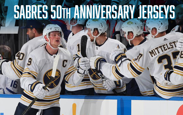
50th Anniversary jerseys haven’t always done so well, but the Sabres are the first team to really strike all the right chords with the commemorative jersey for a golden anniversary. It helps that their colour palette of navy and yellow allows for the easy integration of gold, but that doesn’t necessarily guarantee success.
• More: HbD Breakdown: Buffalo Sabres 50th Anniversary Jerseys
Here though, there’s again an elegant simplicity. The predominantly white jersey adds an aesthetic of regality, with the lack of shoulder yokes balanced by the multiple gold/blue striping pattern (5 stripes = 5 decades). Plus, the detailing in the buffalo on the logo is absolutely mindblowingly exquisite.
And a special shoutout goes to the excellent Carter Hutton mask (created by Jesse’s Custom Design), whose own elegant simplicity matches the jerseys perfectly.
Well done, Sabres, well done. This design checks all the boxes for a unique, 50th year celebratory jersey. It embraces the history of the franchise, it utilizes gold embellishment in the best way possible and it just feels like a special jersey that’ll only be worn 13 times during this golden season.
Agree? Disagree? Did we forgot your favourite pop culture reference? Let us know what you think in the comments or join the conversation on Twitter and Facebook! And don’t forget, we’re on Instagram too.


[…] top five hockey designs of 2019. Those Dallas Stars Winter Classic jerseys are pretty […]
[…] top five hockey designs of 2019. Those Dallas Stars Winter Classic jerseys are pretty […]
[…] top five hockey designs of 2019. Those Dallas Stars Winter Classic jerseys are pretty […]
[…] top five hockey designs of 2019. Those Dallas Stars Winter Classic jerseys are pretty […]
[…] top five hockey designs of 2019. Those Dallas Stars Winter Classic jerseys are pretty […]
[…] top five hockey designs of 2019. Those Dallas Stars Winter Classic jerseys are pretty […]
[…] top five hockey designs of 2019. Those Dallas Stars Winter Classic jerseys are pretty […]
[…] top five hockey designs of 2019. Those Dallas Stars Winter Classic jerseys are pretty […]
[…] top five hockey designs of 2019. Those Dallas Stars Winter Classic jerseys are pretty […]
[…] • More: Top 5: Worst Designs of 2019• More: Top 5: Best Designs of 2019 […]
Thank you for the helpful tips! I would never have gotten this on my own! Is it alright to reference part of this on my website basically include a backlink to this webpage? 토토
This is a perfect post. I like your writing style. I have been looking for this information for quite some times. Will look around your website. 파워볼게임
What a nice post! I’m so happy to read this. 토토사이트추천 What you wrote was very helpful to me. Thank you. Actually, I run a site similar to you. If you have time, could you visit my site? Please leave your comments after reading what I wrote. If you do so, I will actively reflect your opinion. I think it will be a great help to run my site. Have a good day.