HbD Breakdown: 2020 Stadium Series Jerseys

With the 2020 Stadium Series almost upon us, it’s time to take a closer look at the jerseys that’ll be sported by the Kings and Avs at the Air Force Academy’s Falcon Stadium in Colorado Springs, CO on February 15th.
Once again, the NHL and Adidas uses this event to showcase a very different take on jersey design, and you guessed right – it’s polarizing. This year, more than any year before, the envelope has really been pushed in terms of traditional thought around what a hockey jersey should look like. And we’ll break them down, after the jump.
Taking Flight First: A Tale of Two-Tone
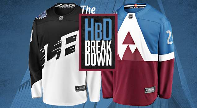
Well, it wouldn’t be a Stadium Series game without large, bold and high-contrast everything on the jerseys. Both teams feature a distinct two-tone jersey design where the top half is a solid color and the bottom half is a contrasting secondary color. For the Kings it’s a top-heavy black met with what appears to be white at first glance, but is actually a very light grey separated by a thin white line.
For the Avalanche it’s their standard blue and burgundy separated by the large white “A” graphic (…or is it a logo?…more on that later).
The result is a very segmented, extremely color-blocked overall look. The Kings will pair with black pants and white/black socks which furthers the zebra vibe.
Although the Avs haven’t officially unveiled their pants and socks pairing, unconfirmed leaks show a similar setup with blue pants and blue/white/burgundy socks.

Nods to the Air Force Academy
Both teams have included Air Force salutes with their respective jerseys. However, it’s the away team that has actually executed those particular design features better than the local Avs.
From the Adidas unveiling press release: “A new LA crest takes flight on diagonal bisected blocking, inspired by aircraft battle stripes.The architecture of the venue’s Air Force Academy, coupled with a pilot’s ambition to push to the edge, inspired the oblique angles used to shape the jersey’s typography and numbering.”
The Kings have taken it a step further with some very reflective and very shiny silver helmets featuring an Air Force roundel star that houses the player number. On that note – and recently on the football field – the always uni-adventurous Oregon Ducks donned chrome helmets in this year’s Rose Bowl and it resulted in some unique reflections of the deep purple setting sun during the game. It’ll be interesting to see if the Kings will unintentionally get some retro vibes going with some purple of their own under the night sky.
As for the Avalanche, their nod to the Air Force Academy is much more subtle and a bit of a stretch…even by design-speak rationale standards. Straight from the Adidas release: “Angular design elements were inspired by the Air Force Academy’s Cadet Chapel.”
Now that we’ve called attention to it, we can no longer ignore…

Big & Bigger: The Logos
Stating the obvious here, but the most prominent design feature (and it’s not even close) for either of the jerseys is the oversized “A” that emblazens the Avalanche jerseys. This is the most discussed and debated design feature for sure.
It definitely gets an A for effort in terms of boldness and uniqueness. Straight from Adidas again: “The reimagined logo is the largest crest ever to be implemented on an adidas Adizero Authentic Pro NHL jersey.” It’s a pretty safe assumption to take this sentiment a step further and say it’s the largest logo crest to ever don a jersey, regardless of manufacturer/template. The only thing that comes close is the Canucks “Flying V” of the late 70’s/early 80’s. These Avs jerseys have inverted and updated that look, and just like those Vancouver sweaters, let the debate rage.
The strangest part of the Avs’ logo crest though is the decision to have the “A” go all the way to the collar (and, theoretically, the point of the A is beyond it). There’s been a multitude of obvious comparisons to a bib, and it’s hard not to see.
You can’t help but think that making the crest just a little bit smaller so that it peaks below the collar (as someone on Twitter did). The results speak for themselves.
Some great concept work by Spencer Ford tweaking the Avs #StadiumSeries jersey. Still clunky and cluttered in areas, but man does adding negative space above the apex of the A make major differencehttps://t.co/FJdjqZZg0L pic.twitter.com/vXHzc9gwZM
— Hockey By Design (@HockeyByDesign) November 15, 2019
Another distraction regarding the Avs’ crest is the obvious line in the burgundy between the bottom of the “A” and the bottom half of the jerseys. We’re guessing it’s because of production constraints with all those angles in the crest, but it decreases the aesthetic of the jerseys considerably.

Shifting over to the Kings and by comparison they take a slightly more subdued approach. The new LA wordmark is large, spanning the entire width of the front of the jersey, but it doesn’t stretch up into the collar and extend around the entire jersey….so yeah, by comparison it’s not as over-the-top. It is, though, the best design element on either jersey.
The Kings have taken the text treatment of their current “LA” wordmark and updated with the aforementioned angled stylings as well as the streaking/motion lines of the Gretzky-era Kings logo. It’s a well executed blend of new and old, and it fits very well with the Air Force motif.
A Full Throttle Summary
These jerseys definitely won’t be everyone’s cup of tea, but you can’t innovate without a little experimentation. The NHL has made it clear that the Stadium Series is where they’ll continue to hit the throttle a little harder when it comes to redefining the look of hockey. For this iteration however, the line is tip-toed along the edge of MLB’s infamous “Turn Ahead the Clock” games from 1999.
There are some interesting design elements for both the Kings and Avs, that with a little scaling back, would most likely be a little less over-the-top. There have been some alternate mockups shared by designers across the interwebs that pepper in a little moderation and they work quite well. It also remains to be seen what the full picture will look like under the stadium lights. It’s a unique game environment and opinions will sway in a myriad of directions once they hit the ice.
After it’s all said and done, if the design directive was to do the unconventional, then mission accomplished…because they hit that target without a doubt.
Agree? Disagree? Let us know in the comments below or join the conversation on Twitter, Facebook, or Instagram!


[…] • More: HbD Breakdown: 2020 Stadium Series Jerseys […]
[…] More: HbD Breakdown: 2020 Stadium Series Jerseys• More: HbD InDepth: 2020 Stadium Series Branding (Part […]
[…] More: HbD Breakdown: 2020 Stadium Series Jerseys• More: The 2020 Stadium Series Jersey […]
[…] More: HbD Breakdown: 2020 Stadium Series Jerseys• More: The 2020 Stadium Series Jersey […]
[…] More: HbyD Breakdown: 2020 Stadium Series Jerseys• More: 2020 Stadium Series Jersey […]