Worst to First Jerseys: Colorado Avalanche
As we go through the 2019-20 season, we’ll be updating all of the Worst to First Jersey posts every Monday, as almost all the teams in the league have unveiled new jerseys since their original posts. We’ll start with the ones most needing updating and work our way through the league. Today, it’s time for the Colorado Avalanche to get updated.
Also, a huge thanks to SportsLogos.net and NHLUniforms.com for most of the jersey images and references.
The Avs, for only existing about 25 years in the NHL (not counting their life as the Nordiques of course) have had pretty good success: multiple division, conference and league championships with star players and goaltenders. But what about their jerseys? Do they stand up to the high bar their play has set for the franchise? We’ve already decided that the logo isn’t that great compared to the rest of the league, but maybe their jerseys will do the franchise justice?
• More: BTLNHL #29: Colorado Avalanche
Here’s how this works: I’ll count down, from worst to first, all the jerseys the Avs have ever worn. Homes and aways will be lumped into the same category (so, more of a jersey “era”) and I won’t worry about small changes (like slightly changed positions of piping for example). Third jerseys will stand on their own. And we’re focusing on the jerseys only, not the entire uniform. For the Avs, there’s seven different jerseys/eras. And we’ll start with the worst one.
7. 2001–07 Third Jersey
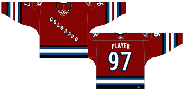
We start with the first third jerseys that Colorado ever wore, the worst the Avs have ever worn. I completely understand the appeal of having the sloped lettering going across the torso of the jersey. The Rangers have been pulling it off since their inception in the 1920s and have turned it into their iconic look, to the point where it looks strange if they wear anything other than that (like they did in the ’70s). And it also looks just as strange when other teams try to copy it.
Let’s call a spade a spade. The Avs copied the Rangers. You can call it “inspired by”, or “paying homage to”, or whatever you want, but at the end of the day, they copied the Rangers iconic look so they could have a historic-ish (since the Avs don’t really have a history to draw from) third jersey and make money selling it. It’s lacking in creativity. Pittsburgh (who have an incredibly sordid jersey history) tried it for 5 seasons in the ’90s, and then it ended. These jerseys also lasted only five seasons. That’s the general shelf life for bad jerseys.
But that’s not the only reason these jerseys drop to the bottom of the list. That striping pattern along the base of the jersey is pretty horrendous, as well as being totally inconsistent with the striping on the sleeves. The human eye is always naturally attracted to wherever is the most contrast, and having a very high contrast black/white combination, separated by thin strips of blue, automatically will divert the eyes down to the bottom of the jersey. That’s fine if you want to draw people’s attention to your sugar lumps, but on a hockey jersey, it just distracts from what should be the main focus: the crest on the chest. It leaves the eyes not knowing exactly where to look. Not to mention, that’s also a lot of stripes down there.
And then the sleeve striping decides to throw in a different striping pattern…and adds event more stripes. The middle burgundy stripe – and the fact that the cuffs are kept burgundy instead of black like the bottom striping – helps lower the contrast, but there’s 7 stripes on there! Black, blue, white, burgundy, white, blue, black. It’s way too complicated, unnecessary and distracting. I haven’t seen attire so distracting related to the number 7 since Star Trek: Voyager.
They put laces on there…so that’s good.
The use of a non-traditional jersey colour on a historical design (essentially trying to create something new within the framework of traditional hockey aesthetics) is definitely a noble effort, but it comes off looking uncreative and over-designed at the same time. It just becomes a strange combination, so it sits here at the bottom of the list.
Jersey Recommendation: #21 Forsberg. This is not a slight against Forsberg at all, giving him the worst jersey on the list. Rather, it’s impossible to make this list without recommending a Forsberg jersey, one of the greatest players to ever lace their skates during the ’90s and ’00s, and the Avs simply have too many great players with too few jerseys.
6. 2009–2015 Third Jersey
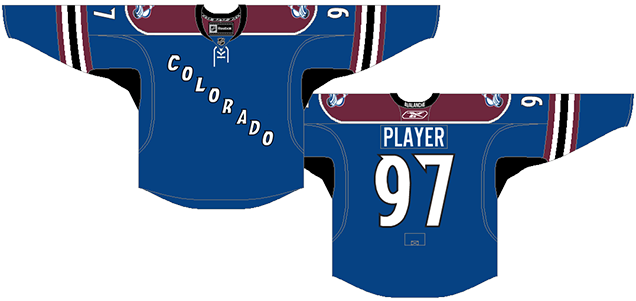
Given what I said about the previous third jerseys, it shouldn’t come as a huge surprise what’s ranked second worst on the list. But this one gets the nod above the last-placed jersey for a number of reasons.
First the heavy and obnoxious striping at the bottom of the jersey is removed completely, ensuring that the focus of the jersey is on the word “Colorado”. Removing those stripes also makes the jersey look more modern and differentiates it from its Rangers’ cousin in a more positive way. The striping on the sleeves is, while very similar to their burgundy third jerseys we just discussed, a little more consistent and, as such, less of an eyesore for having 5(!) distinct stripes in there.
But, seemingly to compensate for removing the bottom stripes, they added in shoulder yokes, slapped some logo patches on there and…added pit stains. Not cool. This is one Reebok Edge jersey fad that I’ve never been able to understand – adding in patches of darker colour right where the pits are. Colorado isn’t the only team to have done this. Buffalo does it. Calgary does it. But Colorado does it with a colour that’s nowhere else on the jersey except on a single sleeve strip and around the letters/numbers. It makes no sense and just look like a pit stain. Gross.
The shoulder yokes are not bad, because they clutter the top of the jersey a bit, but that’s minor complaint really.
The best thing about this jersey is the use of that steel blue as the main jersey colour, which is completely unique within the NHL. Sure, there’s tons of blue jerseys, but adding a new tone of blue to the conversation helps set the Avalanche apart from the other blue-jerseyed teams substantially. Honestly, it looks great on a jersey and on the ice. And again, the laces are a nice touch.
They’re also the first (and only) Avs jerseys to not have curved nameplates, which is a personal choice, but I like it better straight. All that gives these jerseys the nod above the previous third jerseys.
Jersey Recommendation: #90 O’Reilly. The Venn diagram for the lifespan of these jerseys and O’Reilly’s career with the Avs is just a single circle. And he was a substantial contributor to the Avs during his time there, despite it being pretty much the worst era the Avs have had in terms of on-ice performance.

5. 2007–2017 Home & Away Jerseys
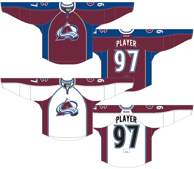
The Avs were one of the teams that went for a full jersey redesign once the Reebok Edge jerseys came into effect in 2007. It wasn’t a massive change from their previous jerseys – same colours, same typefaces, etc – but the striping changes to reflect the new hemlines in the Reebok jerseys. In a basketball-esque move, the sides of the jerseys were made a different colour from the rest of the jersey, instead of any striping along the bottom. The super-narrow black-and-white/blue-and-grey stripes that were used on their Avalanche’s original jerseys now outlined these sidebars of colour. The shoulder yokes remained the same, aside from taking out their zig-zaggetyness. That’s a word, right?
Like I’ve already said about the previous jerseys, the black and white stripes on the burgundy jersey makes too high of the contrast.
Following the hemlines from the collar to the bottom was something a few other teams did as well (like Edmonton, Atlanta and Florida, for example), with mixed results. These Avs jerseys actually turned out better than some of the other ones, but all of them cause a serious problem for other reasons. The major problem being the strange patches of colours alluded to earlier.
The Cs and As for the captains and alternates end up going right over the hemline. Is you’re using a typical strong typeface for the letters, it’s not so big of a problem. If you’re using a very stylized typeface like the Avs do – where the C looks more like a computer icon than a letter – it ends up looking awkward and incredibly busy when placed right over top of the striping.
Aside from that, the curved shoulder yokes are fine, but I’ve never personally been a fan of the full shoulder-to-cuff yoke, and even less so of the curved kinds, but the unique burgundy/steel-blue combination – and the lack of strong contrast between those two colours – helps alleviate that issue.
These are not bad jerseys at all, but the über-embracement of the new Reebok hemlines causes issues, and the hemlines lasted only a decade makes them look dated already, only 3 years removed.
Jersey Recommendation: #92 Landeskog. The latest captain and leader of the Avs, and unquestionably skilled. Aside from the third jerseys, he’s never worn anything in the NHL other than these. Get it in the whites…but pretend it’s from his rookie season and skip adding the ‘C’.
4. 2020 Stadium Series Jersey
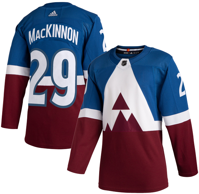
Yes, the “A” reaching all the way to the collar makes this jersey look like the player’s are wearing some sort of lobster bib, and the general design is…different. But that shouldn’t detract too much from what is otherwise a unique and interesting approach to jersey design.
It definitely gets an A for effort in terms of boldness and uniqueness. Straight from Adidas: “The reimagined logo is the largest crest ever to be implemented on an adidas Adizero Authentic Pro NHL jersey.” It’s a pretty safe assumption to take this sentiment a step further and say it’s the largest logo crest to ever don a jersey, regardless of manufacturer/template. The only thing that comes close is the Canucks “Flying V” of the late 70’s/early 80’s. These Avs jerseys have inverted and updated that look, and just like those Vancouver sweaters, let the debate rage.
Another distraction regarding the Avs’ crest is the obvious line in the burgundy between the bottom of the “A” and the bottom half of the jerseys. We’re guessing it’s because of production constraints with all those angles in the crest, but it decreases the aesthetic of the jerseys considerably.
Aside from the crest, there’s an impressive about of minimalism that allows the Avs’ great colour palette of burgundy-and-blue to get fully featured. Any other stripes or elements anywhere else on the jersey would’ve made them too complex within the context of that logo crest.
These jerseys definitely won’t be everyone’s cup of tea, but you can’t innovate without a little experimentation. The NHL has made it clear that the Stadium Series is where they’ll continue to hit the throttle a little harder when it comes to redefining the look of hockey. And as Stadium Series jerseys go, these weren’t too bad. And they admittedly looked pretty great on the ice.
• More: HbD Breakdown: 2020 Stadium Series Jerseys
• More: The 2020 Stadium Series Jersey Countdown
Jersey Recommendation: #49 Girard. He scored the only goal for the Avalanche during the Stadium Series game, and was named the third star.

3. 2015–17, 2018–present Third Jersey
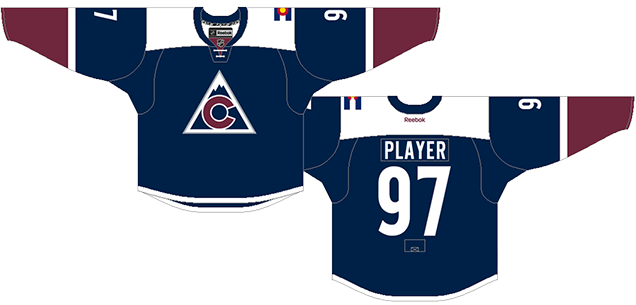
The most obvious change for these Avs jerseys is the introduction of a new alternate logo that looks a lot like an old logo. While the execution is somewhere different from the old Rockies logo, the concept is identical: a simple mountain icon with the Colorado flag’s ‘C’ with a circle in the middle.
Related Reading: BTLNHL Vintage: Colorado Rockies
The new version simplifies the concept by removing the stripe behind the ‘C’ (which was, again, from the Colorado state flag) and making a outline of the mountain a solid triangle, removing the jagged lines the mountain’s peak. The end result? Something striking, simple, modern, relevant to the location, and with roots in history. Generally, that’s the makings of an absolute classic logo, and this one almost gets there.
The issue I have with the logo is the colours. If you’re mimicking the state flag, the circle in the middle of the ‘C’ is yellow and pretty obviously represent the sun. I haven’t seen a black hole sun since the early ’90s, and this navy blue one comes close to that – which doesn’t make a lot of logical sense.
Okay, but what about the jersey itself? The design is super-simple and minimalist…and consistent. And single white stripes is used both on the sleeves and on the bottom of the jersey. Then, it’s mimicked again on the shoulder yokes. I’m generally not a huge fan of the white shoulder yokes (and I feel the same way about the Islanders using it) as it draws a lot of attention to it.
• More: HbD Breakdown: Avalanche and Ducks Third Jerseys
In the Avs’ case, because there’s a lot of solid white both in the logo and in the stripes, it’s better than most. And, you could use the symbolism of snow-capped mountains to explain it. But, it just still dominates a little bit too much, as they’re designed quite large…too large. They’d be better scaled back a little bit.
But mostly, the rest of it is pretty great. The burgundy cuffs separated the the white stripes works exceptionally well, especially since it’s carried onto the uniforms’ socks.
I’m not crazy about the navy blue base of the uniform. I would’ve loved to have seen them use their regular Avalanche branded blue (from their previous third jerseys) – lighter and more snow- and ice-esque. I know, again, they’re drawing from the state flag design, but when you have a unique blue that you use on your uniforms, why not just keep rocking that? It looks way better anyway.
Minor issues aside, the design is a great mix of modern and vintage: it’s drawing from the teams’ history, the specific location of the team, and brings in some modern (and minimalist) touches that creates something unique. I’m a fan. Not a massive fan, as there’s still some issues, but a fan nontheless.
• Jersey Recommendation: #96 Rantanen. Another Venn diagram that perfectly matches a players career and the lifespan of a jersey, both Rantanen and these jerseys entered the league in 2015, and both have made the Avalanche great ever since.
2. 2016 Stadium Series Jersey
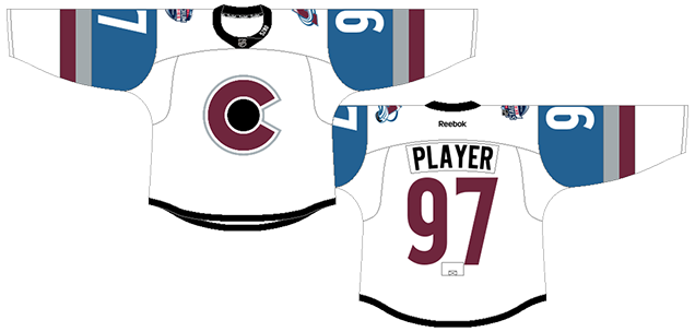
The first Colorado Avalanche outdoor jersey definitely hits some good marks. Overall, these are some pretty nice looking jerseys and it’s nice to see the home team wearing white (as it should be). Its clean simplicity will work well in the context of the venue, and it’s one of the better Stadium Series jerseys we’ve seen yet. But there’s minor details take it slightly down a notch, like the black-hole sun, the black collar, needing a stripe along the bottom. Minor details maybe, but it keeps it a little bit down on this list.
The first Colorado Avalanche outdoor jersey come close on the heels of the alternate jerseys that were just discussed above, so not surprisingly, there’s lots of similarities between the two, including the prominent use of an alternate logo mimicking the Colorado state flag‘s C with a circle in the middle, except here, there’s no mountain.
So, there’s a lot of jersey incestuousness happening. Not that that’s a bad thing. Consistent and relevant branding is a good thing. Plus, I’m sure George Michael and Maeby would approve.
Like all Stadium Series jerseys, this jersey embraces extreme minimalism, and here, it works really well. This first look at this year’s Stadium Series jerseys have eliminated some of the unnecessary elements from the previous year’s event, like the horizontal stripe through the middle of the jersey, for example. And the thick simple stripes on the sleeves are a really nice look and let the Avs flaunt their branded colours on an otherwise all-white jersey.
• More: HbD Breakdown: Avalanche Stadium Series Jerseys
• More: The 2020 Stadium Series Jersey Countdown
What hurts the jersey is the elimination of all striping except on the sleeve, edging it ever-so-slightly towards a practice jersey look. My suggestion? Remove the grey stripe on the sleeve and place a single stripe that’s the exact same thickness near the bottom of the jersey, but in the Avalanche blue. Here’s a mock-up of that.
Then there’s the “5280” on the collar, which happens to be the amount of feet in a mile. Being Canadian, where the much more intuitive metric system is used to calculate these sorts of things, it didn’t make sense to me initially. But I wonder, American readers, is this general knowledge for you? Either way, when I did figure it out, I didn’t feel enlightened or amused by their clever whimsy. I rolled my eyes. “Mile High City”, got it. A bit cheesy and unnecessary. Does Denver really pride itself that much on its elevation?
Minor details aside, these are some pretty nice looking jerseys. And the home team wearing white always makes me happy. Its clean simplicity will work well in the context of the venue, and some of the best Stadium Series jerseys we’ve seen yet.
• Jersey Recommendation: #29 MacKinnon. Another outdoor game that the Avs lost, but Nathan MacKinnon got a goal, an assist, and a third star. And as one of the best players to ever put on an Avs jersey (which is pretty elite company), he deserves to join your jersey collection.
1. 1995–2007, 2017–present Home & Aways
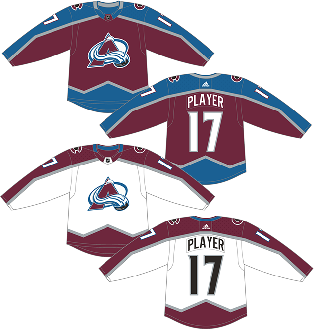
One of the biggest winners of the switch from Reebok to Adidas in 2017 was the Colorado Avalanche, which ditched the Reebok-hemline-inspired weirdness and returned to their inaugural jersey set. And while these Adizero version are nearly identical (which is why they’re lumped together here in this ranking), there’s a few small changes that made these even better, and even easier to place in first.
As you can see in this image, the mountain-esque zig-zig stripes are much less accentuated along the shoulder stripes on the Adizero version, as well as switching out the black-white stripes for a single grey stripe, and it all works better this way.
But regardless, championships will make almost anything bad look better. Or anything merely good look fantastic. There’s a reason why the Original Six logos and jerseys are never changed – their iconic and have won more Cups than anyone else. And Colorado, which has barely existed for 25 years, has more championships than teams that have been around for more than double that amount of time, wearing these jerseys.
• More: HbD Interviews: Daniel Price (Colorado Avalanche logo designer)
Even with the old jerseys being too typical ’90s design with the hyper-zig-zag stripes, and those high-contrast black and white stripes, we see with the Adizero jersey that the core of a great jersey was still there. And at least the shape of the stripes makes sense because of the mountain that’s on their jersey. It also adds movement and strength to a jersey that’s left pretty simple otherwise.
Plus, these jerseys have done this (twice), which no other jerseys on this list have.
Jersey Recommendation: #19 Sakic. One of the greatest players to wear an Avs jersey, Sakic is a natural choice. Plus, as the Avs current GM, it would be perfect acceptable to get it in the newer and better Adizero version. Get it in the burgundy.
Agree? Disagree? Let us know in the comments below or join the conversation on Twitter, Facebook, or Instagram!


Avs fan here – I’d say you got the ordering of the list generally correct. I would personally put the current third over the white Stadium Series jersey. I also think there are enough differences in the current set versus the original set to make them different entries – in which case I would put the original set at #1.
Adidas can’t seem to get the collars right and ends up with a weird 3-color cluster that is inferior to the V-shaped necklines with contrasting piping on the originals. The shoulder patch has never been very strong – the yeti foot was never good, but the C with black sun (puck?) looks too much like the Chicago Cubs. They need to give it some motion or at least some frosty edges to make it fit the Avalanche theme.
Lastly, I think the Avs logo is very ’90s, but not in a bad way. In my mind it works and doesn’t need changing. The A for avalanche in bold burgundy invokes the red C on the state flag, but with a modern edge. The A doubles as a snow-capped mountain, which Colorado is well known for. The puck sliding down the mountain creates action and intensity while tying in with the sport. It’s a lot of elements in a concise package. The background oval is the only element that screams ’90s, but it’s necessary to balance the bottom-heavy logo. It thinks it’s much more original than a roundel, and sorta resembles a rink, tying in more with the sport. Again, it’s a minor element, but the logo is better with it than without it. When the yeti foot patch was on the shoulders, the oval was present there as well, giving it further purpose within the theme. Now that the C’s are on the shoulders, the curves are mismatched which creates a subtle, yet noticeable dissonance.
At the end of the day, you can’t beat that mountain hem. It’s a truly unique look in this league full of amazing identities. It’s a shame that Reebok ever thought it would be a good idea to replace it with those hideous apron strings.
The red is better in the older, original jerseys. At some point they went to a darker red, which makes the jerseys look dull and tired. Probably in my bottom 5 least favorite team uniforms
Great team, especially with Ray Bourque on defense, and I appreciate opportunity to comment on jerseys. My first point is that pro sports teams are supported by large communities and in my opinion a Jersey design should be a tribute to that community more than a tribute to the particular franchise. To borrow a concept from Herb Brooks, the name of the team is a helluva lot LESS important than the name of the community it represents. So I think at least one home or away jersey(for all teams other than perhaps the original 6)should feature that name. Logos can go on shoulders or under the name or on crest of matinee/stadium jerseys. I’m sorry but when the sharks or the coyotes are on the ice in New York no one knows who the hell they are without a jersey translation device. That’s a huge missed opportunity. You want to make people feel good? Let them see a guy with SAN JOSE across his chest raising his arms up in triumph after blasting a scorching slap shot past a Rangers goalie.
A simple SAN JOSE just says so much more than a shark biting a stick in half. Jerseys still offer lots of opportunity for cool artwork. But making it clear where the teams come from more often would be a huge step forward. Okay so that said, on to colors. Bright colors are okay but garish designs and jarring color mixes seem geared more toward branding than paying tribute to, or representing, a community. I don’t see why branding is that necessary. Being able to represent a community as a pro team that fills arenas is the best brand you can have. It’s a good deal for the team. Please chill out on branding.
So in my opinion on Colorado, the burgundy is a great color and the steel blue is interesting but they don’t go together that well and the Avalanche jersey designs tend to accentuate the mismatch. It would have been better to find the best Colorado image for a logo repping that region. Perhaps that’s a triangular shape with a snowy peak or crossed skis. Whatever. Okay take your marquee image, or even two of them, and employ as your logos. Don’t choose cartoons for logo images(thinking of perhaps the stupidest mascot in NHL, a penguin. Other than it’s an animal that starts with a P what is its connection to a great city?)
Don’t miss the chance for insignia based on letters like the NY in the Yankees symbol. It doesn’t have to be the prime logo, but it communicates a lot. Do small ones on helmets/pants when appropriate.
Remember that hockey is enormously distinctive on its own, the sport shouldn’t need to try so hard to be different from other sports.
If a logo doesn’t convey a cool team name, use an ancient communication technique — lettering — to get job done on helmets, sleeves, pants, gloves. But place logo(s) in best real estate after the crest. Some teams” names will go better with that signature logo image than others.
Don’t mix two distinctive shades for a team’s color. For Colorado, I’d go with burgundy, gray and white.
Once you’ve got the lettering and logos more in control, you can get a little more creative with the actual jersey designs.
Some of the Olympic designs over the years have been pretty cool.
But, honestly, those original 6 designs are pretty stellar. I also like St Louis Blues and Edmonton Oiilers away designs. Employ that classic style with San Jose and ithe teal doesn’t look so darn fufu.
Anyhow, that’s my take. Community. Community. Community.
[…] • More: BTLNHL #29: Colorado Avalanche• More: Worst to First Jerseys: Colorado Avalanche […]
[…] • More: BTLNHL #29: Colorado Avalanche• More: Worst to First Jerseys: Colorado Avalanche […]