
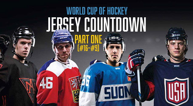
The World Cup of Hockey Jersey Countdown (Part 1)
 Now that we’ve had a chance to see all the teams play in both their home and away uniforms, we thought this might be a great time to rank of all the jersey from the World Cup of Hockey. We went into them in greater detail back when they were first revealed (see the links below), so make sure to check that out for a fuller analysis of the jerseys.
• More: HbD Breakdown: WCoH Jerseys – North America
• More: HbD Breakdown: WCoH Jerseys – Scandinavia
• More: HbD Breakdown: WCoH Jerseys – Europe
Some of the jerseys looked good in concept but failed to impress on the ice…and vice versa. And since there’s a decent amount of jerseys (16 in total), we’ll split it up into two posts.
• More: World Cup of Hockey Jersey Countdown (Part Two)
This one will rank the bottom half of the bunch, from #16–#9. And in HbD fashion, we’ll start with the worst one…
 There’s a few things that make this jersey truly awful. It looks like white pyjamas. The striped/smokey texture of the light grey stripes look like duct tape. The striping is more contemporary and bolder, but falls completely flat in the design and is totally inconsistent across the jersey, thicker in some parts, thinner in others. And to quote ourselves from our original assessment: “this might be the worst ‘Adidas striping vs. design’ conflict that I’ve seen from any of the HWC jerseys.”
Also, why did they decide to not have the bright orange anywhere else on the jersey at all, other than the logo? That alone is a bizarre decision. And the numbers with the random lines going through them? Unnecessarily distracting.
Easily the funnest team in the tournament wore easily the worst jersey. Just flaming garbage.
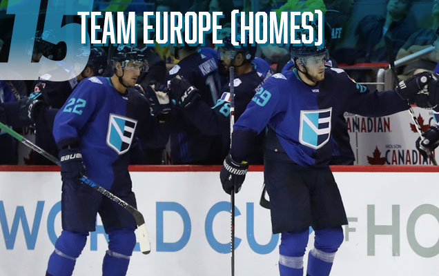 The two-toned Jekyll-and-Hyde jersey was an interesting idea, but it just can’t be taken that seriously. Mirroring the Team Europe logo way too literally, the design splits the entire jersey in two blues. And while, the blues are close enough in colour that they’re not going to mistake their teammates for being on another team, the complete lack of any other design element makes it feel lifeless and, again, like odd pyjamas.
Then, adding in the teal blue from the logo, numbers and half the collar, you get three different tones of blue on the same jersey. It’s a bit much, and it becomes asymmetric because of the collar, and that only one cuff is coloured differently from the sleeve.
Too much blues, too little of everything else, on a concept that’s poorly executed and doesn’t really work. To quote ourselves: “It’s an unfortunate missed opportunity, as there were unlimited possibilities for creating a graphic, contemporary jersey with no historic strings attached, but this one was a big flop.”

 More North America, but this time with their slightly better home blacks. They’ve still got the grey duct tape all over their jersey. They’ve still got the overly distracting numbers. They’ve still got striping that’s consistent (both within the jersey itself, and with it’s white road jerseys), but the sleeve stripes here are much better than on the road whites.
And, they actually brought in more of the orange elsewhere on the jersey to compliment the logo a bit more. This jersey feels much more like a cohesive whole than their white ones, but it’s still duct tape on black pyjamas with super-bright orange Adidas branding on the sides.
I know some of you love them, but just separate the team itself from the jersey. The team was awesome and so much fun to watch and cheer for, which led people to like the jerseys. But the jerseys were hot garbage.
 That previous group of 3 represents the worst the WCH had to offer in jersey design. The next batch represents a clear division from that to good jerseys that just weren’t as good as the best ones. Because of that, they’re incredibly hard to rank, and I’d accept arguments for any of the ones ranked from #13 to #9 (or higher) to move up and down the list in that range.
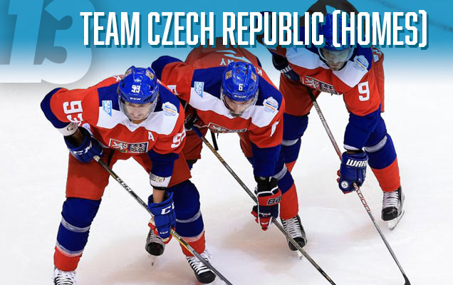
But, we’ve got to rank these somehow, so the Czechs enter the discussion with their home red jerseys. They’re not horrible, but I just can’t get over that odd blue/white shoulder yoke. The Czech Republic has had a history of dividing their jerseys into odd blue, red and white chunks, but these jerseys – because of the angle of the cut between the blue and white – end up looking like odd capes when worn. Not to mention, it’s a little too reminiscent of those two-sided Buffalo jerseys.
The same things happens with the bottom striping – blue on the back, white on the front. It might have be better to alternate those, so that both the front and back of the jerseys always have red, white and blue visible.
Again, these aren’t horrible jerseys, but the details knock it down the list. Oh, and the Adidas side tri-stripe doesn’t jive with the thick chunky stripes elsewhere on the jersey very well.
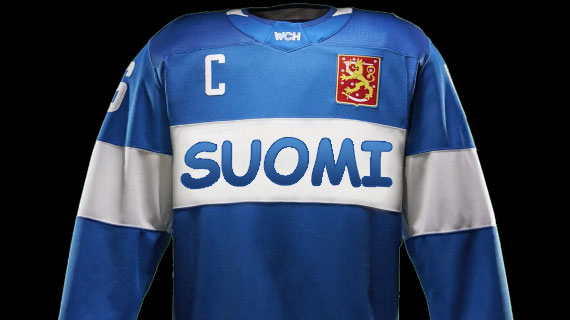
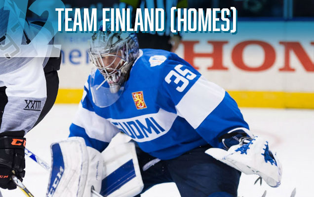 The Finns home jersey is an interesting exercise in minimalism, with a solid white line crossing the chest and sleeves. But, it achieves that fine balance between being simple, but not boring. As we mentioned before:
Clean, minimalist, daring, and continuing to establish Finland as owners of the blue/white stripe across the chest, it’s a great modern approach to a jersey that manages to avoid being too minimalist or too boring. The only major complaint is the choice of typography. Something with a little more character might have knocked this one out of the park.
And we still stand by this. The typography is so bland on this one, with little or no character to it, that it’s a real missed opportunity to make a cool, iconic jersey. We’re not saying it had to be a script font or, heaven forbid, Comic Sans or Papyrus or anything. But, just something with a little more energy would be great.
In this case, too, the placement of the Finnish “logo” – their coat-of-arms – is perfect. Reminiscent of soccer kits, but also places that national symbol over their hearts, it works well.
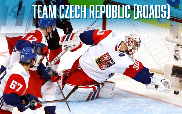 The Czech Republic makes another appearance with their white road jerseys.
It works better than their road reds in many ways (including better integration with the Adidas tri-stripe). The blue/white/red chunks of colour are kept to more of a minimum, with large chunks of red and blue on the sleeves – a more contemporary approach to sleeve design on hockey jerseys – and the three stripes on the collar. It’s a simpler approach that works better, and it would be great to see that element continue on future Czech jerseys.
It would have been great if the Adidas tri-stirpes would have been alternating colours, like they are on Neuwirth’s pads and blocks (pictured above).

 The Americans make their first appearance on the list, with their navy blue homes jerseys. They’re great jerseys, but the biggest complaint against them is that they’ve taken simplicity too far. And this is one of the cases where they looked better on paper than they did in practice.
Part of that has nothing to do with the jerseys themselves. The predominantly navy blue jerseys were worn with navy blue pants and navy blue socks, stressing even more the jersey’s simplicity…to its detriment. They border on practice jersey aesthetics when combined with the full uniform. Red pants might’ve worked better.
But there’s still a lot of like about these jerseys – the simple red stripe works with the white tri-stripe on the sides. And the small touch of the red and white stripes on the collar is a nice touch. Questions of consistency start arising with the different combination of stripes, but they’re minimal enough that it’s not overly distracting.
 The Russian reds don’t differ that much from their 2014 Sochi jerseys, with the same blue shoulder yokes and blue/white stripes on the sleeves. And hey, if it works, why break it?
I guess that’s the only main complaint about the jerseys – they’re not super adventurous or unique. They’re still great jerseys though, there’s no question, with a design that’s slowly becoming iconically Russian.
The only other complaint we might have is the typography on these jerseys, which are old-school Soviet in aesthetics: solid blocks with no character other than their extreme functionality and lack of detailing. It’d be nice to see something a little less conventional and stereotypical.
Looking for #8–#1? Check out Part 2 here!
Agree? Disagree? Let us know in the comments or join the conversation on Twitter and Facebook! And don’t forget, we’re now on Instagram too.


[…] • More: World Cup of Hockey Jersey Countdown (Part 1) […]
Couple of comments: the typography of SUOMI was used already a long time ago in sweatshirts for the Finnish Olympic team, and these jerseys are mimicking those shirts, so hence the font. Also, the stripe pattern on Neuvirth’s pads and blocker is exactly the flag of Thailand, so maybe that’s why they’re not used in the jerseys.
I’ve never seen a Finnish jersey with that font on it…do you have an image? I’d be interested in seeing it. And the Thai flag is very close, but the blue stripe is much thicker than the red ones, so within the context of the jerseys, I wouldn’t have a problem with it.