
HbD Breakdown: WCoH Jerseys – North America
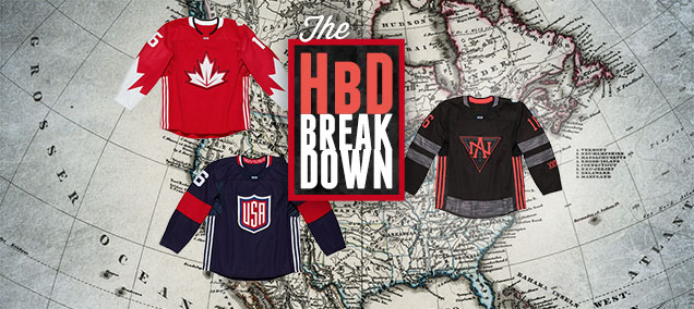 With the release of all eight jerseys for the World Cup of Hockey at once, we’re breaking them all down in geographic clusters: North America, Scandinavia and Europe. Today: North America. After: the jump.
More: HbD Breakdown: WCoH Jerseys – Scandinavia
More: HbD Breakdown: WCoH Jerseys – Europe
Adidas
First, some general comments about the WCoH jerseys as a whole, these first hockey jerseys designed by Adidas: they’re pretty damn solid. Sure, some are better than others and none of them are perfect, but Adidas certainly did a decent job here.
World Cup of Stadiums
A major aspect to these new jerseys that Adidas has created is their complete embracement of modern minimalist design. All of them have extremely simple elements to them: a logo, some very simple and thick striping, and a minimal colour palette. Basically, give them all bigger sleeve numbers, and they could pass as Stadium Series jerseys.
And while that’s not necessarily a bad thing, there’s nothing very innovative or incredibly interesting happening. That’s not because we’ve all seen jerseys like this before in the Stadium Series games, but because that seems to be the now visible trend happening in hockey jersey design over the last few years.
It’s great that we’ve moved away from the outrageousness of ’90s jersey design, but it feels like the pendulum has swung a little too far the other way now. At the same time, they’re very modern, iconic and well-designed. But, they just feel very slightly underwhelming because of how the trend is going that Adidas has firmly become entrenched with.
But again, as a whole, Adidas did a pretty solid job. Onwards to North America! (Canada by John van der Woude, USA by Ally Koss, Team North America by Chad Pinckney)
Canada
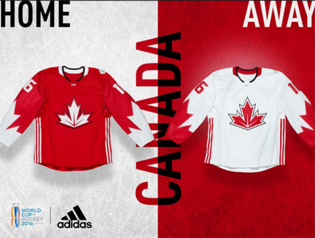 Sleeve it to Beaver
Hands down, the absolute best thing about this jersey is easily the sleeves. It’s an obvious allusion to Canada’s iconic 1972 Summit Series jerseys that featured the maple leaf in a very similar fashion, half cut-off and bleeding off the edge.
Here they are. Team Canada will rock these sweaters at the World Cup of Hockey. #WCH2016 https://t.co/t9ifQVeUEfhttps://t.co/gyuiiFW2C9
— Sportsnet (@Sportsnet) March 2, 2016
It’s still arguably the best jersey that Canada has ever worn in a hockey game. And this new jersey’s reference to it is absolutely awesome. But unfortunately, that’s almost where the awesomeness ends.
Maple Leaves?
This is the only Canadian hockey jersey that I can recall that has two distinctly different maple leaf designs on them. That is, the maple leaf on the sleeves (looking like the Canadian flag-styled maple leaf) does not look like the maple leaf on the crest (more angular and stylized). It’s jarring and from a conceptual standpoint, doesn’t make much sense.
![]() The obvious outlier, then, becomes the new logo designed for the jerseys. It’s a different approach to a maple leaf, with more movement and dynamism to it, but there’s no getting around that it looks cut-off. Unless you’re Tobias Fünke, that’s not a good thing.
The obvious outlier, then, becomes the new logo designed for the jerseys. It’s a different approach to a maple leaf, with more movement and dynamism to it, but there’s no getting around that it looks cut-off. Unless you’re Tobias Fünke, that’s not a good thing.
“The three veins,” says Adidas, “…represent Canada’s three coasts”, and I’m cool with that. But turning the maple leaf into the logo equivalent of a stubby bottle? Not so cool.
Red And White…and Black
The only other thing this jersey has going for it is the extremely simple red and white design. The maple leaves on the sleeves are impactful enough that you don’t need much more in terms of striping, or any other design element other than the crest. The Adidas stripes were unavoidable obviously, but it’s not detrimental to the jersey at all.
However, the addition of just a couple black elements don’t make a lot of conceptual sense. The black outline around the logo is unnecessary and jarring against the minimal maple leaves on the sleeves. Then the black is placed around the collar as well, and it looks awkward there too.
Final Verdict
The sleeves and minimalist red-and-white design? Awesome, absolutely awesome. It’s almost enough to overcome the truncated maple leaf logo and the off-putting and illogical throw-in of the black lines. Almost, but not completely. It’s still a great jersey though, and definitely better than the Sochi mess of 2014.
USA
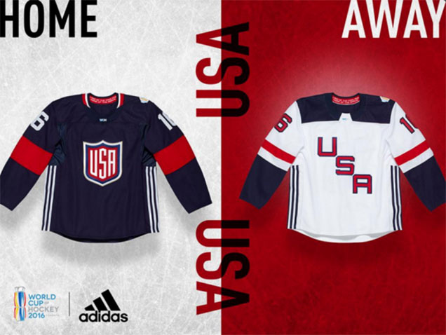 No Stars, More Stripes
The US of A actually went two pretty different routes for their home and away jerseys, so we have two different designs to discuss. The wonderful thing that they have in common though is that this year there are no rubber stars (or Phil Kessel for that matter) anywhere in sight!! The unfortunate brainchild of Nike made American hockey fans cringe during the last Olympics, and now that Adidas is in charge, we’re free of plastic ornamentation forever.
Here’s the sweater Team USA will wear at the World Cup of Hockey. #WCH2016 https://t.co/t9ifQVeUEfhttps://t.co/ifIoWVqRws — Sportsnet (@Sportsnet) March 2, 2016
Everything comes with a catch though, and what we lost in sticky stars we gained in triple Adidas striping, possibly the jerseys where the side stripes are most visible of any in the tournament. A solid stripe down the side would look much cleaner, as these kind of give me traumatic flashbacks to the track pant trend of the 90’s, but it could still be worse.
The Bad News First
The navy and white jerseys are pretty drastically different, so let’s get the lesser of the two out of the way first. The diagonal lettering on the white jersey is a nice historic touch, throwing back to the 1980 Olympics, but the rest of the jersey is full of bizarro design elements that are throwing me for a loop. First off, the shoulder yokes and collar; the navy gets broken up by an odd white notch popping up in the center of the neck, which doesn’t seem to have a purpose and looks out of place. The stripes on the sleeves also seem a bit haphazard with full navy from the elbow down and a thin red band on the upper arm. A navy stripe around the elbow would’ve been, in my opinion, a better choice here.
Save the Best for Last
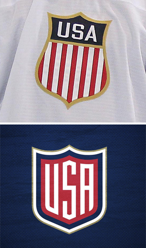 While the away jersey missed the mark on modernizing a classic design, the navy home sweater is a really nice blend of old and new. The K-Swiss logo is no more (hooray!) and has been replaced by a sleek new shield with contoured lettering in simple red, white, blue and gold. The shoulder yokes are gone, swapped out for a simple striped collar with all of the focus on the center logo. The sleeve stripes on the home jersey look more natural too, opting for a medium-width red band around the elbow instead of the two-toned look of its counterpart.
The typography on the back keeps things simple too with classic, athletic-style lettering in plain white. No muss, no fuss.
Final Verdict
Looking at this set together, the US still have one of the best jerseys of the tournament. Adidas did a good job of using historic elements and modernizing them while still keeping a clean, classic look.
Team North America
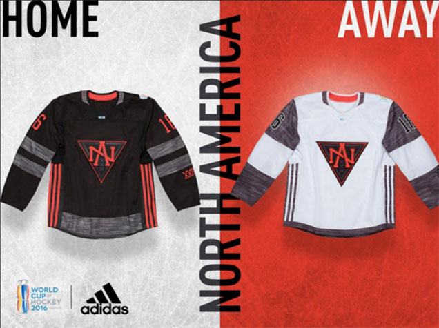 Black is the New Black
This North American unit, comprised of rising young American and Canadian stars (age 23 and under) had a big design problem to solve: coming up with a jersey that would incite pride and unity while not actually being a Nation with any sort of history to draw from.
Here’s the sweater Team North America will wear at the World Cup of Hockey. #WCH2016 https://t.co/t9ifQVeUEfhttps://t.co/PYsPrvpN3L
— Sportsnet (@Sportsnet) March 2, 2016
So what do you do? Well, if you’re the new kids team on the block with something to prove, going with a menacing black jersey design isn’t a bad idea! Yes, I know the black jersey trend in the NHL lately has been played out, but for a tournament full of teams sporting mostly primary colors, this is a good way to stand out from the crowd.
N/A
 Maybe it’s the upside-down triangle, roman numerals, or Halloween colors, but there’s definitely something cryptic about this logo. Our own HbD Editor John van der Woude declared it a blatant death metal band logo on Twitter when it was revealed on Tuesday. But our readers already know that I like that.
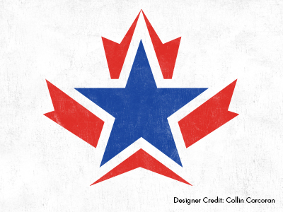
My only real concern with this logo is how ambiguous and non-representational it is. The abbreviation “N/A” has never been more true than in this instance. I would have liked to see an icon that infuses a shared culture, and could visually communicate the idea of “North America” in a more obvious way. You know, like this maybe.
Up in Smoke
I don’t totally hate it, but the smokey texture that makes up the grey trim on this jersey is somewhat distracting upon first viewing. I noticed it before I even had a good look at the logo on the chest. It’s definitely unique, I haven’t seen any other HWC team using a texture like this.
Other issues: the horizontal grey trim at the bottom of the jersey clashes with the vertical Adidas stripes running along the sides, this might be the worst “Adidas striping vs. design” conflict that I’ve seen from any of the HWC jerseys. It will be interesting to see what this looks like on the ice.
On the white jerseys, the grey trim looks worse, like fleece pyjama material, or something. And the altered striping and removal of the red from anywhere but the logo doesn’t help either.
Final Verdict
There are major issues with this jersey (and overall branding) of the newly minted ‘Team North America’ but there’s also a certain badass-ery to it that cannot be denied.
Agree? Disagree? Let us know in the comments or join the conversation on Twitter and Facebook!
And don’t forget…we’re breaking down the jerseys from Scandinavia and Europe as well!


[…] HbD Breakdown: WCoH Jerseys – North America More: HbD Breakdown: WCoH Jerseys – Europe (Coming […]
[…] HbD Breakdown: WCoH Jerseys – North America More: HbD Breakdown: WCoH Jerseys – […]
Check out ezxporn for the newest amateur adult videos on the planet
[…] More: HbD Breakdown: WCoH Jerseys – North America • More: HbD Breakdown: WCoH Jerseys – Scandinavia • More: HbD Breakdown: WCoH Jerseys – […]