NHL Playoffs 2021: Cup Finals Countdown and Predictions
Round 3 was kind to aesthetics, with both our brand-based picks advancing to the Cup Finals. Congrats to Montreal and Tampa Bay! That brings us to 7-for-14, back at .500, which is probably as good as most of your own brackets, or at least better than your North Division brackets.
Now that it’s the Cup Finals, let’s rank all 15 of the match-ups from the entire playoffs! Why not? There’s so much time in-between games now, you’ve got lots of time to through long ranking lists like this. And aside from a few duds, there were a huge amount of really nice jersey match-ups.
Plus, it will give a few “oh yeah, that series happened” moments.
• More: NHL Playoffs 2021: Round 1 Countdown and Predictions
• More: NHL Playoffs 2021: Round 2 Countdown and Predictions
• More: NHL Playoffs 2021: Round 3 Countdown and Predictions
As a quick recap, here’s how this works. We’ll compare the overall branding of each series and see how they match-up. This includes the logos, alternate logos, jerseys, historical logos and jerseys, general legacy and everything else that builds a team’s brand.
But on top of that, the match-ups are going to be ranked according to which will be the best to watch from an aesthetic standpoint. Some jerseys work better together than others, and you’ll see why. After 9 post-seasons (not including the current one), we’re 69-for-143, or 48.3%. Trying to get us back to .500.
Okay, like usual, let’s start with the worst jersey match-up from the entire 2021 Playoffs…
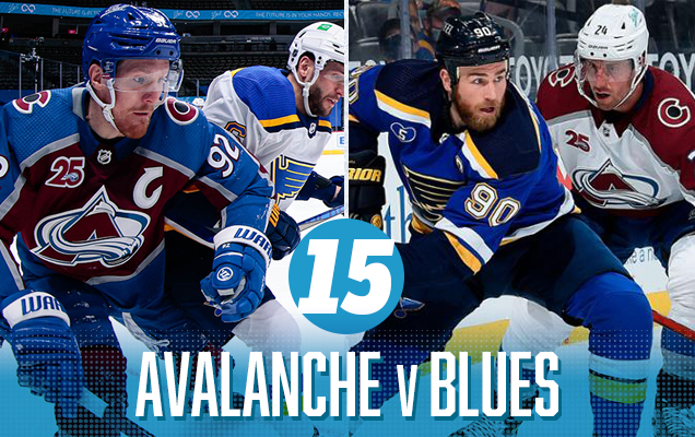
I surprised myself having this matchup at the bottom. On paper, it seems like a good matchup: lots of blue with a bit of burgundy and yellow to brighten things up. Seems legit.
But, there’s three different tones of blue happening here, which starts to become a little bit grating, and the clash of jersey styles (with St Louis going for a classic aesthetic and Colorado with a more contemporary look) makes this visual matchup oddly out-of-sync with each other, and a monotone, dull palette. It’s not terrible by any means, but it’s the worst of this round the playoffs.
Colorado Avalanche Visual Brand: They’ve been remarkably consistent in their visual brand since moving from Quebec City in 1995, using the same (mediocre-at-best) logo and recently going back to a jersey inspired strongly by their inaugural jerseys – the best they’ve worn. And their third jerseys (and Stadium Series jerseys) have been pretty good too, along with an excellent Reverse Retro jersey this season.
• More: BTLNHL #29: Colorado Avalanche
• More: Worst to First Jerseys: Colorado Avalanche
St Louis Blues Visual Brand: Their brand is solid (and mostly consistent throughout their existence), with their logo, jerseys, and visual legacy all in the top half of the league, with their historical third jerseys being among the absolute best in the league. But they’ve made missteps in the past, and then doubled-down on those missteps in recent seasons with their third jerseys and Reverse Retro jerseys, which definitely hurts.
• More: BTLNHL #4: St. Louis Blues
• More: Worst to First Jerseys: St. Louis Blues
Prediction: Colorado in 7 (in 2OT) ✅
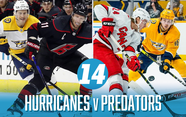
It almost all hot colours here…and a lot of them, from Nashville’s predilection for all things gold (including their helmets), to Carolina’s red. The Preds’ almost-black navy blue mixed with the actual-black from the ‘Canes gives them a visual connection as well, but otherwise, the red-v-gold is a bit too aggressive with not much else to balance out that intensity, at least for the games in Nashville. With Carolina wearing their black thirds, the games in Raleigh feel a bit too monochromatic.
Carolina Hurricanes Visual Brand: Carolina has a chance here because of – and all apologies to Connecticut – having those amazing Whalers unis on the ice again. It’s pretty easily the best jersey they’ve ever worn, and having a logo mistaken for a toilet bowl doesn’t help much.
• More: BTLNHL #19: Carolina Hurricanes
• More: Worst to First Jerseys: Carolina Hurricanes
Nashville Predators Visual Brand: They’ve pretty much got the worst jerseys in the league at this point, with an average logo and some truly horrendous jerseys in their library. They do get bonus points for always been experimental with their visual brand though, pushing the boundaries…for better or worse.
• More: BTLNHL #18: Nashville Predators
• More: Worst to First Jerseys: Nashville Predators
Prediction: Hurricanes in 7 ✅
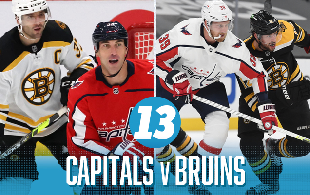
The biggest issue with this matchup is the clash of styles, with Boston’s extremely classic approach (tri-stripes, shoulder yoke strip, outlined classic number fonts, etc) mixed with Washington’s extremely modern approach (slabs of colour, thin stripes, more unique fonts) not exactly jiving together. Otherwise, this clash or red vs gold is much more muted than the aforementioned Preds-Canes matchup, to its benefit.
Boston Bruins Visual Brand: This is an incredibly strong visual brand, epitomizing the “big, bad” moniker attached to it, using a consistent logo concept since 1948. They’re among the best in every single category from a visual brand perspective: great logo (2nd best imo), great jerseys, great legacy. And those Reverse Retro jerseys! They’re a brand beast.
• More: BTLNHL Finals: Boston Bruins v Detroit Red Wings
• More: Worst to First Jerseys: Boston Bruins
Washington Capitals Visual Brand: Being burdened with what is generally one of the worst logos in the league isn’t going to help any brand, which is especially frustrating since they have a great logo in the Weagle staring them in the face. But lacklustre efforts with their jerseys – and, let’s be honest, they’ve never worn a really great jersey ever – means that they’re not really improving their brand anywhere else either.
• More: BTLNHL #24: Washington Capitals
• More: Worst to First Jerseys: Washington Capitals
Prediction: Bruins in 4 ✅

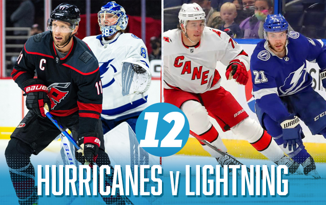
Oh, what could’ve been. Carolina seems quasi-allergic to their predominantly-red home jerseys, opting again to go with their inferior and mediocre black third jerseys, removing what would’ve been a beautifully classic red-vs-blue jersey matchup. Instead, we’re treated to that for only the games in Tampa. In Raleigh, it’s decidedly monochromatic with just hints of the red-vs-blue that we all deserve.
• More: BTLNHL #19: Carolina Hurricanes
• More: Worst to First Jerseys: Carolina Hurricanes
Tampa Bay Lightning Visual Brand: Decent logo, pretty good uniforms, and a disastrous jersey legacy featuring some of the worst things that ever graced the ice, not to mention their latest addition to a Bolts third jersey library of horrors. Despite all that, they’ve embraced a superior classically inspired minimalist aesthetic overall and have mostly held to that.
• More: BTLNHL #22: Tampa Bay Lightning
• More: Worst to First Jerseys: Tampa Bay Lightning
Prediction: Hurricanes in 7 ❌
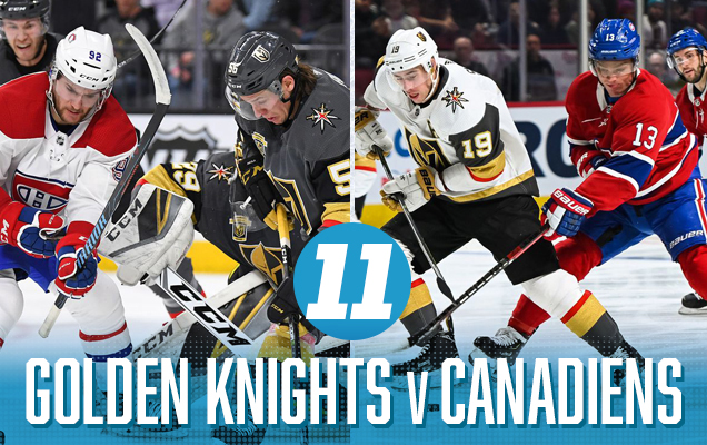
The second round had a whole bunch of great matchups making the decision for who claims the top spot very difficult. The third round posed equally difficult decision-making, but for the exact opposite reason. Neither of those matchups were great visually, but for the lesser spot, it’s the Knights-Habs.
Sure, there’s a lot of colour happening here, but that’s part of the problem. It’s a visual onslaught with almost equal amounts of red, blue, and yellow melting your retinas while competing for your attention. It also features the league’s oldest jersey set vs the league’s newest, so the clashing of jersey styles is also on full display here. In short, it’s just all too much.
Vegas Golden Knights Visual Brand: The Golden Knights get some decent kudos for their jerseys, but the consensus take on their logo is that it’s buried in the bottom half of the league. Their recent forays into alternate jersey territory, which include those gold-weave third jerseys and the red Reverse Retros, are okay, but those gold helmets are completely unforgivable and objectively terrible.
• More: Worst to First Jerseys: Vegas Golden Knights
• More: HbD Breakdown: Vegas Golden Knights Third Jersey
Montreal Canadiens Visual Brand: And yeah, it’s the Canadiens. The most iconic hockey sweater in existence that has endured for almost 100 years now. The “bleu, blanc et rouge” is on par with the Yankee pinstripes and has been celebrated in book and film. The logo is almost equally iconic. Montreal is a visual brand beast. They don’t really miss with their alternate jerseys either, and they never let the ’90s influence their brand at all, which gives them a game right there.
• More: BTLNHL #5: Montreal Canadiens
• More: Worst to First Jerseys: Montreal Canadiens
Prediction: Canadiens in 4 ✅
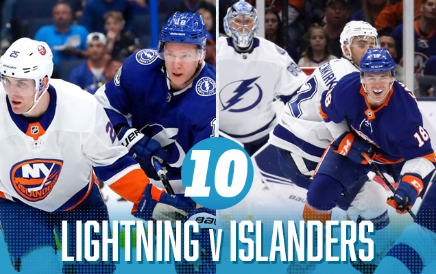
And now we have the re-match of last year’s Conference Finals Round 3 matchup. And we have the opposite problem from the Habs-Knights jersey matchup: there’s not really enough colour. Or rather, there’s a lot of blue here, with only a bit of orange to break it up, so it comes across as a little bit basic. Don’t get me wrong, these are still two good jersey sets, but slap them together over a 7-game series and, well, there’s not much diversity to it. But still, they’re two sets of classically-designed jerseys with simple solid striping and liberal use of colours, so it gets this round’s nod for the top spot.
• More: BTLNHL #22: Tampa Bay Lightning
• More: Worst to First Jerseys: Tampa Bay Lightning
New York Islanders Visual Brand: Their current classic look is great…for the Islanders. The consensus is that they still don’t have a great logo, their jerseys are not too bad, and their recent third jerseys don’t stand up against some of the others in the league (and they have a history of some much, much worse ones). Oh, and Captain Gorton is still too recent to be completely forgotten.
• More: BTLNHL #20: New York Islanders
• More: Worst to First Jerseys: New York Islanders
Prediction: Lightning in 7 (in OT) ✅
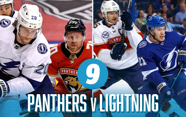
The inaugural Battle of Florida playoff series is a classic blue-vs-red jersey matchup, which is usually a great thing. But as you can see, both the road white jerseys suffer from a lack of colour in general, especially since the Panther’s wear blue pants. As a result, each of the home-away matchups come off a little bit dull despite everything else with not enough colour.
Florida Panthers Visual Brand: Their new visual brand from the 2016-17 season made these cats look more refined and grown up. And good riddance. Their original logo/jersey was never very good, being too complicated and cartoonish and the colour scheme of blue, red and yellow (all the primary colours) with the beige of the logo, is just too aggressive and obnoxious to work (although, their Reverse Retro jerseys helped clean some of that up). You gotta give them points for at least being very consistent with just the one major brand change since their inception in 1993.
• More: BTLNHL #26: Florida Panthers
• More: Worst to First Jerseys: Florida Panthers
• More: BTLNHL #22: Tampa Bay Lightning
• More: Worst to First Jerseys: Tampa Bay Lightning
Prediction: Panthers in 7 ❌

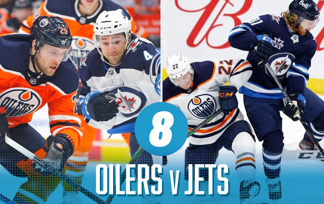
Orange and blue are complementary colours, and they’re on full display here, with the Oilers’ orange jersey providing the perfect counter to the Jets’ home white-and-blues, with the navy blue being the natural connector between the two sets. The games in Winnipeg, though, are a bit more bland, with not enough contrast happening to offset all that blue, making it a bit too monochromatic.
Edmonton Oilers Visual Brand: A story of extremes, Edmonton has won more Cups than the vast majority of the league, and have been mostly terrible for the last decade plus, until McDavid and Draisaitl developed stronger back to carry the team on. They have one of the better logos in the league and, despite dabbling in different colour schemes (see: navy and copper), then going back to their classic orange and blue from their glory days, and now sadly having a distorted version of those colours that just don’t quite work as well.
• More: BTLNHL #11: Edmonton Oilers
• More: Worst to First Jerseys: Edmonton Oilers
Winnipeg Jets Visual Brand: The Jets visual brand is the epitome of middle-of-the-road. An average logo. An average jersey set. And (aside from their glorious recent Heritage Classic jerseys) it’s pretty much always been that way. Oh, and their third jersey is a total rip-off too, which doesn’t help.
• More: BTLNHL #15: Winnipeg Jets
• More: HbD Breakdown: Jets and Sharks Third Jerseys
• More: Worst to First Jerseys: Winnipeg Jets
Prediction: Oilers in 7 ❌
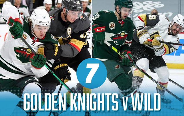
I was not expecting to like this matchup but, it’s pretty solid. Vegas’ jerseys need something with a good amount of colour to balance their grey/white aesthetic, and though forest green isn’t exactly a vibrant colour, there’s a lot of it on the Minnesota jerseys. The small amounts of red on both uniform sets actually form a visual connection between them, as well as the gold provided a little more visual intensity. Add in the similar contemporary jersey aesthetics, and you’ve got a solid matchup.
• More: Worst to First Jerseys: Vegas Golden Knights
• More: HbD Breakdown: Vegas Golden Knights Third Jersey
Minnesota Wild Visual Brand: Their logo is generally well-loved (except by me, apparently) and one of the better ones in the league. That, and some really great, understated jersey design over the last decade has solidified their visual brand as the best to emerge from the most recents waves of expansion in the last 20+ years.
• More: BTLNHL #16: Minnesota Wild
• More: Worst to First Jerseys: Minnesota Wild
Prediction: Wild in 5 ❌
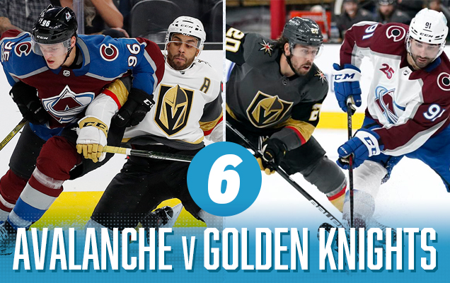
From the Carolina-Tampa match-up, it’s a large step up to the top 3 matchups, each of which could argue for the top spot on this list. The Colorado-Vegas matchup (on top of being probably the series to watch in the second round) is surprisingly great from an aesthetic standpoint. It’s all non-traditional and contemporary colours and jersey designs, and like I’ve said before, Vegas needs a jersey with a lot of colour playing against it to look good, and Colorado brings that. The gold, burgundy, and royal blue play off each other really well. So why third? Because the other matchups are pretty great too, as you’ll see.
• More: BTLNHL #29: Colorado Avalanche
• More: Worst to First Jerseys: Colorado Avalanche
• More: Worst to First Jerseys: Vegas Golden Knights
• More: HbD Breakdown: Vegas Golden Knights Third Jersey
Prediction: Avalanche in 6 ❌
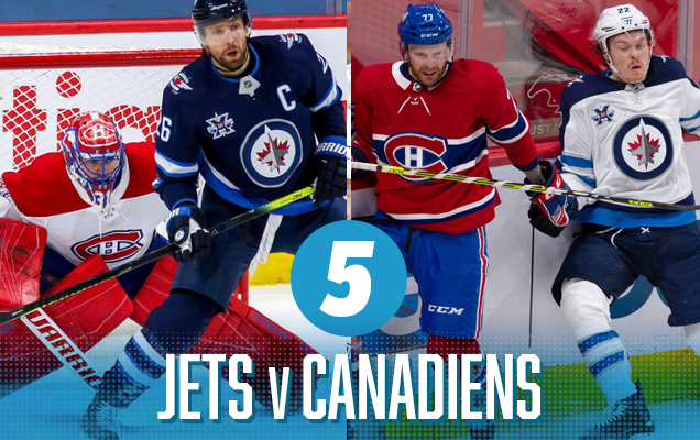
This is another classic red-vs-white matchup featuring two classically-designed jerseys, similar to the Habs/Leafs matchup from the previous round. The difference here is that the Jets use a predominantly navy blue jersey with de-intensifies the colour, looking closer to black than the blue the Leafs where, so it keeps this matchup out of the top spot. It’s still pretty great, especially with the small amount of red in the Jets’ unis connecting to the Habs’ unis, and vice versa with the blue.
• More: BTLNHL #15: Winnipeg Jets
• More: HbD Breakdown: Jets and Sharks Third Jerseys
• More: Worst to First Jerseys: Winnipeg Jets
• More: BTLNHL #5: Montreal Canadiens
• More: Worst to First Jerseys: Montreal Canadiens
Prediction: Canadiens in 5 ✅

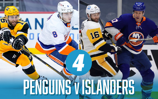
With Pittsburgh wearing their gold third jerseys, that changes that dynamic here, with a heavy dose of a great blue-yellow colour combination between the two teams, along with a healthy dose of Islander orange. Plus, with two classically-designed jerseys, and you’ve got an aggressive, colourful series.
Pittsburgh Penguins Visual Brand: No expansion team has played with their jersey design more than the Penguins, going from baby blue, to navy blue, to gold, to white, to Vegas gold, to a lettered-chest, to gradients. It’s exhausting. But their logo (aside from their corporate robo-penguin) has remained consistent. And they’ve finally settled on what’s their best jerseys of all time. They took a weird, winding, creative path, but they got there.
• More: BTLNHL #6: Pittsburgh Penguins
• More: Worst to First Jerseys: Pittsburgh Penguins
• More: BTLNHL #20: New York Islanders
• More: Worst to First Jerseys: New York Islanders
Prediction: Penguins in 6 ❌
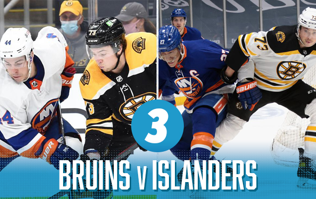
Similar to the Islanders’ first round opponents, the Bruins feature a black-and-gold jersey set that really combines well the Isles’ classic blue-and-orange look. And as black jerseys go, Boston pretty much has the best one in the league, with lots of gold and white to set up some aggressive contrast. Add in that they’re both classically-designer jerseys, and you’ve got an aesthetically-great matchup.
• More: BTLNHL Finals: Boston Bruins v Detroit Red Wings
• More: Worst to First Jerseys: Boston Bruins
• More: BTLNHL #20: New York Islanders
• More: Worst to First Jerseys: New York Islanders
Prediction: Boston in 5 ❌
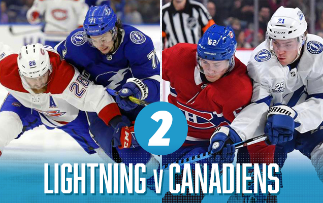
We’re about to see the top jerseys match-up of the entire 2021 playoffs, and these represent the knock-off version. It’s so incredibly similar to the #1 spot, but, it’s not the original version of it, so we’ll let the top spot give you the breakdown.
• More: BTLNHL #22: Tampa Bay Lightning
• More: Worst to First Jerseys: Tampa Bay Lightning
• More: BTLNHL #5: Montreal Canadiens
• More: Worst to First Jerseys: Montreal Canadiens
Prediction: Canadiens in 5


C’mon, was there another choice? The playoff matchup Canadian fans (or at least, Canadian media) have been slobbering in anticipation of for who-knows how many years is finally here, and it’s the most classic blue-vs-red jersey matchup you could ever hope for. It’s just so…beautiful. There’s no black anywhere, lots of colour, classic jersey designs (the quintessentially classic jersey designs, actually) – it all adds up to easily the best visual matchup of the first round.
Toronto Maple Leafs Visual Brand: Toronto’s generally renowned for having one of the best logos and best visual legacies in the league, so it’s tough to see anyone somehow getting by the Leafs here. Their jerseys are great, and while that Stadium Series uniform was a hard pass along with a mediocre Reverse Retro jersey, there’s just so much history here.
• More: BTLNHL #8: Toronto Maple Leafs
• More: Worst to First Jerseys: Toronto Maple Leafs
• More: BTLNHL #5: Montreal Canadiens
• More: Worst to First Jerseys: Montreal Canadiens
Prediction: Canadiens in 7 (in OT) ✅
Agree? Disagree? Let us know in the comments below or join the conversation on Twitter, Facebook, or Instagram!


This website is really a walk-through for every one of the details you wanted concerning this and also didn’t know who to ask. Glimpse right here, and also you’ll absolutely uncover it. 대딸방
Excellent way of describing, and good piece of writing to obtain data concerning my
presentation subject, which i am going to convey in school.대구오피