
NHL Playoffs 2021: Round 3 Countdown and Predictions

Well, that round hurt for the brand-based predictions, with the better designed (aesthetically, that is) teams going just 1-for-4, with Montreal being the lone team advancing to the third round. That makes us 5-for-12 which is…not great. Hopefully we’ll catch up a bit in this round?
• More: NHL Playoffs 2021: Round 1 Countdown and Predictions
• More: NHL Playoffs 2021: Round 2 Countdown and Predictions
As a quick recap, here’s how this works. We’ll compare the overall branding of each series and see how they match-up. This includes the logos, alternate logos, jerseys, historical logos and jerseys, general legacy and everything else that builds a team’s brand.
But on top of that, the match-ups are going to be ranked according to which will be the best to watch from an aesthetic standpoint. Some jerseys work better together than others, and you’ll see why. After 9 post-seasons (not including the current one), we’re 69-for-143, or 48.3%. We need a good post-season this year.
Okay, like last time, let’s start with the worst jersey match-up in this, the Cup semi-finals.

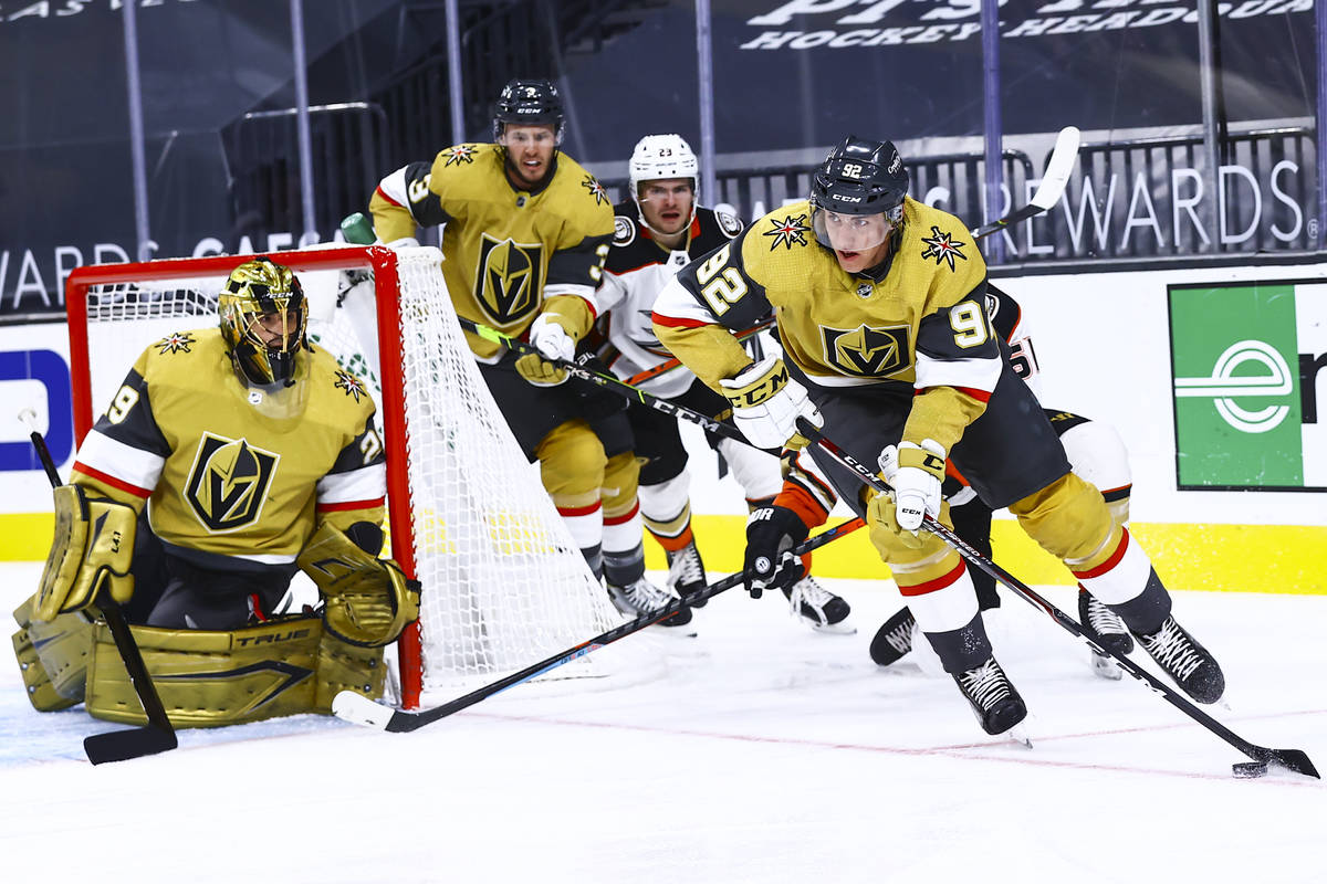
The previous round has a whole bunch of great matchups making the decision for who claims the top spot very difficult. This round poses equally difficult decision-making, but for the exact opposite reason. Neither of these matchups are great visually, but for the bottom spot, it’s the Knights-Habs.
Sure, there’s a lot of colour happening here, but that’s part of the problem. It’s a visual onslaught with almost equal amounts of red, blue, and yellow melting your retinas while competing for your attention. It also features the league’s oldest jersey set vs the league’s newest, so the clashing of jersey styles is also on full display here. In short, it’s just all too much.
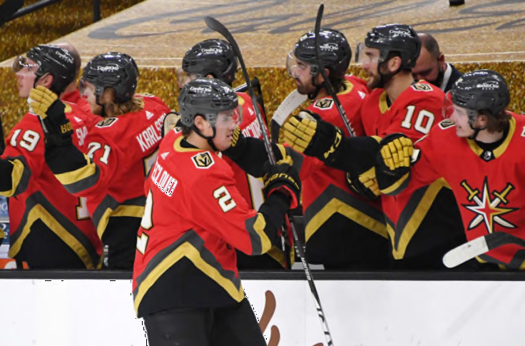
Vegas Golden Knights Visual Brand: The Golden Knights get some decent kudos for their jerseys, but the consensus take on their logo is that it’s buried in the bottom half of the league. Their recent forays into alternate jersey territory, which include those gold-weave third jerseys and the red Reverse Retros, are okay, but those gold helmets are completely unforgivable and objectively terrible.
• More: HbD Breakdown: Vegas Golden Knights Jerseys
• More: HbD Breakdown: Vegas Golden Knights (Logo and Alternate Logo)
Montreal Canadiens Visual Brand: And yeah, it’s the Canadiens. The most iconic hockey sweater in existence that has endured for almost 100 years now. The “bleu, blanc et rouge” is on par with the Yankee pinstripes and has been celebrated in book and film. The logo is almost equally iconic. Montreal is a visual brand beast. They don’t really miss with their alternate jerseys either, and they never let the ’90s influence their brand at all, which gives them a game right there.
• More: BTLNHL #5: Montreal Canadiens
• More: Worst to First Jerseys: Montreal Canadiens
Prediction: Canadiens in 4


And now we have the re-match of last year’s Conference Finals Round 3 matchup. And we have the opposite problem from the Habs-Knights jersey matchup: there’s not really enough colour. Or rather, there’s a lot of blue here, with only a bit of orange to break it up, so it comes across as a little bit basic. Don’t get me wrong, these are still two good jersey sets, but slap them together over a 7-game series and, well, there’s not much diversity to it. But still, they’re two sets of classically-designed jerseys with simple solid striping and liberal use of colours, so it gets this round’s nod for the top spot.
Tampa Bay Lightning Visual Brand: Decent logo, pretty good uniforms, and a disastrous jersey legacy featuring some of the worst things that ever graced the ice, not to mention their latest addition to a Bolts third jersey library of horrors. Despite all that, they’ve embraced a superior classically inspired minimalist aesthetic overall and have mostly held to that.
• More: BTLNHL #22: Tampa Bay Lightning
• More: Worst to First Jerseys: Tampa Bay Lightning
New York Islanders Visual Brand: Their current classic look is great…for the Islanders. The consensus is that they still don’t have a great logo, their jerseys are not too bad, and their recent third jerseys don’t stand up against some of the others in the league (and they have a history of some much, much worse ones). Oh, and Captain Gorton is still too recent to be completely forgotten.
• More: BTLNHL #20: New York Islanders
• More: Worst to First Jerseys: New York Islanders
Prediction: Lightning in 7 (in OT)
Agree? Disagree? Let us know in the comments below or join the conversation on Twitter, Facebook, or Instagram!


/cdn.vox-cdn.com/uploads/chorus_image/image/52663085/623535160.0.jpg)
[…] • More: NHL Playoffs 2021: Round 1 Countdown and Predictions• More: NHL Playoffs 2021: Round 2 Countdown and Predictions• More: NHL Playoffs 2021: Round 3 Countdown and Predictions […]