
Worst to First Jerseys: Montreal Canadiens

As we go through the prolonged 2019-20 season, we’ll be updating all of the Worst to First Jersey posts every Monday, as almost all the teams in the league have unveiled new jerseys since their original posts. We’ll start with the ones most needing updating and work our way through the league. Today, it’s time for the Montreal Canadiens to get updated.
Also, a huge thanks to SportsLogos.net and NHLUniforms.com for most of the jersey images and references.
The Canadiens are basically a case study in terms of a consistent, strong overall team brand. Their primary logo and uniforms have gone mostly unchanged for about a hundred years. Yeah, that’s a century’s worth of one of the most iconic looks in not only the NHL, but in all of professional sports. If it weren’t for a few different iterations in the early 1900’s before the now signature look was landed on, this would be an extremely short list. Our countdown starts with those versions, which were also worn as throwbacks during the Habs centennial season in 2009-2010.
Here’s how this works: we’ll count down, from worst to first, all the jerseys the Habs have ever worn. Homes and aways will be lumped into the same category (so, more of a jersey “era”) and small changes (like slightly changed positions of piping for example) will be excluded, for everyone’s sanity. Third and special event jerseys, like the Winter Classics, will stand on their own. For the Habs, there’s 7 different jerseys/eras. And we’ll start with the worst one:
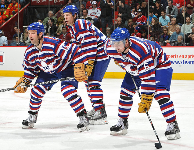
7. 1912–13 Jersey, 2008–10 Commemorative Jersey

While the uniqueness of this jersey can be appreciated on some levels, it’s honestly just a little bit difficult to even look at…especially when replicated across an entire team. The repeating stripes pattern is visually jarring and requires a focused effort to not go cross-eyed when looking at these 1912 throwbacks.
The best part of the jersey is the primary chest logo. It features a white maple leaf stroked in red with blue letters of “CAC” which stood for Canadian Athletic Club. By the nature of its design, the logo looks more like it could have been a vintage Toronto Maple Leafs logo as opposed to a Montreal Canadiens logo, but it’s a classic looking logo nonetheless. Overall, let’s keep these “beauts” in 1912.
Jersey Recommendation: #4. Newsy Lalonde was a star on the Canadiens in their NHA and early-NHL seasons. Plus, in the 20-game 1912-13 season, he scored 25 goals with 0 assists. That’s as ridiculous as these jerseys. Don’t get the name on there though, as they didn’t have those way back in the ’10s.
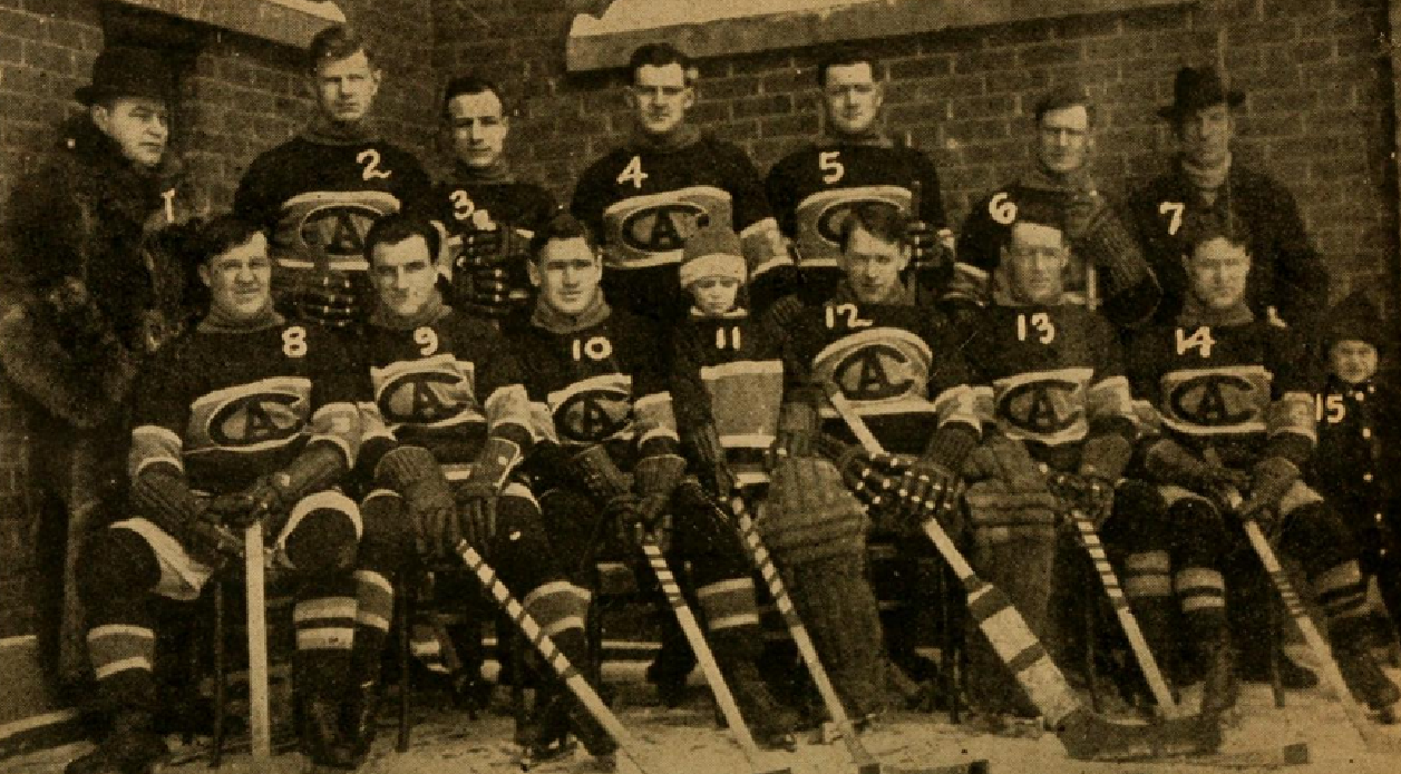
6. 1909-1910 Jersey, 2009–10 Commemorative Jersey

The first-ever Canadiens jersey comes in next on the list at #6, being worn for their inaugural season only in 1909-1910. Another example of unique striping, just much less of it.
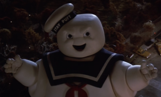
Overall a very simplistic jersey with a solid blue base, a “C” logo and singular white stripe that runs across the chest and then angles upward over the shoulders. The angle of the thick white stripe and how it spans the shoulders creates an odd look and I can’t help but think of a sailor uniform ala the Stay Puft Marshmallow Man when I see it. If you didn’t happen to make that visual connection on your own, now that’s all you’ll ever see when you look at this jersey. You’re welcome.
Jersey Recommendation: #5. Didier “Cannonball” Pitre – known for his cannon of a shot – was the very first player signed by the Montreal Canadiens, making him a fitting number for this jersey.

5. 2017 NHL100 Classic Jersey, 1935–41 Road Jersey

The Canadiens took a refined, simple approach to their look for the 2017 NHL100 Classic outdoor game. We here at Hockey By Design did a breakdown feature of this jersey when it debuted, and the sentiment remains the same: it’s clean, it’s sharp and the small silver accents/details are nice, but overall it trends on the boring side. It was a safe approach and when compared to other Canadiens jerseys it just leaves you wanting a little more.
• More: HbD Breakdown: NHL100 Classic Jerseys
The design is drawn from the original white jerseys worn in 1938–41 (and the 1935–38 white jerseys, which added in some additional stripes). But again, it was unfortunate to have something so bland for a game that literally will happen only once.
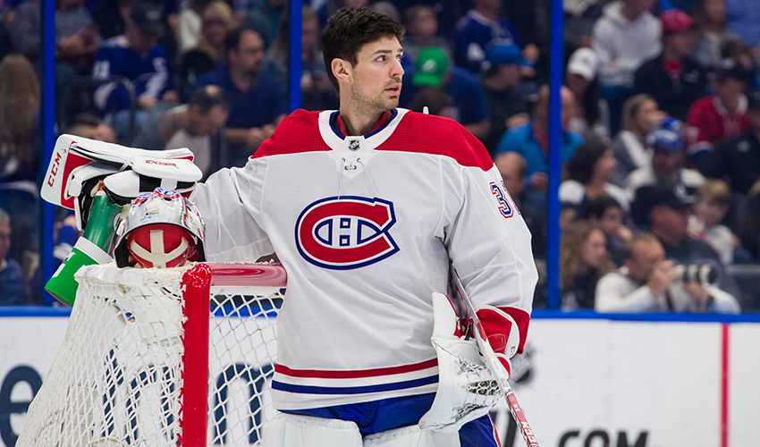
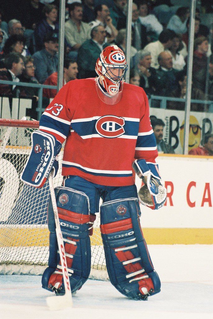
Jersey Recommendation: #31 Price. Montreal lost the game 3-0 to Ottawa, so there’s not a whole lot of players to pick from who excelled during this game, but Price was the second star after making 35 saves on the day.
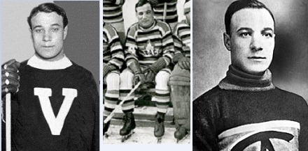
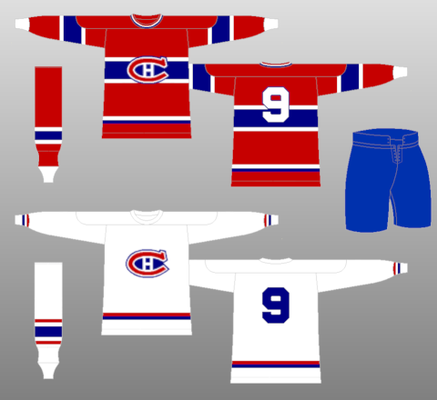
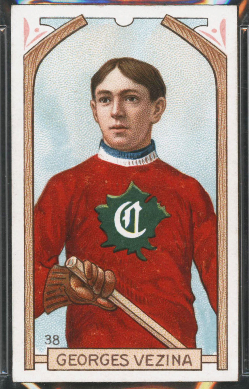
4. 1910–11 Jersey, 2009–10 Commemorative Jersey

Cracking the top four is another throwback installment from the early 1900’s. This particular Canadiens jersey is somewhat tough to evaluate because there’s really absolutely nothing about it that portrays the visual identity of the Habs as we know them.
It’s red and green (not blue), it features a maple leaf logo design with an old english-esque “C” and the striping patterns are very traditional…all things that look nothing like what we think the Canadiens should look like. It could pass for a vintage Team Canada jersey easier than a Canadiens jersey…which I suppose would have been the case in 1910.
With all that being said, as a stand-alone look this jersey is quite solid. It’s about as classic as a hockey jersey can be in terms of the lace-up collar with big and bold stripes that compliment a strong primary chest logo. It’s a formula that’s hard to mess up, and they did it well back in 1910 and again as a throwback in 2010.
Jersey Recommendation: #1. Georges Vezina (yes, that Vezina) played his first game for the Montreal Canadiens in 1910, wearing this jersey…and then promptly played almost every single game in the Habs net until 1925, dying of tuberculosis at 39. He’s the original goaltending legend.

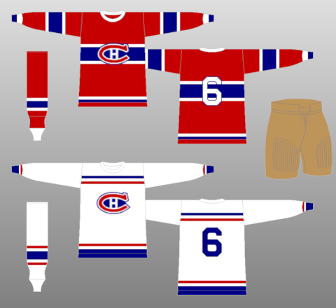
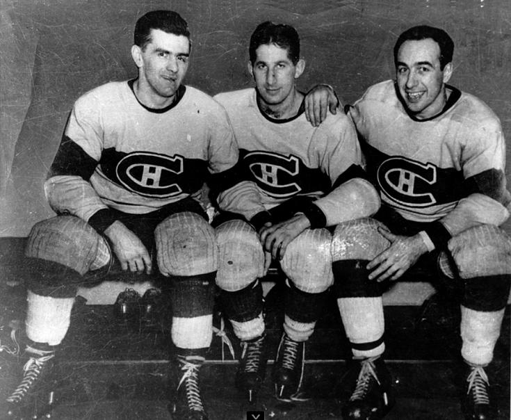
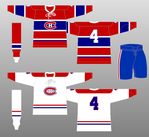
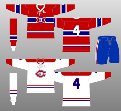
3. 1944–47 Road Jersey, 2003–07 Third Jersey, 2009–10 Commemorative Jersey

The next two spots on the countdown were very close, as they are both white jerseys that feature the famed center chest stripe. First up is the mid-40’s jersey that Montreal also wore as part of the NHL’s “Vintage Series” starting in 2003 (and again for their 100th anniversary in 2008–09).
• More: BTLNHL #5: Montreal Canadiens
For all intents and purposes this jersey is essentially a white “reversed” version of the iconic red home jersey that is synonymous with Montreal. The look is uniquely Canadiens, but there’s something about this jersey that makes you wish it was the red iteration. The white base of the jersey works well with the blue striping that is stroked in red, but again it just doesn’t quite feel right…almost like an imposter against the classic look that is the Canadiens red jersey.
Jersey Recommendation: #6. Toe Blake was part of the legendary Punch line (with Elmer Lach and Maurice Richard) and had some of his most successful playing seasons during this jersey’s era, winning the Cup twice. And then he became their coach and won the Cup another 8 times.
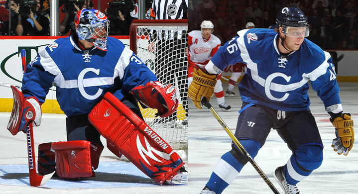
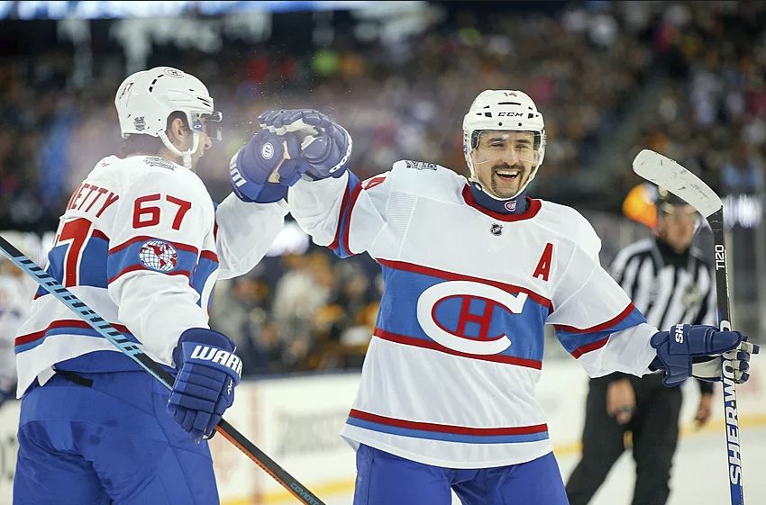
2. 2016 Winter Classic Jersey

The 2016 Winter Classic jersey gained the edge over #3 because it evokes much more of a vintage vibe by utilizing a different, lighter shade of blue to go along with the retro “C-H” logo and the modified World Champions sleeve logo.
The jersey is a unique creation that borrows from Habs jerseys of the past to create a mash-up of vintage and modern elements. We fully broke them down when the jerseys debuted in late 2015…check it out for the nitty-gritty on all the design details.
• More: HbD Breakdown: Canadiens’ Winter Classic Jerseys
Jersey Recommendation: #11 Gallagher. The Winter Classic featured the Canadiens drubbing their arch-rival Bruins 5–1, and Brendan Gallagher was the first star of the game, with a goal and an assist.
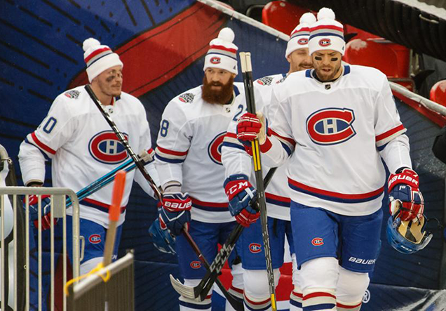
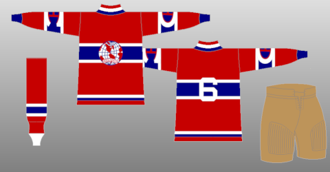
1. 1913–present Home Jersey, 1941–44 & 1947–present Road Jersey

Was there ever a doubt? The Canadiens red jersey is a uniform hall-of-famer, not only in the NHL but in all of professional sports. It’s right up there with the Yankees home white pinstripes, the green and gold of the Green Bay Packers and the showtime gold of the LA Lakers. Iconic. Just an absolute all-timer. And it’s been worn since before your grandparents were born.
The look of the primary road white Canadiens jersey was established in the early 1940’s and has remained very consistent ever since. Over the years there have been some minor tweaks, but for this purpose, we’ll consider them a singular entry.
This jersey is one of two looks that define the Canadiens and exemplify the power of their brand. The red shoulder yoke and sleeve cuffs paired with the small red and blue bottom striping are absolutely classic. It’s a great balance of color led by red and perfectly accented by the blue and white detailing in the logo, stripes and numbers. A true classic all around.
Similar to the white jersey, there have been slight changes over the years like the thickness of the horizontal blue chest stripe, the number placement on the sleeves, the collar trim and/or laces dependant upon jersey templates, etc., but all-in-all the look has been a staple of hockey uniform design for over 100 years. A case in point for “if it ain’t broke don’t fix it” if there ever has been one.
The Canadiens own the horizontal chest stripe look and literally every single other jersey design that utilizes it is compared against this classic Habs jersey feature. An excellent balance of color paired with striping that uniquely compliments the logo, it remains classic yet clean and modern looking at the same time. Not bad at all for a jersey that’s only been around for a century.
Jersey Recommendation: Take Your Pick. With over 100 seasons to draw from, there’s just too many worthy players. Roy, Plante, Lafleur, Richard, Beliveau, Gainey, Dryden, the list can go on and on. With 24 Cups and multiple players listed on the Cup multiple times, there’s no shortage of possibilities. Pick your favourite, and get it in the classic red.
Agree? Disagree? Let us know in the comments below or join the conversation on Twitter, Facebook, or Instagram!


Being a Habs fan, it would seem like I should be biased. The red jersey is a classic, does not need any tweeking, alternative jerseys, etc. I also like other teams’ jerseys so I see the appeal in other designs. But I agree with your assessment that this is one of the greatest logos/jerseys and its longevity proves it. It also was interesting to see the other designs you’ve unearthed. Yes, some are tough to look at so I am grateful someone came up with the CH. I wear it here in Oregon with pride.
[…] • More: Worst to First Jerseys: Montreal Canadiens […]
If it were up to me, I’d put #3 (1944–47 ROAD JERSEY, 2003–07 THIRD JERSEY, 2009–10 COMMEMORATIVE JERSEY) back in circulation. Though I was a long-time Habs fan as a kid, and it’s tough to argue the value of a long-standing tradition associated with success… but I would love to see the 44-47 jersey more often than the standard white sweater. It looks awesome, and would serve as a true reverse of the untouchable red uniform.
[…] • From the barber poles to the classics, a look at the best and worst Canadiens jerseys. [Hockey by Design] […]
Lose the newest BLUE jersy….
For as long as i can remember its always been the red jersey…..and the white jersey…..
Both are iconic jerseys…..why change… i know of no one who has asked for such a change….leave our team iconic colors be….
I like the new “chandail bleu royale”. It gives me something new to add to my collection. I have all of the other ones already so seeing this new bleu was a treat, especially since I’ve been wanting to see les glorieux try this very thing for quite a long time.
It doesn’t look bad (like the barberpoles), it has the same striking design as the classic crimson but with the crimson and royal reversed. For a lifelong Habs fan, I know it could be a shock (I AM a lifelong Habs fan and native Montrealer) but once you get over the “shock and sacrilege” reaction, it’s still a beautiful sweater.
I forgot to add that it’s rare for people to ASK for a change. Hell, I thought that the Winnipeg Jets should have kept their 80s uniforms because they were fantastic. Our COLOURS (No REAL Canadian spells “color”) haven’t changed. They’re still the “bleu, blanc et rouge” (royal, white and crimson) that they’ve always been, just in different proportions (actually the white part remains the same).
I actually don’t think that they took it far enough. I really wish that they had reversed the colours on the crest as well to match correctly with the blue the way that the red on the crest matches the red. Red C on red sweater and blue C on blue sweater. It would have looked really cool because it would have been very different and at the same time, not different at all.
[…] • More: BTLNHL #5: Montreal Canadiens• More: Worst to First Jerseys: Montreal Canadiens […]
[…] • More: BTLNHL #5: Montreal Canadiens• More: Worst to First Jerseys: Montreal Canadiens […]
[…] • More: BTLNHL #5: Montreal Canadiens• More: Worst to First Jerseys: Montreal Canadiens […]