
HbD Breakdown: NHL100 Classic Jerseys
 On December 16th, the Winter Heritage Centennial NHL100 Classic takes place at TD Place Stadium in Ottawa, commemorating the 100th anniversary (almost to the day) of the very first NHL game on December 19th, 1917 between the Ottawa Senators and the Montreal Canadiens, also in Ottawa.
And on Tuesday, Adidas unveiled their first specialty jerseys since taking the jersey-design reins from Reebok last summer for the NHL100 participants: a team that’s one of the oldest and most successful franchises to ever exist in the league, and a team that’s heavily borrowing from one of the oldest and most successful franchises to ever exist in the league.
Not Forget-Me-Nots
First, let’s talk about the jerseys in general without talking specifically about either team, but the jerseys in general and their features/elements that run through both of them. And…first impressions overall.
And those first impressions are…meh. Don’t get me wrong, they’re nice jerseys and they’ll look good during the game, but they feel extremely safe. Safe can be good, but you only get one chance to celebrate 100 years of hockey, and that’s not a time to play it safe. What’s going to happen is that the game will be played, it will be exciting and lots of people will buy and wear the jersey, and then they’ll just get forgotten.
These jerseys aren’t distinctive, remarkable, interesting, or anything that would create strong, lasting emotions in anyone. They’re just…nice. And that’s not what you want for a 100th anniversary. It’s like having a cupcake and a single balloon hung to celebrate your hundredth birthday with your caretaker. If you live to 100, you celebrate that shit big. So, expectations should be higher than just your average Winter Classic.
Why so…nice?
The primary reason that they’re so blandly nice is that there’s nothing innovative happening on these jerseys at all, and there is a deep and storied history to both these teams that could be drawn from. For example, they could’ve double-downed on the historical angle and replicate the jerseys from 1917. What you would see is basically a jersey match-up like this…
 And that’s just glorious. The Habs don’t actually look too much different (which speaks to the greatness of their jerseys), but to have the original logo on there with the more eccentric differences to their current jerseys would make it a must-buy for fans. And the Sens, well, would look so unique and fantastic. The match-up would’ve been a testament to both (a) how far jersey design has come, and (b) the traditions that hold true today, at the same time. It’s like a visual way of saying: “Look at how far we’ve come and how rich our traditions are after 100 years.”
Or, they could’ve gone in a completely different direction and create something ultra-modern and innovative. They probably would’ve received a lot of flack for it, and it’s unlikely Montreal would’ve gone for something that departed too much from what they’ve worn for 100 years, but at least it would’ve been pushing the jersey design conversation forward in new and exciting ways. What does that look like? I’m not sure, but it’s not without precedent. They’ve tried lots of different things with the Stadium Series jerseys. Some good, some terrible, but at least they’re interesting. It’s like a visual way of saying: “You think the last 100 years was exciting. Let’s keep looking ahead to the next 100 years.”
• More: Stadium Series Jersey Countdown (2017)
But they did neither. They straddled the line between these two extremes and came up with something that…well…nice. But uninteresting. And disappointing for a one-in-a-century game like this.

Silver Lining
The one thing they did that was somewhat interesting was the silver stripe around the sleeves on each jersey, each subtly embossed with the years that the team won Stanley Cups. For Montreal, I’m surprised they could fit them all on there.
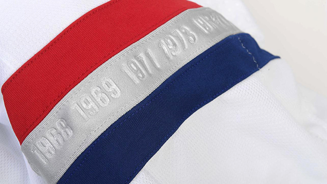
The silver stripe on the Habs’ jerseys, from NHL.com.
For Ottawa, that’s not really the same franchise as the Senators from the 1880s–1930s. They only thing they share is the name, and I don’t care what’s hanging in the rafters in Kanata. If you want those titles (and diminish them by hanging the banners with an awful logo), then you also get the 90-year Cup drought that goes along with it. Congrats Toronto, you’re officially off the hook.
But, this silver lining isn’t even particularly innovative, as Reebok put the exact same thing on Detroit’s Centennial Classic jerseys last year. I get the possible intention of having similar elements between the Centennial and NHL100 Classic jerseys…but then why didn’t Toronto have that? Besides, I personally like Detroit’s jerseys better than either of these. 2 points to Reebok.
Sens-Less
 Don’t get me wrong, this is still a nice Senators jersey, better than most of anything they’ve worn.
I feel sad typing that out.
• More: Worst to First Jerseys: Ottawa Senators
But this is a Sens jerseys that uses their far-superior “O” logo, mimics their third/Heritage Classic jerseys with the double-stripe through the chest, and has nothing to do with what our recent 2017 Brand Power Rankings determined to be the third-worst jersey set in the league.
• More: 2017 NHL Brand Power Rankings
But there are changes, like the inclusion of the silver stripe, switching the heritage-white (aka light beige) to actual white, changing the O from black to silver, and removing the stripes along the bottom of the jerseys. All of this modernizes the design…to its detriment, because the primary charm of those jerseys were their historicity. Now it doesn’t look particularly historical, or particularly modern.
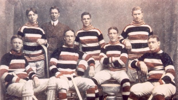
The Ottawa Silver Seven (1905), from TSN.ca
The silver stripe makes a visual connection to the Ottawa Silver Seven, which is what the Ottawa HC was referred to before they were the Senators. That’s a nice touch, but it seems at this point more like a happy accident than an intentional inclusion.

Hab-Nots

Again, don’t get me wrong, this is still a nice Habs jersey. But considering the jerseys that they wear on a regular basis, or even including their recent Winter Classic jerseys, they’ve set a very high bar for their jerseys, and “nice” just isn’t good enough.
It’s actually not too dissimilar to the jerseys they wore from 1938–41, aside from the stripes on the cuffs moving to the sleeves, and adding a silver outline on the numbers.
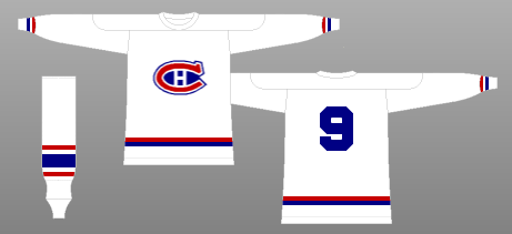
1938-41 Jerseys, from nhluniforms.com
As Canadiens jerseys go, 3 seasons is really not much time, comparable to the timespan of humanity’s existence within the age of the universe. Miniscule. And because the elements of Canadiens jerseys are so ingrained in hockey culture, not having the chest stripe or red shoulder yokes makes the jerseys aesthetically empty. Again, there’s not much going on that’s very interesting.
But, they’re elegant and simple jerseys. Like I said earlier, they’ll look good wearing them, but they’re also forgettable.
from NHL.com
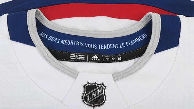
One really nice touch (or Easter Egg, if you will), is the inclusion of the text on the inside collar of the Habs jerseys, which reads: “Nos bras meurtris vous tendent le flambeau”, or in English, “To you from failing hands we throw the torch; be yours to hold it high.” It’s an excerpt from an iconic Canadian poem “In Flanders Fields” – often spoken in reference to Remembrance Day, the Canadian version of Veterans Day – and has been emblazoned on the Habs’ dressing room walls for decades.
Final Verdict
Basically, these jerseys were trying to look historic without being historical, and were trying to be a modern take without looking too-modern. They’re nice, simple and ultimately forgettable, which is really disappointing when you’re playing what is literally a once-in-a-century game.
Agree? Disagree? Let us know in the comments or join the conversation
on Twitter, Facebook and Instagram!


Will you do a ranking/breakdown of the olympic jerseys?
Yes, that’s coming up soon! Stay tuned!
I can’t believe how great the « What could have been » jerseys look… What a wasted opportunity.
Of the two jersey, I have to say I prefer the Sens one, which has at least something on it. Still, it would be great if they went with designs such as their Belleville affiliate for next year! I wonder if they would replace the « light-beige » with white, like Belleville did… Personally, I would prefer the light-beige version, but I’m not sure if there is some kind of rule which states that a team can’t wear a uniform that is not white on the road.
Yeah, I think there’s a rule like that, but for one-off games, they’ll bend it. They did that for the Wings/Leafs Winter Classic from a few years back, and it was fantastic!
Yes it was!
Also, I remember that the Bruins’ yellow alternate jersey was worn during home games, at a time when usually the home team wore white uniforms. A blue versus yellow game like this one would certainly look good : http://bit.ly/2zVw2af
I actually really like both of these, but I agree that they could have been more historically accurate. On the upside, if the Sens do switch’s to their throwbacks full time, this could be a good alternate jersey. By the way, Senators owner Eugene Melnyk said that the team will rebrand for the 2018-2019 season with the O as the primary mark.
That is fantastic news! Hadn’t heard that.
Did not hear of that either, great news!!
Are the alternate jersey coming back next year?
About a future Ottawa alternate jersey… would the Sens prefer going with a 2D centurion logo (the one from the late 90s, early 00s) on a red jersey? What about a red =O= jersey matching the template from the Heritage jerseys the Sens had in the last years?
Seem like they didn’t want to go full color both team. But why so much white ? so much space deserve a graffiti somewhere
[…] Breaking down the NHL 100 jerseys for the Montreal Canadiens and Ottawa Senators. [Hockey By Design] […]
[…] Breaking down the NHL 100 jerseys for the Montreal Canadiens and Ottawa Senators. [Hockey By Design] […]
[…] Breaking down the NHL 100 jerseys for the Montreal Canadiens and Ottawa Senators. [Hockey By Design] […]
[…] Breaking down the NHL 100 jerseys for the Montreal Canadiens and Ottawa Senators. [Hockey By Design] […]
[…] Breaking down the NHL 100 jerseys for the Montreal Canadiens and Ottawa Senators. [Hockey By Design] […]
[…] Breaking down the NHL 100 jerseys for the Montreal Canadiens and Ottawa Senators. [Hockey By Design] […]
[…] Breaking down the NHL 100 jerseys for the Montreal Canadiens and Ottawa Senators. [Hockey By Design] […]
[…] Breaking down the NHL 100 jerseys for the Montreal Canadiens and Ottawa Senators. [Hockey By Design] […]
[…] Breaking down the NHL 100 jerseys for the Montreal Canadiens and Ottawa Senators. [Hockey By Design] […]
[…] Breaking down the NHL 100 jerseys for the Montreal Canadiens and Ottawa Senators. [Hockey By Design] […]
[…] Breaking down the NHL 100 jerseys for the Montreal Canadiens and Ottawa Senators. [Hockey By Design] […]
[…] Breaking down the NHL 100 jerseys for the Montreal Canadiens and Ottawa Senators. [Hockey By Design] […]
[…] • More: HbD Masks: 2017 Winter Classic Masks • More: HbD Breakdown: NHL 100 Classic Jerseys […]
[…] take without looking too-modern. They’re nice, simple and ultimately forgettable. • More: HbD Breakdown: NHL100 Classic Jerseys • More: Worst to First Jerseys: Ottawa Senators The cummerbund jersey (and yes, I had to look […]
[…] approach to their look for the 2017 NHL100 Classic outdoor game. We here at Hockey By Design did a breakdown feature of this jersey when it debuted, and the sentiment remains the same: it’s clean, it’s sharp and the small […]
[…] More: HbD Breakdown: NHL100 Classic Jerseys • More: Worst to First Jerseys: Ottawa […]
[…] • More: HbD Breakdown: NHL100 Classic Jerseys […]
[…] approach to their look for the 2017 NHL100 Classic outdoor game. We here at Hockey By Design did a breakdown feature of this jersey when it debuted, and the sentiment remains the same: it’s clean, it’s sharp and the small […]