HbD Breakdown: Canadiens’ Winter Classic Jerseys
 by John van der Woude (all embedded images from canadiens.nhl.com)
On Saturday, for the first time since 1944, the Montreal Canadiens unveiled a completely new jersey concept that they’ll be wearing on New Year’s Day in the 2016 Winter Classic against Boston. To put that in perspective, probably some of your grandparents weren’t even born yet the last time the Habs made any significant changes to their jersey, or wore any other jersey.
You might remember the 2008-09 season where, to celebrate their centennial, they wore most of their pre-NHL jerseys over the course of the season, but these were (as much as possible) exact replicas, so technically, they weren’t new jersey concepts. So, that’s over 70 years of essentially wearing the exact same thing. They’re like the Steve Jobs of hockey.
But, it was worth the wait. Read more after the jump.
Heritage Winter Classic
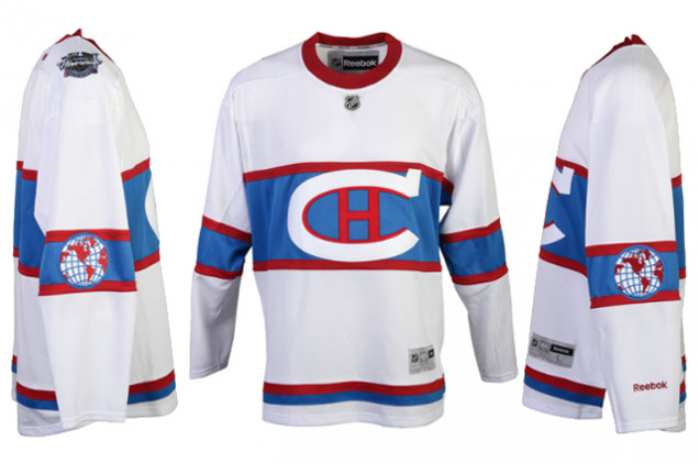 You just knew, given the history of the franchise as well as its complete reluctance to deviate from tradition in general, these jerseys would pay some homage to some jersey they already wore, if not another exact replica from a past jersey. Keep in mind that this is the team that wore their regular jerseys to the 2011 Heritage Classic against the Flames, and the 2003 Heritage Classic against the Oilers, despite both their opponents bringing out vintage designs. Personally, I wasn’t sure if they would do anything different this time around.
However, you could see evidence to the contrary. The summer’s WC announcement showed a logo not worn on a Habs jersey since 1924. And then the Habs Twitter account started releasing teasers of the jersey online, showing enough detail to conclude that (a) it was probably a white jersey and (b) it would be closely aligned to their 1922–25 jerseys. Since the Bruins are wearing close-replicas of their inaugural 1924–25 jerseys, it made sense.
The only issue is that the Habs didn’t wear white jerseys from 1922–25, only red ones. So, these are basically a mixing of those jerseys with their 1944–47 jerseys, the only time they wore a blue stripe across the chest of their white jerseys. Or, it’s logically what a white jersey would have looked like in 1922–25, if they had had one.
So it’s a little ironic that for the Winter Classic (and not the Heritage Classics) that they decided to design a new heritage-based jersey.
Not Quite Exact
The reason this jersey qualifies as a new concept is because of the distinct differences between the original 1922–25 jerseys and these. The first, the most obvious, and the one we’ve already discussed, is these are white instead of red. But there are others.
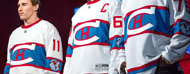 On the originals, the Habs’ logo spills outside the top and bottom of the stripe across the chest. The decision to keep the authenticity of the old jersey logo on these new jerseys (white ‘C’ with a red ‘H’) meant that, to work on a white jersey, the stripe would have to be widened to contain the entire logo within. If not, you get a white ‘C’ on a white background, which would basically turn the ‘C’ into negative space and the notch on the ‘C’ gets lost. So, the stripe is widened. Had to be done, and makes good sense from a design perspective.
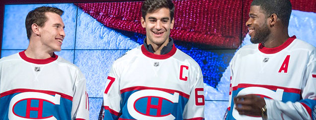 Another difference: the collar. Like the Bruins’ Winter Classic jersey, the Habs are using the crew neck collar. The originals (like the Bruins) were turtlenecks, and multi-coloured necks at that, with ‘bleu, blanc et rouge’ striping, drawing inspiration from the Chinese Striped-Necked Turtle, apparently. These new simple red crewnecks? Much better. Also, Plekanec lobbied against it. HE’S the guy on the team that wears the turtleneck. NOBODY ELSE DAMMIT!
Speaking of bleu, this isn’t your father’s bleu, blanc et rouge…or your grandfathers’, or perhaps your great-grandfathers’, or possibly not even your great-great-grandfathers’. The blue on this jersey is drawn from their inaugural 1909 jerseys, way back at the beginning on the NHA, the immediate predecessor to the NHL. This blue is much lighter, more of a sky blue than the dark royal blue they wear now.
Personally, I like it. It instantly adds to the historicity of the jersey and sets it apart from their current jerseys in a meaningful way. It’s also a nice way to pay homage to your origins, especially when your colours have changed since…oh…before the NHL existed.
World, but not ‘Champions’
Another change is the location of the logo on the jersey. These jerseys are meant to specifically pay homage to the 1924–25 Habs jerseys, the same season the recent Bruins’ WC jerseys are based on. That season, however, the Habs placed their primary logo on the sleeves of the jersey, and on the front wore a globe with a banner saying ‘Champions’ near the bottom, to commemorate their first Stanley Cup championship in the NHL (they won once in the NHA).
(Aside: It might have been their second NHL Cup championship, if not for the flu. The 1919 Finals, against the Seattle Metropolitans, was cancelled mid-way through the series, which was tied at 2 games each in a best-of-5 series, because of the influenza epidemic. It’s true, check it out.)
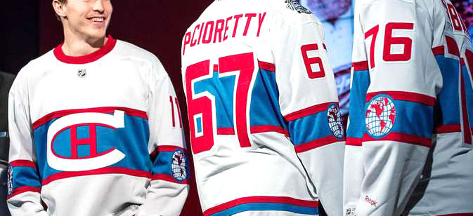 On these WC jersey, however, the globe and logo switch places, with a close replica of the globe on the sleeves of the jerseys, but without the ‘Champions’ banner on it. Which is unfortunate, because that’s just incredibly funny. Nothing gives your opponent the middle finger more than wearing right on your jersey what is essentially a sign that says “we’re better than you and we know it.” It’s like Chicago replacing their crest for this season with images of them celebrating with the Cup.
With 24 Cups, 11 better than second place Toronto, they still deserve to wear that globe. And it’s a great way to pay homage to both that specific season and their first NHL championship. Plus, it’s incredibly unique to the franchise and the league, and at the same time it fits with today’s alternate-logo-patch-heavy jerseys.
Bad (Good) Logo
 The logo, to be honest, is a much lesser version than the current Canadiens’ logo. The ‘C’ is thinner, looking flimsy and weak without the outlines we know today. The little notch at the top-right is way over-exaggerated and draws way too much attention to it (and away from the rest of the logo).
The ‘H’, same thing – flimsy and weak.
The only really positive thing is that this logo more clearly contains two ‘C’s, since the team is technically the “Club de Hockey Canadien” (CHC).
But basically, it’s a weird logo that shouldn’t work at all. But in this instance, it does. And it works incredibly well. It’s the main element that looks historic on a jersey that’s otherwise still incredibly similar to the general design (striping, colours, etc) of what they wear today. It was a smart, and necessary, design decision.
The Disappointments
Not everything is perfect with the jersey though. The first mis-step was the typography.
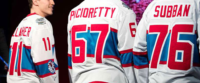 The numbers they used are different than the standard numbers they wear now. These ones are a little more stylized and look much more modern than they should. Don’t get me wrong, this style of numbering would look fantastic on a modern jersey, but it doesn’t feel historic enough to work with these jerseys. And the typeface used on the nameplates is very similar, but not quite the same as the numbers, using thinner characters. So, it’s a small inconsistency that I noticed right away and annoyed me. Most wouldn’t notice, so it’s a small disappointment.
But like the Bruins’ jerseys, the numbers are going to have historic stitching on them, which is a very cool detail.
Second disappointment, with the Bruins wearing black, the Habs could’ve worn red jerseys instead on white. There’s enough splashes of colour on the jerseys (thick yellow stripes on the Bruins, and the thicker blue stripe with red outlines on these) that it won’t look as aesthetically-dull like…say…the Sharks playing the Kings, but it’s a missed opportunity at the same time. Again, a small disappointment, but it would have been nice to see.
Final Verdict
A couple small mis-steps don’t take away from what is a fantastic Winter Classic jersey: historical, well-designed, and a new concept from what is by-far the most design-consistent and iconic franchise in hockey. I might have to get one for myself and, as always, I’m looking forward to watching on January 1st.
Agree? Disagree? Let us know in the comments below, or join the conversation on Twitter!


The hockey gods have blessed us.
#gohabsgo
Great breakdown, as always. I agree about the crest. It does look “off” and delightfully so. Its as if Frank Selke’s aunt knew a lady who offered to sew the logos by hand onto the sweaters at a discount. I was also hoping for red, but they are probably sitting on a few designs for their day in the sun when they host it sometime soon (pun intended). Oh, and the subtle FU to the world (and the Bruins in particular) with the globe is perfection.
Wonder which way they go with pants. I hope both teams use brown which would be correct for the “time” they are commemorating. If B’s go black, its going to given their uni’s a practice feel. The Habs could use that lighter blue and it would be beautiful, but I am still hoping they go all out. Any idea?
[…] Winter Classic Sweaters Review by Hockey by Design – Habs Bruins […]
[…] Full Analysis: HbD Breakdown: Canadiens’ Winter Classic Jerseys […]
[…] More: HbD Interviews: Dave Gunnarsson More: HbD Breakdown: Canadiens’ Winter Classic Jerseys […]
[…] […]
[…] • More: HbD Breakdown: Canadiens’ Winter Classic Jerseys […]
[…] • More: HbD Breakdown: Canadiens’ 2016 Winter Classic Jerseys […]