Worst to First Jerseys: Nashville Predators
As we go through the 2019-20 season, we’ll be updating all of the Worst to First Jersey posts every Monday, as almost all the teams in the league have unveiled new jerseys since their original posts. We’ll start with the ones most needing updating and work our way through the league. Today, it’s time for the Nashville Predators to get updated.
Also, a huge thanks to SportsLogos.net and NHLUniforms.com for most of the jersey images and references.
I’ve always respected the Predators for being one of the more innovative teams with the looks of their jerseys. They’ve always included some non-traditional design elements, which is fitting for playing in a non-traditional hockey market, which has built them a solid library of jerseys. That being said, some are definitely better than others.
Here’s how this works: I’ll count down, from worst to first, all the jerseys the Preds have ever worn. Homes and aways will be lumped into the same category (so, more of a jersey “era”) and I won’t worry about small changes (like slightly changed positions of piping for example). Third jerseys will stand on their own. And I’m focusing on the jerseys only, not the entire uniform. For the Predators, there’s 7 different jerseys/eras. And we’ll start with the worst one.
7. 2001–07 Third Jersey
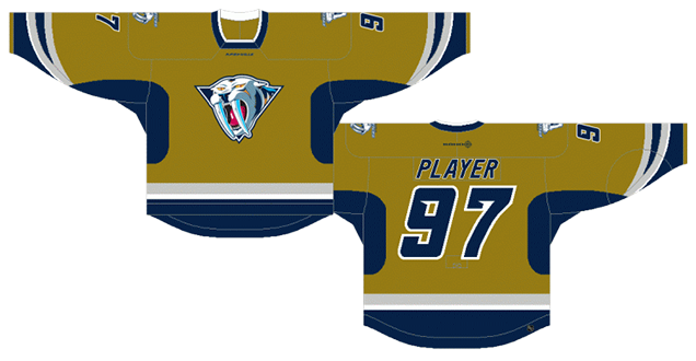
Embracing a French’s-mustard colour scheme is one thing. Embracing a dijon mustard one – the kind that’s super grainy and looks like vomit – is another thing altogether. Especially when it doesn’t even match the colours in the logo. Like I said in the intro, I respect the Preds for being innovative with the jersey designs, but puke doesn’t look good on anybody…unless it’s rainbow-coloured.
But aside from the colour, there’s just so many other odd choices here. First, there’s the alternate logo crest that looks more like a cheap sabre-toothed tiger clip art image from MS Word XP than any sort of well-conceived logo, looking comically non-ferocious. How can anything with teeth that big look less intimidating?
Another odd choice was the neck line. It’s not exactly a crew neck, it’s definitely not a v-neck, but it’s a weird combination of the two that I’ve never really seen before. In game play, it looks like a old-time sweater design, but at the same time, not quite right. Again, I respect the Preds’ innovative nature, but as Samsung learned a few years back, not all innovation is successful.
And then there’s the sleeve stripes/patterns. It’s obvious enough that they were mimicking the teeth from the logo on there, but doubling up the grey stripes to form that tooth shape isn’t a good idea, as it creates way too many layers/stripes within a small amount of room, and is inconsistent with the rest of the jersey’s striping around the waist. Plus, in game play, it’s difficult to see the tooth shape anyway, so it’s an element that just never worked.
And then there’s the pit stains. Yeah, not a good look. Like, ever.
Another element is the mesh texture on the jersey themselves. Not quite the same as what your uncle used to wear in the ’80s, but not that far off. There’s a navy blue layer underneath the mesh mustard layer, which makes the gold appear darker than it already is at a distance, which is not helpful. It’s an interesting innovation to try, but with the colours being used, it just doesn’t help the overall look of the jersey at all.
This whole jersey is a classic case of trying to do too much innovating and losing sight of the overall design. I can’t say enough how much I respect the Preds for trying to push jersey design forward, but this jersey becomes a shitmix of different elements thrown together to create something resembling puke.
Jersey Recommendation: #29 Vokoun. Goalies are always kind of strange creatures: quirky, unique within their sport, cathartic. So, a goalie is a perfect fit for this jersey, and Vokoun was the best goalie the Predators had in the franchise’s first decade, while they wore these jerseys. And, if you know the medical definition of catharsis, it’s especially fitting for the jersey’s colour.
6. 1998–2007 Home & Away Jerseys
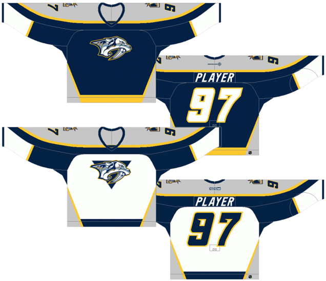
Nashville’s original jerseys come in the second-last spot, and they’re a perfect specimen of late-’90s extravagance and experimentation with hockey jersey design that doesn’t take it to the extremes that some other teams did. But most of those extremes were for third jerseys, while Nashville worked it into their regular jersey set. Some of it works. Some of it doesn’t.
The good stuff: The colours and general styling are consistent, with no unnecessary gradients or flashy elements. The striping is generally characterized by consistent thin gold stripes separating different chunks of colour. And for a jersey that’s carrying four different colours simultaneously (grey, navy blue, white and gold), they actually balance each other out amazingly well.
The bad stuff: there’s just too many elements and angles going on here. From the curved shoulder yokes that meet awkwardly at a point at the elbows, to the side triangles blocking the thick stripe along the bottom, to the strange patches of white on the bottom of the sleeves on the blue jerseys, to the strange inclusion of navy blues in the pits on the white jerseys, there’s just too much going on.
To top it off, the grey areas of the jersey used a material that made it shimmer like it was metallic. But instead of the looking like the silver (which I’m assuming is what they were going for), it looked like tin foil.
These jersey worked better within the era of ’90s design, but now they look like a dated overdone mess. It’s best to leave them in the past.
Jersey Recommendation: #44 Timonen. Timonen’s career with the Predators lasted exactly as long as these jerseys did. His rookies year was the Preds’ inaugural season in 1998-99, and he left as captain of the team after the 2006-07 season. A perfect fit! Get it in the slightly less-busy navy blues.

5. 2007–11 Home & Away Jerseys
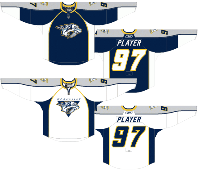
When the NHL brought in the new Reebok Edge jerseys in 2007, Nashville was one of the teams that re-worked their jerseys to fit the new streamlined design without making any large changes. But, they did make some small changes which helped the overall design of the jerseys immensely.
Essentially, they simplified things. Gone is the thick stripe along the bottom. Gone are the triangle shapes along the sides and in the shoulder yokes. Gone is the tin foil grey feature. Gone are (some of) the gold outlines.
What’s left is much more refined and unquestionably looks better than their previous jerseys…but at a cost. There’s very little gold on these jerseys, being left predominantly in the collar, a thin outline around the side stripes (stretching up to the collar on the fronts), and an outline around the numbers. Grey has unquestionably overtaken gold as the Predators’ secondary colour with these new jerseys.
Nashville being Nashville, they were also innovative and non-traditional (along with Colorado and Edmonton, among others) to accentuate the new hemlines on the front of the jersey by outlining it in gold and eliminating any stripes along the bottom of the jersey, generally unheard-of in modern hockey jersey design before 2007. With anything different, some denounced it, accusing them of looking like practice jerseys (although with the side stripes and shoulder yokes, it was less of an issue for Nashville). There was also the awkwardness of the stripes running right through the captaincy letters.
So while there are still issues with the jersey, there’s no question these were a simpler, more refined, and superior version of their inaugural jerseys. And while still innovative in some ways, the loss of the gold hurts.
Jersey Recommendation: #11 Legwand. If there’s anyone that you could call Mr Predator, it would probably be David Legwand, spending almost his entire career with the Predators, including the entire lifetime of these jerseys. Getting it in the slightly more-refined whites.
4. 2017–present Home & Away Jerseys
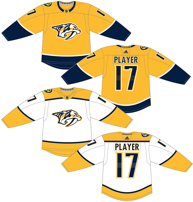
When Adidas unveiled the new Adizero jersey in 2017, these were the biggest disappointment of the entire league. These were also the first ones to be leaked out, getting me worried that it was going to serve as a template of sorts for the rest of the league, but luckily, most teams just stuck with what they already had.
Nashville has always been a little bit experimental with their jerseys, some not so good (as we’ve already seen on this list), some really good (which we’ll talk about soon). These are experimental only in their minimalism, which strips away any character and individuality that Predators’ jerseys have become known for, replaced only with a love for the gold.
The gold home jerseys are essentially practice jerseys with some navy blue at the bottom. Boring, devoid of personality, too much gold. Puck Daddy had an article about these jerseys in which Adidas stated the jerseys were “accentuating and celebrating what [the Preds] are all about”. We’ve all seen (especially in their semi-recent trip to the Cup Finals) what Nashville and the Preds are all about: energy, excitement, charisma, dynamism, celebration. And none of that exists here.
The only touch of charisma is the keyboard on the inside of the collar (which nobody sees) and the six-string element within the numbers on the back, which suddenly seems out-of-place with the rest of the über-minimalist jerseys, as the element isn’t close to being repeated anywhere.
All that being said, the Predators wanted to own the gold, and they certainly did that with these jerseys. And outside of the context of the Predators’ jersey library and the city of Nashville in general, these are fine jerseys. Bland? Nondescript? Awkwardly minimal? Absolutely. But there’s nothing really offensive about them at all. Which gets them smack dab in the middle of this list.
Of note, the jerseys (especially the gold one) takes some design cues from the Tennessee state flag if you turned in 90º clockwise. It’s a nice thought, but a good flag does not necessarily a good jersey make.
Jersey Recommendation: #59 Josi. The only person to wear the “C” on this jersey so far, he’s unquestionably the leader of the team and, for a franchise that has had defence as a major strength for years now, he may be one of the best. Get it in gold.

3. 2009–11 Third Jerseys
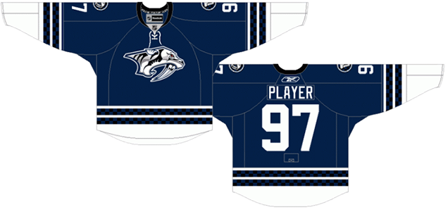
While it may seem odd ranking these jerseys as the second-best considering I bemoaned the loss of some gold in the previous jerseys discussed – and these are the only Predators’ jerseys to have no gold on them whatsoever (including removing the bits of gold from the logo) – there’s just so much more to like about these that I can’t help but rank them this high. It is, essentially, the Predator’s innovative homage to traditional jersey design.
The most obvious innovative aspect of these jerseys is the checkerboard design in the sleeve and waist stripes, but they’re handled in some a subtle and discreet way, alternating between navy blue and black, that they never become a cloyingly obnoxious feature, but something the puts a unique stamp on a traditional jersey.
The black is used again in this alternate version of their primary logo, as well as in the collar, but otherwise, this jersey embraces the navy blue completely, making it easily the most uni-chromatic jersey in the Predators’ library (also, their only one with collar laces).
And, yeah, it works really well. The balance between the navy blue and white is perfect. The double-checkered-stripe pattern on the sleeves and waist is consistent and provides the much-needed burst of contrast on a jersey that has very little other elements on it. Again, it’s just really well-balanced. And uni-chromatic jerseys go, it’s difficult to get much better than that while including just a little bit of innovative jersey design. And as much as I love them, they’re just not interesting or innovative enough to place any higher.
They also had a road white version of the jersey that was worn by the players for a public event and then auctioned off afterwards, but never made it onto the ice.
Jersey Recommendation: #6 Weber. It would just seem strange to me to have a list for the Predators and not recommend a Weber jersey at some point. But that’s just me.
2. 2020 Winter Classic Jersey
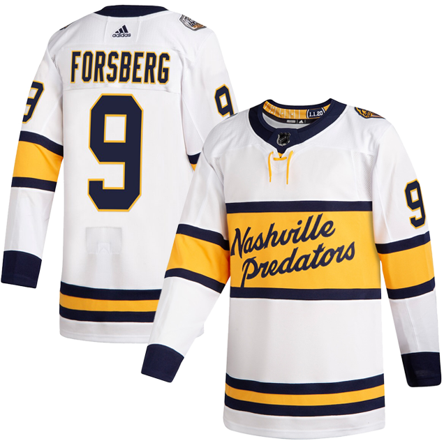
For their first foray into the Winter Classic, Nashville dug into the archives of their city’s hockey history and found themselves a template courtesy of the Dixie Flyers, a team that, like the Preds, sported gold sweaters but with a large purple stripe across the chest enclosing a script word mark. Now if you ask me, this seemed like a golden (pun intended) opportunity for a color vs. color game, yet the Preds went with white, which while expected, makes these jerseys slightly duller than the originals.
The lettering style here is a great modern adaptation of the original Dixie Flyers script––majorly cleaned up and streamlined––however the challenge lies in the number of characters in “Nashville Predators” versus “Dixie Flyers.” Given how long the name is, Adidas actually did a fine job making it work as well as it can in the space, but the biggest complaint is this itty bitty overlap between the bottom of the P and the navy stripe. This small overlap looks more like a mistake than a deliberate design choice, which cheapens the design a bit.
A really cool element is the new alternate logo on the shoulder. The team took the Predator head and created a fauxback version that drew inspiration from 1950s letterman-style patches. The simplified style and posturing of the cat is very high school-esque (in the best possible way), and the execution with embroidered felt further supports the letterman aesthetic. The collegiate style continues onto the back of the jersey where the designers opted for bold, varsity-style typography on the name plates.
Is this a bad design? Definitely not, but it’s a little bit underwhelming given what the Preds and Adidas were working with. It’s a golden (again, pun intended) opportunity for a color vs. color match up that never was, and while the details like the shoulder patch and guitar frets inside the collar are really nice, it’s an overall solid, but not stellar, sweater.
Jersey Recommendation: #95 Duchene. The Preds lost the Winter Classic to Dallas, but Duchene was a bright spot, factoring in on each of Nashville’s goal with a goal and assist, along with being named the third star.
1. 2011–17 Home & Away Jerseys
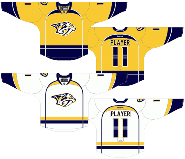
The weakest part of all the Predators’ jersey had always been their logo, with the sabre-toothed-whatever-it-is having too many shadows/highlights, too many colours, and sometimes placed inside a triangle, sometimes not, and sometimes with Nashville written over top. Or it was a bad clip-art alternate. Generally, it was a bad logo that was treated badly on the jersey.
When they refined their logo in 2011, finally dropping the grey from their branding palette and focusing on navy blue and gold, everything changed for the team from a visual branding perspective…for the better.
• More: BTLNHL #18: Nashville Predators
These jerseys are the culmination of a process for a new franchise to slowly identity and build its visual brand. It’s a process that takes a lot of time, and it took 13 years for the Predators to really hit their stride. Unpopular opinion time…these were among the best jersey sets in the league. They’re unique, innovative, a great mixture of traditional and contemporary, and a great balance between minimalist and detailed.
First, the innovations. Nashville is taking advantage of being the first team since the 1966-67 Bruins to have a gold jersey as their dark home jersey, owning the gold and the fans have fully embraced it. So, it gives a unique colour to build their identity around (which is much better than the overly common navy blue, or the grey).
They’ve fully embraced the hemlines of the new jersey designs, with the thin stripe going up the sides to the collar, but have modified them so they actually frame the logo/nameplate-numbers in a less obtrusive way than before, and it doesn’t cause any awkward issues with the captaincy markers. Only team in the league to do anything like this. And I don’t mind it at all.
The patches of colour at the tops of those arches are a little bit strange, but they provide some balance of the colours throughout the jerseys, so I can understand their inclusion.
Nashville was also one of the few teams to have different striping patterns on their home and away jerseys, but both are minimal and consistent throughout the jersey, and rooted in traditional jersey design. But there is still a slight consistency between the jerseys, with a thin line separating two stripes, and on the golds, the bottom waist stripe just goes all the way to the bottom of the jersey. But, because of the blue pants they wear, that detail doesn’t create enough visual separation between the jersey and the shorts. For that reason, I’m more inclined towards the road whites. But still, the striping is a perfect balance between being different and interesting, but still consistent
The detail of 6 guitar strings going across the numbers is fantastic as well. It’s an extremely subtle but unique detail that symbolically connects the jersey to the team’s city. Lots of teams use their logos, alternate logos and shoulder patches to connect to their respective city, but through a detail on the jersey itself? I can’t think of another team who does that.
Oh, and their secondary logo/shoulder patch was and still is one of the best in the league.
So, negatives? There’s not much. Everything is nicely balanced: a great combination of old and new, a great mix of a more minimized colour brand, a better logo, and great details. I’m not sold on the gold helmets with the gold jerseys, but the jersey takes the top spot on this list, and it wasn’t really even that close.
Jersey Recommendation: #35 Rinne. For a team that has a pretty solid stable of goalers over the course of the franchise, these hasn’t been any better than Rinne. While his play has declined in recent years (since getting rid of these jerseys?…), he was still an elite goalie during his peak era and guided the Predators to the Cup Finals. Get it in the slightly-better road whites.
Agree? Disagree? Let us know in the comments below or join the conversation on Twitter, Facebook, or Instagram!


[…] • Rating the Nashville Predators’ jersey designs, from worst to greatest. Sure, mustard ranked low on the listing. (Hockey By Design) […]
Yeah, mustard jerseys weren’t reasl popular in Jacksonville for the Jags either.
[…] The Nashville Predators have had some … interesting jerseys. […]
[…] The Nashville Predators have had some … interesting jerseys. […]
[…] The Nashville Predators have had some … interesting jerseys. […]
[…] The Nashville Predators have had some … interesting jerseys. […]
[…] The Nashville Predators have had some … interesting jerseys. […]
[…] The Nashville Predators have had some … interesting jerseys. […]
[…] The Nashville Predators have had some … interesting jerseys. […]
[…] The Nashville Predators have had some … interesting jerseys. […]
[…] The Nashville Predators have had some … interesting jerseys. […]
[…] The Nashville Predators have had some … interesting jerseys. […]
[…] The Nashville Predators have had some … interesting jerseys. […]
[…] The Nashville Predators have had some … interesting jerseys. […]
[…] The Nashville Predators have had some … interesting jerseys. […]
[…] The Nashville Predators have had some … attention-grabbing jerseys. […]
you have 1 and 6 reversed
[…] • More: BTLNHL #18: Nashville Predators• More: Worst to First Jerseys: Nashville Predators […]
[…] • More: BTLNHL #18: Nashville Predators• More: Worst to First Jerseys: Nashville Predators […]
Nice post. I learn something much more difficult on different article sites everyday. 야한동영상
[…] • More: Worst to First Jerseys: Nashville Predators […]
Thank you so much for sharing this information, this will surely help me in my work and therefore, I would like to tell you that very few people can write in a manner where the reader understands just by reading the article once.
사설경마
I really like looking at and I believe this website got some really useful stuff on it! 카지노사이트프로
I know this site presents quality based content and other information,
is there any other website which gives these things in quality? 바카라사이트
Very nice article. I certainly love this website. 바카라사이트
Wonderful web site. Plenty of useful info here. I am sending it to several pals ans additionally sharing. 카지노