
The World Cup of Hockey Jersey Countdown (Part 2)
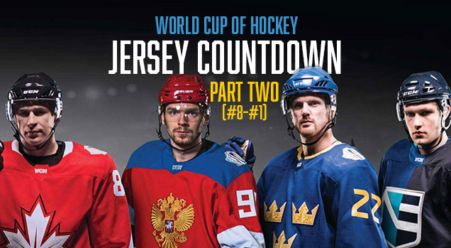 The final series of the World Cup of Hockey starts tonight, and we’ve gone through the bottom half of the jerseys worn in this tournament, so now we’ll get into the better half.
• More: World Cup of Hockey Jersey Countdown (Part 1)
Don’t forget, we went into them in greater detail back when they were first revealed (see the links below), so make sure to check that out for a fuller analysis of the jerseys.
• More: HbD Breakdown: WCoH Jerseys – North America
• More: HbD Breakdown: WCoH Jerseys – Scandinavia
• More: HbD Breakdown: WCoH Jerseys – Europe
Some of the jerseys looked good in concept but failed to impress on the ice…and vice versa. And since there’s a decent amount of jerseys (16 in total), we’ve split it up into two posts. Let’s keep going where we ended off last time…
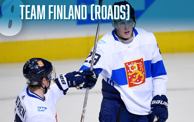 We’re still in that middle batch of jerseys where arguments could easily be made to move these ones further up or further down the list. Team Finland’s home blue jerseys are lumped in there, and so are these, their road whites.
Like the home jerseys, the main feature on them is a solid bar going across the chest and sleeves. And like the home jerseys, they walk that fine line between minimalist and not being boring.
So, what makes these better? I’m personally a bigger fan of the somewhat complicated coat-of-arms logo crest being bigger (so you can actually see the details of it), and it adds a punch of colour to a predominantly white jersey. It works better than just the “Suomi” text.

Another team with both their white and colour jerseys lumped into this middle pile, Russia’s whites get the edge over their home reds.
While it’s definitely a much less adventurous and unique jersey than their 2014 Sochi whites, these are excellent in their own right. And they’re very consistent in design with their red jerseys, but with the red and white areas swapping places.
So while, like their red jerseys, these are not particularly innovative, they still look good. These are ranked higher since, I admit, I’m prone to appreciate well-designed road white jerseys in general over the home jerseys. They just look slightly classier on the ice when there a good amount of colour splashed on them, as these have. And the crest stands out a little better on these as well.

 Team Canada makes their first appearance on this list. And they’re becoming the classic Star Trek movies of hockey jerseys, where only every other one is any good.
The Canadian Vancouver 2010 jerseys were beautiful. Their Sochi 2014 follow-ups were cheap-looking pieces of dollar store crap. These ones? They’ve righted the ship again.
Like Finland, they’re created jerseys that are simple but not boring. And drawing from their 1972 Summit Series jerseys as inspiration for the design on the sleeves is never a bad decision. Easily the best sleeves in the tournament. Is there such a thing as a Best Sleeve award? There should be.
But these don’t reach the iconic level that the Summit Series jerseys do, because there’s nothing really innovative or incredibly interesting about these jerseys aside from the sleeves. But, on the flipside of that, it blends really well with the Adidas tri-stripe. Unfortunately, the worst part of the jersey is the logo, as the black stripe looks out of place.
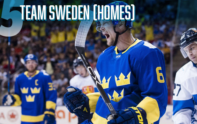 Now we’re moving into the upper-echelon of the jerseys in the tournament, and what should come as no surprise, Team Sweden makes their first appearance here.
I can’t fully describe it, but there’s something about their particular shades of yellow and blue that works so well, especially in combination with each other. Elegant and totally unique. When there are so many countries that use red, white and/or blue, the vibrant yellow just stands out.
The design is simple but not boring (and that’s helped in large part of what is probably the most interesting and iconic logo in the tournament), contemporary and classic at the same time. Innovative? Not particularly, but sometimes when things work, you just go with it.
It’s only downfall is that the yellow band along the bottom gets broken up by the Adidas tri-stripe. But, you gotta have a yellow stripe there is you’re going to wear blue pants with it. I blame this on Adidas more than Sweden.
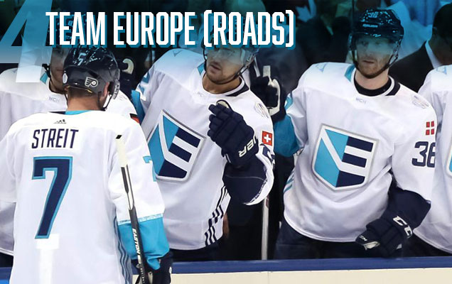 Surprised? So am I. Everything that went so wrong with Europe’s home tri-blue-toned white jerseys gets eliminated here in favour of something far simpler, but with the same basic concept.
The cuffs on the sleeves use the different shades of blue/teal drawn used on the logo, as do the Adidas stripes and collar.
The inclusion of the lines of text (of the European countries represented on the team) above the cuffs is actually visible on these jerseys and a very classy and subtle design element. And the logo, which is one of the better ones in this tournament, is actually allowed to take centre stage.
This is one of those jerseys that was more striking in practice than it was on paper. Originally, we said:
The road white jersey, while not quite as offensive, looks odd with literally one side of the jersey’s details in navy and the other in teal. Integrating the colors a bit more would’ve helped create some balance in the design and probably help enforce the message of unity more too.
It’s still true, as alternating the colours a bit (switch the colours on the sleeves, but not the collar, for instance), might have helped the split-personality effect, but damn, they looked clean, elegant and intense on the ice.
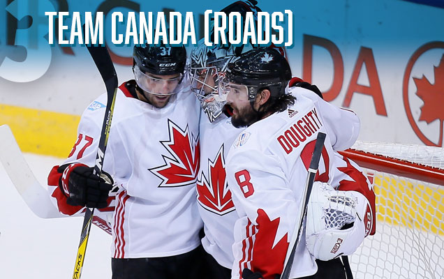 Team Canada returns, and you can pretty much repeat what was said about their home red jerseys above, as they’re the exact same design, but with the red and white reversed.
Great sleeves. Summit Series-inspired. Simple but not boring. Works well with the Adidas tri-stripe. But not particularly iconic.
These are higher on the list because the black outline on the logo works way better on the white jerseys, and the white just seems more memorable. Not sure why though.

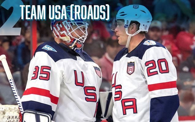 Originally, we liked the Americans’ blue home jerseys more than these white ones, but on the ice, these looked incredibly sharp.
The striping, while not considerably complex, is still more interesting and iconic-looking than their blue jersey’s counterparts. The modernized yet old-school aesthetics of the diagonal “USA” across the chest is a throwback to their classic hockey jerseys.
What wasn’t originally unveiled was the stars-and-stripes crest they wore over their hearts, a fitting inclusion to a jersey that just needed a little extra something. Not to mention the great integration of the captain and alternate captain markers within them.
Modern and classic. Simple and interesting. Innovative and iconic. The white notch in the collar is still weird, but they turned out to be better jerseys than originally expected.
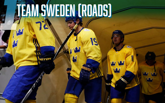 Tre Kronor arrives again, this time at the top of the list.
What I said about the uniqueness and intensity of that yellow for their home blue jerseys is just amplified here. No other team can pull off the full yellow jersey like Sweden does. And again, while there’s nothing particularly innovative here (aside from the beautiful and excellently subtle details within the logo), sometimes you don’t need to fix what isn’t broken.
The simplicity of the jersey works because of the uniqueness and brashness of the yellow. The Adidas tri-stripe actually works far better on this jersey because of the removal of the bottom stripe. And even the typography on the jersey is a little more contemporary and interesting than most in the tournament.
No surprise that these jerseys take top spot. I would’ve loved to have seen these play again the Canadian red jerseys in the final series, but Team Europe’s whites will be a decent consolation prize.
Agree? Disagree? Let us know in the comments or join the conversation on Twitter and Facebook! And don’t forget, we’re now on Instagram too.
For Part 1 (Jerseys #16–#9), click here!


[…] • More: World Cup of Hockey Jersey Countdown (Part Two) […]