HbD News: NHL Announces All-Star Jerseys
Friday afternoon is well-known as the perfect time to make an announcement that you’re not proud of and/or want to disappear very quickly. The NHL did exactly that last week when they released what the All-Stars will be wearing in Columbus on January 25th, which doesn’t necessarily seem coincidental. I can understand and appreciate what the League has been trying to do with both these and the Stadium Series jerseys: create something a little more innovative and unique to jersey design. But, it continually feels like Paula Adbul’s relationship with animated cats: two steps forward, two steps back.
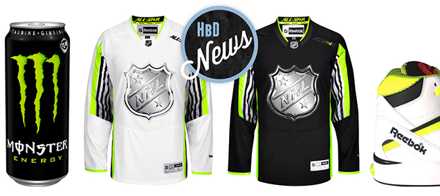
Speaking of the ’90s, these jerseys bare a canny resemblance with the clothing of MC Hammer, neon fanny packs, Reebok Pump shoes, and Hypercolor shirts. But everything old is new again, and 1995 is so 2015 apparently. Just look at these two cans of Monster Energy Drinks, with Toews’ and Kane’s faces painted on them. Black, white and neon. And chrome. Yikes. Let’s break this down…
Chromed-Out Logo
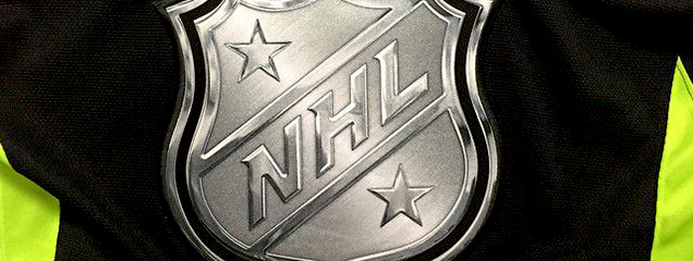 Again, the NHL brings out a fake chrome logo for these jerseys, like what 6 of the 7 teams that participated in last season’s Stadium Series jerseys wore (and good on New Jersey for not participating in that). Not only is it about 5 years behind all the current design trends, but it’s just completely unnecessary. The jerseys look better with just a regular old NHL logo on there (which already have a fake chrome effect on it). A like bit of the chrome effect can give more depth and movement to a logo, which can be effective for sports or automobile logos, but having the extremely exaggerated fake chrome is a bad attempt to create something cool, and it fails. Faux leather, faux suede, faux fur, faux anything, just looks cheap. And the chrome logos cheapen the logo, the jersey, and the league.
Related Reading: HbD News: Stadium Series, All Chromed-Up
Neon Accent Colour
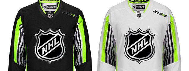 The addition of neon is what gives these jerseys that ’90s flair. The black jerseys remind me of another horrible design that came from the bowels of the NHL offices: the Black Ice jerseys. Those jerseys (which, if you didn’t know, were actually regular jerseys rolled around in the leftover ashes of a campfire and then coloured with Mr Sketch markers) were truly awful. They were something meant to counter-balance the sudden explosion of pink team jerseys for, you know, ladies. Because all ladies apparently like pink. Sexist or not, they were popular, so they thought a black version might be popular with the, you know, men. Because all men apparently like black. Black, dark grey and neon. Not too far off from these jerseys. Especially considering how they blacked-out the All-Star logo itself.
That being said, I’m not against the neon at all. It stands out, it’s trying something relatively new, and let’s face it, neon is back in fashion again. And these jerseys are only going to be used once, so it’s not like they’ll be going out-of-style because they’ll never be worn again after the 25th. And when you’re working with the NHL logo, which is monochromatic, it’s a good way to add some colour in there. But the way it’s applied is the big issue.
Related Reading: Black Ice Jerseys Suck
Striping
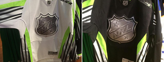 What. The. Hell. To me, this is hands-down the worst aspect of the jerseys. I’m not sure the purpose or thinking behind having those alternating black/white stripes going up and the sides and then half-way down the inside of the arms (breaking only for the pits), but it does a couple things.
One, it grabs attention. It’s the area of each jersey where there’s the most contrast and patterns, which automatically draws in the human eye (because science!). The problem is, why are the jersey designers wanting people to focus on the players’ armpits? Is it too draw attention away from the chromed logo? Because that I can understand. Having the neon yellow at the edges of this high-contrast pattern doesn’t help lessen the the attention it’s getting at all.
Two, it makes the design of the jersey incredibly awkward, with the striping pattern just ending the elbows for no real reason. Yes, there’s a hemline there, but when we look at jerseys, we don’t look at the hemlines, and the hemlines are practically invisible from a distance, so you’re either (a) making the pattern make no sense or (b) trying to draw attention to the hemline. Neither is good jersey design.
Because it’s a relatively busy striping pattern on the side, the rest of the jersey is kept relatively simple. The neon is given a very thin stripe along the cuffs and the collar (and to outline the numbers). It’s necessary, but it doesn’t do anything to draw attention away from the striping on the side, so the jersey almost needs something else to balance it. It looks too plain and too busy at the same time.
“All-Star”
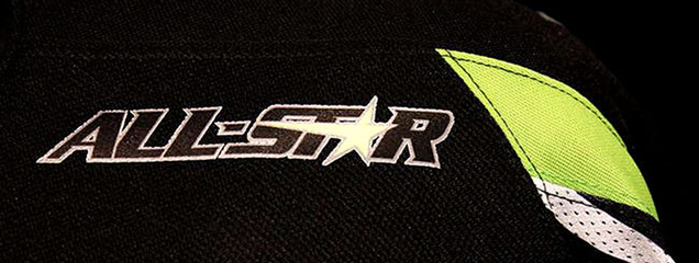 Removing any Conference specification on the jerseys (Western vs Eastern, or Wales vs Campbell) is not a new thing for the All-Star Game, but adding in “All-Star” is. In previous years, it’s always been inferred by the inclusion of stars (or many, many stars) on the jerseys. That’s also already been included here with stars added to the NHL logo. So, why the “All-Star” added awkwardly right below the hemline of the shoulder yoke? Again, no idea. I guess, unlike Dr. Seuss, subtlety is not this jersey’s strong suit.
And then on the back jersey, they left the “All-Star” text black with white lettering, which it another decision that doesn’t make much sense. Could the NHL really not afford to create a new All-Star patch that had white lettering instead? Exhibit A for the next lockout at the end of this CBA?
Marketing
 After all this, here’s the big revelation: these jerseys are not being marketed to us, the hockey fans, the ones who will watch the game (or at least somewhat pay attention to it, depending on your view of All-Star games) regardless of what they wear. The jersey was designed with the non-hockey fan in mind: the football fans who are about to have the NFL season come to a close, the NASCAR fans who don’t like basketball and want a winter sport to watch, etc. It’s something unique, something over-the-top, something meant to grab attention and make non-hockey fans think about how cool hockey can look. And it’s meant to have these people want to buy a jersey.
In an effort to expand and grow the game beyond the rabid fandom that already exists (you and me), these jerseys – and the Stadium Series jerseys for that matter – are attempts to do exactly that. My guess is they’ve done heavy research into the design, with focus groups and researching other sports (like in the image above), and determined this will appeal to that market. These jerseys aren’t for us, it’s for them.
Sigh. But that doesn’t mean we still can express our displeasure about them.
Agree? Disagree? Let us know in the comments below.




Teows looks like he died a little inside when they made him put on that jersey.
[…] Related Reading: HbD News: NHL Announces All-Star Jerseys […]
[…] Related Reading: Top 5: Worst NHL All-Star Jerseys Related Reading: HbD News: NHL Announces All-Star Jerseys […]