
Top 5: Pekka Rinne Jerseys

As the dust settles on the off-season and the free agency-induced game of NHL goaltender musical chairs, there’s a set of pads over in Nashville that won’t return to the Predators locker room next season. Preds goalie Pekke Rinne announced his retirement after an illustrious 13-year career between the pipes for Nashville. Since taking over the starter role in ‘08-’09, Rinne racked up the most wins and shutouts in franchise history, won the Vezina Trophy in ‘17-’18, was a four-time All-Star and became the all-time winningest Finnish-born NHL goalie. And, oh yeah, he also scored a goal last season too. Quite a resume, and he did it all in the gold and navy of the Nashville Predators. So which one of Rinne’s jerseys will land at number one? Find out after the jump.
Rinne has been along for the ride as Nashville has slowly evolved their brand over the years. This evolution has been a case study in addition by subtraction; they’ve simplified pretty much everything in his tenure – logo, color palette and overall jersey design. But first, remember those four All-Star nods? We’ll start with the best of that bunch…

All-Star jerseys pretty much always go one of two ways, 1) the concept gets “over designed” and turns out way too complicated with extraneous details and wild color palettes, or in this case 2) a simple, bold jersey design that features well-executed sleeve striping and pops of yellow color. This iteration applies a clean, modern approach to a classic jersey layout and the result is a timeless design that would look as good in 2038 as it did back in 2016. Additionally, the NHL shield generally looks great on the front of a jersey and is much, much better than the ghosted monochromatic team logos of the last couple of All-Star games. Let’s all agree that the NHL should return to this type of All-Star look, right?
• More: HbyD Breakdown: 2016 All-Star Game Jerseys

When done well, monochromatic jerseys are an underrated good look. For these relatively short-lived third jerseys, Nashville removed all traces of gold and went with a solid navy jersey with pops of white and some very subtle black checkerboard pattern within the striping. Again, it can be hard to beat a simple, clean design and this is yet another example. It worked well as a third jersey at the time as it contrasted nicely with their home and away sets during that era. It succeeded with a much more traditional look, complete with classic sleeve and tail striping and a lace collar, all while keeping consistent with the team’s overall brand.
The only confusing part of this jersey was the choice for the shoulder patch. It featured an updated version of the secondary skull logo that was placed on the checkerboard background and contained within a circle that housed “Nashville Predators Hockey Club” text around the circle. Just a lot going on within such a small space of visual real estate.


Landing at #3 on the list is the road white jersey that Rinne sported for the majority of his career, including the Preds run to the Stanley Cup Final in 2017. Now here’s where this particular Pekka Rinne list veers slightly and differs from our Nashville “Worst to First Jerseys” rankings published last year, as this look took the top spot in those rankings. Let the intricate details of jersey design and franchise branding argument ensue and rage on! Not really, as all points made in our Worst to First ranking hold very true…just ranked slightly different here.
• More: Worst to First Jerseys: Nashville Predators
These white jerseys did a fantastic job of marrying traditional striping and non-traditional trim elements together in a very well executed manner. As we mentioned at the onset, Rinne was along for the ride as Nashville made gradual improvements to their overall brand and this jersey was part of the set that really helped the Preds sink their teeth into a really solid look. Gone was the grey, gone was the overly complex jersey layout and gone was the superfluous triangles and text bolted onto the primary logo.
All logo and jersey elements were refined and cleaned up, and some unique details were added as well. Guitar elements were added to the numbers via six strings that subtly cross the digits and a single pick shoulder patch dons the right shoulder. Both cool details that pay homage to the city of Nashville while managing to not over do it design-wise. Overall a great look.

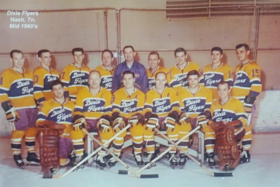
Fauxback designs are usually a great opportunity for a “new-ish” franchise to expand upon their visual identity by drawing upon outside influences to create a retro look. This was the case for the Preds 2020 Winter Classic jersey as it was inspired by the 1960’s Nashville Dixie Flyers of the Eastern Hockey League. They stayed pretty true to the original layout of the jersey with the laced collar, number placement and script text, but essentially reversed the color scheme to create a white sweater. Featuring only script text on the chest is typically pretty hard to pull off on a hockey jersey as it’s a look most associated with baseball. Especially in this case, when both the team name and also the city name are stylized in script. However, they manage to execute it pretty well within the large center chest stripe. Definitely a departure from a classic look, yet it still looks classic…a well-designed conundrum!
• More: The 2020 Winter Classic Jersey Countdown
Now moving to perhaps the best designed element of this jersey: the secondary logo that was featured as a shoulder patch. It was essentially a redesign of the primary logo with a retro spin that harkened back to 60’s era varsity athletics. A very well done design that perfectly captured the fauxback vibe. A case could be made that it’s actually better than the current logo. I for one would love to see it make another appearance on a Preds jersey…especially as the primary chest logo.

Welcome to Smashville. Be bold, be gold. The Predators fully embraced gold back in 2011 when they switched their primary dark jersey to gold…the first team to do so since the Boston Bruins of the late 60’s. The move to gold allowed the Preds to build a unique visual identity around gold as the dominant color accented by navy and white. Sure, several other franchises like the Bruins, Penguins and Flames feature gold or yellow in their respective color palettes, but it’s used as a secondary color that takes a backseat to a more dominant black or red. In Nashville’s case they went all-in with gold and it has worked really well for them.
Now here’s where opinions differ, including those of us here at Hockey by Design. The latest iteration of Nashville’s jersey set is a result of the NHL jersey manufacturer switch from Reebok to adidas. With that switch, the Preds reduced most of the additional trim/piping details that worked well on the Reebok template and went with a much more simplified look when converted to the adidas template. Addition by subtraction? Too simple and bland? That’s the beauty of design…can both of those sentiments be right?! Sure, as long as the look isn’t downright hideous, there can be varying degrees of appreciation.
For this particular countdown, we’re going with the less is more approach. With some of those additional color blocks and trim elements now removed, it allows a couple of those unique features to stand on their own: the six guitar strings/horizontal stripes within the numbers and the single shoulder patch can now take center stage along with the “freed of clutter” primary chest logo. For those reasons, the Preds gradual shift to a much more simplified look takes the top spot.
Agree? Disagree? Let us know in the comments below or join the conversation on Twitter, Facebook, or Instagram!


Leave a Reply