
HbD Masks: 2018-19 Eastern Conference Preview
The 2018-19 season is fast approaching, and new masks are starting to be unveiled. We’ll be breaking down the newest bucket art from across the league and grading the designs according to style, legibility, composition and branding (if you’ve read the Bucket Bracket Showdowns, you know the drill).
• More: HbD Masks: 2017-18 Eastern Conference Preview
• More: HbD Masks: 2016-17 Eastern Conference Preview
Keep checking back, as we’ll continue to add new masks to the roundup as they roll out before the season gets underway.
2018-19 Western Conference Preview »
Petr Mrazek, Carolina Hurricanes
Dave Gunnarsson (Daveart)
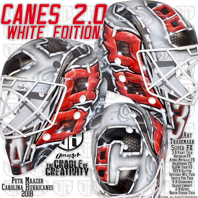 While the new Hurricanes logo may be a mess on the front of the team’s new third jerseys, it served as artist Dave Gunnarsson‘s inspiration for Petr Mrazek’s new mask. “As his first Canes mask, Petr wanted it to be a classic design which live[s] and breath[es] Canes,” Gunnarsson shared. “We brainstormed together during the summer, and when I saw the new Canes logos, I immediately fell in love with them.”
• More: HbD Interviews: Dave Gunnarsson
Incorporating the hockey stick with tattered hurricane flags on each side and the Carolina “C” in the middle, the end product here is classic Daveart with metallic shimmer, light flares and holograms throughout the design. The logos do fit nicely along each side of the mask, and while the paired-down color palette allows them to stand out in the design, the composition isn’t particularly dynamic or innovative.
Overall, this bucket is pretty expected for a logo-centric Daveart design to the point where it almost seems templated (although could you blame him, given the number of masks the guy cranks out a year?). It’s certainly not offensive in any way, but doesn’t blow me away either.
Grade: B

Scott Darling, Carolina Hurricanes
Dave Gunnarsson (Daveart)
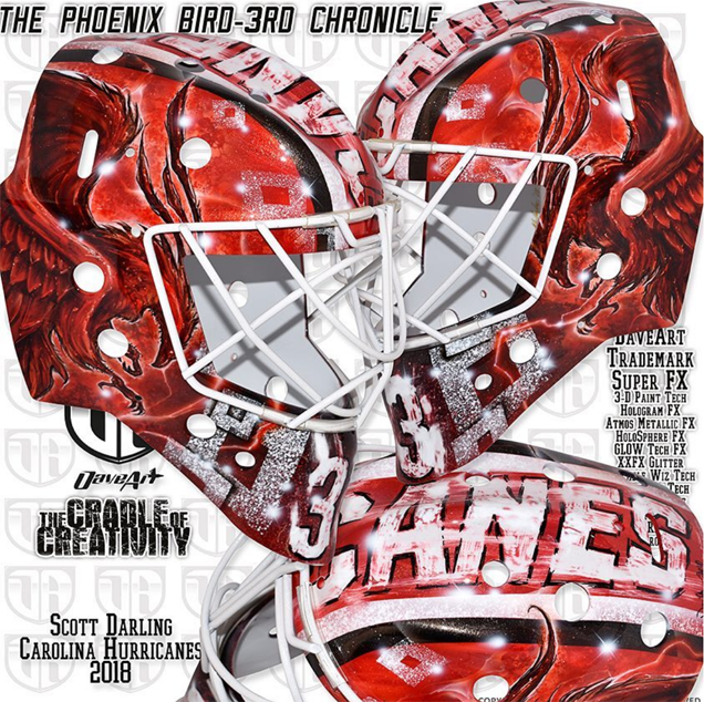 Also with a new Daveart Hurricanes mask is Scott Darling. The design centers around the phoenix bird rising from the ashes, an important image for both the goaltender (Darling has it tattooed on his arm) and the Canes as they look to rebuild. “This Hurricanes design is, just as his previous mask, totally all based on the myth of the phoenix bird,” Gunnarsson shared. “Here I painted the phoenix in a dramatic way on each sides, surrounded by the violent force of a Hurricane.”
The phoenixes are surrounded by tiny speckled hurricane flags and bold stripes up the middle with “CANES” written in the center. The bold color of this mask is perhaps its best quality, but the detail in the birds shows Gunnarsson’s strong artistry and skill. Hopefully Darling and the Canes will be able to channel these phoenixes and rise up as they rebuild in the new season.
Grade: B-
Jimmy Howard, Detroit Red Wings
Ray Bishop (Bishop Designs)
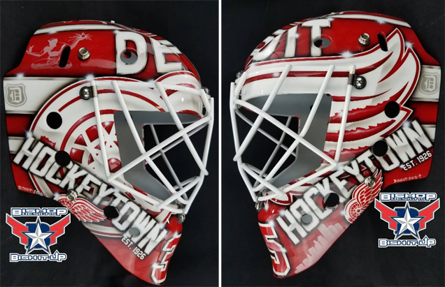 Back with another mask that’s all Detroit, artist Ray Bishop crafted this sharp Red Wings bucket for long-time client Jimmy Howard. Described by the artist as “a modernized bold and classic design,” this mask incorporates almost every piece of iconic Detroit imagery fathomable.
Instead of creating a symmetrical composition, Bishop creatively wraps the Wings’ logo around the front of the mask, which creates a dynamic flow from right to left. In the negative space, the artist included the city skyline along the chin, Detroit crests in the racing stripes on each side, and the Spirit of Detroit illustrated on the top.
View this post on Instagram
Howard and Bishop have been one of the most consistently excellent goalie-artist duos of the past decade, creating a signature style yet still crafting new designs year after year. This is yet another sharp and timeless design as traditional and iconic as the Red Wings’ brand itself.
Grade: A-
Michael Hutchinson, Florida Panthers
David Leroux (Diel Airbrush)
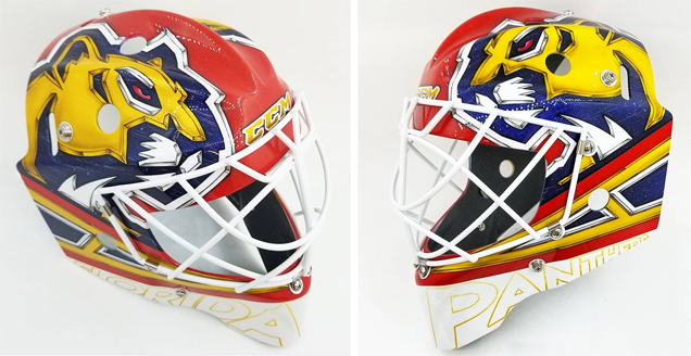 David Leroux is one of the most consistently stellar artists creating masks for NHL goaltenders, and I’m pleased to report that his knack for crafting thoughtful, crispy designs hasn’t gone away. For Florida netminder and long-time client Michael Hutchinson, Leroux painted this super slick design with modern typography and chrome-effect accents.
Hutchinson has had an affinity for minimalist, bold designs since his time in Winnipeg, and fortunately, that the trend has followed him to Florida. Aside from the overall composition of this mask, two of my favorite elements are subtle ones that could tragically go unnoticed. The sans serif typography around the bottom is a style we don’t often see on today’s masks, but the weight of the letter forms and flow of the words as the letters reduce in size is really clean and modern looking. Additionally, the blue and yellow pattern that runs above the words on each side is actually pulled from Hutch’s new CCM Extreme Flex 4 pads, which is a subtle yet smart tie-in to give all of the netminder’s gear a fully cohesive look.
Michael Hutchinson
9/15/2018 pic.twitter.com/bW2yRTZVkj— Dad Shoes (@turbuL3NT2) September 15, 2018
I really love this mask and how consistent Leroux’s work is. While we’ve yet to see Hutchinson’s full gear ensemble together, I’d say it’s coming together quite nicely thus far.
Grade: A+
Roberto Luongo, Florida Panthers
Stephane Bergeron (Griff Airbrush)
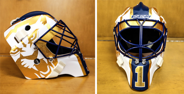 Panthers goaltenders probably win the collectively most stylish award this season, because Roberto Luongo’s new bucket is equally as stellar as his teammate’s. Painted by Stephane Bergeron, the striking gold and navy design is the perfect execution of minimalism that I wish the league had more of. Using gold foil on white to execute all of the graphics, you won’t find any light flares or holographs here.
The bold lines of the panther head applied in solid gold really pop off the stark white background, and the navy blue accents give the design the perfect amount of color and contrast.
Always remembered. #MSDStrong pic.twitter.com/A8OamcmbVU
— Florida Panthers (@FlaPanthers) October 4, 2018
A native of Parkland, Florida, Lu added a tribute on the backplate to the victims of the Stoneman Douglas school shooting earlier this year, a red ribbon with the number 17 for the number of students who lost their lives.
The gold foil has now become somewhat of a signature for Luongo, but this new mask in particular is really striking. Another job well done by Bobby and Bergeron.
Grade: A+
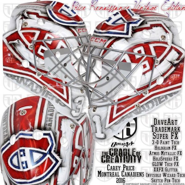
Carey Price, Montreal Canadiens
Dave Gunnarsson (Daveart)
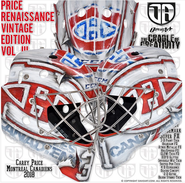 Very few goaltenders keep their masks as consistently brand-centric as Carey Price, and his 2018-19 mask is no different. Titled “Price Renaissance Vintage Edition,” the third edition in the series dating back to 2016 is a slight style update to the netminder’s standard composition.
“This is created in a mix of textile and vintage effects, with the beautiful team logo in focus,” Gunnarsson shared of the design, featuring a trio of Canadiens logos as the main design elements. The other mainstays include Price’s number 31 on the chin and “Les Canadiens” stenciled along each side, but the new addition this season is the torn fabric texture along the bottom and on the tops of the logos.
View this post on Instagram
For a logo as iconic as the Habs’ CH, I’m actually ok with going this team-centric, although I wish Price took the opportunity to showcase some more personal style rather than going with something so generic year after year.
Grade: B+
Cory Schneider, New Jersey Devils
Dave Gunnarsson (Daveart)
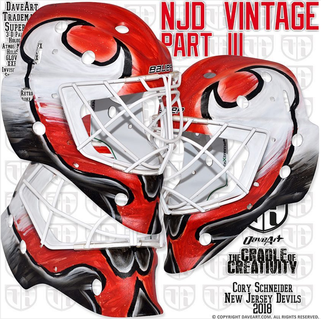 The third chapter in Cory Schneider’s “NJD Vintage” series by Dave Gunnarsson, his latest mask was inspired by the 70s and painted using a low-tech brush technique. “It is a time machine, created as the first goalie masks back in the 70s,” the artist shared. “No extra effects what so ever.”
View this post on Instagram
The lack of extra effects is something we rarely see in Gunnarsson’s designs, so the artist going back to the basics here is actually quite unique. The simple composition suits the vintage concept, from a time when goaltenders like Wayne Stephenson and John Garrett (hey, there’s merch for that!) found creative ways to display their teams logos on their masks. What I wish this mask had, however, were the clean lines of Luongo’s or Howard’s to give the design a bolder, neater look. The brush technique appears a bit sloppy and juvenile, which unfortunately detracts from the overall composition.
Grade: B
Keith Kincaid, New Jersey Devils
Dave Gunnarsson (Daveart)
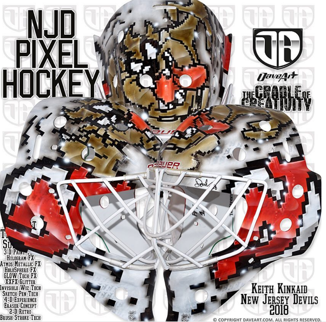 In a style debuted by John Gibson with his Pac-Duck mask, Gunnarsson took the retro pixelated style to the extreme in Kincaid’s latest Devils bucket. “He said, go full pixel,” the artist shared. “I started to think of the lovely old school video games I played when I was a kid.”
Going super minimalist with large, chunky pixels, Gunnarsson placed the Devils logos on each side of the mask and the Tasmanian devil on top, which has become somewhat of a mainstay for Kincaid on his recent buckets. The negative space was kept all white with small holographic Devils logos stamped throughout to give the design some added depth and visual interest.
While super creative and nostalgic, my only issue with this mask is legibility. Unlike in Gibson’s pixelated mask, the larger size of the pixels here make Taz almost illegible, which takes away from the overall cleanliness of the design. That aside, the logos look sharp, and the retro flair in this design is really creative and fun.
Grade: B
Robin Lehner, New York Islanders
Dave Gunnarsson (Daveart)
 While many goaltenders opt to showcase things about themselves on their masks like family members’ names or illustrations of their favorite cartoon characters, Robin Lehner took a serious and powerful approach in creating a design with Dave Gunnarsson that was extremely personal.
Having joined the Islanders after seeking treatment for mental illness and substance abuse, Lehner recently penned a moving piece in The Athletic, and subsequently used his mask as an opportunity to share his recovery story through a different lens. “I want to help make a difference and help others the way I have been helped,” the goaltender wrote in the piece. “I want people to know that there is hope in desperation, there is healing in facing an ugly past and there is no shame in involving others in your battle. ”
Designed in all gray, Gunnarsson used a sketch pen technique to create gritty illustrations of the Islanders’ Captain Gorton logo in front of a sunrise, with an eerie multi-headed demon and prison bars above, representing Lehner’s struggles with Bipolar disorder. “The most important part of mask is the sides,” Gunnarsson shared. “There is the sun at dawn, describing the start of the new life for Robin when he decided to seek help for himself.”
The drawing is extremely evocative, and really does a great job conveying the pain and complexity of the goaltender’s disease. This concept could’ve easily gone awry, but Lehner and Gunnarsson did a great job here bringing an important and moving message to life.
Grade: A-
Henrik Lundqvist, New York Rangers
Dave Gunnarsson (Daveart)
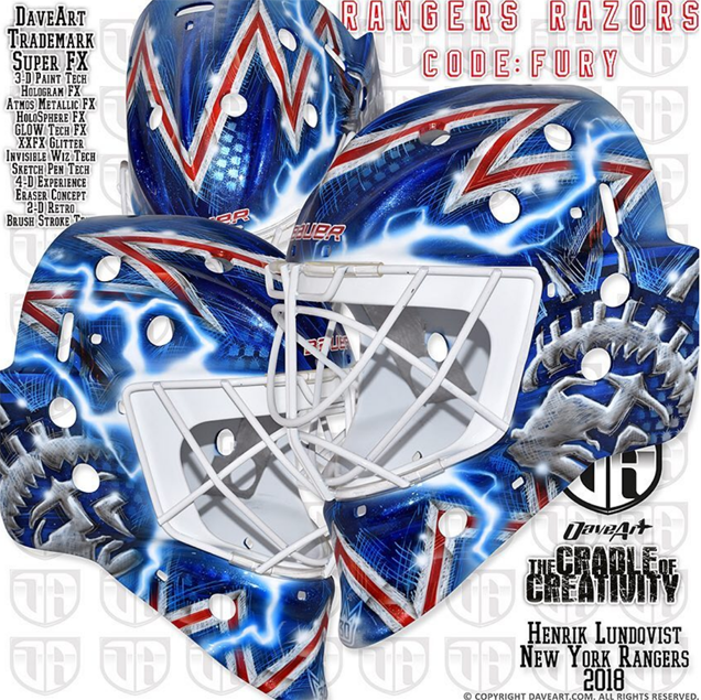 Lundqvist has stuck with the “Rangers Razor” mask concept for the better part of the last decade, but Gunnarsson brings some new flair to this iteration with sketch pen and 4-D techniques. “We have been working together for 21 years,” the artist shared, “and the lightning is a sure thing on almost every of Henrik´s masks since the first one we did 21 years ago.”
View this post on Instagram
The Daveart signature lightning strikes and hologram effects in this design are offset by the vintage look of the white lacquer cage and gritty textures. The plain white left inside the cage is also something we rarely see on modern masks, but the old school combined with contemporary elements creates an interesting juxtaposition that stands out from the other masks in this series.
Grade: B+
Craig Anderson, Ottawa Senators
Sylvie Marsolais (Sylabrush)
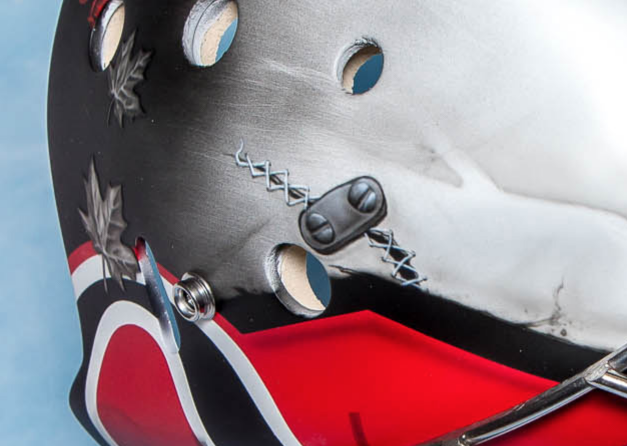
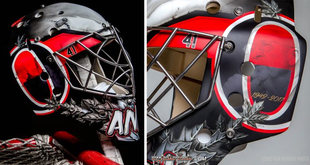 The Senators might be a cluster-you-know-what, but one thing in Ottawa is looking good this season, and that’s Craig Anderson’s gear. Following the netminder’s reveal of his slick black and gold Brian’s pads, artist Sylvie Marsolais gave us a peek at Anderson’s bucket to match.
• More: HbD Interviews: Sylvie Marsolais
A tribute to the late Senators GM Bryan Murray, Marsolais executed the soft portraiture with her usual skillfulness, in high contrast with the bold, rich blacks and sharp lines of the “O” logos surrounding them. The artist’s talent at photo realism airbrushing is really second to none, but her compositional skills also get their chance to shine in this mask. The design is perfectly balanced, creating depth and dimension with the deep blacks and lighter grays and red in the foreground. The letters in “Andy” across the chin really jump forward with the shadow and red halo effects, as do the logos with the light gray borders against the red and black backdrop.
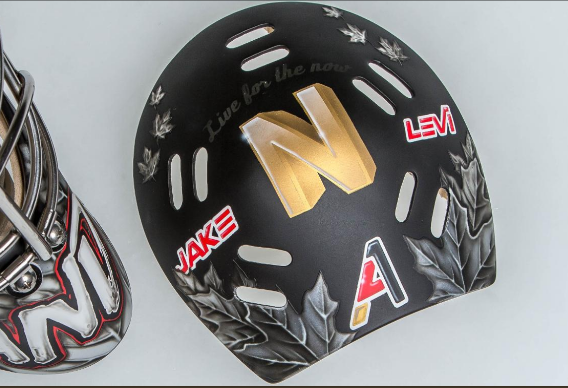
The back plate includes a few extra personal touches, the names of the goaltender’s children along with a golden N and the words “live for the now” for his wife Nicholle, who joined the league’s Hockey Fights Cancer initiative last season and courageously beat the disease.
Overall, this is a beautiful tribute to Murray and Nicholle and a standout mask design. Regardless of what the Sens’ season brings, at least Anderson will be looking good during it.
Grade: A+

Michal Neuvirth, Philadelphia Flyers
Dave Gunnarsson (Daveart)
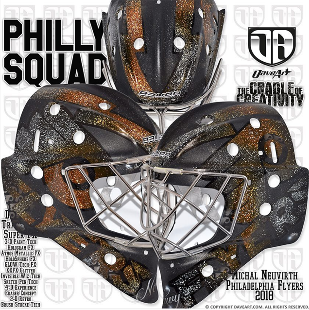 Breaking out of Gunnarsson’s signature style and showing us something out of the box, Neuvirth’s new dot-work bucket mixes texture and sheen to create a style all his own. “For his new Philadelphia Flyers mask, we wanted to try something very unique,” the artist shared. “The whole design is created with thousands and thousands of small dots… and you can only see it in certain angles with the DaveArt 4-D Experience.”
View this post on Instagram
We all know I’m a sucker for matte black masks, but what Gunnarsson does here, creating a sort of galaxy effect with pointillism, is pretty damn cool. The orange, gold and silver metallic dots make up the entirety of this design, and it gives it a depth that really captivates the viewer. The composition itself is quite simple, which lends itself well to this kind of paint technique, but props to Gunnarsson and Neuvirth for thinking up something so unique and innovative.
Grade: A-
Brian Elliott, Philadelphia Flyers
Fran Drummond (Paintzoo)
 Also coming in hot with a new Flyers mask is Brian “Moose” Elliott. Staying true to his nickname with a design by Fran Drummond, Elliott’s antler-filled bucket is a crisp, modern take on the goaltender’s moniker. “He wanted to go with nice clean design with a ol’ [school] feel representing moose antlers,” Drummond shared of of the concept.
The layered antler shapes create a semi-abstract, organic composition, which combined with the matte paint and minimal color palette, end up looking really sharp. In contrast with the free-flowing forms of the antlers, Drummond included a geometric crest on the chin with Elliott’s initials and the Flyers logo. The backplate art further ties into the moose theme, depicting a goalie gear-clad moose cartoon holding an orange “moose x-ing” sign.
A lot of masks with animal or cartoon designs quickly become juvenile or kitschy, but Drummond does a really nice job on this to elevate the concept to something sophisticated and contemporary.
Grade: A
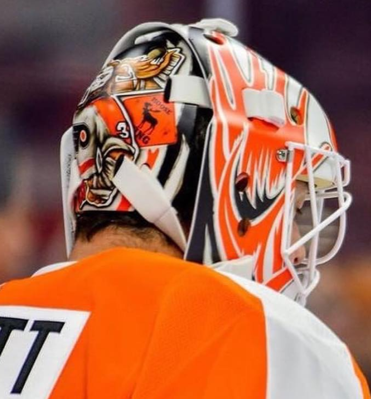
Calvin Pickard, Philadelphia Flyers
Fran Drummond (Paintzoo)
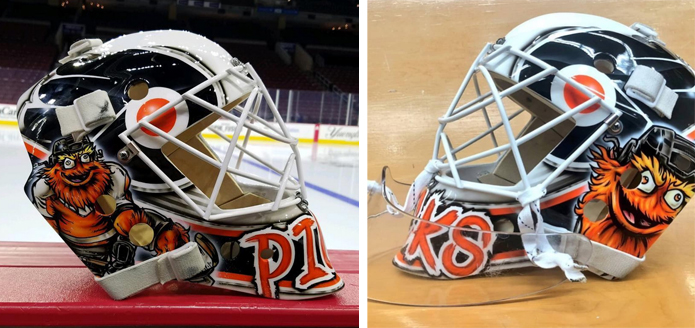 Well, it was only a matter of time. Philly’s new sensation of a mascot has made his way onto a goalie mask. Described by Flyers’ Twitter as having “beauty, elegance and glamour,” artist Fran Drummond quickly turned Pickard’s Leafs mask into a Gritty masterpiece when the netminder was traded from Toronto. After sanding off the mask’s Toronto art, with only the approval of the Flyers’ equipment manager, Drummond went to work executing his vision for the Gritty design.
“[Pickard] was blown away that we got it done so soon,” Drummond told NHL.com, adding that the goaltender’s first reaction was “wow, this is pretty cool.” Having only requested that his nickname “Picks” be included on the chin, the netminder had no idea what to expect of his new mask art, but I can’t imagine he was disappointed. Using a graffiti airbrush style, Drummond illustrated the satanic muppet mascot on each side of the mask, even giving the lettering on the chin a furry textured edge to tie into the Gritty theme.
Having so little time to turn this design around, Drummond really did a great job of creating a buzzworthy mask that Gritty himself loved. French, Canadian, Philadelphian… a good mask is a good mask.
Paint me like one of your French masks. https://t.co/9Sl1jD9TOi
— Gritty (@GrittyNHL) October 9, 2018
Grade: A-
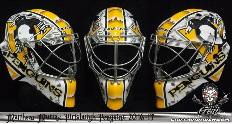
Matt Murray, Pittsburgh Penguins
Stephane Bergeron (Griff Airbrush)
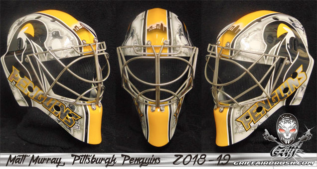 The robo-penguin is back thanks to Matt Murray and his long-time artist Stephane Bergeron. The artist’s interpretation of the minimalist 90’s logo appears on both sides of Murray’s new bucket, sparking speculation that the Pens could be bringing back the look for their new third jersey.
Branding from before Murray’s birth aside, this design is very consistent with what we’ve seen from the goaltender in past seasons. “Murray doesn’t like paint jobs with a lot of details,” the artist shared on his Facebook page, “so he asked for something simple like his previous masks.”
• More: The 2017 Bucket Bracket Showdown (The Finals)
The bold, graphic logos take center stage in this design, framing the gold stripe down the center that contains a silhouette of the Pittsburgh skyline. The negative space is filled with screened logos scattered throughout and a large Penguins word mark in metallic foil down each side.
The consistency and simplicity in this design don’t leave much for us to pick apart, however the basic composition and lack of innovation or pizazz also prevent it from earning higher marks.
Grade: B
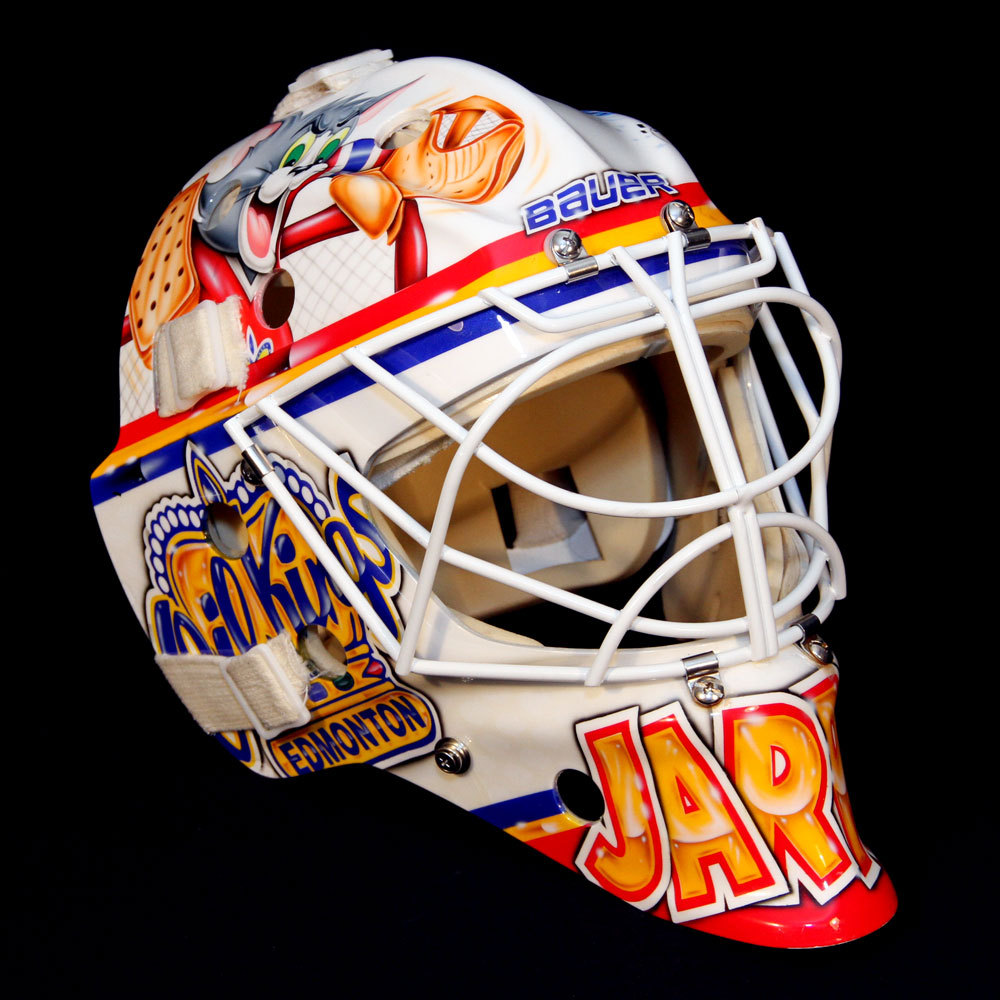
Tristan Jarry, Pittsburgh Penguins
Jason Bartziokas
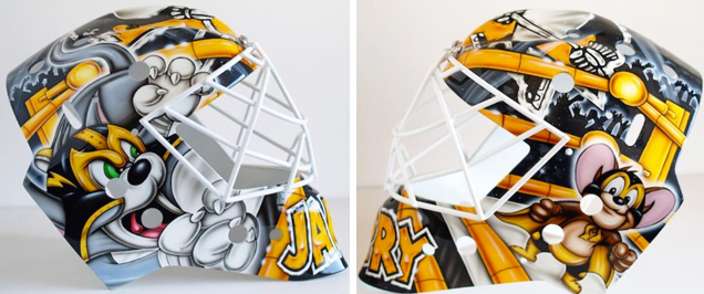 Murray’s backup also has a new mask courtesy of artist Jay Bartziokas. Unlike his teammate who went the more conservative route with his bucket, Jarry went full on cartoony again with his now signature Tom and Jerry motif and bubble lettering around the chin. This seems to be what Jarry gravitates towards, having included the Looney Tunes characters on his bucket since his days with the Edmonton Oil Kings.
There’s not a whole lot you can do as an artist when a client insists on having a Looney Tunes-themed mask year after year, so design-wise, this is a bit cringeworthy, but there’s no denying Bartziokas’ talent in executing this cleanly. There’s some nice texture detail in the Penguin logo on top, but otherwise, the concept of this mask just lacks the sophistication (or irony) to get higher marks.
Grade: C-

Andrei Vasilevskiy, Tampa Bay Lightning
Sylvie Marsolais (Sylabrush)
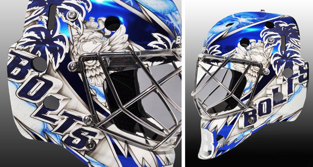 After winning the NHL’s fan favorite mask vote at the end of the 2017-18 season, Vasilevskiy and artist Sylvie Marsolais are back with another color-changing Bolts bucket. With a very few changes from last year’s design, Marsolais stuck with the winning composition but incorporated the Russian coat of arms tucked behind the palm trees on each side.
Aside from the artist’s always flawless execution, the standout element once again is her use of the subzero paint, which reveals the miniature Lightning logos stamped on the sides of the mask and the blue coat of arms on the chin.
Many goaltenders with superstitions prefer to keep their mask designs the same year after year, so it’s hard to fault an artist for delivering on their client’s ask, but while this mask is pretty stellar, that we’ve seen it before is the only thing keeping me from awarding it a higher grade.
Grade: A-
Louis Domingue, Tampa Bay Lightning
Dave Gunnarsson (Daveart)
 Sporting a different kind of tribute mask from Craig Anderson, Louis Domingue opted to use his new bucket to honor his team’s past. Painted by Dave Gunnarsson, the design incorporates portraiture of Tampa Bay legends and Domingue’s family with imagery of the city’s history.
The right side of the mask is all about Martin St. Louis with two illustrations of the former Bolts captain and the Hall of Famer’s number 26. The opposite side honors Tampa Bay’s other retired number and former captain, Vincent Lecavalier, in the same fashion.
Using the thick blue striping to frame the various sections of the mask, Gunnarsson completed the design with a large sketch illustration of Zeus on top and cartoon renderings of the goaltender’s children.
With Gunnarsson’s typically cluttered style, this mask is actually composed quite nicely to let each area of the design really shine. The sketch drawings give a dynamic style to an otherwise simple concept, and the end result is top notch.
Grade: B+
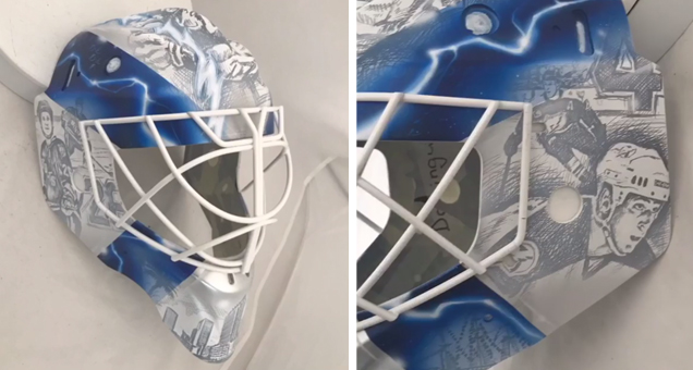
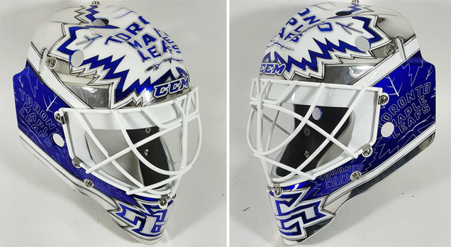
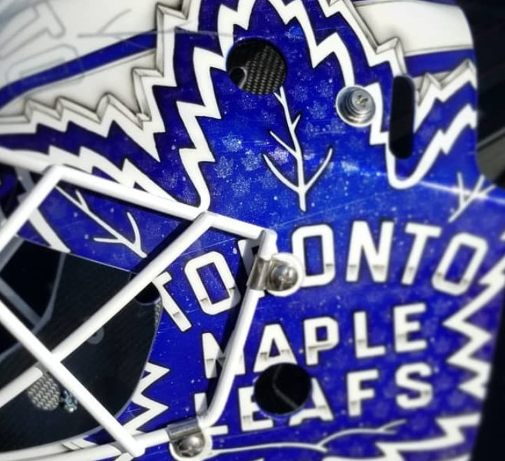
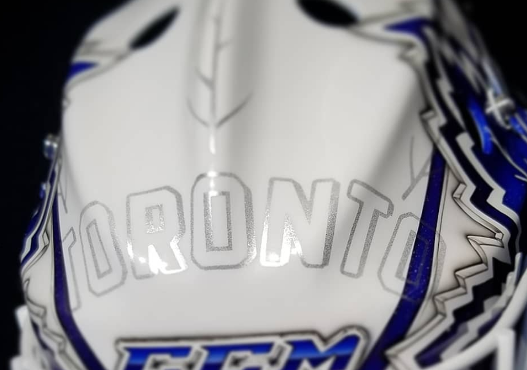
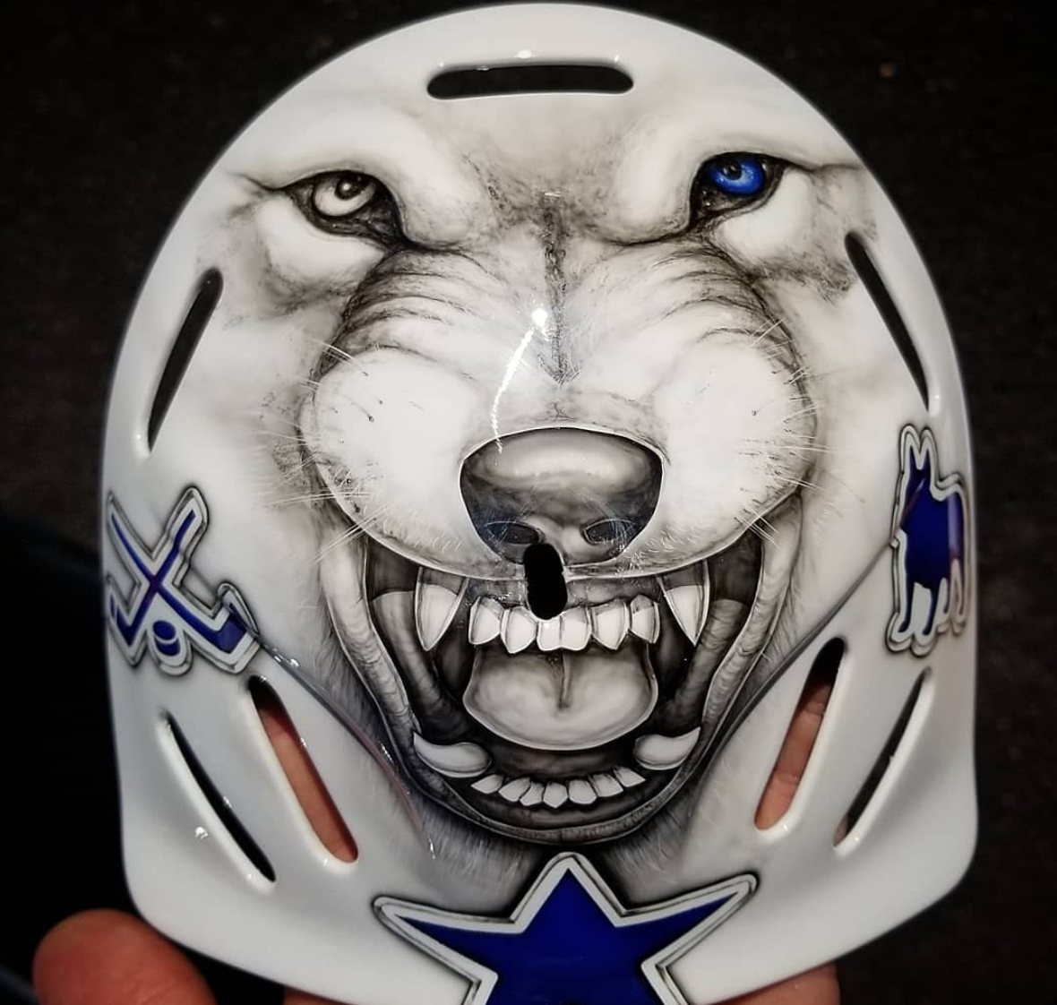
Curtis McElhinny, Toronto Maple Leafs
David Leroux (Diel Airbrush)
 Another stellar mask from David Leroux is for Toronto netminder Curtis McElhinny, and it certainly meets the bar set by his 2017-18 mask.
The simplicity of Leroux’s work is really where his skillfulness shines, adding subtle symbolism and sharp details into an otherwise basic composition. “That’s what Curtis likes… clean and simple,” the artist commented on Instagram.
View this post on Instagram
From the small metallic leaves stamped within the large logos on the left side to the silver Toronto wordmark and leaf veins painted on top, this mask is full of beautiful detail work. The back plate includes some personal touches for the goaltender; a star for McElhinny’s wife, and the dog and hockey sticks for his children. According to the NHL’s post with the design, the wolf represents motivation, with two different colored eyes for the good wolf and bad.
This mask is flawlessly executed, and the best part is that the design speaks for itself.
Grade: A+
Frederik Andersen, Toronto Maple Leafs
Dave Gunnarsson (Daveart)
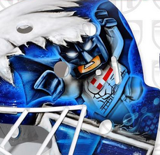
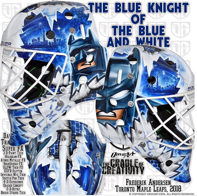 A native of Denmark, Freddie Andersen has long had an affinity for 1) showcasing Denmark-made Legos and 2) Batman on his masks. “His Lego buddy shows up on the mask and becomes The Blue Knight Of The Blue and White,” artist Dave Gunnarsson described of the concept, that depicts a Lego Batman on each side in front of a Toronto skyline contained in the shape of the Maple Leaf.
View this post on Instagram
For how complicated this design is, Gunnarsson actually does a really nice job of arranging the composition so that it’s legible and flows nicely. The placement and layering of the white leaves and blue silhouettes framing the skylines play nicely against the Lego figures in the foreground and blue brick in the negative space. It’s a nice combination of team branding and personal style all pulled together in a dynamic and interesting composition.
Grade: A-
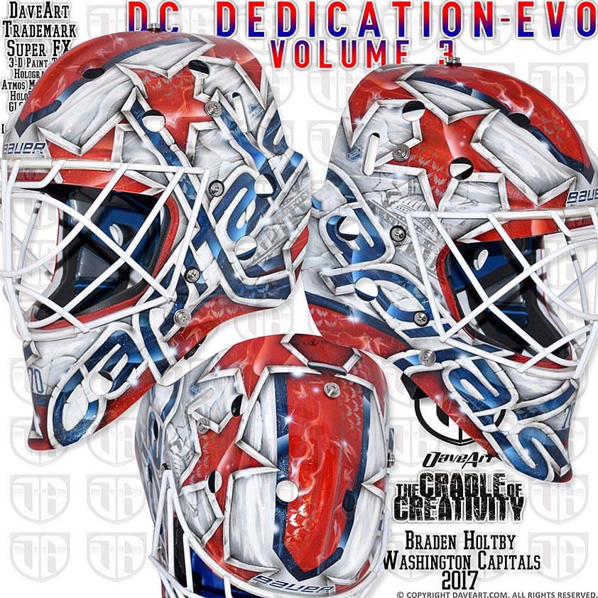
Braden Holtby, Washington Capitals
Dave Gunnarsson (Daveart)
 Perhaps a hint at the Capitals upcoming third jersey reveal, Holtby’s new bucket features the team’s retro Capital building logo with army-font wordmark predominantly on each side. Artist Dave Gunnarsson has added a chiseled stone texture to the logos, which run diagonally down each side and the rows stars hovering above, a nod to the team’s current logo.
Holtby historically has gone with very logo-centric masks that rely heavily on the team’s branding, so it will be interesting to see if this logo choice has anything to do with the Caps’ third jersey design. Objectively speaking however, this mask is very much in line with what we’ve seen Holtby and Gunnarsson create before, so while it doesn’t give us much to complain about, it also doesn’t spark much excitement on the innovation front.
Grade: B-
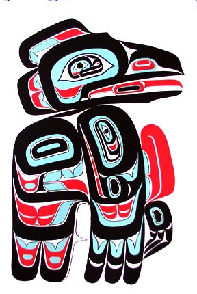
Pheonix Copley, Washington Capitals
Dave Gunnarsson (Daveart)
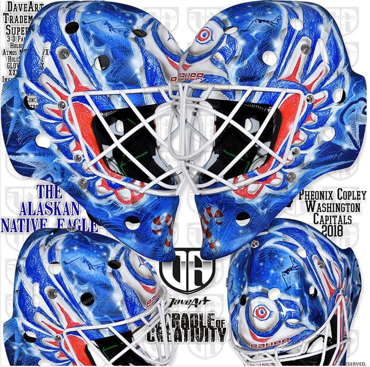 While working with the same artist, Holtby’s teammate Pheonix Copley took a very different approach in designing his mask for the new season. An Alaskan native, Copley wanted to design his new bucket in the style of traditional Alaskan art, which gave Dave Gunnarsson a new challenge outside his normal wheelhouse. “I started to do research and study the Alaskan native art,” Gunnarsson explained. “We brainstormed and came up with a design concept built on the American bald eagle spreading out the wings.”
View this post on Instagram
While I love the concept for this mask and the unique approach of using Alaskan art as inspiration, I have a few issues with the end result here. Rather than capturing the bold style of the Pacific northwest, the sketch pen technique and blended colors end up making this look more like water color, and the forms appear a bit sloppy. The head of the bird, which should serve as a representation of the Capitals, is drawn to look more like a puffin and less like an iconic, strong eagle.
I commend Gunnarsson and Copley for taking a creative approach, but the end product here just misses the mark.
Grade: C
Agree? Disagree? Let us know in the comments or join the conversation
on Twitter, Facebook and Instagram!


[…] […]
[…] • More: Hbd Masks: 2018-19 Eastern Conference Bucket Preview […]
[…] • More: HbD Masks: 2018-19 Eastern Conference Preview […]
[…] • More: HbD Masks: 2018-19 Eastern Conference Preview […]
[…] More: HbD Masks: 2018-19 Eastern Conference Preview• More: HbD Masks: 2017-18 Eastern Conference Preview• More: HbD Masks: 2016-17 Eastern […]