
The 2017 Bucket Bracket Showdown (The Finals)
 This is it, the last two standing. In a late plot twist, last year’s runner up Matt Murray (back with a new mask) has once again taken over for Marc-Andre Fleury and is poised to face Pekka Rinne in the final showdown of 2017 buckets.
These two masks by two different artists are worlds apart in style and concept, so we have a lot to unpack as they go head to head. Now that we’re down to the final duo, we’ll be breaking down the matchup in matters of composition, artistry, branding, innovation and intangibles to see who wins the final tally. Before we dive in, be sure to catch up on rounds one through three, and then we crown our 2017 champ.
• More: The 2017 Bucket Bracket Showdown (Conference Finals)
• More: The 2017 Bucket Bracket Showdown (Round 2)
• More: The 2017 Bucket Bracket Showdown (Round 1)
…and here…we…go!
Nashville Predators vs. Pittsburgh Penguins
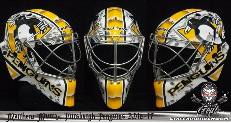
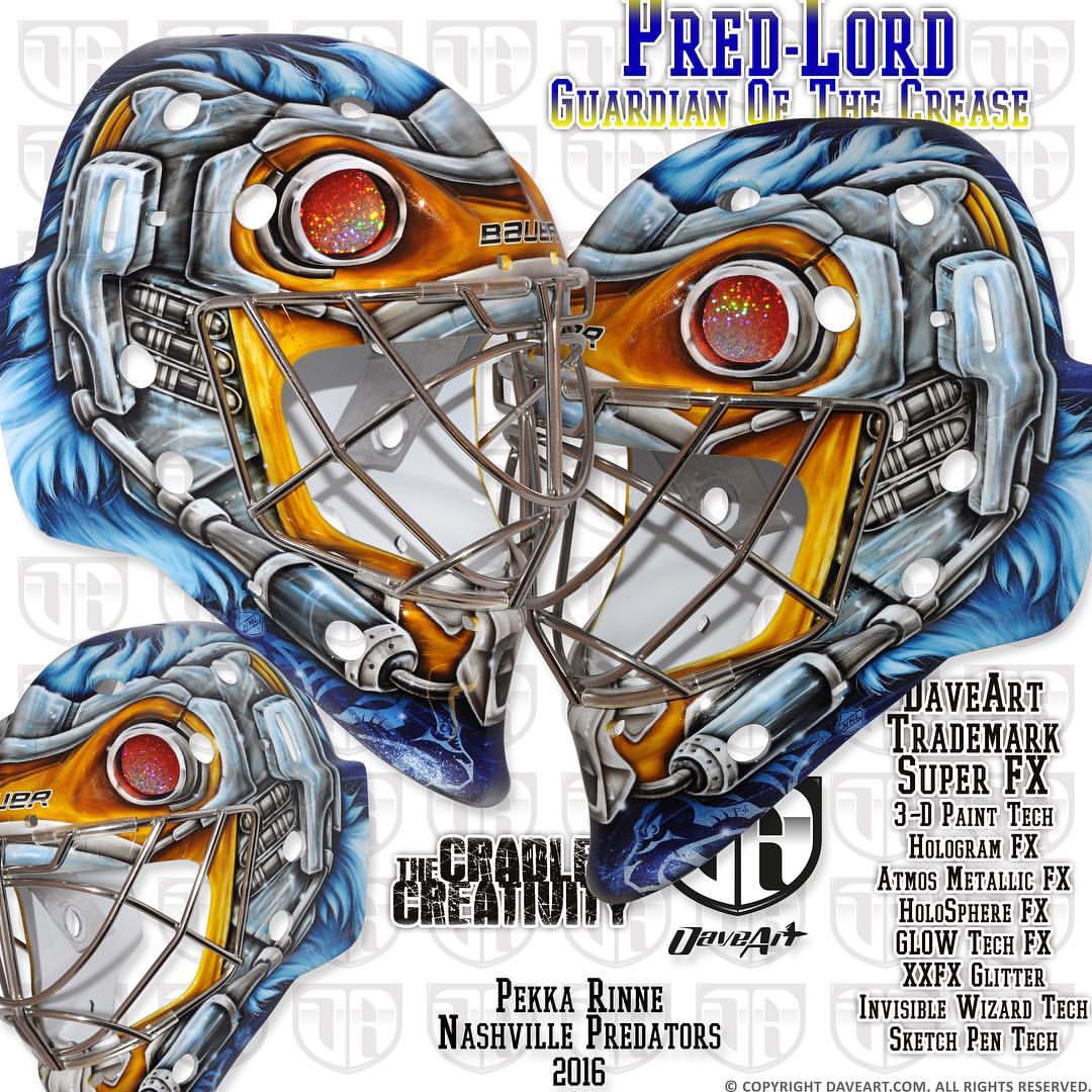
Pekka Rinne (Dave Gunnarsson, Daveart) vs. Matt Murray (Stephane Bergeron, Griffe Airbrush)

Composition
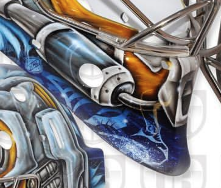
In breaking down composition, we’ll look at the design elements of each mask and how they’re arranged to form a complete and cohesive design. The more orderly composition here is clearly Murray’s, so let’s start there.
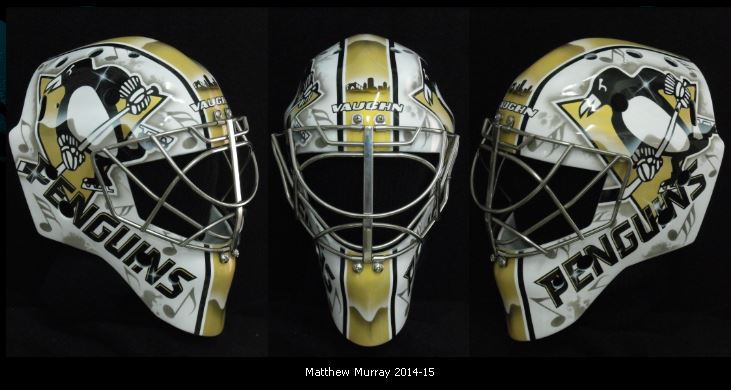
With only a color update from his 2014-15 mask, Murray’s Stephane Bergeron bucket is about as clean and straightforward as they come with little left to the imagination. The netminder told Pens Inside Scoop last season, “I didn’t do anything crazy on my helmet this year. I put a couple Penguins logos and the Pittsburgh skyline on the front and a bunch of music notes everywhere,” adding “it symbolizes that I listen to music when I’m out there or something, I don’t know what the point was behind that.”
The composition is just as Murray describes, and while not wildly original or unique, the layout is legible and balanced, making for an overall successfully executed design. On the other side of the ice, Rinne’s mask might be the exact opposite, trading legibility and balance for creativity and flash.
• More: HbD Interviews: Dave Gunnarsson
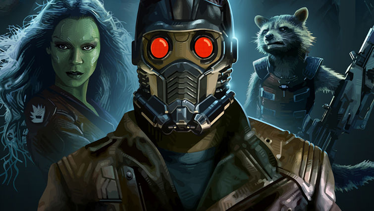
The Finnish goaltender’s Guardians of the Galaxy-themed mask boasts everything from glitter to holograms to glow paint and a whole lot in between. While the symmetry helps create some balance in this complex and hyper-detailed Daveart design, the similar tones and variety of textures make it hard to decipher what’s happening on this mask, especially from afar. Perhaps a more paired-down interpretation would have been more successful, but “paired-down” is probably a dirty 4-letter word in Mr. Gunnarsson’s vocabulary.
Rinne – 0
Murray – 1

Artistry and Style
In looking at the workmanship in both these masks, it’s clear both artists know their stuff but take wildly different approaches to their work. When it comes to having a signature style, no artist comes to mind quicker than Dave Gunnarsson, whose complex and cutting-edge techniques are instantly identifiable across the league. While Rinne’s mask may lose points in the legibility and composition columns for its complicated and hyper-detailed design, it gains steam for its creativity and execution, as there is no denying Gunnarsson’s skill when examining this piece.

Murray’s mask on the other hand also showcases its artist’s mastery in execution, but the simplicity of the design doesn’t allow for Bergeron’s talent to shine in the same way that Rinne’s mask does for Gunnarsson. There are some fine details like the gradients around the skyline and the layering of the bold yellow logos over the gray musical notes in the background, but there’s not quite enough pizazz to give Murray the boost over Rinne in this one.
Rinne – 1
Murray – 1
Use of Team Branding
With every goalie taking a different approach when it comes to their mask, some choose to focus more on personal elements or pop culture, while others rely heavily on the team’s brand or history when forming a concept. Murray’s masks have always gone the team route, focusing primarily on the team’s logos and nostalgic designs from Penguins past.
The most recent iteration in Murray’s mask repertoire is no exception, using large Pens logos on each side with the team wordmark running underneath. With a subtle nod to Denis Herron, whose mask Murray channeled more explicitly in his alternate bucket, the iconic chevrons poke in on each side underneath the lettering, all on top of a subtle backdrop of music notes and splatter effects.

Rinne’s mask gives more subtle nods to the Preds brand by using a variation of the team’s blue and gold color palette and incorporating holographic logos throughout the design. Rinne and Gunnarsson have almost created a brand all their own for the Nashville netminder with his movie-themed masks over the years in a very distinctive style, but while this iteration captures Rinne’s personal brand, the team brand recognition falls short, handing this battle to Murray.
Rinne – 1
Murray – 2
Innovation
With everything from color changing to glow in the dark paint becoming more mainstream in the NHL, artists and goalies continue to find new ways to push the envelope and create unique and exciting mask designs. Arguably leading the charge in this space is Dave Gunnarsson with some of the wildest paint technology in his arsenal.
While Rinne’s isn’t as overtly innovative as say, Ben Bishop’s glowing lightning bucket or Khudobin’s color changing mask, it boasts a massive amount of special effects that shouldn’t go unnoticed. Just reading through Gunnarsson’s description of the mask alone, the artist cites 3D, hologram, glow, sketch pen and invisible wizard pen effects (just to name a few) as techniques used in the “Pred-Lord” design.
In addition to the special effects, the design itself is quite innovative, taking elements from film characters and translating them into a piece of art that fits on a goalie mask–no easy task.
On the other end, while certainly a lovely and well executed mask, from an innovation standpoint, Murray’s doesn’t exactly push the envelope in any way. Don’t get me wrong, there is something to be said for a timeless, classic mask with no bells and whistles, but in looking strictly at innovation, Murray’s doesn’t bring anything new to the table that we haven’t seen before.
Rinne – 2
Murray – 2
Intangibles
Heading into the final breakdown, Rinne and Murray are knotted at a 2-2 tie with intangibles being the tiebreaker for the title. As we pointed out last year, sometimes design can’t be defined as right or wrong or by the sum of its parts, and it just comes down to what looks good and works.
Like many games this postseason, the scoreboard isn’t reflective of what’s transpired on the ice, and this final showdown isn’t any different. Rinne may have taken the cake when it comes to style and innovation, but when push comes to shove, Murray’s mask is just a better design. The legibility, identifiable branding and overall aesthetic value of this bucket get a leg up on Rinne’s muddled design, giving this second year finalist his hard-earned trophy.
Congratulations, Matt!

FINAL:
Rinne – 2
Murray – 3
Agree? Disagree? Let us know in the comments or join the conversation on Twitter, Facebook and Instagram! And if you’re interested, we’re now on Pinterest too.


[…] • More: The 2017 Bucket Bracket Showdown: (The Finals) […]
[…] back for the playoffs to crown another goalie mask champion for the fourth year running. Last year’s victor Matt Murray returns to defend his title against some some new goaltenders (and new teams) who […]
[…] More: The 2017 Bucket Bracket Showdown (The Finals) • More: The 2016 Bucket Bracket Showdown (The Finals) • More: The 2015 Bucket Bracket Showdown […]
[…] • More: The 2017 Bucket Bracket Showdown (The Finals) […]