
The 2016 Bucket Bracket Showdown (The Finals)
 by Ally Koss
Well, we’re down to the final round, and our reigning Bucket Bracket Showdown champion will be dethroned. It’s been a wild ride, but the field of sixteen masks has been narrowed to two, and luckily they’re two of my non-Ben Bishop favorites this year.
These two goalies may not have been who we expected to see facing off for hockey’s ultimate prize; rookie phenom Matt Murray stepping in for (and seizing the reigns from) injured veteran Marc-Andre Fleury, and Sharks’ backstop Martin Jones who stole the spotlight after jumping from Jonathan Quick’s backup to Boston’s trade bait to San Jose’s starting man. Both goaltenders wear great masks this year with a lot of historical elements to break down, but before we jump in, catch up on rounds 1-3.
• More: The 2016 Bucket Bracket Showdown (Round 1)
• More: The 2016 Bucket Bracket Showdown (Round 2)
• More: The 2016 Bucket Bracket Showdown (Conference Finals)
…and here we go. Let’s break ’em down and crown a champion!
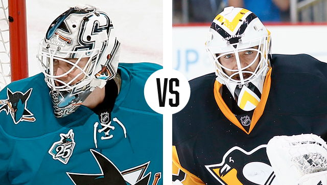
San Jose Sharks vs. Pittsburgh Penguins
Martin Jones (Steve Nash, Eyecandyair) vs. Matt Murray (Stephane Bergeron, Griffe Originale)
 Composition
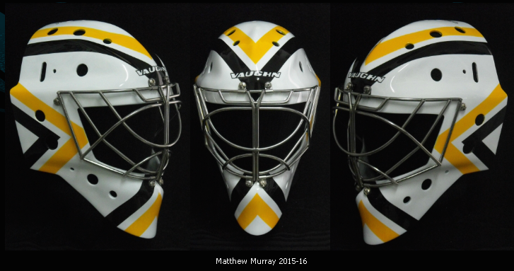
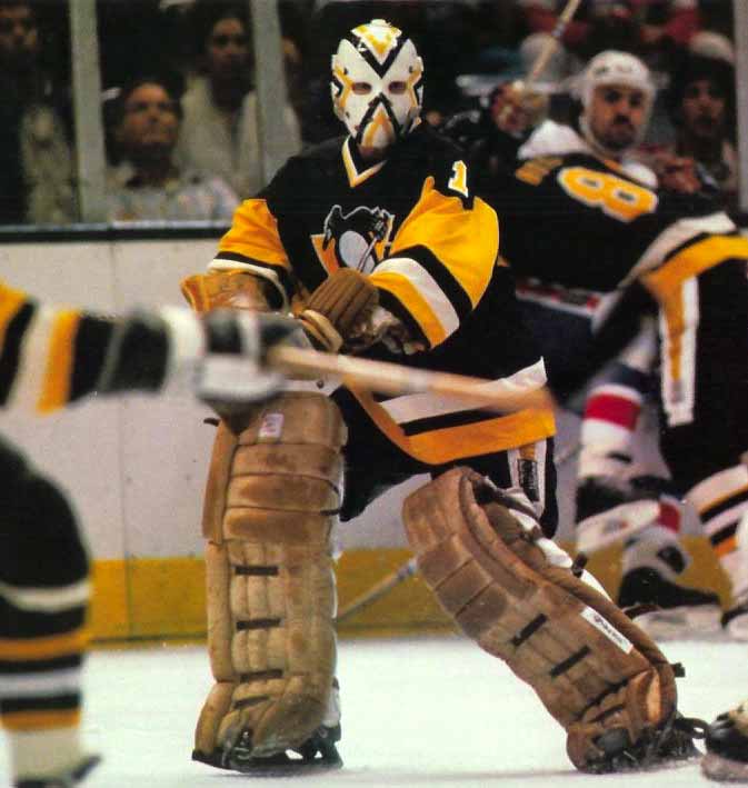
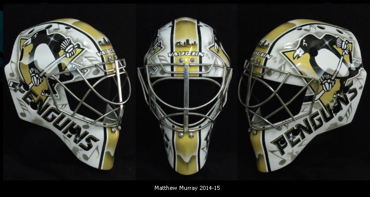
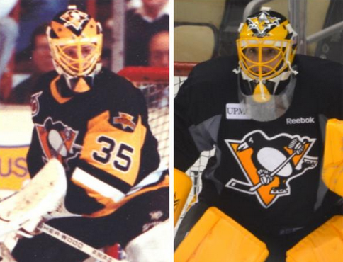
If we compare these masks solely on their composition, they’re both extremely strong. Murray’s mask, painted by Stephane Bergeron, is void of any text, logos or recognizable imagery, opting instead for a graphic patterned approach. The white cage blends seamlessly into the rest of the mask, which is only broken up by the four gold and black chevrons––reminiscent of Denis Herron’s––pointing inward towards the center. The angles and symmetry of the chevrons create a really strong dynamic that looks great with the Pens’ new alternate jerseys.
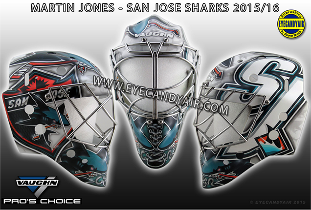
The layout of Jones’ mask is a bit more complex but thoughtfully executed. Artist Steve Nash created a collage of sorts for the Sharks’ 25th anniversary using logos of the team’s past and present. The minimal color palette really helps keep this mask from being too busy and overwhelming, and the variety in scale creates a nice balance throughout the design.
While both of these are compositionally strong in their own ways, the bold cleanliness of Murray’s gives Pittsburgh the early edge.
Jones – 0
Murray – 1
Artistry and Style
One of my favorite things about both Murray and Jones’ masks are the clean and simple styles chosen by their respective artists. There seems to be a trend around the league in overly-busy, everything but the kitchen sink aesthetics, but as goes for most things in sports design, less is usually more.
 The airbrush technique in Jones’ mask and the way in which Nash executed the paint job is really smart and well done. Using a subtle white and gray backdrop for the logos, Nash filled the negative space with light silhouetted sharks, fish, anchors and other relative symbols to add dimension to an otherwise logo-centric design. The white within the logos, particularly in the large “SJ” on the left side, recedes into the background allowing the teal and orange to really stand out.
With Murray’s mask on the other hand, the concept is executed flawlessly, but the design and paint job themselves don’t really allow for much as far as style points. The lines are crisp and solid, but the design itself is a revamp of a vintage look, so there isn’t really any opportunity for artistic freedom. This one goes to the Sharks.
Jones – 1
Murray – 1

Use of Team Branding
While goalie masks are one of the few outlets for athletes’ to use creative expression on the ice, for a design to be successful, it ultimately has to pair well with the uniforms and align with the team brand. Jones and Murray both do that, but one in a far more obvious way than the other.
Murray’s mask doesn’t actually use any branding at all, but instead ties into the team’s history. Long time Penguins fans will recognize the nod to Herron’s mask, and the color palette is in perfect alignment with the team’s third jerseys, but the design is void of any logos, text, or really anything that explicitly identifies it as a Penguins mask. Without context, it could just as well be a Bruins mask. To be fair, Murray has an alternate mask to go with the Pens’ primary Vegas gold jerseys which is chock full of logos and references to the city of Pittsburgh.
With Jones’ mask, it’s hard to say much of anything about using team branding when the entire design is created with the team’s logos. As far as this element is concerned, Jones knocks it out of the park.
Jones – 2
Murray – 1
Innovation
With so many goalies using the same artists and playing for the same teams year after year, after time, it becomes a challenge for the players and artists alike to think up new and innovative ideas each season. Jones and Murray took two completely different routes in this regard, but both have pretty standout end results.
 Rather than thinking forward, Murray and Bergeron instead looked back and created a design based upon one of the past. This line of thinking has worked well for other goaltenders as well like Brian Elliott and Marc-Andre Fleury
 who also brought back iconic and successful designs from their teams’ pasts and tweaked them for present day. While the throwback concept is certainly popular and great for nostalgia, it doesn’t really get points for innovation either.
Jones’ mask isn’t super innovative either as far as imagery goes, given that logos don’t allow for much creative interpretation, but the way in which Nash placed them throughout the mask shows some more creative intention than anything in Murray’s.
Jones – 3
Murray – 1
Intangibles
Whether it’s a logo, a jersey or a mask, sometimes design can’t be defined by technicalities or right versus wrong and it just comes down to what looks good and what works. We’ve broken down the composition, artistry, branding and innovative nature of these two masks, and while Martin Jones heads into the final match with a 3-1 lead, I have to give Matt Murray one last point for just having a really damn cool mask. Does it have a fancy paint job? Not really. Is it a crazy new idea that we’ve never seen before? No, but it’s memorable and stands out in a league with 70+ other masks, and that on its own says something.
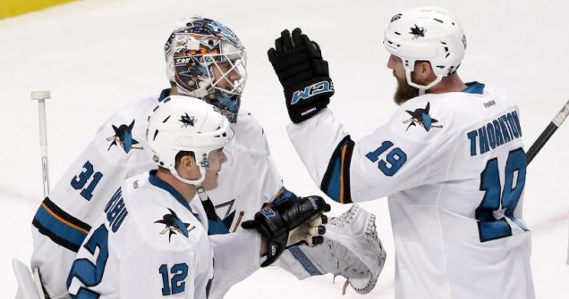
Both of these masks are really fantastic, which makes for a great Bucket Bracket Showdown final match up, but by a margin of one point, our new champion is Martin Jones. Hoist that cup high, Marty! ‘Til next year…
 FINAL:
Jones – 3
Murray – 2
Agree? Disagree? Let us know in the comments or join the conversation on Twitter, Facebook and Instagram!


[…] because for the third year running, the playoff battle royale of goalie masks has returned. Both of last year’s finalists are back in the mix again, so will we see a repeat champion or will a new winner be […]
[…] • More: The 2016 Bucket Bracket Showdown (The Finals) […]
[…] is it, the last two standing. In a late plot twist, last year’s runner up Matt Murray (back with a new mask) has once again taken over for Marc-Andre Fleury and is […]
[…] • More: The 2016 Bucket Bracket Showdown (The Finals) […]
[…] More: The 2017 Bucket Bracket Showdown (The Finals) • More: The 2016 Bucket Bracket Showdown (The Finals) • More: The 2015 Bucket Bracket Showdown (The […]
[…] Grubauer in net throughout the first round, so let’s see how his mask stacks up against former BBS champ Martin […]
[…] Bracket Showdown (The Finals)• More: The 2017 Bucket Bracket Showdown (The Finals)• More: The 2016 Bucket Bracket Showdown (The Finals)• More: The 2015 Bucket Bracket Showdown (The […]