
The 2020 Bucket Bracket Showdown: The Finals

To be honest, I was skeptical we’d even get here, but nine weeks and more than 30,000 negative COVID tests later, we’ve made it to the Stanley Cup Final. It’s been a wild ride with upsets, an insane amount of overtime, and surprisingly few game sevens, but despite all the madness and uncertainty, one thing we now know for sure is that either the Stars or Lightning will be crowned Stanley Cup Champions.
With Anton Khudobin filling in for Ben Bishop down the stretch, for the first time ever we have an all-Sylabrush final, with both masks having won their conference final match ups as well. For the final, we’re going to dig into the composition, artistry, branding, and innovation of each bucket, with the fifth and final element being intangibles in the design.
• More: The 2019 Bucket Bracket Showdown (The Finals)
• More: The 2018 Bucket Bracket Showdown (The Finals)
• More: The 2017 Bucket Bracket Showdown (The Finals)
• More: The 2016 Bucket Bracket Showdown (The Finals)
• More: The 2015 Bucket Bracket Showdown (The Finals)
All caught up on the play-in round plus rounds one, two and three? Ok, let’s get after it then!
Dallas Stars vs. Tampa Bay Lightning
Anton Khudobin (Sylvie Marsolais, Sylabrush) vs. Andrei Vasilevskiy (Sylvie Marsolais, Sylabrush)

Composition
In what’s sure to be a tight contest both on the ice and in the BBS, we have two goaltenders and one artist, putting the masterful Sylvie Marsolais’ work up against her own. For those who may not be familiar, the Quebec-based artist is known for her skillful hyper-realism (like, seriously?) and crisp execution, having also worked with the likes of Craig Anderson, Tuukka Rask and Joonas Korpisalo.
• More: HbD Interviews: Sylvie Marsolais
In an era where overly complicated masks seem to be all the rage, Marsolais consistently does a great job of carefully selecting and placing her design elements to build a composition that both reads aesthetically and meets the ask of her client. Neither of these are an exception.
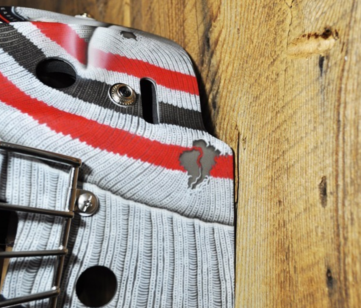
Starting with Khudobin, what I really love about this composition is the use of color to create balance. While it doesn’t appear so at first glance, there are actually a lot of design elements in this mask that the artist had to carefully configure; Dobby the elf on the left, the Stars logo on the right, the beveled typography around the chin, plus the skyline, “Stars” wordmark, and green stars on top. The way in which Marsolais used color blocking to create separation and contrast really serves this design well and allows for each element to be legible and appreciated on its own.
Vasilevskiy’s mask also has a number of complex elements that Marsolais had to seamlessly integrate into a cohesive composition. We have palm trees, Russian symbolism, lightning bolts, a lion, and block typography. Oh my. But here, the artist also uses color to her advantage, layering bright shapes of solid cobalt blue with soft gray shading to create contrast and legibility. What does get a tiny bit lost in the shuffle is the beautifully rendered lion on top, which gives Dobby the slight edge to take this win.
Khudobin – 1
Vasilevskiy – 0

Artistry and Style
I’ll preface this by saying it’s quite challenging to have an artistry battle when both masks were designed by the same artist, but here we go. Judging off style, both these goaltenders have developed a signature look for themselves that do a really nice job of integrating their respective teams’ brands, but we’ll get to that in a minute.
As we’ve seen in some earlier rounds, some buckets around the league feel generic, like any goaltender could be wearing them, or use an uninspired design like a mask decal. This is where artistry comes into play, as the best buckets embrace the goaltender’s unique opportunity to showcase their own personality and style, and both of these do a pretty damn good job.
Khudobin’s “Dobby” nickname is integrated flawlessly here, both with the use of the Dallas D in the chin typography and the illustration of Dobby the elf on the side of the mask. The artistic execution on both is near perfect, and they bring a smart and playful sensibility to the design.
Not to be upstaged, Vasilevskiy’s mask is packed with beautiful artistry and really showcases Marsolais’ versatility in her craft. Even while sticking to a monochromatic palette, the number of different styles she pulls off and makes feel cohesive is really remarkable, from the soft shading in the lion on top to the crispy chrome accents and crackled stone textures. This is a really close call, but the complexity of Vasilevskiy’s ties up the series at 1-1.
Khudobin – 1
Vasilevskiy – 1
Use of Team Branding
While Vasilevskiy has spent his entire career with Tampa Bay, Khudobin has been more of a journeyman, and as a result has sported masks leveraging a number of teams’ brands, including the Bruins, Ducks and Hurricanes.
Vasilevskiy’s use of the Lightning brand is fairly subtle, with no real logos anywhere on the mask. Instead, Marsolais leveraged the Tampa cobalt blue and design elements like palm trees, lightning strikes, graphic bolts and the word “Lightning” spelled out on the side.
Khudobin’s branding elements are more overt, with the green stars on top and large Dallas logo on the right side. While both rely heavily on color to tie into their respective teams’ brands, the use of the logo on Dobby’s gives Dallas a 2-1 lead.
Khudobin – 2
Vasilevskiy – 1

Innovation
Despite the industry being dominated by a handful of in-demand artists, the few who craft masks for all 60+ NHL goaltenders are constantly pushing the envelope and coming up with new ways to evolve their craft. Marsolais was at the forefront of using color-changing subzero paint that would change with temperature, something she used during Khudobin’s time in Boston, but neither goaltender’s current mask is leveraging that technology.
While it may not be a technological innovation, the creativity in how Marsolais has incorporated Dobby the elf time and time again is really stellar and has developed into a signature for the goaltender. The use of the Dallas logo as part of the “Dobby” lettering also shows innovative thinking and gets Dallas ahead 3-1.
Khudobin – 3
Vasilevskiy – 1
Intangibles
Coming into the intangibles with a 3-1 score wasn’t something I expected in looking at these two masks, as they’re both so strong and have their own merits. Looking at the two designs holistically, the color in Vasilevskiy’s immediately stands out as being more eye-catching simply because it’s so bold and saturated. Thinking about these two on the ice, that color really pops both on television and from the stands. While the green in Khudobin’s is also quite rich, the all-over saturation on Vasilevskiy’s grabs your attention first, giving it the slight edge in this final match up.
When all’s said and done, this was a fight to the finish between two great masks by a phenomenal artist. Dobby wins by a 3-2 margin and is crowned our latest Bucket Bracket Champion!
FINAL:
Khudobin – 3
Vasilevskiy – 2

Agree? Disagree? Let us know in the comments or join the conversation on Twitter, Facebook and Instagram! And if you’re interested, we’re now on Pinterest too.


[…] losing in a close battle to Anton Khudobin in last year’s BBS final, Vasilevskiy is back to seek revenge and claim a mask title for himself. But if Price has anything […]