HbD Masks: 2018-19 Western Conference Preview
The 2018-19 season is fast approaching, and new masks are starting to be unveiled. We’ll be breaking down the newest bucket art from across the league and grading the designs according to style, legibility, composition and branding (if you’ve read the Bucket Bracket Showdowns, you know the drill).
• More: HbD Masks: 2017-18 Western Conference Preview
• More: HbD Masks: 2016-17 Western Conference Preview
Keep checking back, as we’ll continue to add new masks to the roundup as they roll out before the season gets underway.
2018-19 Eastern Conference Preview »
Ryan Miller, Anaheim Ducks
Ray Bishop (Bishop Designs)
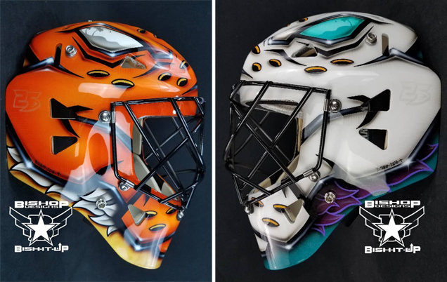 The Ducks are celebrating their 25th anniversary this season with a retro third jersey to honor the milestone. Piggybacking on the Mighty theme, artist Ray Bishop created a stunning pair of masks for Ryan Miller to match.
• More: HbD Breakdown: Anaheim Ducks Third Jersey
The primary orange mask is quite similar to what Miller sported last season, where Bishop transformed the bucket into the duck face mask from the original Mighty Ducks logo. This year’s iteration has a few extra touches, including the beach scene silhouetted in the eyes and the 25th anniversary logo subtly stenciled on the side. The back plate remains almost entirely unchanged, showcasing Miller’s family on the beach with the phrase “Miller Time” underneath.
View this post on Instagram
The alternate mask is equally as stunning but has an extra punch due to the nostalgia factor of the eggplant and teal color palette. The design is essentially a carbon copy of the primary mask with the colors swapped out, but I especially love how the teal eyes and purple feathers pop in contrast to the white mask. It’ll be really exciting to see this bucket worn with the team’s new third jerseys, and Bishop gets brownie points for considering the alternate color palette and creating a mask accordingly. I don’t give out perfect scores lightly, but this duo deserves it.
Grade: A+
John Gibson, Anaheim Ducks
Dave Gunnarsson (Daveart)
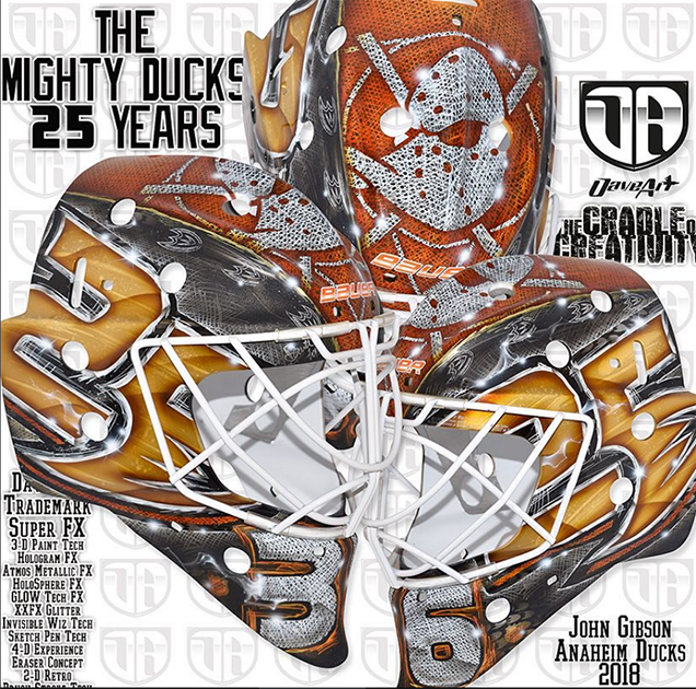 Also with a new 25th anniversary Ducks bucket is John Gibson, but Gibson and artist Dave Gunnarsson took a slightly different approach from Miller and Bishop. “John knew for sure what he wanted on this bucket,” the artist explained on Instagram. “He wanted it to be a tribute to the 25 years anniversary of the Ducks.”
• More: HbD Interviews: Dave Gunnarsson
Gunnarsson incorporated the various Ducks logos from their 25 year history, including the original Mighty logo in textured 4D paint on top and small duck feet stamped throughout. The anniversary logo is the focal point of the design, painted with a chrome effect on each side of the mask.
Despite how busy this design is with so many different textures and paint techniques, Gunnarsson does a good job of evenly distributing the styles, like using the 4D texture on the top and on the chin, so that the composition and hierarchy are balanced. It’s a bit of a disappointment to see Gibson stray from his playful Pac-Duck mask days, but this design doesn’t give us too much to complain about.
Grade: B
John Gibson, Anaheim Ducks
Shell Shock Designs
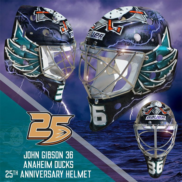 Stop me if you’ve heard this one before. John Gibson has a second mask from the folks at Shell Shock Designs, and it’s pretty damn fantastic. Inspired by Guy Hebert’s iconic Ducks mask, the design is a perfect compliment to the team’s throwback third jerseys with the eggplant and teal color palette.
Keeping the same composition as Hebert’s original, the artist injected some modern flair like lightning strikes and chrome effects to bring the design into the 21st century. Nods to Gibson’s hometown of Pittsburgh, like the city skyline, Pirates and Steelers logos are subtly incorporated throughout, and the orange sticks on the logo on top reference the team’s new brand and coloring of the logo on the third jersey.
My favorite part of this mask however is on the back, a tribute to the 2007 Stanley Cup Championship team, that brings the Cup right back to the Honda Center ice.
Simply Awesome!
— Guy Hebert (@guy_hebert) September 12, 2018
The artists at Shell Shock did a great job of interpreting this iconic design for 2018, and if Hebert himself approves, well then who are we to disagree?
Grade: A
Antti Raanta, Arizona Coytotes
Dave Gunnarsson (Daveart)
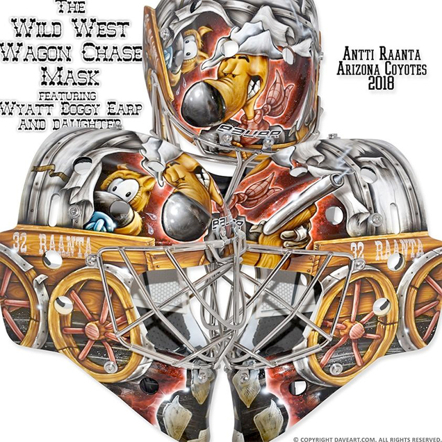 Raanta, who has been known to include colorful cartoon characters on his buckets, went full wild west with this Daveart design, transforming the mask into a covered wagon with a canine depiction of Arizona marshal Wyatt Earp. The concept here is fun for a team located in the desert, but the composition contains enough for about five masks all jammed into one.
Even in comparison to Raanta’s locomotive mask from last season, the wagon is so compacted that the design looks cluttered from the bottom up. The choice to make the dogs the same color as the wagon doesn’t help Gunnarsson’s design from a legibility standpoint either, as all of the workmanship and detail just gets lost in this huge shuffle.
Kudos for creativity and running with a signature theme here, but this mask is another case of when less would have been more.
Grade: D
Mike Smith, Calgary Flames
David Arrigo
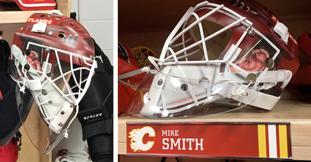 With many teams, including the Calgary Flames, going the throwback route for their new third jerseys, Mike Smith took the opportunity to create a special throwback mask to match. Painted by artist David Arrigo, the design pays tribute to legendary Flames netminder Mike Vernon, who gave the mask his own stamp of approval. “I think it’s so cool,” Vernon told NHL.com. “I saw a few photos. It looks amazing… I don’t think he’s honoring me. I think he’s honoring the past. That’s what important.”
Smitty’s new mask = 🔥
The netminder shows off his new lid, made by @darrigoart! pic.twitter.com/msWVVeMTWy
— Calgary Flames (@NHLFlames) October 4, 2018
Smith admits that he struggled with the idea of creating a retro tribute mask, but once the idea came to him, Arrigo executed it perfectly. It’s a new take on the creepy ear mask idea that we’ve seen goaltenders do in outdoor games and beyond, but designing it to mimic the combo style is really unique and playful.
This is a really cool and well executed tribute to compliment the Flames’ new thirds, so bravo to Smith and Arrigo.
Grade: A+
Cam Ward, Chicago Blackhawks
Steve Nash (Eyecandyair)
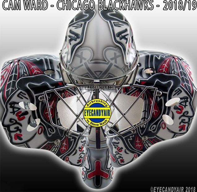 Blackhawks newcomer Cam Ward has a non-Hurricanes mask for the first time in his career. Painted by Ward’s long time artist Steve Nash, Wardo has abandoned the pirate theme of his past to make a fresh start in Chicago. “We were very excited to hear that Cam would be playing in Chicago,” the artist recently told InGoal Magazine, “but it also meant we would have to redesign his identifiable Blackbeard pirate skull mask as that had historical significance to Carolina.”
With a desaturated color palette, Nash created a collage-like composition by repeating the Blackhawks’ logo on each side and incorporating design elements from the team’s brand and history. The negative space in the center is filled with a scaled back rendering of the Hawks’ secondary “C” logo to give the design some depth, and the nod to Murray Bannerman on the chin is a particularly nice touch (in case you didn’t know how much I like Bannerman’s mask, there’s a poster of it).
The traditional airbrush style isn’t something we see much of in today’s NHL but that Nash does exceptionally well. The end product here is clean and well-balanced – far more appealing than some of Ward’s more cluttered designs – so a solid start to his career in Chicago.
Grade: B+
Anton Forsberg, Chicago Blackhawks
Dave Gunnarsson (Daveart)
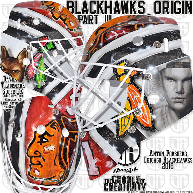 Another Blackhawk changing things up with a new bucket design is Anton Forsberg. Forsberg and artist Dave Gunnarsson worked together to create a tribute to late EDM artist, Avicii, of who both the goaltender and artist were fans.
“Anton knew what he wanted on his new mask, he wanted to pay tribute to the Swedish DJ legend Tim Bergling, a.k.a Avicii, who recently passed away,” Gunnarsson shared of the concept. “Just as Anton, I am also a big admirer of his music and person and family.” Gunnarsson even went as far as to share the design with Avicii’s family before revealing it to the public as a gesture of respect.
With the exception of the portrait of Bergling on the left side, the rest of the mask is super brand-centric, using a large Blackhawks logo on the top and the team’s iconic striping on the sides. The composition is pretty traditional by Daveart standards, but certainly more appropriate for a tribute mask.
Grade: B
Philipp Grubauer, Colorado Avalanche
Dave Gunnarsson (Daveart)
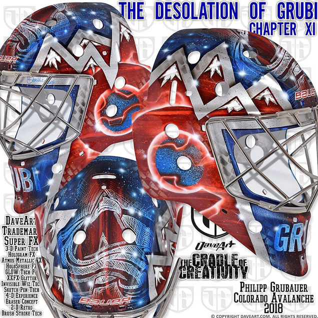 Yet another Daveart mask unveiled for the new season is the next iteration of Philipp Grubauer’s “Desolation of Grubi” series. “Grubi and I have been working together for many years, and this is his eleventh chapter in his latest Grubi series of masks,” Gunnarsson explained, “his first Avs mask.” For the goaltender’s first season in Colorado, the artist created a brand-centric design incorporating an illustrative depiction of the Rocky Mountains.
View this post on Instagram
Mixing effects like holograms, sketch pen, traditional airbrushing and Gunnarsson’s new “4D experience” textured drawings, this mask has a lot of dimension and visual interest. Even though there’s a lot going on, the decision to keep the color palette minimal and blocked into large maroon and blue areas helps give the design definition and clarity, even from afar.
Gunnarsson blends the different styles together quite well in this design, creating a successful and aesthetically pleasing piece even with this level of detail.
Grade: B
Anton Khudobin, Dallas Stars
Sylvie Marsolais (Sylabrush)
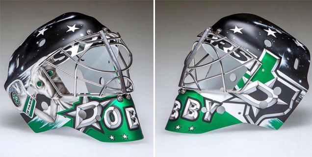 Anton Khudobin and artist Sylvie Marsolais made headlines last season for the goaltender’s color-changing Bruins mask, and while this season Dobby may not have any subzero paint on his bucket, the inclusion of another Dobby is grabbing just as much attention.
• More: HbD Interviews: Sylvie Marsolais
Painted in black and Slytherin Dallas green, the goaltender’s nickname is spaced across the chin using the Stars’ logo for the D just below an illustration of the other Dobby, the house elf from Harry Potter. Like the hockey player Dobby, elf Dobby is shown flashing the leather and making a glove save, although as pointed out by NHL.com, unlike hockey player Dobby, elf Dobby seems to catch with his right hand.
Like with all of Marsolais’ work, this mask is flawlessly executed with a well-balanced composition and super sharp airbrushing. While the top of the mask is a bit plain, the playfulness of incorporating the Harry Potter character and giving him a goalie glove gets bonus points for creativity and making the viewer smile.
Grade: A-
Ben Bishop, Dallas Stars
Dave Gunnarsson (Daveart)
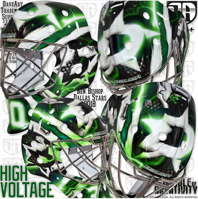 A former Bucket Bracket Showdown champion during his time in Tampa, Ben Bishop has since had a string of pretty great (although not *as* great) glowing masks. This season however, as Dave Gunnarsson shared on Instagram, Bishop wanted to change things up and create something with more black. With the darker backdrop, the Stars logos are given an electrified effect, glowing green with lightning strikes throughout.
View this post on Instagram
While the concept worked better with the Lightning brand, Gunnarsson has done a good job evolving the “high voltage” look for Bishop’s new team and keeping the mask dynamic and bold. Some of the details like the fraying and tears get lost in the shuffle among the electric currents, holograms and neon glows (oh my!), but overall, the mask is pretty sharp.
Grade: B+
Jonathan Quick, Los Angeles Kings
Steve Nash (Eyecandyair)
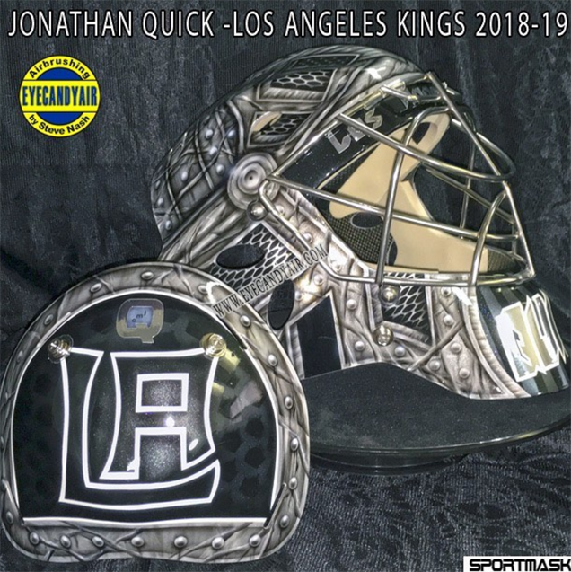 I think by now we can add Jonathan Quick having a battle armor mask alongside death and taxes to the list of life’s certainties. Working once again with artist Steve Nash, Quick has probably made fewer changes to his mask art than any other goaltender in the last decade. The backplate is somewhat similar to Quick’s 2015 mask with the small crowns silhouetted behind the LA monogram.
View this post on Instagram
The biggest change from last year (and I’m aware, we’re splitting hairs here) is that the metal has more texture which leans more towards a realism style versus a graphic one. Both are aesthetically quite nice in their own rights, but the more detailed approach gives Nash an opportunity to really show off his airbrushing skill.
Nash also created a second battle armor mask for Quick this season with some other slight changes, as one will be worn for practice and the other for games (although it hasn’t be stated which is which). This concept has become one of the most recognizable signature buckets in today’s NHL, and I don’t see Quick abandoning it any time soon.
Grade: A-
Andrew Hammond, Minnesota Wild
Jason Bartziokas
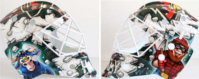 After spending the majority of his career in Ottawa followed by a brief stint in Colorado, Andrew Hammond and artist Jason Bartziokas bring us the goaltenders first mask a member of the Minnesota Wild. Now I’ve said this before, but artists are faced with added challenges when designing for Wild goaltenders given the team’s difficult logo and somewhat abstract brand imagery.
During his time in Ottawa, Hammond became known as the Hamburglar and thus began sporting masks to match. I’m glad to see that Bartziokas has continued this playful theme, and even evolved it to suit the goaltender’s new city, depicting the Hamburglar as a lumberjack on the left side. What’s unfortunate however is that the color palette and lack of balance of this mask make it hard to understand what’s going on. The two characters stand out with the glow effect around them, but the rest of the detail gets lost in the shuffle. Had the lumber-burglar taken more of a front seat in the composition with fewer the white areas, the design would’ve been more legible and ultimately successful.
Grade: B-
Pekka Rinne, Nashville Predators
Dave Gunnarsson (Daveart)
 While Rinne’s masks typically have some sort of movie reference, style-wise he has been one of the most inconsistent goaltenders year over year. With everything from a super cluttered Mad Max design to a minimalist brand-centric concept, this Iron Man bucket falls somewhere in the middle of the spectrum.
“I have painted the awesome Iron Man helmet before, but never on a predator monster,” Gunnarsson shared of the concept. The mask depicts an Iron Man mask over the gritty sort of blue fur that we’ve seen on Rinne’s masks before. While Gnash isn’t the furriest of creatures, it appears the color comes from the Preds’ mascot, although without reference, that’s not entirely clear.
The way in which Gunnarsson transforms this mask into Iron Man is certainly innovative, and the larger areas of solid color make this design more legible than others. Overall, a step up from many of Rinne’s prior masks, but the concept is still more kitschy than quality design.
Grade: B-
Martin Jones, San Jose Sharks
Steve Nash (Eyecandyair)
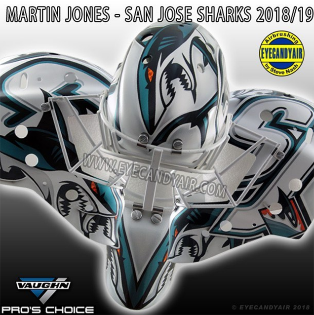 Another new mask from Eyecandyair is Martin Jones’ new Sharks bucket, and damn is this thing sharp. Nash has a knack for creating logo-centric designs with super dynamic compositions, and this one is no different.
View this post on Instagram
Not straying far from Jones’ past Sharks buckets, the biggest difference in this year’s design is the lack of lacing on the chin. While I’ve always been a fan of that element and was bummed to see it go, the V shape created by the two shark heads is super dynamic and smartly thought out by Nash. The way in which the symmetrical sharks create a perfect V in the center and then flow up the sides of the mask is really great, as is the layering and hierarchy between the SJ logos and the shark forms.
Adding orange metallic foil to the eyes was a nice finishing touch on this mask to give it some pizazz, but the composition here is really what shines and shows off Nash’s eye for design.
Grade: A-
Aaron Dell, San Jose Sharks
Dave Gunnarsson (Daveart)
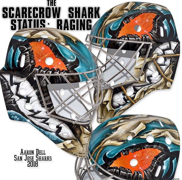 Jones’ fellow Shark Aaron Dell has an apparent affinity for spooky mask art, as evidenced by his most recent Dave Gunnarsson design. Following a pair of Halloween-worthy pumpkin and scarecrow masks last season, Gunnarsson ditched the Jekyll and Hyde approach and created a more cohesive scarecrow shark that is the most cohesive and successful design to date.
View this post on Instagram
San Jose goaltenders have a long history of transformative shark head masks dating back to Brian Hayward in the early 90s (and hey, there’s merch for that!), but Gunnarsson really takes this concept to the next level using the team’s logo as basis for the Shark’s anatomy and incorporating textures to create the look of a scarecrow. New additions include the subtle All Star logo in the eye of the shark and the omission of the broken stick along the teeth, which helps with the legibility of this extremely detailed design.
In looking at the three masks in this unofficial series, this is the best scarecrow shark to date and overall, a compelling and unique design.
Grade: A
Jake Allen, St. Louis Blues
Dave Gunnarsson (Daveart)
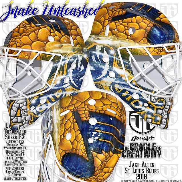 After sporting one of the most polarizing yet in my opinion stunning masks of the last few years, Jake Allen has a new artist and a totally new aesthetic for the 2018-19 season. Working with Dave Gunnarsson, Allen went from retro minimalism to the visual embodiment of his “Jake the snake” nickname.
“Jake I and brainstormed during the summer how to create it,” the artist shared of the process. “We wanted to do it with snakes, but in a new style, something never done.” The end product, which Gunnarsson describes as ” raw and rough and aggressive” is created entirely of scales, which is actually a pretty cool concept for a goaltender nicknamed “the snake.” My issue with this mask is that the design ends up looking less snake-like and more like Ben Grimm.
View this post on Instagram
The texture created in the numbers on the chin look more like stonework, which further removes the pattern from the realm of scales, and the design ultimately ends up looking confused. I do like the negative space Blues note on top, and as always, the workmanship and detail in Gunnarsson’s masks are second to none, but this one, sad to say, is a miss.
Grade: C-
Chad Johnson, St. Louis Blues
Jason Bartziokas
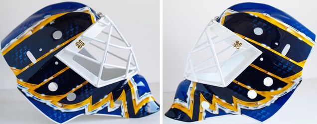 Well damn, isn’t this just beautiful. Painted by Jay Bartziokas, the smart composition and flawless execution make Chad Johnson’s new Blues mask a total stunner.
Using the Blues’ logo as the sole design element, Bartziokas created a dynamic and balanced symmetrical composition with multiple layers of detail. The boldness of the notes’ wings in the rich navy blue outlined in gold create contrast and depth that give this simple design punch. The illusion chrome and tiny holographic notes (straight out of the Daveart playbook) provide enough additional interest without overwhelming the viewer.
One of my favorite things about this mask though is the white lacquer cage and small “31”s inside the face mask. Putting Johnson’s number on the chin of the mask would have been the most predictable design choice, but Bartziokas’ decision to work the small typography into the white space behind the cage was really smart and provides some retro flair. The artist also created a second version of this design using the powder blue of the team’s third jerseys, which is equally as stunning, and will look great with the alternate uniform.
• More: HbD Breakdown: St. Louis Blues Heritage / Third Jersey
Overall, I really love both these masks. Executing such a simple design so flawlessly isn’t easy, and Bartziokas really knocked it out of the park.
Grade: A+
Oscar Dansk, Vegas Golden Knights
Dave Gunnarsson (Daveart)
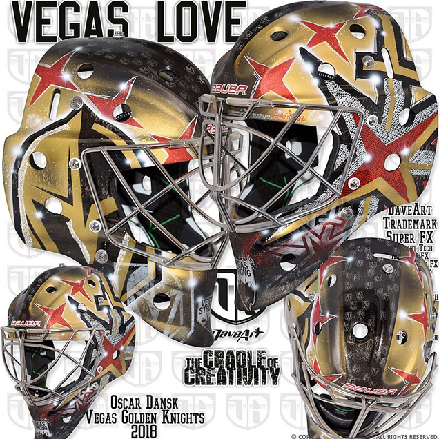 Albeit quite gold, the Knights’ backup goaltender Oscar Dansk’s new bucket is actually somewhat understated by both Sin City and Daveart standards. Titled “Vegas Love,” the more conservative design serves as a tribute to the victims who lost their lives in the mass shooting last October.
“Oscar had a beautiful idea for his new mask,” Gunnarsson shared. “A Vegas Golden Knight helmet is created on the mask for each and every of the 58 victims. All helmets are placed on the top of the mask, closest to heaven.”
In addition to the 58 small logos honoring each of the victims, Gunnarsson included the “Vegas Strong” logo on the chin of the mask to further solidify the theme. The rest of the design relies solely on the Knights’ logos, using a zoomed and cropped primary logo on the left side of the mask and the secondary star and sword logo on the right. I particularly like what Gunnarsson did with the four pointed stars, pulling them out of the somewhat childish logo and letting them stand alone down each side of the mask. It almost further emphasizes the idea of the 58 victims being shown in heaven, surrounded by stars on both sides.
With the holograms and textures all over this thing, it’s definitely a Daveart-style mask, but the simplified composition and inclusion of the tribute give it something a little extra special.
Grade: B+
Malcolm Subban, Vegas Golden Knights
Dave Gunnarsson (Daveart)
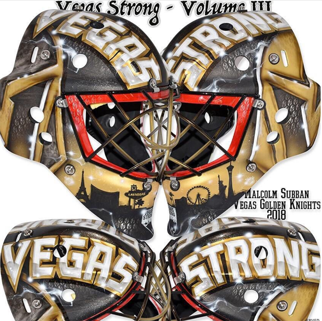 Also sporting a “Vegas Strong” tribute mask this year will be Malcolm Subban. Following up on the tribute mask he commissioned from Dave Gunnarsson last season, the artist delivered the next iteration, titled “Vegas Strong – Volume III.”
“He wanted Vegas Strong to continue be the main theme of his new masks, just as on his previous Vegas masks we created a year ago,” Gunnarsson shared of the goaltender’s vision. “Malcolm wanted the Vegas helmet big on each sides and I loved it.” Floating above the cropped Knights’ logos on each side, the words “Vegas Strong” become the focal point of the design. Like on Dansk’s, the Vegas Strong shield appears on the chin of Subban’s mask in front of a silhouetted Vegas skyline. It appears Gunnarsson has also created a white version of this design for Subban to wear with the team’s road jerseys, although the black version will be his primary bucket.
Malcolm Subban has 2 new masks. Las Vegas silhouette is now under cage. He may use white one on road, black one at home, but the black one will be his regular mask for now pic.twitter.com/vSMuCWab8U
— Sheng Peng (@Sheng_Peng) September 14, 2018
The smoke, light flares and holograms all over this mask unfortunately take away from the strong composition, so while a slight downgrade from last year’s iteration, this mask is still pretty solid.
Grade: B+
Connor Hellebuyck, Winnipeg Jets
Steve Nash (Eyecandyair)
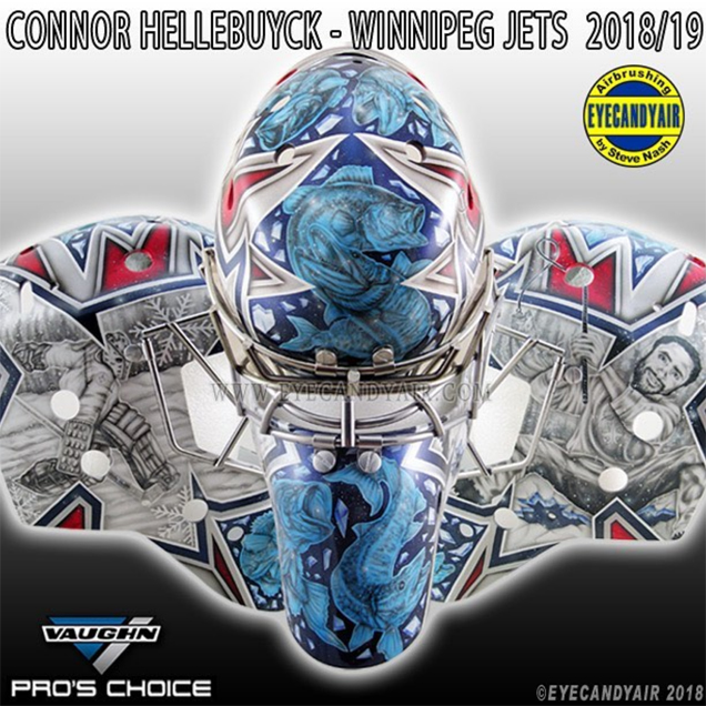 Connor Hellebuyck has had some phenomenal masks over the past few years, and his latest bucket from Steve Nash at Eyecandyair certainly didn’t disappoint. While many goaltenders pay tribute to retired legends or players who have passed on their masks, Hellebuyck decided to pay tribute to… Dustin Byfuglien?
The design highlights the goaltender’s love for fishing with a blue fish and ice chunk pattern up the center of the mask framed by black and gray illustrations of a vintage goaltender playing on a pond and Big Buff happily reeling in a catch, each framed in the shape of the Jets’ logo.
View this post on Instagram
“Buff actually turned me onto ice fishing,” the goaltender shared in a video Tweeted by the Jets. “Instead of just having a guy ice fishing on there, we’ll have Buff ice fishing on there, and it turned out pretty great.”
Aside from the beautiful artistry in this mask, the humor element is a really fun and playful addition. With so few opportunities to show individual personality on the ice, it’s commendable to see goaltenders take advantage and have some fun with their mask designs.
Grade: A+
Agree? Disagree? Let us know in the comments or join the conversation
on Twitter,Facebook and Instagram!


[…] […]
I’d like to feature the mask I painted for Delia of the Chicago Blackhawks to make the 2018-2019 NHL season.
Here is a video the Icehogs made of his new mask.
https://youtu.be/YaU8DnX20hs
[…] theft charges for eating a few slices of ham every day for eight years. … Here’s a look at every goalie mask in the NHL’s Western Conference this year. … Dez Bryant and Jerry Jones went to a Beyoncé concert together. … It sounds like […]
Re: Andrew Hammond’s Minnesota Wild Mask –
That’s the Hamburgler as Paul Bunyan, with Blue the Ox on the other side. That’s friggin’ brilliant. I guarantee that just about anyone raised in the upper Midwest knows exactly what the mask means.
[…] • More: HbD Masks: 2018-19 Western Conference Bucket Preview […]
[…] • More: HbD Masks: 2018-19 Western Conference Preview […]
[…] Image: Hockey By Design […]
[…] More: HbD Masks: 2018-19 Western Conference Preview• More: HbD Masks: 2017-18 Western Conference Preview• More: HbD Masks: 2016-17 Western […]