
HbD Masks: 2016-17 Western Conference Preview
 Now that the World Cup tournament has come to an end, all eyes are set on NHL opening night. We saw many goaltenders sporting new masks in Toronto representing their countries, but now our attention has shifted back to the rest of the regular season.
A number of new masks have been unveiled for the 2016-17 season, so let’s check out what we’ve seen so far. Keep checking back, as we’ll continue to break down more masks as they’re revealed, and while you’re at it, check out the Eastern Conference masks.
• More: HbD Masks: 2016-17 Eastern Conference Bucket Preview
Martin Jones • San Jose Sharks
Steve Nash, Eyecandyair
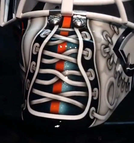
 Following up on a fantastic 25th anniversary mask last season, artist Steve Nash is back with another stellar design for Martin Jones. Similar to last season’s design, Nash took a logo-based approach with minimal pops of color, making the full turquoise shark leap off the side. The alternate “SJ” logo appears more subtly on the left, surrounded by a light gray stitching effect. Complimenting the stitched trim is the lacing up the chin, also a repeated element from last season.
The rest of the mask features less prominent visuals like a simplified shark logo on the backplate, blurry shark silhouettes “swimming” through the negative space and metallic striping overlaid on the right side.
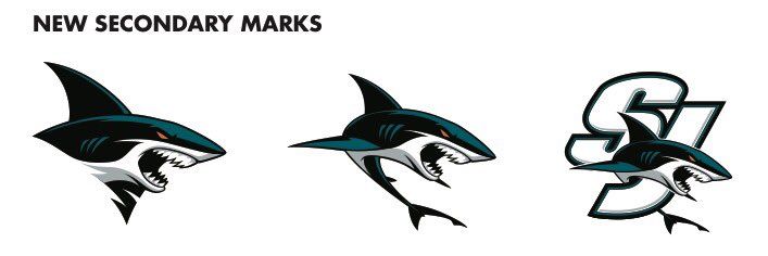
I’m a big fan of this design, as it’s fully Shark-centric and highlights the team’s visual history. Fortunately, the new alternate logos were left out of this design (perhaps on purpose, or maybe the mask was started before they were unveiled) as they look a bit minor league-esque in my humble opinion.
Grade: A-
Jake Allen • St. Louis Blues
Jason Livery, Headstrong Grafx
 Staying true to his “Jake the Snake” moniker, Jake Allen went with a retro racing-style for the Blues’ 50th anniversary season. Painted by artist Jason Livery, the mask is a bit of a hodge podge color palette-wise, using a mixture of light blues, navy, yellows and grays.
The snake and music note logo are the primary focus of this design but unfortunately don’t pop as much as they should due to the busyness of the background. Livery shared on Twitter that Allen wanted the horizontal stripes incorporated to match with his pads, but perhaps the variety in colors and gradient effects is where this design goes overboard. From a distance, the fine details in the snake, light flares over the note and the screened back 50th anniversary logo will get buried in the abundance of color and pattern.
Grade: C
Michael Hutchinson • Winnipeg Jets
David Leroux, Diel Airbrush
 Quebec-based artist David Leroux has a knack for making crisp, clean mask designs, and Hutch’s mask for this season is no exception. Not unlike the Winnipeg netminder’s mask from a few years prior, Leroux’s latest design is all about the Jets’ brand.
The matte paint finish is a trend we’ve been seeing more of recently, and I’m a big fan. It works really nicely with this graphic style, and Leroux even added small touches of shine in thin stripes on the dark blue areas. The lack of sheen lets the design take center stage, and there are a lot of really nice details happening here.
Extremely happy with how my mask for this season turned out. Thanks @dielairbrush Can’t wait to rock this all season pic.twitter.com/2Xio2wlyv5
— Michael Hutchinson (@mhutch34) September 7, 2016
The contrast between the matte texture and faux-chrome effect is really sharp and consistently carries through the entire design. The red maple leaves on the chin and top draw your eye right to the middle and help create a dynamic composition even with a minimal number of design elements.
Since moving back from Atlanta, Winnipeg’s jerseys have a clean, contemporary look, and this mask coordinates perfectly with that aesthetic.
Grade: A-
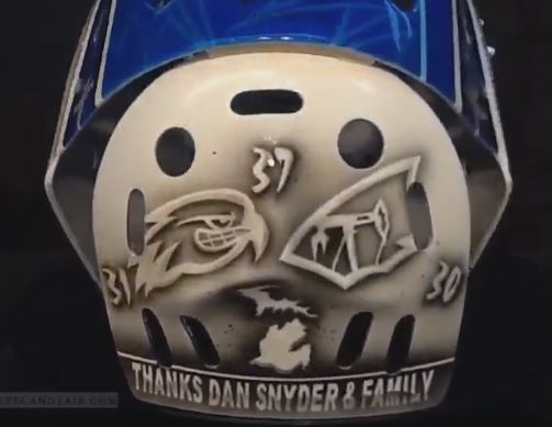
Connor Hellebuyck • Winnipeg Jets
Steve Nash, Eyecandyair
 One of many various tribute masks this season, Connor Hellebuyck opted to honor the memory of Dan Snyder, the former Atlanta Thrasher who tragically died in a car accident back in 2003. Despite Snyder’s death coming long before Hellebuyck joined the club, the young netminder will be the first to wear Snyder’s number 37 for the franchise since his passing over a decade ago. “I was really grateful that the Snyder family was allowing me to use 37 cause it’s been a retired number,” Hellebuyck told the Global News. “I thought I would give a little bit back to him and show that I really care.”
We have something really cool to show you. Check out Connor Hellebuyck’s new mask from @Eyecandyair! pic.twitter.com/IOEAguc6Sj
— Winnipeg Jets (@NHLJets) October 3, 2016
The top of this mask has a beautiful pair of portraits of Snyder surrounded by a ribbon of jet plane-laden trim. On either side of the mask, Nash illustrated a scenic, woodsy landscape with children playing pond hockey and wild animals throughout. The backplate includes Hellebuyck’s former numbers and team logos along with the words “Thanks Dan Snyder and Family.”
Sentiment aside, this is a really beautiful mask on its own. The monochromatic design and artistry in the scenery are really outstanding, so bravo to Nash and Hellebuyck on this one. Said the goaltender of his new bucket, “hopefully I can keep this going and keep his shrine going on my mask so he’ll always be apart of the game.”
Grade: A+
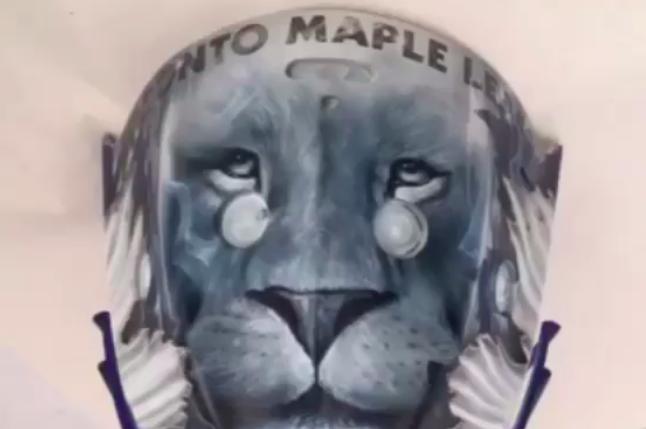
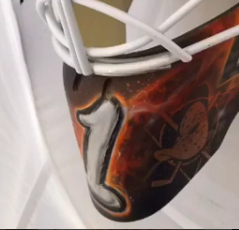
Jonathan Bernier • Anaheim Ducks
Dave Gunnarsson, Daveart
 After migrating east from Los Angeles to Toronto and then back again to Anaheim, Jonathan Bernier is on his third team in twice as many years. With all the changes in masks, one element has been a mainstay on the netminder’s mask––the lion. “We have been working together for a decade,” artist Dave Gunnarsson shared on Instagram. “When it was time to create his first Ducks mask, we brainstormed together and we came up with a design plan.”
Almost identical in composition to Bernier’s 2015-16 mask in Toronto, the lion (Bernier’s zodiac sign is Leo) sits on top of the mask surrounded by the Ducks logo on each side. It appears that Bernier may be wearing #1 in Anaheim, as a large 1 is written on the chin of the mask.
With all of the gradients and light flares, the paint effects throughout this design are a little too boardwalk airbrush booth-y in my opinion. In the meantime, we’ll be anxiously awaiting Gibson’s pixelated design––soon to come!
Grade: B-
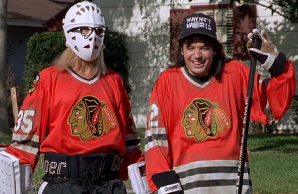
Scott Darling • Chicago Blackhawks
Dave Gunnarsson, Daveart
 We’re not worthy!! Ok, that joke’s been beat to dead, but Scott Darling’s new Wayne’s World theme mask really is excellent… (I’m sorry).
The Mike Myers cult favorite has been associated with the Blackhawks since the skit’s debut due to the characters’ suburban Illinois hometown and the Chicago jerseys frequently sported by Wayne and Garth. The duo’s “Game On!” saying even became the official slogan of the NHL back in the 90’s.
Blackhawks-Wayne’s World plays have popped up quite frequently in the form of jerseys and t-shirts, but this is the first time (at least in recent memory) that we’ve seen it on a goalie mask. This season marks the 25th anniversary of the film adaptation, so it’s only fitting that Darling would pay tribute now.
Game on! Thanks @davidofdaveart and @bauergoalie for another great mask #WaynesWorld
A photo posted by Scott Darling (@sdarling_33) on
Dave Gunnarsson combined a photo realism style with the Hawks’ red, white and black stripes, depicting Wayne and Garth along with a logo for faux bakery, Stan Mikita’s Donuts, on the right side. The Blackhawks’ alternate logo along with Darling’s number 33 can be seen on the chin.
The left side of the mask is equally as COOL, with a close-cropped view of the Blackhawks’ logo in front of native american animal designs, making, as Gunnarsson described on Instagram “2 designs in 1.” This design is fun, nostalgic and beautifully executed, so party on, Darling… (ok, now I’m really done).
Grade: A
Peter Budaj • Los Angeles Kings
Dave Gunnarsson, Daveart
One of many team anniversary masks this season, Budaj’s Kings 50th bucket celebrates more milestone than one. “Peter Budaj and I have been working together for many years,” Dave Gunnarsson shared on Instagram. “Next year we celebrate a decade! That is 10 years of very exciting mask paintings.” The latest is no exception and pays tribute to some of the franchise’s best.
“Peter knew what he wanted on his new Kings mask. A silent and calm design, old school and clean, with a tribute to the anniversary of LA Kings 50 years.” Kings legend Rogie Vachon along with his name and number are sketched on the left side of the mask opposite the team’s anniversary logo on the right. Also tucked into the white panel along the chin is Simpsons character Ned Flanders, a mainstay element on Budaj’s buckets over the years.
The black and gray palette coordinate nicely with the team’s anniversary jerseys, even tying in the metallic trim in the chrome effects throughout.
Grade: B+
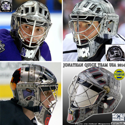
Jonathan Quick • Los Angeles Kings
Steve Nash, Eyecandyair

Budaj’s teammate Jonathan Quick also has an anniversary mask this season. Quick’s long time artist Steve Nash stuck with the battle armor motif that we’ve seen Quick wear over and over again, something the superstitious goaltender has yet to stray from in recent years.
Jonathan Quick must be superstitious with his mask. Despite weakening strength for safety, he has not replaced his bent cage.
— John Bartlett (@BartsBytes) May 31, 2014
The primary variation in this year’s iteration is on the back plate where Nash put the number “50” front and center, honoring the Kings’ half-century of history. Lightning strikes and light flares fill in the black background surrounded by silver bolted armor trim.
Like with Budaj’s mask, the silver tones in Quick’s will coordinate well with the Kings’ anniversary jerseys, as well as their standard black and white kits. Some purple and gold might be nice to see sooner or later, but given Quick’s track record in the battle armor, why fix what ain’t broken.
Grade: B+
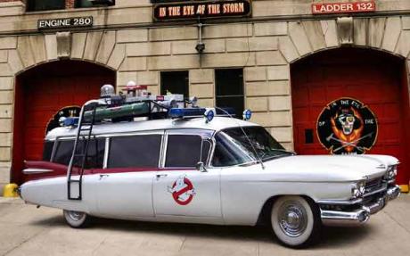
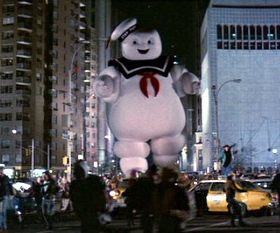
Cam Talbot • Edmonton Oilers
Dave Gunnarsson, Daveart
 We’ve seen Dave Gunnarsson turn masks into vehicles like cop cars and fire trucks, but Cam Talbot’s new Oilers mask transforms into the Ghostbusters Ecto-1. Having created Ghostbusters masks for Talbot in the past, this season’s iteration puts the Michelin Man and ghost front and center, operating the vehicle from each side.
“They must have stolen the car,” Gunnarsson shared of the story behind the design. “I can tell you this, I had very fun when I painted and created this painting for my buddy Cam Talbot.” Small holographic oil drops fill the negative space to tie in the team identity, but this design all but screams Ghostbusters.
While it doesn’t say much about Cam or his team, this mask is well executed and really playful, so analyzing it for what it is, it’s a job well done.
Grade: B
Brian Elliott • Calgary Flames
Dave Gunnarsson, Davear
 Elliott’s first season with the Flames presented a new opportunity for Dave Gunnarsson to craft a fresh take on the goaltender’s moose mask that we’ve seen time and time again. “Brian and I, we brainstormed a lot during summer how to create this piece,” the artist shared on Instagram. “On a distance it is a clean cut and strong profile mask, a design that live and brea[thes] The Flames. Then when you come closer the mask transforms into a new design in front of your eyes, and it becomes a true Storyteller design. And for sure a moose pop up on the top, as a connection to Brian’s nickname.”
As Gunnarsson described, the take on the Calgary logo is the primary element in this design with yellow and white flames shooting out from either side. The inference to the bottom of the “C” is there on the chin with Ells’ nickname, “Moose,” written in between. The top of the mask is where Elliott’s ever-present moose character makes an appearance, but my problem with this moose is that it looks more like a raging bull with antlers than an actual moose (trust me, I’m a Mainer–I would know).
There’s no doubting Gunnarsson’s abilities, as we’ve seen him churn out one complex mask after another for years now, but the overall aesthetic of this one just misses the mark for me.
Grade: C
• More: HbD Masks: 2016-17 Eastern Conference Bucket Preview
Agree? Disagree? Let us know in the comments or join the conversation
on Twitter, Facebook and Instagram!


[…] • More: HbD Masks: 2016–17 Western Conference Bucket Preview […]
As a Kings fan, I’m looking forward to trash talking the fact that Bernier is wearing our mascot on his bucket.
[…] • More: HbD Masks: 2016-17 Western Conference Preview […]
I like Hutchinson’s mask. I would rate it 8 stars on 10
[…] • More: HbD Masks: 2017-18 Western Conference Preview • More: HbD Masks: 2016-17 Western Conference Preview […]
[…] • More: HbD Masks: 2018-19 Western Conference Preview• More: HbD Masks: 2017-18 Western Conference Preview• More: HbD Masks: 2016-17 Western Conference Preview […]